Topic starter
Following discussion on Cotic's new effort, which brands do it well and which do it badly? Pictures or it didn't happen.
A couple of my favourites...
Posted : 19/06/2020 6:25 pm
Like the Brazed on 'O' on my Onza. Can't do pics though.
Posted : 19/06/2020 6:28 pm
![]()
Posted : 19/06/2020 6:37 pm
 was just about to post a Raleigh one! Mostly for nostalgia purposes
Posted : 19/06/2020 6:42 pm
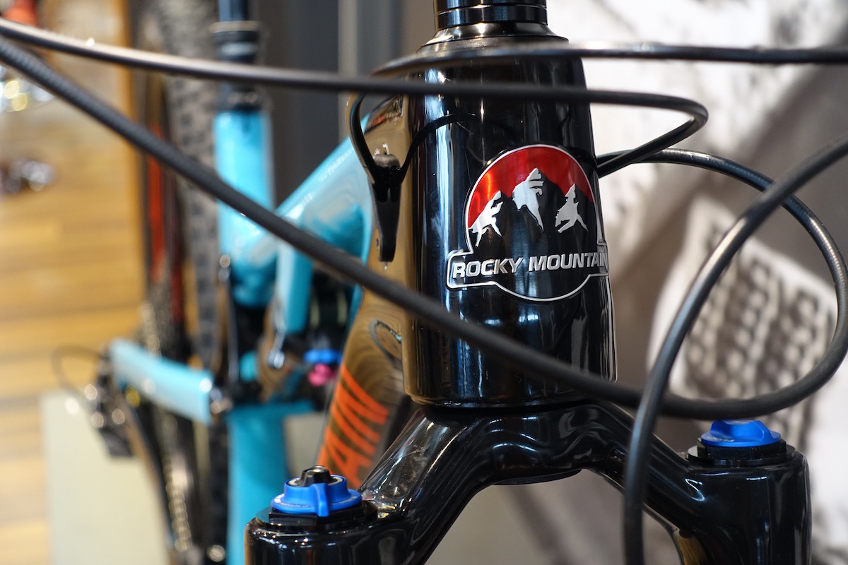
I've always liked the Rocky Mountain one. Anything with a real head badge rather than a logo or brand name painted on is cool. Intense, Salsa, Singular are nice.
Posted : 19/06/2020 6:51 pm
Good

Less good

Posted : 19/06/2020 6:53 pm

Good (old) game on PinkBike...
https://www.pinkbike.com/news/quiz-can-you-guess-the-bike-brand-from-the-headtube-badge.html
Posted : 19/06/2020 6:57 pm
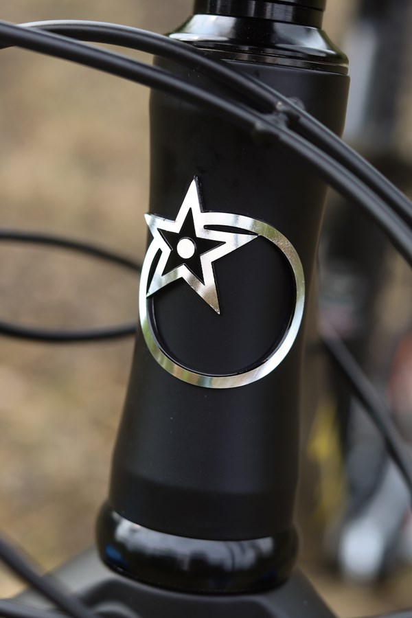
Good, has to be the btr one (sure someone cleverer than me can post a pic)
Posted : 19/06/2020 6:58 pm
![]()
Posted : 19/06/2020 7:07 pm
Sanderson is good imo
Posted : 19/06/2020 7:10 pm
Ragley
![]()
Posted : 19/06/2020 7:12 pm
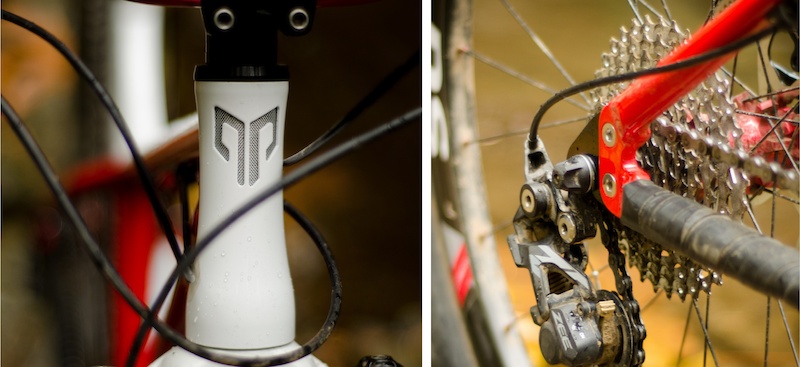
The BTR one reminds me of the early Pyga head tube badges.

My Pyga OneTen falls into the less good category.
Posted : 19/06/2020 7:13 pm
This is mine.
[img]  [/img]
Posted : 19/06/2020 7:13 pm
Posted : 19/06/2020 7:14 pm
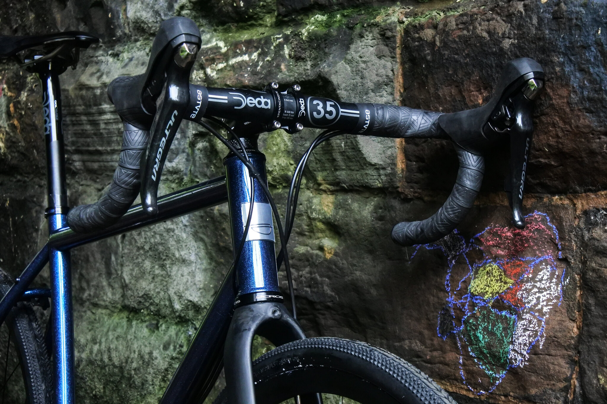
The good
[url= https://i.postimg.cc/W1nVFPrg/55cm-Responsorium-Conic-Head-Badge.jp g" target="_blank">https://i.postimg.cc/W1nVFPrg/55cm-Responsorium-Conic-Head-Badge.jp g"/> [/img][/url]
And I'll second the new Cotic one as not so good.
Posted : 19/06/2020 7:49 pm
I always like the old Yeti ones
Posted : 19/06/2020 7:56 pm
Topic starter
Yes they are waaaaay better than the current Yeti badges, which are perfectly fine anyway.
I get the BTR one but I'm not really a fan of it.
Perhaps because their bikes look like radiators anyway, so that badge doesn't help.
Posted : 19/06/2020 11:14 pm
Bought a retro ‘brass’ Raleigh HB for my Gbike recently after bags/cables rubbed the current one into a razor blade.
AliExpress £3 well spent
Posted : 19/06/2020 11:31 pm
Always liked the old production privee cut out badge, sometimes less is more.
Posted : 19/06/2020 11:38 pm
Sorry but the new Cotic badge is a big improvement. I'm not in love with it but the old one is corny and juvenile. It looks like a teenagers scribble of a regrettable tattoo idea.
The new one is much classier and will be much less embarrassing on a t-shirt or something.
Posted : 20/06/2020 1:21 am
Merak - very nice.
Will post a pic of my indy fab sterling silver one; its on a fully re-furbed steel deluxe.
Posted : 20/06/2020 1:49 am
New Cotic is an improvement imho. Wasn't a fan of the old one. Also the new DT logo style just looks cleaner. The new FS bikes look on another level now, to me.
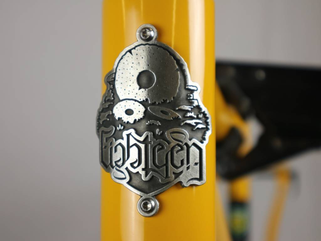
Eighteen's is good, logo/type is smart.
Always liked my Jones's head badge. Kind of cliched in a good way. Scores 3 out of 4 on the Classic Elements of Headbadges - wings, wheels, mountains and fire.

I don't think I've seen a 4 out of 4?
Yeti is an all-time classic imo, early ones as well as later ice axe versions.

Posted : 20/06/2020 8:14 am
Rather like the one on my new Kona

Posted : 20/06/2020 9:11 am
I like the one on my Sour a lot.
The new Cotic one is a vast improvement on the old grinning space hopper one, which as shark attack says looks like an early 2000s teenage tattoo.
Posted : 20/06/2020 9:22 am
+1 for 18 bikes, ace headtube badge.
Always had a soft spot for the spooky bikes logo as well.
http://www.sicklines.com/news-images/spooky1.jp g" alt="" />
Posted : 20/06/2020 9:40 am
Topic starter
Starling are good too.
Like Orange, it's metal but not trying to be retro or overly fussy.

Posted : 20/06/2020 9:50 am
I thought these custom guilloche head tube badges that Swarf offered were rather nice:

Each one is unique.
Posted : 20/06/2020 9:52 am
Topic starter
Lovely.
Posted : 20/06/2020 9:54 am
I really like the simple designs like the nukeproof badge or the evil badge. Think some designs get too complicated.
(Sorry, cant put up photos on my phone, still not learned the dark arts needed to do it on this site)
Posted : 20/06/2020 10:45 am
I quite like the ones I've started putting on my frames.
It's a thistle and rose intertwined to represent my little Scottish/English household. Laser cut from stainless and I engrave each one.
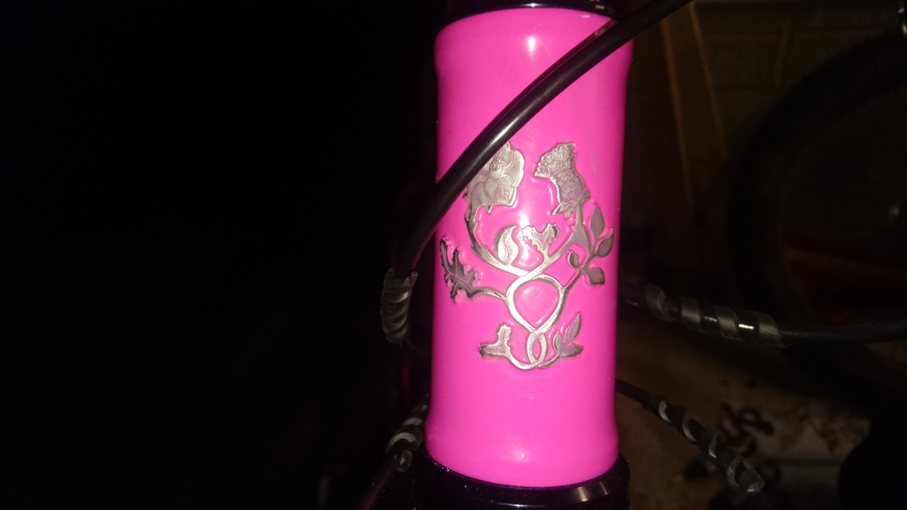
Posted : 20/06/2020 11:43 am

Always liked the simplicity of Ibis
Posted : 20/06/2020 11:56 am
![]()
Posted : 20/06/2020 12:39 pm
I love the Kona one above, definitely my favourite.
Although I have a Cotic with old badge, I think I prefer the simplicity of the new one. However, the new downtube graphics don’t float my boat at all - the wrapped ones looked miles better IMO.
RM.
Posted : 20/06/2020 12:47 pm
I'm struggling to remember the brand and can't find it online, but in the early nineties there was a brand with a super cool head badge that looked like it was integrated into the frame. I want to say Klein but can't find it...
It was a face and the nose stuck out. I'm sure there was one in a shop in Lincoln that I used to drool over. If I'd had an 8000% pocket money raise I'd have bought it!
Posted : 20/06/2020 1:15 pm

The Kingdom headtube badge looks class 
Posted : 20/06/2020 6:29 pm
[img]  [/img]
Posted : 20/06/2020 6:46 pm
Love the Nukeproof one, simple and stylish.
I had to remove the badge on my DMR trailstar2 years ago as my cables kept clicking on it, driving me mad.
Big elaborate badges on skinny headtubes look crap imo, the orange Cotic is my fave so far.
Posted : 20/06/2020 9:12 pm
Don't like the new Cotic badge (looks loads better in colour as it is on their sweaters https://www.cotic.co.uk/order/merch/), it's not as bad as their old one but I do think that mountain bikes should have juvenile head badges and names, they are toys after all.
Posted : 20/06/2020 9:29 pm
So many lovely ones on the Pininterest thread on them
https://images.app.goo.gl/Mw8kfHwtWihb7rwm9
Posted : 20/06/2020 9:35 pm
New Cotic one should come with free felt tip pen set, its a bit 'paint by numbers' looking.
Posted : 20/06/2020 9:38 pm
Swift is the winner so far for me. Classy. Wish I'd bought one the original ones in 'that' blue.
Posted : 20/06/2020 9:38 pm
Hmmm...
Do you think old Cotic looks like teenager tattoo but in the same sentence you are hailing Yeti 5y.o.doodle "classic"?
De gustibus non disputandum esto...
Cheers!
I.
Posted : 21/06/2020 7:58 am
Topic starter
The old Yeti badge looks like a cool '70s counter cultural fanzine illustration.
The old Cotic ones looks like a naff rave flyer.
Posted : 21/06/2020 9:34 am
Old cotic looks better in metal with relief and no colour.
[url= https://i.postimg.cc/wj1LwDsJ/IMG-20200621-002034859-2.jp g" target="_blank">https://i.postimg.cc/wj1LwDsJ/IMG-20200621-002034859-2.jp g"/> [/img][/url]
Posted : 21/06/2020 11:47 am
The badge is fine but the double sided tape that should hold it in place is a different matter.
[url= https://live.staticflickr.com/65535/50029237717_8f4ae03216_z.jp g" target="_blank">https://live.staticflickr.com/65535/50029237717_8f4ae03216_z.jp g"/> [/img][/url]
Posted : 21/06/2020 12:02 pm
Chromag

Posted : 21/06/2020 12:20 pm

Posted : 21/06/2020 12:51 pm
Page 1 / 2
Next