The old Yeti badge looks like a cool '70s counter cultural fanzine illustration.
The old Cotic ones looks like a naff rave flyer.
Old cotic looks better in metal with relief and no colour.
[url= https://i.postimg.cc/wj1LwDsJ/IMG-20200621-002034859-2.jp g" target="_blank">https://i.postimg.cc/wj1LwDsJ/IMG-20200621-002034859-2.jp g"/> [/img][/url]
The badge is fine but the double sided tape that should hold it in place is a different matter.
[url= https://live.staticflickr.com/65535/50029237717_8f4ae03216_z.jp g" target="_blank">https://live.staticflickr.com/65535/50029237717_8f4ae03216_z.jp g"/> [/img][/url]
Chromag


I was pretty happy with the one I made for my old Intense:

Don’t like the new Cotic badge
Why have they chosen a doodle of a genie opening a dishwasher?
Voodoo

The old Yeti badge looks like a cool ’70s counter cultural fanzine illustration.
The old Cotic ones looks like a naff rave flyer.
That is typical lyrical waxing about by-gone days :p
For me Yeti looks gash, childish and made-on-the-back-of-fag-packet.
But as mentioned, De gustibus...
Hand made in England, always the best 😀

Cheers!
I.
Indy Fab: good.

Sycip: even gooder?

It would appear I like head badges that include crowns...
I quite like the Intense one:
![]()
I like the proper metal one from On One. An optional extra though...

Don’t like the new Cotic badge
Why have they chosen a doodle of a genie opening a dishwasher?
Took a while, but what has now been seen can't be unseen!
IF and Intense get the thumbs up from me.
Loving the Pact Weird Cat, Moots and Metal original Cotic ones. I’m still not sold on the paint by numbers genie, but it does look slightly better in colour. WTF are the rectangles on the right supposed to be?
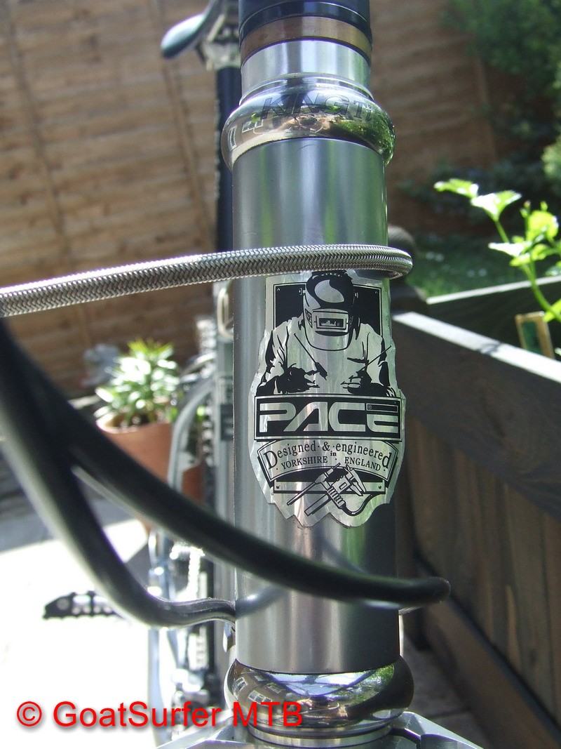
Surprised no one has mentioned the Pace headbadge
WTF are the rectangles on the right supposed to be?
Blocks of flats in Sheffield?
I like the Cotic badge looks a bit classier, and it is better in colour. I like the old one as well.
That Pact badge is ace!

Just had this made by Jen, my frame was one of the last with the old Smokestone logos, so I thought ill have it updated... Had to be pretty big to cover the cnc'd logo on the headtube. 
If the name wasn't enough:

My Pace RC303 had a nice Pewter headtube badge, it was definitely the highlight of that frame. I think it looked like this:
![]()
I quite liked the ones Giant were doing a few years back, where their logo was cut into the headtube, rather than being a sticker or badge attached to the tube.
The Ragley one is close in shape and style to the head badges that Bianchi use. For me the Ragley one looks like it is trying too hard to project a history it doesn't really have.
You will have to Google the Bianchi badge as it's easier than trying to add a picture.
I had these made by Jen to go on the Carbonda and the UP.
[img]  [/img]
I like the Nicolai one. It says "we machine stuff out of aluminium because that's what we do"

This is what I have on my bike, I like it.

[url= https://i.postimg.cc/ZCPx9HbR/Curtis-Headbadge.jp g" target="_blank">https://i.postimg.cc/ZCPx9HbR/Curtis-Headbadge.jp g"/> [/img][/url]
This is what I have on my bike, I like it.
That's my favourite so far, by quite some margin.
that Pace one up there looks sorta like a Judge Dredd badge, cool, I like it
That’s my favourite so far, by quite some margin.
Thanks. Straight from China via eBay.
Much as I love their bikes, bad has to go to Genesis. Looks like something I’d knock off with a scalpel and a bit of sticky back plastic. 1/10 for effort (I can look past that though and love the bikes)
