
Subscribe now and choose from over 30 free gifts worth up to £49 - Plus get £25 to spend in our shop
I'm kind of in the new market for a new road bike (either that or a new 29er), but some of the ones the bike shops around me sell just look pretty cheap, as in not very nice forming or moulding of the carbon, gopping graphics, basic round tubes with no flair, that kind of thing. Lapierre especially comes to mind here. Now I know looks aren't everything and to some people they don't matter, but if I'm spending 1800 or so sterling on a bike and ride it regularly, I like to like the look of what I'm riding.
A lot of Cannondale road bikes to me just look cheap also, along with Trek. Any others people can think of, and how important are looks to you when buying a new bike?
Cheers.
I care more about how it rides.
It's a bike not a handbag after all.
Anthem SX - like the idea but looks really cheap. Why not keep the stealth black?
anything with one of those MEGArange cassettes that are so fashionable at the moment.
anything with a non-racy saddle
anything with mudguards
everything steel
oh.. and anything with a handbag strapped to it
(EDIT: my post made no sense 🙁 )
the amount you are having to pay for some of the shit that is out there i think i want it to look good as well as ride good.
i find everyone seems to want to put as many clashing colours as they can CUBE being one they may be good but it is not coming through my door.
if you are paying for carbon why not show it off it looks great with not paint on it nice and raw thats what i want but nolonger avilable.
I was going to say Cannondale road bikes too - mate has got a SuperSix Evo which was on my shortlist until I saw his. Fab bike, nasty looking graphics.
Anything single pivot. Hecklers, Superlights, Fives etc etc...
if you are paying for carbon why not show it off it looks great with not paint on it nice and raw thats what i want but nolonger avilable.
What do you mean by "paying for carbon"? The majority of carbon road bikes I see out on the road are generic cheap cube/ribble/planet-x etc shouldn't it be 'paying so little for carbon' when a lot of bikes are cheap yet have mid range components making the frames value very little.
Most of the generic carbon road bikes look poor because they are bought by people who don't have a clue how to set them up: inline seatposts, lots of stem spacers, bars turned upwards, short stems that're upside down etc. etc. They may aswell have bought as hybrid.
As for mountain bikes; any of those cotic bfe's that were blue/green/purple. Horrid colours, and they all seem to be bought by slightly thick northern men with no taste whatsoever. Look at this one for example. White parts?? On an MTB??
[img] 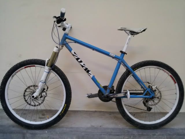 [/img]
Most of the generic carbon road bikes look poor because they are bought by people who don't have a clue how to set them up: inline seatposts, lots of stem spacers, bars turned upwards, short stems that're upside down etc. etc. They may aswell have bought as hybrid.As for mountain bikes; any of those cotic bfe's that were blue/green/purple. Horrid colours, and they all seem to be bought by slightly thick northern men with no taste whatsoever. Look at this one for example. White parts?? On an MTB??
I think tasteful white parts can really set off a bike, I've always been a fan of white wheels on bikes, cars, motorbikes, whatever. Agree that cotic is a bit OTT though, you can have too much white.
the amount you are having to pay for some of the shit that is out there i think i want it to look good as well as ride good.
i find everyone seems to want to put as many clashing colours as they can CUBE being one they may be good but it is not coming through my door.
Well said Sir.
I care more about how it rides.
It's a bike not a handbag after all.
Yeah well try applying the same logic to cars. I bet a lot of cars wouldn't be as popular if they looked horrid.
And I'm not a big fan of those Cotics myself.
Look at this one for example. White parts?? On an MTB??
Is it yours? Tarty but I like it 🙂
I think any MTB when the owner has tried to colour match bits, but it's all different shades of said colour as it's different makes etc, look crap.
Someone posted one in here a while back that had several shades of blue with an orange frame.
It just looked gash.
i dont give a monkey's arse what a bike looks like. they are for riding afterall.....nothing more.
This:
[IMG] 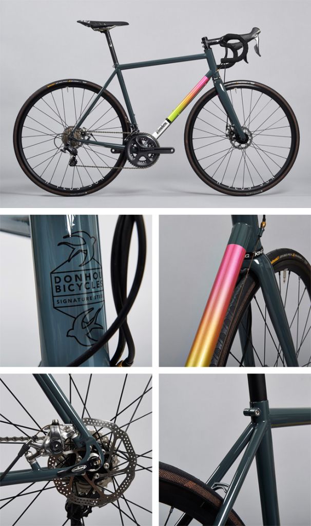 [/IMG]
Half of me wants it for my 40th, but there's a nagging voice saying it looks, well, not like £4.5k worth of bike should look?
Maybe it's just me...
slightly thick northern men
Are you being ironical? My thick northern brain can't decide whether to be offended or not.
4.5k nick ?? Damn i should have stayed in mobile phones 🙂
it looks, well, not like £4.5k worth of bike should look?
Maybe it's just me...
I'd agree there.
My bike looks terrible and cheap because its a mash up of second hand components I got to replace the ones I've broken and the frame has been scratched and dented due to me not being very careful or skillful whilst riding it. It is still an awesome bike though because its mine!
I do object to the posts above saying it doesn't matter what it looks like... I always promise myself that if by some miracle I become good at riding and can trust myself not to trash it then I'd spend the money on a beauty.
Interesting, what some people thinks looks expensive, that road bike up there ^^^ is lovely, not 100% sure about the the colour on the down tube, but it's classy & subtle in my eyes, much better than something like this:
[img]  [/img]
Or
[img]  [/img]
I think that Donhou bike looks reet smart, but not £4.5k nice though.
BMC make some lovely bikes but that's not one of them.
Can't see a problem with the Cannondale though, might not be the best colourway going but I've seen worse.
All cubes with colourmatched forks. But especially manky green ones
bikeneil - Member
Anything single pivot. Hecklers, Superlights, Fives etc etc...
Quite. I'm glad you think my bike looks cheap though, hopefully it means no one will want to nick it 😉
[img] http://photos-h.ak.instagram.com/hphotos-ak-xaf1/t51.2885-15/10932420_630120287114983_1095544110_n [/img]
It rides pretty well though - if that kind of thing is important to you at all
One of my fave bikes I have looks really cheap. It's f----ed, paint is hanging off and worn through then touched up with Humbrol and it looks like a shopper to a lot of riders. All the kit is black or silver. It's a keeper that will only get worse / better. It's brilliant to ride though.
The only new bikes I think can look cheap are the new ones with too much colour co-ord. There's been a trend to make OE forks, rims, saddles and finish kit all use the same colour details and it rarely does the bikes any favours. Thankfully the MOQs for this sort of thing are way higher than the numbers of bikes we order so I have a good excuse not to do it : )
I'm only assuming it's any good, but...
[img]  [/img]
+1 to all those road bikes with loud graphics.
😆 nice one Mick!
Btw, the money is back out there now... I've not seen day rates like this for a good few years mate.
Christ wish id not been away so long mate i really could do with a job change 🙁 give me a shout if you know of any drive test bods needed 😉
well, not like £4.5k worth of bike should look?
Personally I would (and do) prefer a one off bike like that than some carbon 15lb wonder bike from one of the big manufacturers that you can walk out of evans with. Each to his own though.
I have to agree with the cube haters. I still ended up buying one though as the price in the sale was so good and I am not too fussed what a bike looks like. Chavs must like the cubes as I get plenty of 'nice bike' comments which never happened on my old bike.
The more recent Cube bikes do look horrible. Glad I got mine when I did. The change to two-tone bar tape on the road bikes was particularly disturbing
YT Industries bikes look like supermarket specials
I've just had a look at their website and the latest ones don't look as bad as previous years, although there is some red, white and blue monstrosity
It's not the actual bikes, just the colours and graphics
I just leave the price-tag in place. Kills confusion well dead. If it's too small, get a car showroom-style biggy printed up and hang it from the top tube. It won't cure the aesthetics, but no-one will think you're poor, which after all is what riding bikes is all about.
Anything with '.com' in big letters on the down tube.
To be fair, there aren't many ugly bikes these days.
Even Ghost seem to have learned from when all their bikes looked like this...
[img]  ?1291777773[/img]
All TT bikes that have the seatpost/saddle like this.
There seem to be a few about:
[img]  [/img]
Maybe I have terrible taste, but I thought that Cotic BFE looked pretty smart.
Full disclosure, my bike is navy blue with black and silver components.
I'm still laughing about someone complaining about round tubes.
Oh, and the white parts thing is just the sign of a fashion dying out… hence me just buying some white bars for pennies… fashion huh. Same with all those colour matched decals on forks and wheels… the end point of that fashion indicating "expensive" and moving to "cheap" is probably coming soon…
BIKENEIL and teetosugars,I have an orange single pivot superlight with everything in hope blue,and blue odi end caps,I did have an e13 blue single ring but thought it looked a bit cheap,you would love it.
the end point of that fashion indicating "expensive" and moving to "cheap" is probably coming soon…
"fashion, something so ugly it has to be changed ever 15 minutes .."
There is an easy way to avoid colour based fashion faux pas....
Black
A few of the high-end Ti framebuilders have got full sus wrong in the past. Many have given up.
This is still available though:
[img]  [/img]
Wow. That Moots is hideous.
I need to go google the Moots seatpost girl so that I an still like them.
Jones bikes. Hideous and expensive.
[i]"fashion, something so ugly it has to be changed ever 15 minutes .."
[/i]
But style is something versatile ...
Great song. Thanks for taking me straight back to the nineties.
All TT bikes that have the seatpost/saddle like this.
Have to agree there. That bike is gopping!
Jones bikes. Hideous and expensive.
Yep.
I like the moots.....
to quote Dolly Parton,
It costs a lot to look this cheap
Also, there is a difference between 'gopping' and 'cheap'.
[img]  [/img]
basic round tubes with no flair, that kind of thing.
I like classy, old-skool, subtle tubing, with no swoopy fancy shapes or odd cross sections
Lapierre especially comes to mind here....A lot of Cannondale road bikes to me just look cheap also,
Funny, I have a lapierre Helius which IS all swoopy fancy tube cross sections and I like it despite not because of it.
[img]  [/img]
I MUCH prefer something like a Cannondale
[img]  [/img]
or a Cervelo
[img]  [/img]
with minimal shouty look at me shaping.
These are pretty and expensive
[img]  [/img]
problem is your paying £400 for a Chinese factory open-mould frame and £1200 for the paint job 🙄
And we can't have a bike aesthetics thread without a pic of the gorgeous Gulf racing Baum
[img]  [/img]
[img]  [/img]
A year ago I would have said 'almost any Nukeproof'. I think the designs are much nicer this year though. They're finally moving away from that yellow!
As for mountain bikes; any of those cotic bfe's that were blue/green/purple. Horrid colours, and they all seem to be bought by slightly thick northern men
Wow. Slightly thick I can live with, but northern?
[img]  [/img]
A year ago I would have said 'almost any Nukeproof'. I think the designs are much nicer this year though. They're finally moving away from that yellow!
Have to disagree there! The 15 ones look a lot worse than the 14 ones imo.
I think Giant have a knack of making their bikes look cheap, mostly courtesy of dodgy paintjobs.
Speaking of Giant...
[img] 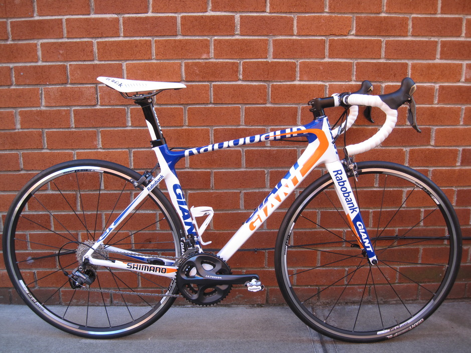 [/img]
Anything with Stans rims.
I've a set of Flows and keep meaning to rip the stickers off them, utterly, utterly hideous graphics.
Also the Specialized Pitch looked cheap when close up, saying that it was a fantastic bike for the price though!
I've a set of Flows and keep meaning to rip the stickers off them, utterly, utterly hideous graphics.
I wouldn't say they're hideous, but they don't match much.
Do it. Hairdryer FTW.