Home › Forums › Chat Forum › What's your favorite company and design?
- This topic has 49 replies, 30 voices, and was last updated 12 years ago by wrecker.
-
What's your favorite company and design?
-
gazerathFree MemberPosted 12 years ago
I’m currently teaching my students about branding and logo design and I’ve got a little side tracked in thinking of my own company design.
I’ve been looking at bike companies and mountain sports. Found some cool stuff but I’m really liking discovering independent companies.
I just wondered if anyone has any cool companies they really like which are not big corporate kings, such as Alpkit or One Planet at Llandegla.
Just looking for cool logo designs and colours and how I can show my students that the logo, name and colour is vital in brand design.
Might be a bit of an obscure topic for anyone to comment on but thought I’d ask. And I’ve got singletrack and its logo before you mention 🙂
Thanks
Gaz
ThurmanMermanFree MemberPosted 12 years agoJust looking for cool logo designs and colours and how I can show my students that the logo, name and colour is vital in brand design.
Not in the least bit bike related, but remember Blue Circle cement?
It doesn’t get any better than that.
Harry_the_SpiderFull MemberPosted 12 years agoThe Fed Ex arrow. Didn’t spot it until somebody on here mentioned it.
 gazerathFree MemberPosted 12 years ago
In terms of a logo Blue Circle Industries has the one of the simplest I’ve seen
cheese@4pFree MemberPosted 12 years agoBrew Dog for cool logo, creative product and marketing and….
PUNK IPAnjee20Free MemberPosted 12 years agoI also hadn’t seen the arrow until one of these threads! Very pleasing.
squiffFree MemberPosted 12 years agoSome clever logos here
http://designshack.net/articles/graphics/50-fantastically-clever-logos/
SaxonRiderFree MemberPosted 12 years agoI think Apple’s logo is brilliant.
Other brands that appeal to me for a variety of reasons:
1. Volvo
2. Shell
3. Budweiser (the American one. I hate the beer, but love the label.)I’m a big sucker for good branding, and will talk about it for hours. So I’ll probably be back with more.
Harry_the_SpiderFull MemberPosted 12 years agoAt the other end of the scale there was the one that had a computer mouse on it… that looked like a knob.
I like this one too.

… and this one 😉

 AlexSimonFull MemberPosted 12 years ago
Very tough to pick favourites within the bike/outdoors industry. Mainly because we attach so many other values to a company and their products.
Simply beautiful

Canyon is quite interesting.

I like how the Poc logo is followed through their product design:

Narrona have a very nicely drawn figure. The humbleness (not a word) and calm of the pose is quite interesting and fits well with the brand in many ways.

Yeti?

Five Ten have that optical illusion thing going on

There’s probably hundreds of great ones and hundreds of thousands of average/bad ones 🙂
BigButSlimmerBlokeFree MemberPosted 12 years agoCompany originally made aircraft engines, the colours represent propellers spinning against blue sky. Note the lack of orange or anything else to imply the presence of indicators.

And Sun Microsystems
 maccruiskeenFull MemberPosted 12 years ago
Talking about the origins of branding helps to clarify how the brand is supposed to interact with the buyer. Theres more to it than ‘this looks cool’. Back in teh olden days (when the internet was in black and white) goods were sold loose in shops. With some goods thats fine, flour is pretty much flour, sugar is sugar. Looks the same, tastes the same. No problem. With something like washing powder though, the power could be really good or really rubbish and theres not really a way to tell by looking at it. By the same measure you could pay a price for good powder one week and be sold rubbish powder by the same shop, out of the same barrel for the same price.
To tackle that manufactures had to start selling their goods in sealed packets with their name on so that their goods couldn’t be mis-sold or cut with inferior product. So a ‘brand’ in the first instance is a guarantee of quality, anything sold with the brand on should meet the expectations you have of it.
But once you’ve sealed it the customer can’t touch/taste/ sample the product so the other job of branding is to confer / infer the qualities of the product so that you can gauge whether the product is for you or not. So in many instances a brand has a duel purpose – to attract the people who would want to buy a product and who would enjoy it and also to sort of repel the people who wouldn’t want to buy it.
Apple sort of illustrates that well, in the sense of their brand’s ability to repel people who wouldn’t want their products anyway. Apple’s strength is in offering an extremely small product line up, they can’t cater for everyone if they do that so they need people to self select themselves as non-apple customers.
headfirstFree MemberPosted 12 years agoThe Garmin one is quite subtle and people don’t often get at first.
AlexSimonFull MemberPosted 12 years agoI don’t know what is interesting to your students, but Kathmandu have just changed logos. From left to right.
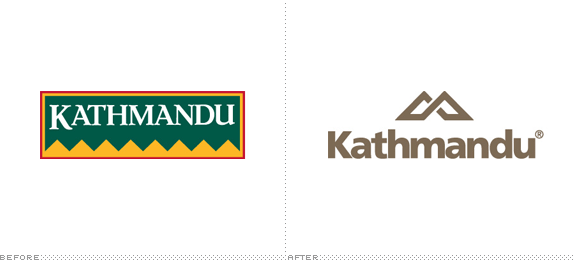
.
There are some outdoor brands I find it really hard to judge objectively (although they are undoubtedly successful designs). These being 2 of them:

 SaxonRiderFree MemberPosted 12 years ago
Of course, BigButSlimmerBloke, the colours are also taken from the Bavarian coat of arms.
bencooperFree MemberPosted 12 years agoI quite like mine – though I didn’t design it…

Though now I come to think about it, it does fall into the stereotypical bike company logo based on a wheel.
TooTallFree MemberPosted 12 years agoSaid up there – Patagonia.
Got the ethics to back it all up, taking it way beyond graphic design.
binnersFull MemberPosted 12 years agoThe bestest branding ever IMHO

Simple, elegent, timeless, and generally lovely from A.M. Cassandre, who also brought us such joys as…
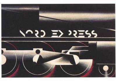


If you’re taking the discussion on to the use of construction in design, this stuff is as good as it gets
Also worthy of mention….
hp_sourceFull MemberPosted 12 years agoamazon is also quite clever with the ‘a to z’ arrow
google also need a mention for how far you can stretch a logo/branding whilst still making it recognisable with all there google doodles…
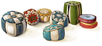

 molgripsFree MemberPosted 12 years ago
The Fed Ex arrow. Didn’t spot it until somebody on here mentioned it.
Then how’s it good, if hardly anyone sees it? Logos aren’t supposed to be a smart-arsed little joke, imo.
The Sun logo is gash, I reckon.
For music related, Ministry of Sound is a cool logo.
And I’m also liking the BBC one that everyone derided when it came out.
AlexSimonFull MemberPosted 12 years agobencooper – Member
Mortage Brokers?
And now you changed your picture
Ha – yes he has. I think STW has been quite restrained in it’s response to those. I’m biting my lip.shotsawayFree MemberPosted 12 years agoThe Office of Government Commerce.
Probably spend a fortune on this logo a few years ago and yet nobody every turned it through 90 degrees! Or the designers were having the last laugh?

PS – The school kids will probably love this one.
The Government had to backtrack quickly after the logo was launched
The OGC Website No Longer Exists
Please Use The Links Below For Further InformationNew information can be found on the Cabinet office website: http://www.cabinetoffice.gov.uk/
Archived OGC informationjfletchFree MemberPosted 12 years agoSee that Mountain Hardware one really puts me off their kit. It just looks a bit cheap and nasty. Much prefer something simpler, more timeless and backed up by a bit of history. In the same arena we have…

Which are great, but this one has been ruined by chavs…
 bencooperFree MemberPosted 12 years ago
To be honest, I do wonder about some logos – take this one that was in the paper a while back:

Why does a test release of some wild beavers need a logo? Still, quite clever the thing with the water.
jfletchFree MemberPosted 12 years agoIts impresive how effective branding is.
I am on the lookout for a new softshell jacket and am pining over something by Mountain Equipment, Haglofs or Arcteryx but would actively avoid even considering a mountain hardware jacket.
I know that makes me a weak sheep but its scary the power it has over me in certain areas (mainly outdoor equipment and bikes) where as in other areas I won’t even notice the brand or will choose purely on price and function.
The topic ‘What's your favorite company and design?’ is closed to new replies.




 [/URL]


