Home › Forums › Chat Forum › Worst building in UK
- This topic has 153 replies, 70 voices, and was last updated 10 years ago by binners.
-
Worst building in UK
-
binnersFull MemberPosted 10 years ago
Salford Shopping City. A monstrous concrete monolith, slap bang in the centre of a post-apocolyse grimscape. I’m constantly amazed that the entire local populace aren’t throwing themselves off the top of it like lemmings, crashing down, their skulls imploding on piss-sodden broken paving stones, strewn with broken glass, dog shit and syringes? Probably only because the lifts are broken.
 willardFull MemberPosted 10 years ago
Is that the winner of the Carbuncle Award? If so, it’s a worthy winner, it looks vile. The only trouble is that a lot of other buildings seem to be going the same way.
AlexFull MemberPosted 10 years ago
Cumbernauld shopping centre. But for the full horror you really need to walk round it. In fact that first pic is its best side
 zokesFree MemberPosted 10 years ago
The chemistry tower at Bangor university has to be up there, especially given how incongruous it is with its surroundings:
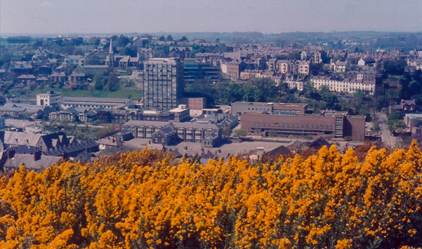
That, or Glyn Garth across the water:
 slowoldmanFull MemberPosted 10 years ago
Pick any shopping centre. The major shortcoming of the Manchester IRA bomb was that it didn’t destroy the Arndale.
zippykonaFull MemberPosted 10 years agoThis is the tallest building near us and ruins the view for miles around.
I fantasise about firing a rocket at it from Epsom Downs.
 lemonysamFree MemberPosted 10 years ago
I think I’d take the modernism above over thousands more of these:

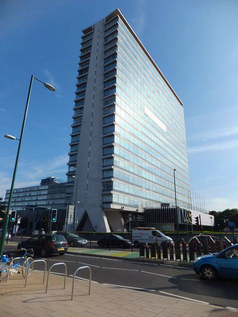
anyway, my winner nomination would be Bridgewater Place:

a building so badly designed as to have killed a man.
lemonysamFree MemberPosted 10 years agocorby bus station, grim doesn’t describe it….
Part of the problem with that is that it hasn’t been looked after, it’s actually got quite a pleasant shape and proportion. I’d have thought it was probably quite striking when it was new and clean.
slowoldmanFull MemberPosted 10 years agoThe Beetham Tower in Manchester. It’s ugly
Certainly is. Boring too.
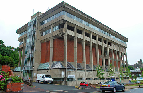
geoffjFull MemberPosted 10 years agoThe chemistry tower at Bangor university has to be up there, especially given how incongruous it is with its surroundings:
I’d agree with that, but also the Brambell Building has to be up there too.
 DezBFree MemberPosted 10 years ago
The Barbican Centre
Looks like the same architect as Portsmouth’s Tricorn Centre, which got demolished about 10 years ago.
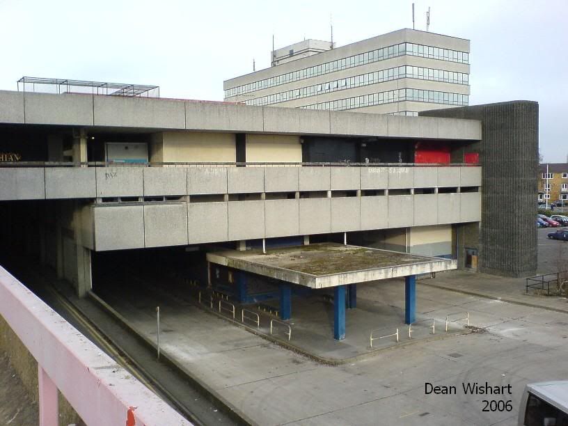
maxtorqueFull MemberPosted 10 years agoThing is, i’d rather 1000 buildings that i personally don’t like the look of, but at least the architect/designer tried a bit, against just 1 concrete straight up, straight down monstrosity where the designer completely failed to take into account the needs of the end user:
Exhibit A: Northampton Bus Depot:

hideous, dark, and totally un-inviting!
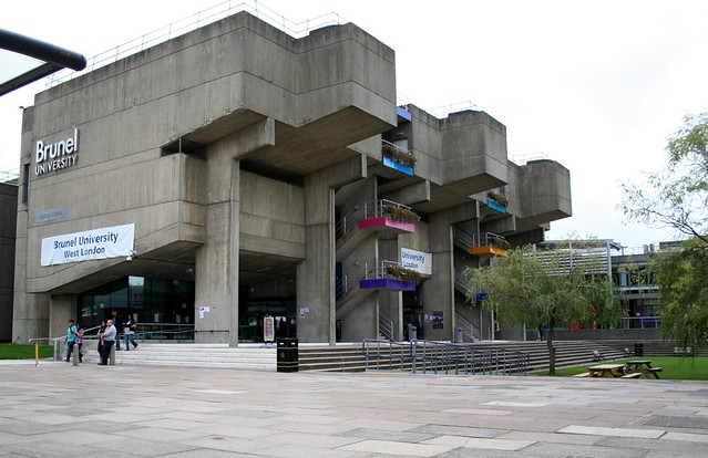
stumpy01Full MemberPosted 10 years ago^^ Ha Ha, I wondered how long it would be until various buildings at Brunel University were shown. Bloody horrible place.
The lecture centre (and Howell building) are apparently supposed to look like a galleon, but were designed to be viewed from a distance as a whole. But with all the surrounding buildings you can’t stand far enough back to ‘appreciate’ it. I think the distance for ‘appreciation’ to occur is about 30 miles.
When I was there, the grassed area lower right in that pic was just a load of cocrete paving with massive concrete boxes, that might have been flower beds.
Apparently when the building was first built, that sunken bit was supposed to be a pond (the galleon in water) but they filled it and it immediately all leaked out! Might be an urban myth though.Should really pay the place a visit! It’s been quite a few years.
bikebouyFree MemberPosted 10 years agoquote]DezB – Member
The Barbican Centre
[/quote]Thing with this is it’s won so many awards for it’s design that it really commands a very high price, if you want to live there.. Which many do. I think they’re mad quite honestly.
Pic from Farringdon Rd..
 [binnersFull MemberPosted 10 years ago
I’ve always reserved a special loathing for the piccadilly hotel. Its like it was designed specifically to blend seamlessly into a heavy, grey manchester sky
 jambourgieFree MemberPosted 10 years ago
A lot of Brutalist architecture represented here. I always think that a lot of these examples would look stunning if they just painted over the grey concrete hideousness. Why don’t they do that, is there a reason?
njee20Free MemberPosted 10 years agoThing with this is it’s won so many awards for it’s design that it really commands a very high price, if you want to live there.. Which many do. I think they’re mad quite honestly.
My parents sold a studio flat there last year, not in one of the towers (which command a higher price), it went for over £450k! More than asking price and sold in two days.
It’s listed I believe, or at least has some protection status.
Tom_W1987Free MemberPosted 10 years agoA lot of Brutalist architecture represented here. I always think that a lot of these examples would look stunning if they just painted over the grey concrete hideousness. Why don’t they do that, is there a reason?
That would make the buildings look too much like a building from a nice happy sunny country such as Spain and not a depressing, grey, wet shithole in the socialist utopia that was soviet russia?
Can’t have that!
Plus, I think a lot were listed.
 avdave2Full MemberPosted 10 years ago
this car park that ruins worthing sea front
It certainly takes away from the architectural gem to the right.
willardFull MemberPosted 10 years agoTom, to be fair, the lecture theatre was supposed to look like a boat an, in the right light after a night in the bar (it used to be just off to the right in that photo) it did. Legend has it that it was built the wrong way round though, and the wood effect concrete has to be seen to be believed.
However, the campus does have some merit, starring briefly in A Clockwork Orange as the aversion therapy institute. It is _very_ sixties though.
lemonysamFree MemberPosted 10 years agoWhy don’t they do that, is there a reason?
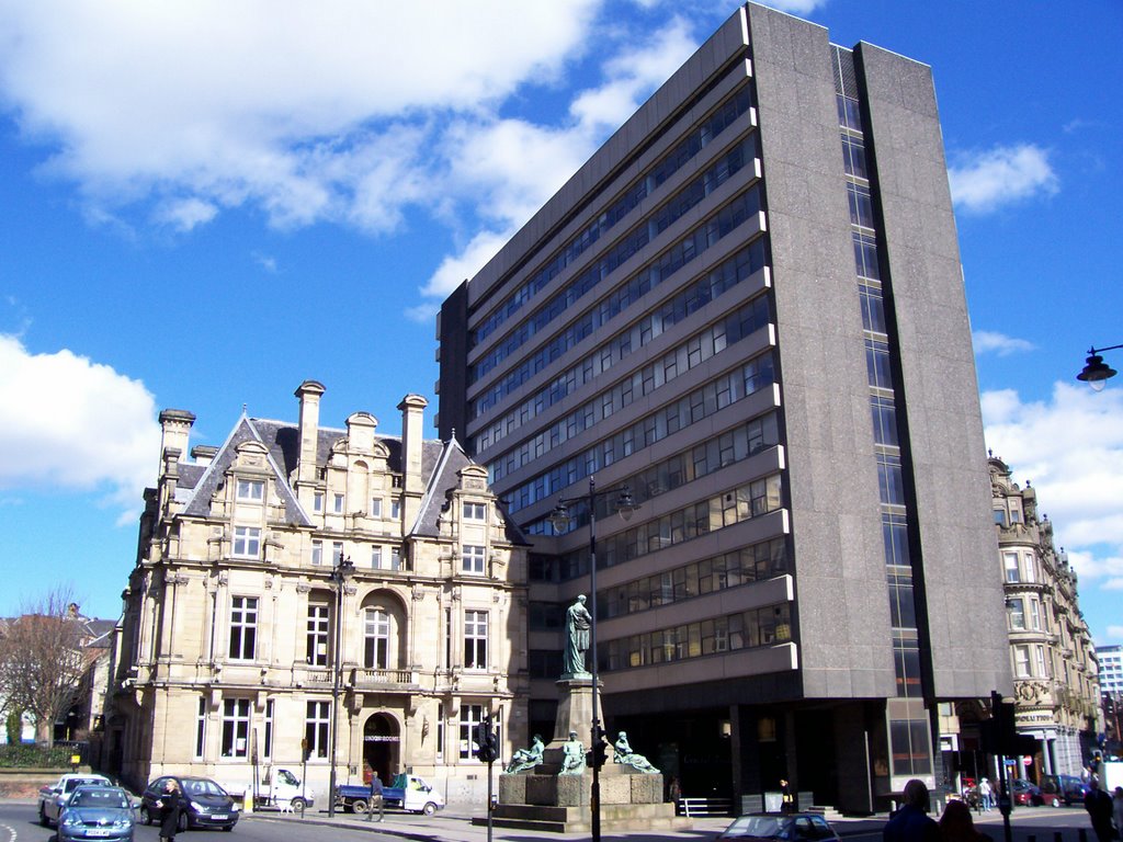
It’s a bit more involved than that, a lot of them suffer from the materials not really being up to the job. With some they do make the effort though and they can look really good, a good local example is Swan House in Newcastle. I don’t really like wht they’ve done with Baron House but that’s a big improvement too.
Anyway, talking about incongruity, it’s only a few years since this went:
 bikebouyFree MemberPosted 10 years ago
Thats the main problem with Brutalism. It was representative of an age of brutal regeneration and quite frankly had to be fit for purpose in a very short time, which most achieved, not to our “modern” tastes admittedly, but non the less they have a certain fractured solidity about them.
avdave2Full MemberPosted 10 years agothis car park that ruins worthing sea front
It certainly takes away from the architectural gem to the right.
Malvern RiderFree MemberPosted 10 years agoThere are so many. A lot of it is down to taste, hence little to no accounting. But for me I feel the woefully shortsighted and brutal architecture of joy-sucking concrete tower blocks and multi-story car parks all over the country would be best reduced by explosives. Even a good, firm, merciful push might be all it would take to transform their moribund mass into ready-soaked piss-stinking rubble. Whilst studying at college I once lived in the Chapel Street Estate, nr Dudley. Admittedly it was by far not the worst (and I could see as far as Wales from the oh-so-tempting balcony, but it was nowhere to live, simply a cynical existence that fomented nightly dreams of escape and a daily drudge of avoiding the similarly crushed souls that coughed and hacked their way up 20 flights of echoing stairs (the lifts being normally the domain of dogs, micturation and drug-taking)
I had friends who lived in the long-since demolished Tanhouse tower blocks, and they took some grim pleasure recounting tales of falling televisions and human bodies that passed their 12th floor window over the years. Designed for unemployed people or those on low wages, they also housed troubled and violent families, criminals, pensioners and young homeseekers. Even if you were an optimistic tenant to begin with then the Block would soon put pay to that.
A building can change the way we live, and by small or large degree change who we are. I know what the high-minded architects and planners were thinking but they were wrong.
 Tom_W1987Free MemberPosted 10 years ago
Tom, to be fair, the lecture theatre was supposed to look like a boat an, in the right light after a night in the bar (it used to be just off to the right in that photo) it did. Legend has it that it was built the wrong way round though, and the wood effect concrete has to be seen to be believed.
What I don’t get is why Brunel University opted for a design influenced by socialism and then supported and pursued fairly right wing policies for the rest of their history.
However, the campus does have some merit, starring briefly in A Clockwork Orange as the aversion therapy institute.
There’s a reason why the used it in that film! The main lecture theater is truly hideous
 , even if they did intend for it to look like a boat.lemonysamFree MemberPosted 10 years ago
That would make the buildings look too much like a building from a nice happy sunny country such as Spain and not a depressing, grey, wet shithole in the socialist utopia that was soviet russia?
But most of them didn’t look like that when they were built, the water staining came later. With modern materials that can be mitigated.
Tom_W1987Free MemberPosted 10 years agoBut most of them didn’t look like that when they were built, the water staining came later. With modern materials that can be mitigated.
I was mostly kidding. Still….grey….against a British grey sky…coupled with grey roads…yay!
plumberFree MemberPosted 10 years agoHaving a career in building has led me to believe that all architects are incredibly crap at design and construction technique – It really is beyond belief.
I have worked in the Barbican centre on small projects in the last 2 years. There is literally nothing you can change in there, its all protected right down to the urinals in the ‘superloo’.
mudsharkFree MemberPosted 10 years agoAnyway, talking about incongruity, it’s only a few years since
How the hell did that get allowed?!
My mate lives in the Barbican and showed me around, very interesting and his flat is all original (e.g.the kitchen area) which is v desirable apparently. Not for me though, I live greenery.
The topic ‘Worst building in UK’ is closed to new replies.


