Home › Forums › Bike Forum › Blue bike owners – accessory colour choices?
- This topic has 38 replies, 31 voices, and was last updated 1 year ago by Alex.
-
Blue bike owners – accessory colour choices?
-
jayx2aFree MemberPosted 1 year ago
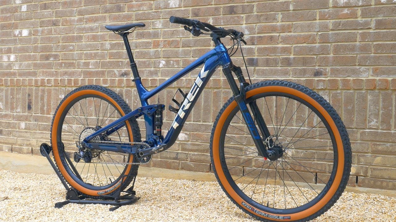
So my blue Trek Top Fuel arrives next week. Not sure whether to bling it up with a different colour or play it safe with blue?
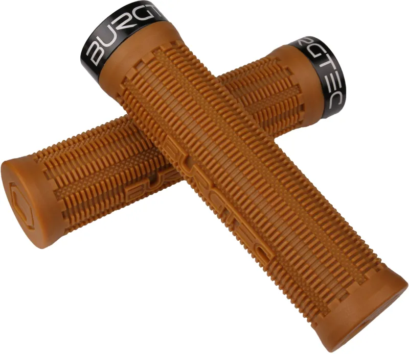
Pedals and grips first. Did consider orange but not sure if that would go with the silver trek logo! Or maybe something like Burgtec deep blue.
What are you blue bike owners running? Pic for reference. It has black side walls, not tan.
 OnzadogFree MemberPosted 1 year ago
Painted parts or anodised parts? I’m not a fan of having anodised and painted in the same colour.
I’d got with yellow painted and plastic but stick with black or silver anodised
gotbikeFree MemberPosted 1 year agoI’ve got a similar coloured bike and felt black went best. If you wanna go full bling then maybe hope orange? Hard to say without seeing it built up like that and wouldn’t be to everyone’s taste
chakapingFull MemberPosted 1 year agoBeautiful colour. Keep it black to play it safe, or getting a few silver bits could work really well.
Did consider orange
No. Stop that now. No contrasting colours needed here.
clubbyFull MemberPosted 1 year agoBlack.
Yes I know it’s the boring choice but coloured parts never match. Anodised parts are best as a contrast to plain silver or black builds. (To me) there is nothing worse than a hodgepodge of slightly different shades on different parts. Even anodised parts from the same company don’t always match exactly.
Only tried coloured grips once. They looked great out of the box, less so after a month of riding.
YakFull MemberPosted 1 year agoStrong colour on the frame = black or silver parts.
Black/silver/dull frame = go nuts with the anodised colours like it’s the 1990s again.Lots of different blues could be a mistake imo.
ads678Full MemberPosted 1 year agoLooks nice as it is, but….
PINK!
Actually, silver stem, seat post collar and hubs would look nice with the silver TREK graphics.
2kayak23Full MemberPosted 1 year agoI say this every time, but listen to Ludwig

That’s a beautiful looking bike. The single colour frame absolutely pops, and the reason for that is that it is not competing with a horrific Hodge-podge of (rarely fully) matching components elsewhere that only serve to dilute the striking aesthetic contrast.
Go to an art gallery. Do they show the works off on your Nan’s Laura Ashley wallpaper? No, it’s almost always mounted on plain backgrounds. It makes the focus the focus and makes it stand out.
Many people would argue that you should break convention and go nuts, making your bike look like a bag of regurgitated Haribo, but those people would be wrong.
It’s science.
HTH 🙂👍1BadlyWiredDogFull MemberPosted 1 year agoOrange ano rims are a must, maybe with blue spokes. Tempting to go with orange hubs, but that might be overkill, maybe stick to a less glaring shade of yellow? Yellow bars, orange stem and some turquoise grips with purple collar would set it all off great. Stem and seat collar should match, purple for a nod to the 90s? Would definitely keep the valve caps stock black though, not a fan of garish valve caps at all, can totally ruin the look of the bike.
It’s all personal though innit.
binnersFull MemberPosted 1 year agoThats a nice looking bit of kit! Those sidewalls contrast lovely with the blue
So if it was me I’d get tyres with the tan sidewalls, then saddle and grips the same colour as the sidewalls


Job jobbed!
desperatebicycleFull MemberPosted 1 year agoI made up a poem.
There’s only silver or black. Anything else is tack(y) 😛whatyadoinsuckaFree MemberPosted 1 year agoif it was the slash i’d say silver hope tech 4 brakes and a bit more silver,
top fuel, i’d go pink, just got a pink wolftooth droper lever, find a matching stem cap and done.
looks greatreluctantjumperFull MemberPosted 1 year agoI had my Orange 5 changed to a similar colour blue (was matt Cobalt Blue as used on Bromptons) and that bike had black everything so as not to overshadow the frame. My current blue Rocket has orange highlights on the frame so I added some orange plastic Neutron pedals to it and am toying with some orange Ergon grips too, thankfully all 3 oranges are very close to each other. Any more than that and it’ll be overpowering!
I’d go with black for your bike and the brown for grips and saddle could work too.
trustyFull MemberPosted 1 year agoSilver works well (slightly biased as that’s what I’ve got on my blue rocketmax) especially for pedals as they don’t scuff up like black ones do.
timmysFull MemberPosted 1 year agoLooks great, leave it as is. Maybe silver pedals would match the downtube logo.
I have a black/white thing going on with my blue bike, but it’s not really comparable.
 DaffyFull MemberPosted 1 year ago
I’d honestly get a decal in a Matte blue the same shade as the frame and cover the shiny silver TREK This will open up anything you want to do. BUT. I’d only do the decal and leave the rest.
noeffsgivenFree MemberPosted 1 year agoSilver, especially silver hubs look awesome, Nukeproofs grey bits would look good, it’s a classy darkish grey that goes well with blue & black
Silver & blue Hope tech4’s would look epic on that Trek.jayx2aFree MemberPosted 1 year agoBeen using cheap Nukeproof pedals on previous bikes with no issues so first thing is to get some of them.
As suggested I will go for black. Did look at the grey Pedals as that’s the closest Nukeproof do to the silver but not sure.
Black ones are super cheap at the mo – 18.99.
bornonaboatFree MemberPosted 1 year agoMaybe treat yourself to a nicer set of nukeproof pedals, the sam hill enduro are £59.99 at the moment and come in a polished silver option that would match the trek logo nicely.
You could go wild and get a matching polished nukeproof stem as well and that would be job done, no need for anything else to be anything other than black.
chakapingFull MemberPosted 1 year agoIf getting silver pedals, then a silver chainring would be a nice touch too.
Maybe stem as well.
That should do it IMO.
submarinedFree MemberPosted 1 year agoYeah, I’m on board with the silver if required and nothing else, TBH.
I’ve got a new bike on the way but only black was available. Maybe it’s my age, but I’m fast coming to the conclusion that most bikes look better with just black or silver bits. So it’s going to be dull silver for me I reckon.
rossburtonFree MemberPosted 1 year agoBlack is safe. Tan if you’re feeling bold. If you’re feeling really brave, hot pink would work! My daughter had a blue frame with hot pink accents and it did look epic.
matt_outandaboutFree MemberPosted 1 year agoI wonder if some silver forks and then let it be – the blue and silver will pop nicely.
 Sanderson Breath and a Gate by Matt[/url], on FlickrAlexFull MemberPosted 1 year ago
I used to be terrible for colour matching* – rotors, bars, stems, saddles, seat collars, etc. Now I just try and keep it simple. Silver pedals on here but that’s what I had. Think I’d probably go stealth black decals if I needed to change them. I keep thinking about a set of lyriks for this bike but it’s always the red ones on offer and I can’t do it 🙂
*never matched. I found this especially with purple!
zerocoolFull MemberPosted 1 year agoBlack, yellow or orange would be my choice.
Blue and yellow or orange looks brilliant.
monkeyboyjcFull MemberPosted 1 year agoBlack for resale value and classic looks. Orange or tan parts of you want some personalised bit and blig
jayx2aFree MemberPosted 1 year agoThanks for all the feedback. I have ordered a set of Nukeproof Sam Hill pedals in silver. Wiggle have the silvers ones on offer for anyone after a set.
Will keep bike as it it for now and maybe do a few more silver bits at some point.
Can you get replacement fork logos made up? Thinking maybe silver ones might look better.
chakapingFull MemberPosted 1 year agoInvisiframe do fork stickers and are always super-helpful and a pleasure to deal with.
Silver seems to be an option on their website for the Sids.
You must be logged in to reply to this topic.


