So just some info. We've ditched the old theme for this new one and it's a little more than cosmetic. The old theme was, well, old. Very old. The code in it was bloated. At the time we wrote it the software we needed didn't exist. Now most of it does and so we have moved on and ditched a lot of unnecessary code. That being said, gl;itches and bugs were not unexpected. Give us a day or two to find them and fix them.
@mark Main site rather than forum-related, but please could you look at handling 'prefers reduced motion' requests on the home page. With the carousel AND the marquee it's all a bit 'whooshy' for those sensitive to these things. 🤢 Thanks.
Looks alright, though are you really ditching all the brand identifiers? One thing stuck out, you used to click on 'FORUM' and get taken to the latest posts in Bike and Chat. Now you have to use a drop down to do that, or load another page to make another click, which doesn't seem to be an improvement.
How do I see the forum in one place ie the Bike and None Bike? I hope it’s not been separated ? If so it’s going to get even less traffic wth all the faff of switching forums
And how to I get to my own profile ?
Cheers @bruneep. I don't see that at all, they all appear the same colour on my phone.
Looks ok like I'll have to do some 'desktop testing' at work tomorrow.
Has no-one noticed that the skip-to-the-top-of-the-page button is back yet?
…logged out again! 🥱
If like to add my +1 to reinstating some method of enabling dark mode as soon as is possible please.
I've never been a fan of staring into a white light whilst trying to read. I went looking for the old forum enable dark mode preference that you told us to turn off at the major update to see if that might be an option again,but I failed to find it.
Has no-one noticed that the skip-to-the-top-of-the-page button is back yet?
I'm sure that's been back for a while... it was just easier to miss. BECAUSE OF THE DARK MODE!
Nope. It's new
If like to add my +1 to reinstating some method of enabling dark mode as soon as is possible please.
I've never been a fan of staring into a white light whilst trying to read. I went looking for the old forum enable dark mode preference that you told us to turn off at the major update to see if that might be an option again,but I failed to find it.
We leave dark mode choices up to you now. It follows your device choices and browser choices.
Looks alright, though are you really ditching all the brand identifiers? One thing stuck out, you used to click on 'FORUM' and get taken to the latest posts in Bike and Chat. Now you have to use a drop down to do that, or load another page to make another click, which doesn't seem to be an improvement.
Clicking 'Forum' in the menu takes you to the latest posts as normal. It's just there's also a drop down if you want to go straight to an individual forum.
dark mode gone
zebra stripes are back
Its a huge backward step, is this the new version forum?
I dont like anything I've seen so far.
Have to force dark mode in opera.
Also, the reply box is still swamped with the "you are not allowed to attach files" text that overlays line 3 of 3 visolinke and prevents finger curser selection of anything on the last written line.
S
We leave dark mode choices up to you now. It follows your device choices and browser choices.
Apparently not. Chrome/Android and Chrome/Windows here and neither are showing Dark Mode.
We’ll look at that in the morning. I’m going to bed.
We leave dark mode choices up to you now. It follows your device choices and browser choices.
Apparently not. Chrome/Android and Chrome/Windows here and neither are showing Dark Mode.
Enter "chrome://flags" into Google Chrome's address bar and enable the "Auto Dark Mode for Web Contents" flag to force Google Chrome to display all websites in dark mode.
This makes it bearable
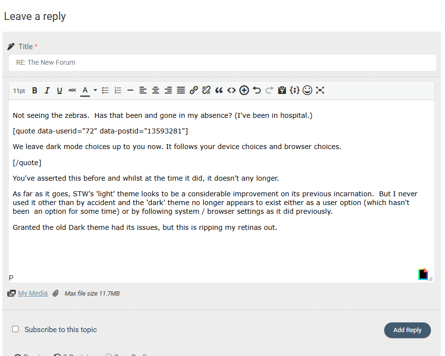
Not seeing the zebras. Has that been and gone in my absence? (I've been in hospital.)
We leave dark mode choices up to you now. It follows your device choices and browser choices.
You've asserted this before and whilst at the time it did, it doesn't any longer.
As far as it goes, STW's 'light' theme looks to be a considerable improvement on its previous incarnation. But I never used it other than by accident and the 'dark' theme no longer appears to exist either as a user option (which hasn't been an option for some time) or by following system / browser settings as it did previously.
Granted the old Dark theme had its issues, but this is ripping my retinas out.
STW in "dark theme" system and browser choices:
Enter "chrome://flags" into Google Chrome's address bar...
This makes it bearable
Specifically,
chrome://flags/#enable-force-dark
And you're right, it works. But it shouldn't be necessary.
Looks really crap on an iPad now, all squished in the middle with acres of white space.

If like to add my +1 to reinstating some method of enabling dark mode as soon as is possible please.
I've never been a fan of staring into a white light whilst trying to read. I went looking for the old forum enable dark mode preference that you told us to turn off at the major update to see if that might be an option again,but I failed to find it.
We leave dark mode choices up to you now. It follows your device choices and browser choices.
I have dark mode enabled on my iPad/safari yet it's showing all white page
Staring at all-white pages on both my phone and pad in Safari, I’ve made no changes to settings, and I really, really don’t like it! I’m not even sure where or what to change to go back to a dark mode!
Just checked settings, dark mode is selected, had a look in Firefox, same there.
I’ve been pretty happy with all the changes, but I’m not at all happy with this change. 😡
Something else I’ve just noticed, the forum doesn’t tell me if I’m logged in or not, or if it is, I can’t see it. There was a little head silhouette in the top right, with a red dot by it, IIRC, but there’s nothing there now - the only way I can tell is it’s letting me write this and post it.
Hopefully whatever gremlins are wreaking havoc will be rounded up soon and incarcerated somewhere without pudding to teach them to mend their ways!
If like to add my +1 to reinstating some method of enabling dark mode as soon as is possible please.
I've never been a fan of staring into a white light whilst trying to read. I went looking for the old forum enable dark mode preference that you told us to turn off at the major update to see if that might be an option again,but I failed to find it.
We leave dark mode choices up to you now. It follows your device choices and browser choices.
I have dark mode enabled on my iPad/safari yet it's showing all white page
Edit : Same white page on iPhone/safari with dark mode selected, same white page on iMac/safari with dark mode selected
Does this mean I can get away with wearing sunglasses in the house at night to view STW?, what Oakley lens would be best?
New classified
Quiet like the new view. Active groups is quite useful.
However, can you put the price back on the list view. Also, can you add the identified for the ‘paid for’ listings compared to the free ads? Makes it easier to identify the new free ads.
👍
Ive tried and failed 3 times to start a new topic on my Android phone and I Pad
As mentioned, dark mode is broken, hopefully that is a quick fix to sort.
The post count wastes space on a mobile screen, would be good to ditch that (on mobile devices).
Profile seems only accessible from main menu burger and is blank - until you tap the chevron and the profile options appear. It is the very last menu option with no words but a Chevron on the right.
Looks really crap on an iPad now, all squished in the middle with acres of white space.
Same on my Android phone
The site still thinks about connecting you for several seconds before it acts
The big arrow thing is back as well, but a 50mm black curved arrow on a more obtrusive blue background rather than the previous white background
The quote boxes have a big grey inverted comma "66" behind the first couple of typed letters when published
It's better on PC than on the phone, but I'm not enjoying a better experience overall, sorry
Have to agree with the above. Going to the forum Home Screen it’s just a screen full of superfluous stuff, and the very first thread only just pokes it head above the parapet at the very bottom.
As example
Should be a screenshot here…..
Enter "chrome://flags" into Google Chrome's address bar and enable the "Auto Dark Mode for Web Contents" flag to force Google Chrome to display all websites in dark mode.
This makes it bearable
As @couger already said, that worked. Didn't have to do that previously though.
I hope I remember I did this so I can go turn it off at some point 🤣
That blue band is too heavy looking - just takes over even on a 27" iMac. Makes the rest of the forum feel squished.
Too many options as well which mean even on said iMac it drops down to two lines making the band even deeper.

AS above, that dark blue band is too big and heavy on my PC.
@Mark and other STW folk - firstly, thanks for the continued work. Overall experience on a desktop is IMO for the better now. Mac OS / Safari and looking like this:

But (there's always a but), mobile browser experience - more specifically appearance - is rather inefficient. iOS/Safari with zoom set to 100%, screenshot below. It actually improves when zoomed out but not sure my eyes would cope with the smaller font that results in for too long. Inefficient use of space with the icons on a second line under username, then post count under that, THEN full/free member indicator: it's all a bit much when I really don't care that much about that info - I just want to read the posts. If this can be adjusted for mobile browser viewing then great.

In fact, for me post count really isn't important enough to me to warrant being displayed alongside username.
Oh, and thank **** zebra appearance on the mobile browser is gone. Saw it last night and very grateful that's been sacked off this morning!
The new higher contrast text is much easier to read. Agree about the wasted space but it's a small issue for me. The old hard to read text was a big issue.
Thanks for the feedback so far. A lot of what is here is default from the new theme. We’ve not written it. It’s called Newscard if anyone wants to google it. Today we’ll prioritise getting dark mode operational and other tweaks.
What does "Favored" mean? Why have I got an icon for it next to my username? and why is it spelled wrong?
Well I'm on my work PC now (Win10/Edge) and it all seems to be working very well at the moment and looking clean and fresh.
One recommendation I would make however - The login/profile button in Chrome (on Android phones, anyway) needs to be a bit more obvious. Just an outline head & shoulders icon at the bottom of the hamburger menu isn't at all clear. Can it have some text next to it and moved up to the top please? I scrolled past it several times before spotting it.
It was so good I said it twice!
Not sure what these icons under usernames mean either - I must be superior though as I have more than Mark! 🤣

- I must be superior though as I have more than Mark! 🤣
I think the cog is your own, as is the banner thing. You see yours but everyone else doesn't.
Not sure what these icons under usernames mean either - I must be superior though as I have more than Mark! 🤣
If you hover over them (on a desktop, anyway) it says what they are.
In order -
Profile, Account, Activity, Favoured (as in favourite threads), Subscriptions (i.e. threads you've subscribed to)
That blue band is too heavy looking - just takes over even on a 27" iMac. Makes the rest of the forum feel squished.
I haven't measured it other than by eye, but it looks to be switching between desktop and mobile themes at a browser width of 1000px (as it always did) and requires a width of about 1800px before the blue header condenses down to fit onto one line.
The old header menu bar used to scroll of the top screen though. This one just sits there looking all oppressive!
The black bar at the very top that just has today's date feels a bit useless too (unless I need to know the date).
Just a test, as my post yesterday vanished.
Well that worked.
