No. I just want to browse the way I choose without being quizzed on it, having to justify it or it being implied I'm doing it wrong*
I'm not saying it's wrong, I'm suggesting that there may be a better way of improving your workflow.
Still slower than it used to be on nearly every function
still can’t get to the classifieds on the drop down left hand menu as you can’t scroll far enough to select it and / or banner pop up adverts block it. Not exactly ideal and been that way (and mentioned before) many times.
I'm seeing a large (about a 1/4 of a page) of space between the Singletrack header and the start of the page. I suspect that it's some sort of advert holder, but it's just empty space.
That "back to top" button was removed on the last iteration of the forum, then mysteriously appeared as a "hovering icon" until this upgrade,and I'm pretty sure was brought back fairly soon after this upgrade, but is now gone again....
Please can we have it back?
There's also now loads of text editing options,which is nice, but given how slow the site is and how godawful it is to use if not signed in seems a bit superfluous?
Some, not all ,posts going super wide again
on iphone.
seems to be anything with an image in the thread..
The “Tony Blair” and “insuring a French van” ro name two..
Suspect the threads have long URLs that aren't being split across multiple lines so it makes the thread go very wide...
Where did the forum search button go?

Suspect the threads have long URLs that aren't being split across multiple lines so it makes the thread go very wide...
I think its also folk posting massive images, I believe the old forum software would resize to a reasonable width .
Itscthe long urls for links that breaks the formstting. I have pisted big pics without breaking it
Itscthe long urls for links that breaks the formstting. I have pisted big pics without breaking it
Yeah but it's f****d your keyboard up big time!
Yeah but it's f****d your keyboard up big time!
I assumed he was ‘pisted’ 😀

I don't like the new format for 'articles' at all. They seem too compressed, convoluted and messy now. The 'thread' associated with them doesn't always make sense as sometimes it now just shows who's posted etc..
For whatever reason there seems a LOT less engagement on the articles than previously... but i suspect it's because people are confused by them as much as i am.
Well, the new website is a bit 'busy', isn't it. How do you get to the last post on a topic- I can open the topic, then select last post, but it takes an eternity- is there a one click from the index method?
As Weeksy says the formatting for articles is a bit crap and the structure and navigation of the whole website is convoluted and illogical. It feels even less designed than previous iterations.
I can't work out the ad policy, I've come to the site on both mobile and laptop and despite being logged in, I'm served up a selection of ads. If the site was more responsive, and the ads the sort that go away as soon as clicked I wouldn't mind, but the performance is bad as it ever was.
I feel like the site is, once again, the product of people who have little to no understanding of usability and user experience or structured design, but have decided to squeeze in as many bells and whistles as possible in an attempt to mitigate more serious failings. Performance can cover up a lot of nav and design flaws, conversely good design will mask performance issues, but tinkering with random forum gadgets and tools that no-one uses while the website burns is just a folly.

I feel like the site is, once again, the product of people who have little to no understanding of
The site is, once again, the product of one and a half web developers who also have a day job to keep the whole thing running at all.
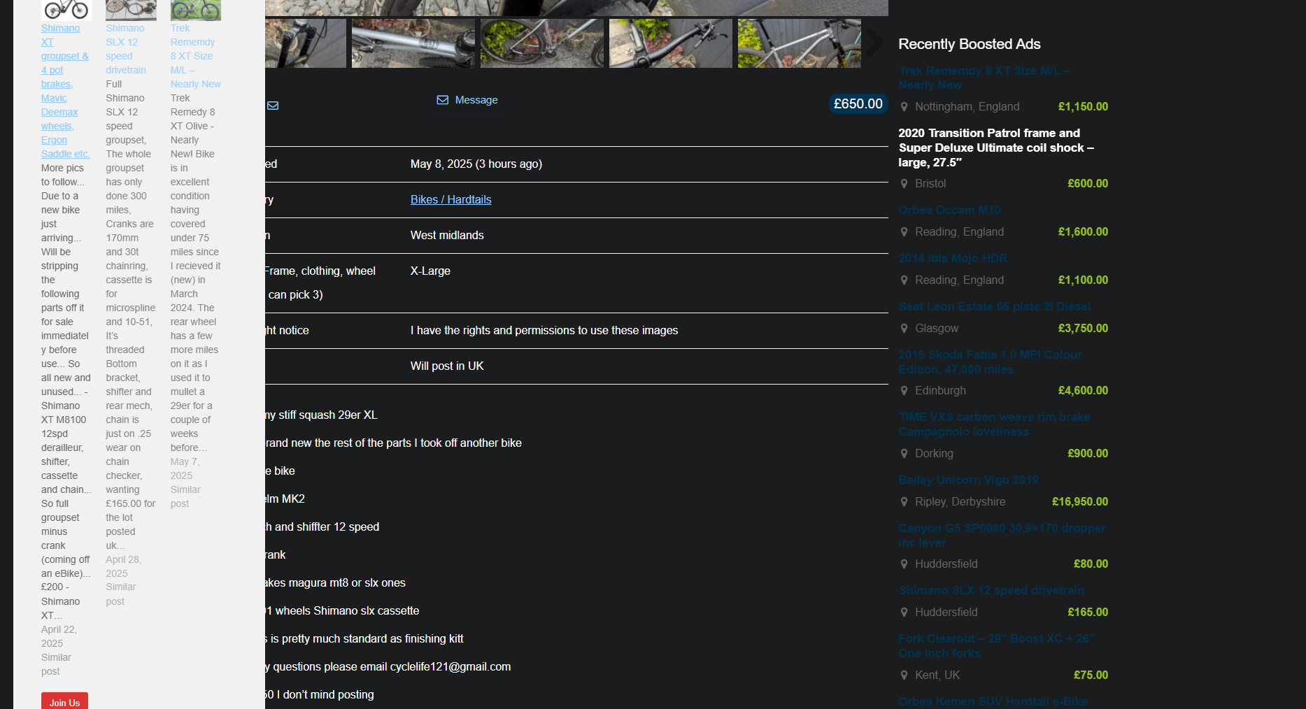
What's with the ads taking up so much of the page in the Classies?
I can't work out the ad policy, I've come to the site on both mobile and laptop and despite being logged in, I'm served up a selection of ads.
Yep. There is some strange behaviour going on, like it doesn't recognise the fact you were logged in and you have to click on your Profile icon every new visit. I know that @Mark is aware of this one but I've not heard of any updates on a fix (though I might have missed those). I'd say that's currently my one major issue with the forum as, other than that, it all basically "just works".
Would a new thread from STW Towers with a "Issues in the pipeline to be sorted" and a "Sorted" list be useful?
One that people can't post on so it doesn't duplicate this one. And only lists issues relevant to users of course, not back-office stuff.
Just thinking people could see where we are heading and where STW have come from without trawling through this thread and posting the same issue over and over again.
All historic replies are back now. We have the full compliment of 9.4 million posts in the forum. If you spot any old but still broken threads then let us know.
Does it look a little different today, or is that me? The graphics in the Wordle thread, for example, look more polished.
Running nicely for me on Chrome.
The graphics for wordle are external.
Something's gone wonky in the Classified (possibly just for Free Members).
If you click into a specific ad. the "Free Ride Jersey" pop up I'm seeing (bottom left) scrolls right up across the page, does a pretty poor job of trying to display some of the Classifieds and blocks a portion of the page; it doesn't appear to offer any way of closing it.
Free Ride Jersey ad that sticks rigidly to the bottom left and cannot be moved
PITA when you click on an image to see it full-size and the ad obscures a chunk
(see also PJay above)
All historic replies are back now. We have the full compliment of 9.4 million posts in the forum. If you spot any old but still broken threads then let us know.
Whooooohooooo
My big bike ride threads now have the pictures displaying. A slight oddity in that the links to the pics are there as well but i dont think that matters.
Thats made me happy. Its the best record i have
I think I've worked out why some people complain about the layout of the site, whereas others don't. If you have "www." at the front of the URL the site looks significantly different - massive font, blank spaces, missing icons, adverts.
Once you click on some of the links the www. is removed and the site looks normal - I think that's why some people talk about having to log in again after coming here - I suspect their bookmark has www. at the start, but after they log out and back in it redirects to a link without "www.".
The site really needs to redirect on loading any link with "www." at the front, or get the formatting to apply to both links.
I discovered this by following a link from Google which took me to a "www." page, so even if people updated their bookmarks, many would still see the issue if coming from a search engine.
I think I've worked out why some people complain about the layout of the site, whereas others don't. If you have "www." at the front of the URL the site looks significantly different - massive font, blank spaces, missing icons, adverts.
Great spot - just tried that - OMG an advert hell!! 😱😱
Free Ride Jersey ad that sticks rigidly to the bottom left and cannot be moved
There's an 'X' top right o fthat ad. Which is currently white on white (will be fixed in a few minutes ) Click that and you never see it again.
Great spot there @versus
We've been scratching our heads over this one. That makes perfect sense. www.singletrackworld.com is very different to https: //singletrackworld.com
If you come in on www.singletrackworld.com and then click a link you will be taken to the non-www site where everything works. So, if you have a bookmark for www.singletrackworld.com then removing the www will sort it. For our part we will see about a redirect that takes all www. traffic straight to the correct address.
I'm finding Classifieds cannot be viewed on either Android OS or laptop Chrome browser. What happens: Click an ad, it loads, then immediately the page is filled with a full screen pop-up for similar items for sale on STW. odd!
Anyone else getting the same?
It's in the post above. It's a Singletrack popup that's gone wrong. It's the same one you'll see bottom left on the forums. It should have an X to close it after which it vanishes for good.
That’s a really weird new bug. It’s as if the classifieds plugin and the user notice plugin have had sex. Two completely different and separate systems trying to mate. It will be high on our list of things to fix this week.
Small potatoes but, there's a disparity between account name and display name when quoting. Whichever way around it should be, it's showing the other one.
Not sure it just me but I can't get to the classifieds section. If I click the hamburger menu in the top left of the site, the classifieds link is at the bottom but is covered by an ad which I can't seem to close.

Have we found out why the forum takes ages to load a page or post a reply?, I was under the impression that the new “forum” would be much faster
edit - 12 seconds to post above.
Mine doesn't take as long as that.
Edit: maybe 6 seconds?
Have we found out why the forum takes ages to load a page or post a reply?, I was under the impression that the new “forum” would be much faster
It's rapid for me, aside from posting taking a few seconds. Certainly no slower than any other website. What are we doing differently? How long is "ages"?
Posting that reply took about 15 seconds. A page refresh was sub 2 seconds.
iPad/iPhone using safari, iMac using safari, all updates done.
This is the only website/forum that has this slow issue, could it be a routing/node problem?.
I’ll time how long this page takes to post
edit : 19.27 seconds to post the above as the little green spinny “working” icon popped up in top right corner of page on iPad Pro
I’ll time how long it takes to post my edit.
edit to my edit : only took 5.68 seconds to post.
Have we found out why the forum takes ages to load a page or post a reply?, I was under the impression that the new “forum” would be much faster
Bookmarks --> select BBC News - the page comes up in less than 1 second
Bookmarks --> select Singletrack forum - it takes about 7 or 8 secs to load the list of threads.
Android and Chrome on a Samsung phone, nothing out of the ordinary. The time lag is similar on the laptop. I can certainly live with it, but it suggests something is slow serving the data.
(OK, I appreciate BBC servers may be a bit more chunky, but that was just an example, I have several other bookmarks which are equally quick)
Yeah, editing does seen faster than initial posting. Why, I have no idea.
How long are your page loads taking?
