- This topic has 502 replies, 107 voices, and was last updated 7 years ago by Flaperon.
-
What to cut to fund the NHS?
-
jambalayaFree MemberPosted 7 years ago
TJ you couldn’t be more wrong (IMO). Had we continued as we where going to consequences would have been far worse. We are far from out of the woods yet.
Kimbers the Tories are trying to spend as much as they can, it just won’t be enough as its our system which is broken. Universal free at the point of delivery healthcare is a wonderful objective but it cannot cope with today’s requirements and an electorate that won’t vote for the necessary taxes.
But it is an excellent example of private sector involvement in healthcare provisions.
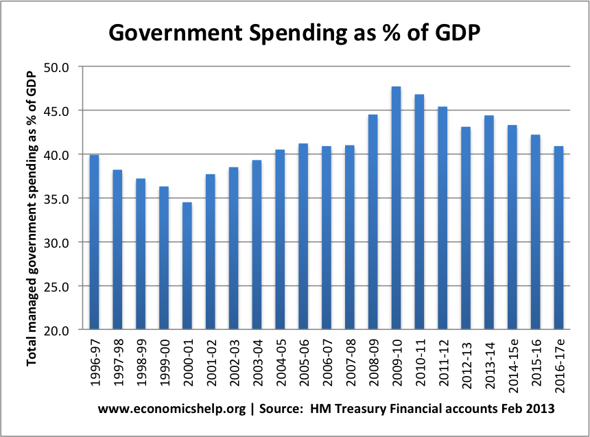
No the US is a terrible example, its an absolute outlier. Once again I post this chart, we should be looking to our European neighbours who share our welfare state model
 grumpyscullerFree MemberPosted 7 years ago
ernie_lynch – Member
jambalaya – Member
Ernie, agreed the US is not the right model for the UK.But it is an excellent example of private sector involvement in healthcare provisions
It is an excellent example of private sector exclusivity in healthcare.
There are plenty of good examples of private sector involvement. France and Germany spring to mind. As does our own general practice (by and large, there are areas with problems).
teamhurtmoreFree MemberPosted 7 years agoIf the household and corporate sectors are running surpluses, then givernments should and can run deficits. Unfortunately that simple logic is outside the mainstream economics that lies withing government thinking.
george got there in the end, but not by design
tjagainFull MemberPosted 7 years agoUtter nonsense Jamba the tories have even admitted its all about reducing the state not reducing debt and deficit – as many of the things they have done will actually increase both.
that graph btw is well out of date Now heading for under 8% with the tories openly acknowledged aim to have it under 7%
ernie_lynchFree MemberPosted 7 years agoteamhurtmore – Member
Kimbers, good job Osbounre abandoned austerity years ago then. next thing you know the nasty Tories will be ring fencing the NHS. Bas££rds
What’s the point of ring-fencing if there’s no cuts in public expenditure ? Austerity is generally understood to refer to government measures to reduce public expenditure.
The Financial Times claimed just over a year ago :
Autumn Statement does not mark end of austerity, says George Osborne
So according to you THM both the Financial Times and a Tory Chancellor of the Exchequer don’t understand what austerity is.
If nothing else I’m impressed with your own self-belief, however misplaced it might be.
Btw were you wearing your “political neutral” hat when made the sarcastic “nasty Tories” comment?
teamhurtmoreFree MemberPosted 7 years agoGenerally understood is not synonymous with correct, after all it is generally understood that Jezza is doing a very bad job.
The UK running one of the most expansionary fiscal policies in the developed world right now – as it should. One reason (in addition to stealing) why our economy is performing relatively strongly.
But you are correct to point our that George pulled off an amazing confidence trick by pretending that he was doing something completely different
OOI, in which year did public expenditure fall/ reduce during this period of austerity?
ernie_lynchFree MemberPosted 7 years agojambalaya – Member
No the US is a terrible example, its an absolute outlier.
The US mix according to your graph appears to be about 50/50 what’s wrong with that? Is it a ‘terrible example’ because it completely undermines the point you’re trying to make?
.
grumpysculler – Member
There are plenty of good examples of private sector involvement. France and Germany spring to mind.
According to jambalaya’s graph the ratio of private to public involvement in healthcare in France and Germany is very similar to the UK, ie, a bit more private involvement but also a bit more public involvement.
A high level of private involvement doesn’t necessarily mean better healthcare, it can just mean that the public healthcare provisions are crap.
I reckon the US model shows this particularly well. The astronomical healthcare costs in the US also shows what can happen when you factor in profits and all the administrative costs associated with that.
dazhFull MemberPosted 7 years agoGenerally understood is not synonymous with correct, after all it is generally understood that Jezza is doing a very bad job.
You mean you think he’s doing a good job? I wish you could cross post on here 🙂
teamhurtmoreFree MemberPosted 7 years agoIt’s a word play on bad job dazh, subtle at know especially at this time of night (plus a wee joke with the clairvoyant one)
ernie_lynchFree MemberPosted 7 years agoteamhurtmore – Member
But you are correct to point our that George pulled off an amazing confidence trick by pretending that he was doing something completely different
And the Financial Times agrees with him. The question is whether your interpretation of austerity is the correct one or the Financial Times’s interpretation is.
It’s a difficult one. I see that I am going to have to give this one a lot of thought.
ernie_lynchFree MemberPosted 7 years agoIt’s a word play on bad job dazh, subtle at know especially at this time of night
You don’t do subtle at ten to eleven ?
mikewsmithFree MemberPosted 7 years agoOh wow the single metric graph again…..
Given the utter disparity between rich and poor outcomes in the US what does the graph show? as the saying goes it’s not about the size it’s what you do with it.teamhurtmoreFree MemberPosted 7 years agoNo thought at all Ernie – just look at the economy, it would never have recovered had we had policies of austerity. The fact that it recovered faster than other economies (including those with left wing givernments) also shows how inaccurate you narrative is.
Have you found the years when expenditure fell yet?
How are the nasties doing with delivering their much vaunted surpluses? Has Phil,gione even softer or does he need some of George’s Viagra?
julianwilsonFree MemberPosted 7 years agonot a snidey or sarcastic post here, more of a gently pissed and fuzzily confused one. (‘on the waterfront’ is on bbc2, mmmmmmm…)
I accept that austerity wasn’t really all that. After all, even lefty blogs remind us of how under Osborne the debt went up etc etc, it must have gone somewhere..
How do we reconcile that with the bits that show unequivocally that the NHS was about the only part of public service in which he didn’t smake significant cuts? (and as above, it is in crisis anyway partly because of defunding in not-so-obviously-health areas). What did he spend it all on instead or where did he/we take less in tax?
ernie_lynchFree MemberPosted 7 years agoteamhurtmore – Member
shows how inaccurate you narrative is.
What do you mean my narrative? I’m just a simple soul, I don’t understand complicated stuff. I was quoting the Financial Times, it’s the FT’s narrative that you’re arguing against, not mine.
teamhurtmoreFree MemberPosted 7 years agoIf you say so Ernie. But your negative self- assessment seems rather damning to me though. You even seem to understand Corbyn and that defeats most of us, even his closest allies. Don’t do yourself down.
dazhFull MemberPosted 7 years agoIs it just me or has this thread become the Big Hitters O.K. Corral?
ernie_lynchFree MemberPosted 7 years agoteamhurtmore – Member
If you say so Ernie. But your negative self- assessment seems rather damning to me though.
What’s “negative” about being a simple soul ?
Have another glass and tell me what you think.
tjagainFull MemberPosted 7 years agoJulian – the main problem with the NHS apart for the tories ideological hatred of it is that the tory cuts to local authority budgets destroyed an already badly broken social care leading to major bed blocking. In Edinburgh where there are around 1000 NHS beds at one point last year 300 of them where blocked by people waiting for social care.
tjagainFull MemberPosted 7 years agoAnd where did the money go?
Tax cuts to the rich
Increased social security due to increased unemployment
Decreased tax take due to contraction in the economy
Increased defence spending on bombing brown peopleteamhurtmoreFree MemberPosted 7 years agoSorry Juilan, fell asleep and missed your question
This is a good source to answer your question
http://www.ukpublicspending.co.uk/charts.html?title=Public_Pensions_Chart&chart=00-total&state=UK
ernie_lynchFree MemberPosted 7 years agoJulian’s question was :
How do we reconcile that with the bits that show unequivocally that the NHS was about the only part of public service in which he didn’t make significant cuts?
As in this :
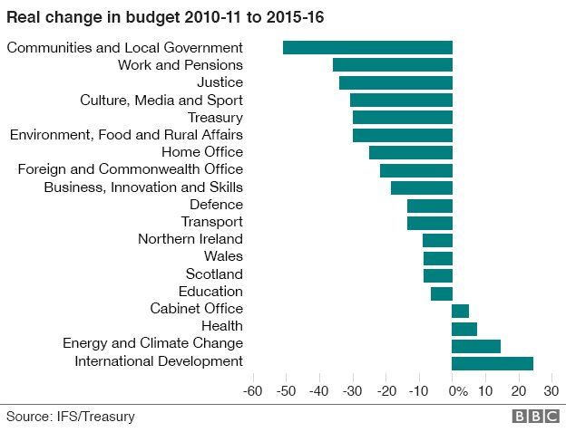
You didn’t answer the question you just posted a link to lots of charts which rely heavily on “estimates”, which don’t seem to show change in real terms, and even then show clear signs of departmental cuts.
Here’s another chart which relies on estimates :
EDIT : The small increase in Health budget is more than lost by the huge cuts in Communities and Local Government budget.
teamhurtmoreFree MemberPosted 7 years agoTeach a man to fish
But well done Ernie, your graph is much better 😉
Excuse me linking a useful source Julian. My bad!!
jet26Free MemberPosted 7 years agoLarge parts of current problem related to social care which is nothing to do with NHS budget.
Going forward health prevention also an issue – also nothing to do with NHS budget.
NHS efficiency could be greater in parts, some parts are ok.
But isolating it from public health and social care is madness. As is the so called competition and internal market
ernie_lynchFree MemberPosted 7 years agoExcuse me linking a useful source Julian.
Well useful to you. Not that you, a political neutral, would want spin Tory policy, oh no, perish the thought.
Here’s another unspun take, this time from the Daily Telegraph business section, not that Daily Telegraph business editor understands what “spending cuts” means of course.
Budget 2016: George Osborne to unveil £4bn in spending cuts
“Britain faces a fresh round of government spending cuts”[/b]
ernie_lynchFree MemberPosted 7 years agoAfter your embarrassing attempts to post vaguely readable posts last night, apparently accumulating with you falling asleep, I suggest you ease off liquid nutrition.
teamhurtmoreFree MemberPosted 7 years agoC’mon Ernie you can do better than that. How was your lunch?
DracFull MemberPosted 7 years agoAny chance you two can stop turning thread another bitch fight between you?
ernie_lynchFree MemberPosted 7 years agoAny chance you two can stop turning thread another bitch fight between you?
If you want to add a constructive and useful point to the thread Drac I can’t see a problem. In the meantime challenging the Tory narrative concerning government spending and departmental cuts seems perfectly fair to me. After all the thread is about what to cut to fund the NHS.
teamhurtmoreFree MemberPosted 7 years agoThere you go Drac, there’s your problem!
But I note your good point and sensible modding.
tjagainFull MemberPosted 7 years agoErnie – don’t feed the troll? We all know he is trolling – why not ignore him?
However I do agree that his far right viewpoint needs to be challenged and making his sneering condescension obvious can be a good weapon.
Drac – there is one constant in these bitchfests and its not ernie
jambalayaFree MemberPosted 7 years agoHowever I do agree that his
far rightcenter/center-right viewpoint needs to be challengeFIFY
Far right looks very different. No welfare state, no universal healthcare for example. Continual tagging of “far-right” is an attempt to discredit pure and simple.
tjagainFull MemberPosted 7 years agoNo its not – its the truth. You sit on the far right as well Jamba so of course he looks reasonable and centrist to you. centre right is ” one nation” toryism. the neoliberal let the market take care of everything cut government spending to the bone and privatise everything is far right.
tjagainFull MemberPosted 7 years agoJamba – the difference with you is you remain polite and will debate. the unpleasant troll reffered to is rude, condescending and every post is intended to wind folk up hence I block him altho I am told he still answers my posts
ahwilesFree MemberPosted 7 years agojambalaya – Member
Far right looks very different…
out of idle curiosity, would you describe Corbyn as ‘far left’…?


The topic ‘What to cut to fund the NHS?’ is closed to new replies.