Bruce
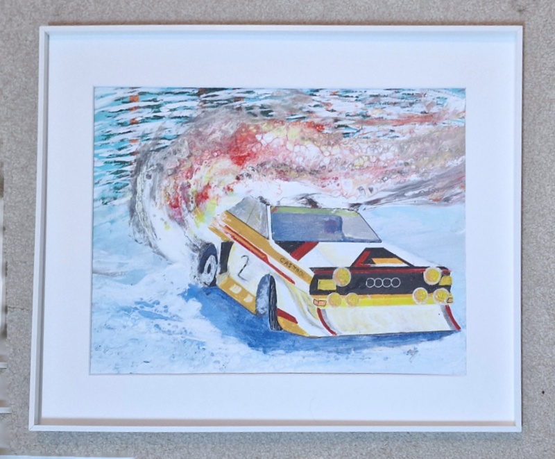
The front corner of the car is out of place because I cocked up the proportions so it goes almost to the edge of the actual canvas. I started with a car which was a much more accurate shape and proportion but it looked wrong so I had to extend and enlarge the bonnet. I agree with your comment but it was a case of ‘saving’ a painting that wasn’t working. I think some clever framing might solve the problem though so – see below.
If you look at the windscreen and windows you get an idea of the original proportions and the front of the car ended about where the black line across the front of the car currently is. That positioned the car better on the canvas but somehow looked wrong, even though it more accurately reflected the 6 – 7 reference photos I used. I could only get it to balance properly by pulling the left (as you look at it) headlight towards the viewer and enlarging it. This meant the lines down the length of the car got a bit skewed and I was only just able to keep the whole cat front ont he canvas.
Dyna-ti
I tried plain white and it looked worse. Please remember that I am making these frames in my garage with what I can get and am not a professional framer. My stock answer to buyers is “You are buying the art, the display frame is justy there to carry it”. This kind of excuses some of the weaknesses but I agree that there are probably better frames possible.
The trouble is that I sell paintings like this for between £150 – £250 so there is not enough margin to get a professional frame made when they cost upwards of £80.
EDIT
I just spotted this picture mount and frame surround leaning against the wall in the corner of the office. It is not an actual frame, just a foam insert, but gives an impression of what it might look like with a narrow, perhaps metal, surround.
