
Subscribe now and choose from over 30 free gifts worth up to £49 - Plus get £25 to spend in our shop
What manufacturer, in your opinion, makes the most consistently nice-looking bikes? Could be road, mountain, or whatever; you just have to name the company, and why you think their bikes tend to be the most attractive (whatever that means to you).
For mountain bikes, I have always liked a lot of the [b]Santa Cruz[/b] offerings. I can't remember a Chameleon I didn't think was nice.
For road, it has to be [b]Bianchi[/b]. I don't have one, but I have always thought that their use of celeste as a colour gave them a sense of standing above other bikes.
SC have some awful colour schemes and occasional Driver 8s but usually look pretty good.
Trek are making really clean looking bikes with a single, simple graphic and one bold colour nowadays, am a big fan of the look. It's what Transition used to do when they started out.
As for roadish stuff, that Shand chap makes some stunning steel bikes. No fan of the catalogue carbon ones, but I can happily spend an hour on his website looking at bikes I don't need.
Islabikes, I think.
Might nominate Cannondale, too. I'm sure there have been a few biffers I can't quite see through my rose-tinted spectacles, but there haven't been many that I haven't wanted at least a bit. Even the Hooligan sort of looked right in its own special way.
Trek do pretty well, too. And Genesis.
Am I allowed Pegoretti? 😀
Award for the most consistently awful, to answer a question you didn't ask, is probably Pinarello.
I'm liking the current crop of pivots
Cotics for me, granted they haven't made loads of different models though. Oh and the Hemlock wasn't great!
Ibis are lovely looking bikes.
Ritte do very nice road bikes.
Ritchey
And Genesis.
I'm a Genesis fan, but they've had some ropey colour schemes some years
Colnago don't do much wrong in my eyes, even their aero bikes look good and keep classic lines rather than the dog having a dump arched top-tube (I'm looking at you Specialized)
Genesis are probably the most consistent with both road and MTB, again by keeping it simple and classic.
However it's all in the eye of the beholder, I like classic designs and steel frames, not many carbon frames float my boat
Mountain: Salsa.
Road: Wilier.
Road: Wilier.
I'm with you there. I actually have one, and LOVE it. I mentioned Bianchi, but I would rank Wilier up there with them - if not above.
Trek's are always 7s or 8s - more than presentable, but I don't recall any howlers or stunners either.
I was going to say Cove, they make lovely HTs and their FS bikes look good to me (being that they're all pretty much the same design on different scales for varying travel) but then I remembered their Single Pivot FS frames and shuddered.
Commencals are nice - I remember even their entry Supernormal (or whatever it was called) from a few years ago was a beautiful looking bike, especially for an entry level HT.
There's not many nice looking bikes these days. Too many lumps and bumps and distorted bent tubes.
Big : Look - always different
Small : English - just class
Cervelo
[url=www.englishcycles.com]English[/url]
Or perhaps Rourke. I guess I like steel road bikes.
Edit, great minds TiRed
I really like the new Transition range. Not too fussy, nice colours and really well sorted aesthetically.
Speedvagen make some lovely contemporary steel-framed bikes - road and CX
Moonmen and Blacksheep do some really interesting stuff
I have a fondness for Colnago as they have been one of the consistent innovators / best handling bikes
The less said about Bianchi the better - look beyond the paint and they've been woeful at times
Liteville of course.
And also Seven
Cotic, Stanton, Starling.
I'm going through a bit of a #steelisreal phase at the mo
Singular Cycles.
Genesis - they just seem to make nice, simple looking bikes.
Salsa - Not sure why I like them, but they always look pleasing to the eye.
Production Privee and Stanton - although they only have a few models, they manage to look retro and modern at the same time
I'd still love a Klein of any variety!
I'd have to agree with qwerty and say Singular. Their bikes always look good and Sam seems to have a knack of picking great colours for each model.
I might be slightly biased with this as I've got one but there's not a Mason bike that doesn't look fantastic but it's not exactly a huge range to choose from at the moment!
Santa Cruz..
Orbea range looks pretty good both mtb and road
the teaboy - Member
I'd still love a Klein of any variety!
Any?
[img] 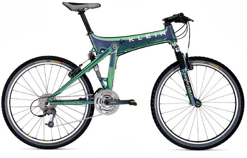 [/img]
Santa Cruz and wilier, as above. Trek this last couple of years, so not really consistently, Katy and T-Mo's bikes are stunning.
Road: Wilier.
I sold mine and bought a Mason. Both are lovely looking machines IMO.
good point. They always look good but for some reason they are not as instantly desirable as a ColnagoRoad: Wilier.
CaptainFlashheart - MemberAny?
Ah, um, ahem. Forgot about that one.
For road, Enigma. Their use of titanium makes me feel all warm and fuzzy inside. For mountain, I've never owned one but for some reason I think that Scott bikes look like machines with purpose. And I've seen some gorgeous Yeti's hanging around Peaslake.
Nicolai, 2 triangles,square tubes, gorgeous machining and welds 🙂
Forgot about Enigmas. Always gorgeous. If I check into a food stop on a sportive littered with lovely bikes it's usually the Enigmas I end up gawping at.
Consistent?
Ritchey.
[img]  [/img]
[img]  [/img]
Breadwinner and Cotic for me. Some lovely choices on here though.
The brand doesn't matter they'll either look rubbish or good depending how they're setup.
For example, a Pegoretti that looks awful
[img] 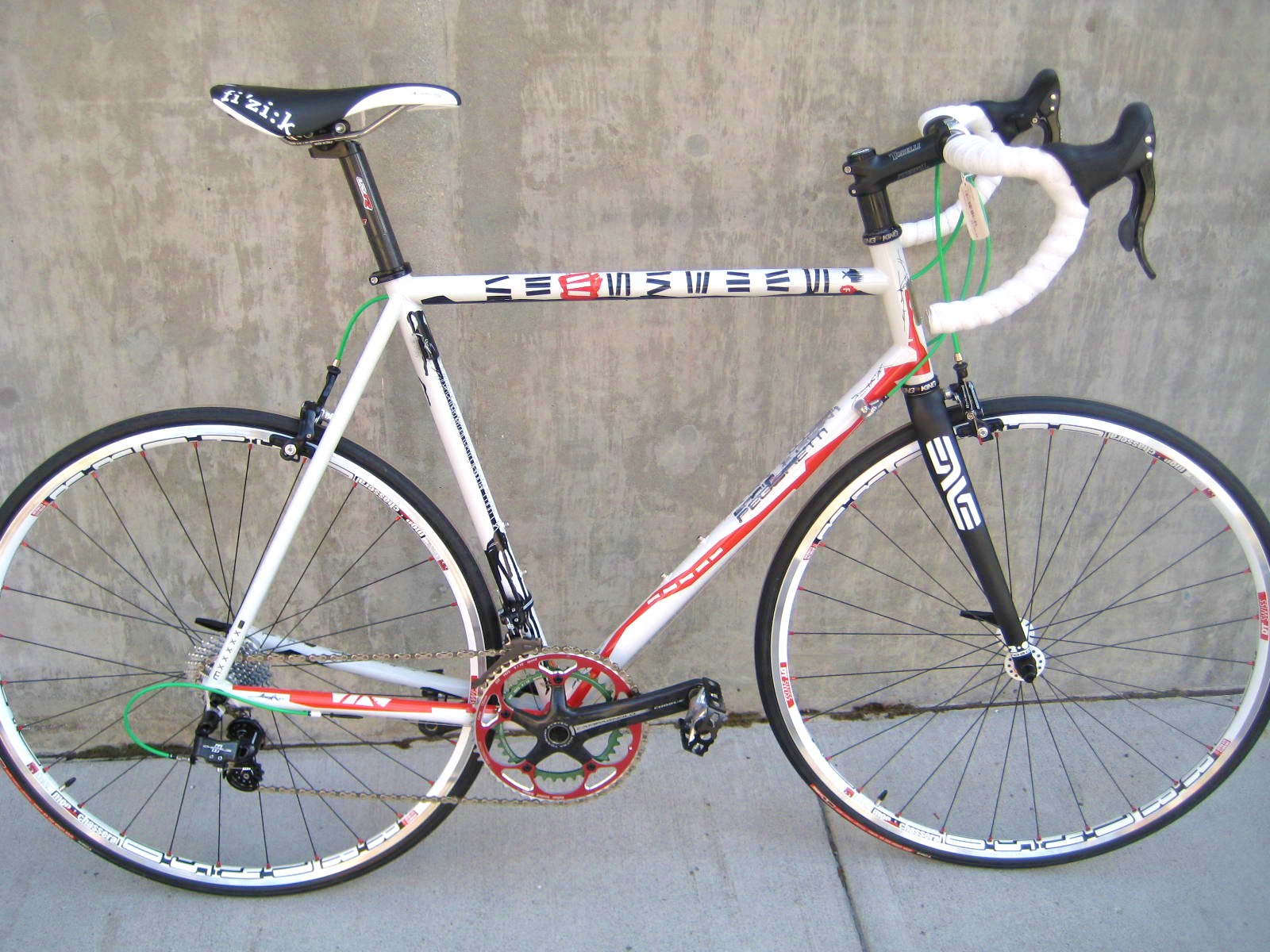 [/img]
A Fuji that looks good
[img] 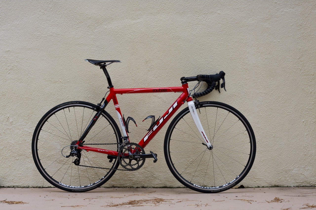 [/img]
As for MTBs, most full suspension bikes look awful, Santa Cruz included. The new Scott Sparks look ok, even with a ridiculous cassette..
[img]  [/img]
[img] 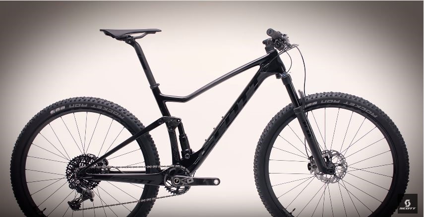 [/img]
Hmmm.
GT, Cannondale, Spesh, Ritchey, Breezer, Cotic, Surly.
But for MTB's it has to be Singular.
Never ridden one, don't know Sam.
But I've never, ever seen an ugly Singular.
Its about proportions, garden gate bikes never look good.
I'm not certain any brand gets it as there all just brand managers with different designers.
So take any any 54/56 road bike put some deep rims on it and it will look awesome to someone.
MTB are more complex but its still about proportion.
I'm enjoying this Merida at the moment.(even when its pointing the wrong way)
[img]  [/img]
So take any any 54/56 road bike put some deep rims on it and it will look awesome to someone.
[img] 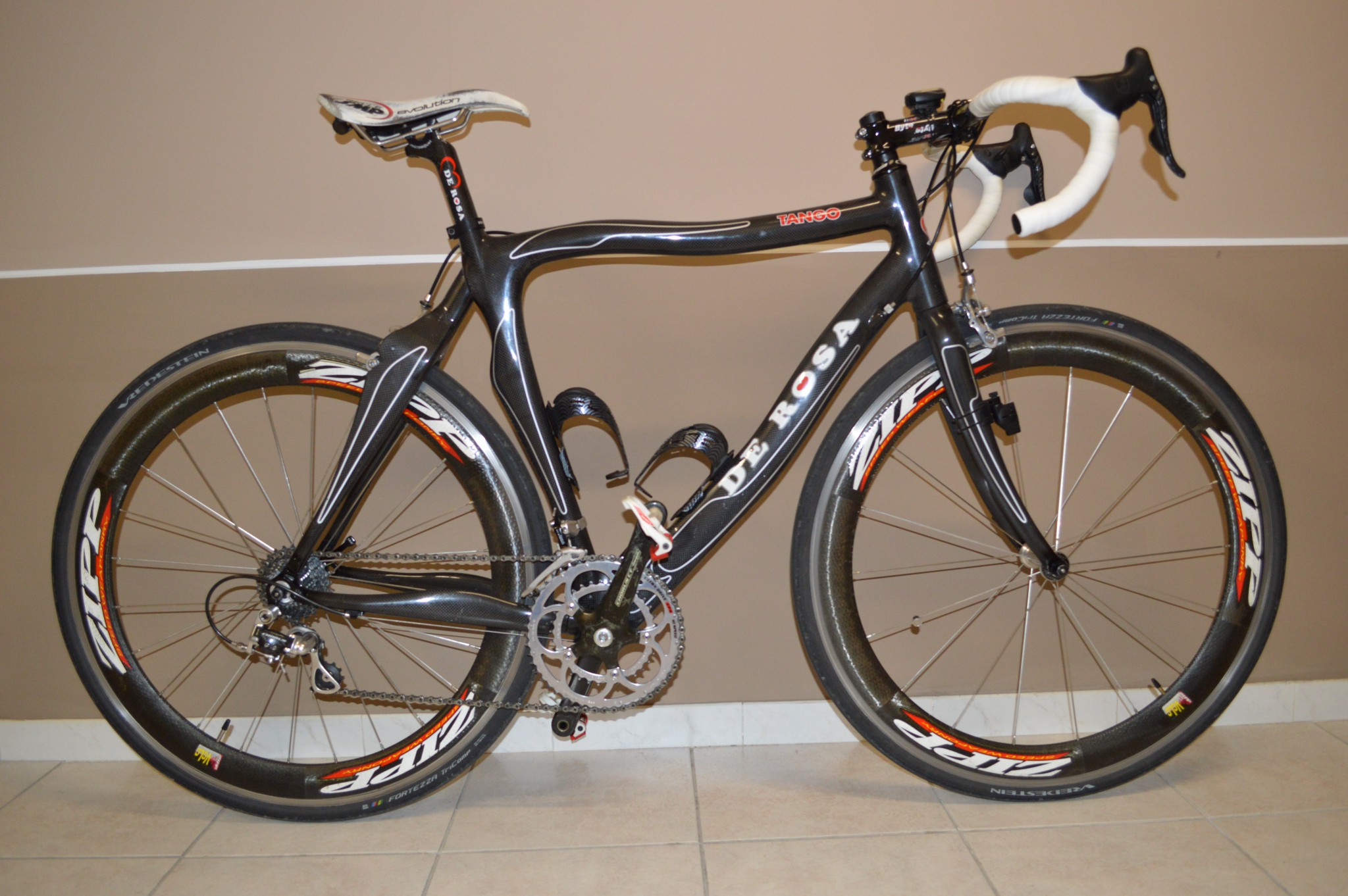 [/img]
Anyone?
looks as though someones already tried to kill it with fire.
😀
SMP saddles ruin the look of any bike
Speaking of Bianchi... the new Pantiani tribute Specialissima is quite nice...
[img]  [/img]
SMP saddles ruin the look of any bike
Yeah. It's the saddle that ruins it, isn't it?
😀
still about proportion.
Yes. But that Merida is in anything but proportion. The drop to the bars is too big for such a small bike, the head tube is too short, the stem and bars are pointing to the sky. Most world Tour bikes look crap TBH.
Singular.
MrBlobby's bike is a looker 😉
You are kidding the saddle is way too high, thats set up for a picture not a rider.
The Merida is perfect you are clearly mad.
You are kidding the saddle is way too high, thats set up for a picture not a rider.
[img]  [/img]
Npot bad for a Giant.
I assume everyone saying Santa Cruz hasn't seen the new nomad then? 😉
😳
I have swapped the rather ugly 10sp ultegra mechs for nicer 11sp ones. And it is now sporting some Lizard Skin camo black and white bar tape. And that is the actual saddle height 🙂
And that is the actual saddle height
Nearly as high as mine!
Presumably laddo was on about that Bianchi....
Fair point..I assume everyone saying Santa Cruz hasn't seen the new nomad then?
Cotic, Surly, Brother, Breadwinner and Orbea for me.
I really can't get on with the rear triangle on the Santa Cruz full suss offerings. Looks odd.
Don't think Roberts made many duffers, oh, and Fat Chance.
Too many consistent road/cross manufacturers but Kona have surprised me recently.
They've always had a few stunners each year since they got back into road bikes.
I think Marin are the most polarized between hardtails and full suss.
The former often spot on, the latter always uglier than a hatful of elephant's bums.
Ellsworth And Dahon
NS Bikes..... paint schemes are by far the best.
For road, Cinellis, easily.
A lot of the big manufacturers seem to think that putting matching colour stickers on forks/ rims is attractive. In terms of aesthetics this is about as advanced as hiring a 5 year old to do the design work.
As a graphic designer, with hair-trigger aesthetic sensibilities I'm a big fan of Intense. 90% of the time they get it so right, but when they get it wrong.... dear god!
Presumably laddo was on about that Bianchi....
Bingo..well done Dad.
Mountain bikes: Pace.
Had an RC405, beautiful, just gutting I couldn't get on with it 🙁
Road bikes: Orbea
To me they just look 'right'
Cotic, if it weren't for the Hemlock, have never made an ugly bike. Often they're a wee bit conservative, but they're always right. Except the Hemlock, which looked like one of those french swing bridges.
BMC, I think, have it pretty sorted. Good proportions, good lines, a mix of boring and lairy colours. I'm just rebuilding my Trailfox and man, it's [i]handsome[/i]. Considering it's more or less the shape as my Remedy, it's somehow leaner [i]and[/i] more muscular and the shape has a lovely flow and sense to it. The colours are a wee bit drab but still.
On that note,
P-Jay - MemberTrek's are always 7s or 8s - more than presentable, but I don't recall any howlers or stunners either.
My Remedy looks like it's "accidentally" put some fruit up its arse and now it's frantically trying to squeeze it out. It is fairly horrible.
Steel tubes and deep section rims do it for me. I like pegorettis, but some of Dario's paint schemes are an acquired taste. I like a horizontal TT on a steel bike and a compact frame in carbon. TCR and Defy aren't bad.
Never seen an ugly English. My shorter is a bit of a looker too in all its filet braised loveliness. :p
For mtbs, ibis were always lovely but again, I like thin steel tubes and nice big tyres.
Another vote for Colnago.
Recommend what you own seems fair to me as it's reasonable to assume I like the bikes I've bought.
So, Cotic for MTB and Kinesis for CX/Road is my shout.
Not a boutique brand, but YT seem to have been pretty consistently good looking for a few years
I know they have a lot of haters on here, but I can't really think of a Yeti I haven't liked?
When going through my SS phase I wanted one of these, it's got a look of "handmade" about it, no idea what it rode like though..
[img]  [/img]
But I bought one of these, (I can't get a pic of my Niner One9 off imgur for some reason so this will have to do.. )
[img]  [/img]
I've had plenty of road bikes during my time, but this is the best looking and riding one I've owned.
[img]  [/img]
Jaegher
[img]  [/img]
I'm enjoying this Merida at the moment.
The designer was clearly determined to get his money's worth out of his set squares.
As a graphic designer, with hair-trigger aesthetic sensibilities I'm a big fan of Intense. 90% of the time they get it so right, but when they get it wrong.... dear god!
Intense is a good shout, their frames usually have lovely proportions with a muscular, fast look.
What [i]are[/i] they thinking with the new clashy-clashy colour schemes though? Is that a thing that designers do, or is someone there colour blind and everyone's afraid to tell him?
Always thought my Breezer is a nice looking machine:
[img] http://www.retrobike.co.uk/forum/download/file.php?id=8245 [/img]
andykirk - MemberFor road, Cinellis, easily.
I agree, great looking bikes. I do also really like the look of kinesis frames.
MTB wise, none of them look really nice IMO, but that's ok, they are tools, you'd soon crash if you were looking at your bike when you were riding it 😆
I do like SC, but evil make the best looking FS bikes to my eyes. I don't have the balls to buy one though, I couldn't afford to replace it.
I loved my Nicolai argon HT, probably the best looking bike I have owned.
The brand doesn't matter they'll either look rubbish or good depending how they're setup. For example, a Pegoretti that looks awful
Anyone can take any frame and put loads of spacers, a high rise stem, various green things and over-stickered white rims on it. It's hardly an indictment of Pegoretti; his part in that bike is entirely splendid. I can understand that not all of his paintwork is everyone's cup of tea, but then it's not meant to be. Personally I love it: for me the radical paint on a conservative frame works far batter than a radical frame, which brings us to Flashy's vomit-inducing De Rosa contribution. One of the few brands that can really outdo Pinarello for hideous road bikes. Yet the Milanino in blue is a thing of unfussy beauty.
Its about proportions, garden gate bikes never look good.
You are kidding the saddle is way too high, thats set up for a picture not a rider.
You dissing my bike? 🙂
[img]  [/img]
Demon Frameworks.
[img]  [/img]
I don't think Tom knows how to make an ugly bike.
If there's an award for "Most Improved Mountain Bike Aesthetics", then Norco has to be in with a shout? If you look at their early 2000s North Shore stuff, the entire range was distinctively ugly, but their newer mountain bikes are really quite attractive.
[img]  [/img]
[img]  [/img]
[img]  [/img]
just got my pegoretti back from Dario after a repaint and a repair to the seatstay, built it up last weekend and reminded myself why its such a great bike by taking it for a spin, best riding/handling bike i have ever ridden.
MTB: Yeti
Road: Most of the plastic bikes look alike really but I quite like the current Cervellos
Cross/Gravel: Niner apart from the steel one.
Bikebouy's Cervelo, a lot to like there. I'd have one if I just had one bike, didn't want to race it, and lived somewhere the sun shone year round 🙂
MTB. Has to be the simplicity of Cotics (except, as has already been pointed out, the eyebleach that was the Hemlock). NS always look cool too though.
Road. No idea, but would probably be something with skinny steel tubes.
Moonmen bikes gets my vote consistently stunning!