MrBlobby's bike is a looker 😉
You are kidding the saddle is way too high, thats set up for a picture not a rider.
The Merida is perfect you are clearly mad.
You are kidding the saddle is way too high, thats set up for a picture not a rider.
[img]  [/img]
Npot bad for a Giant.
I assume everyone saying Santa Cruz hasn't seen the new nomad then? 😉
😳
I have swapped the rather ugly 10sp ultegra mechs for nicer 11sp ones. And it is now sporting some Lizard Skin camo black and white bar tape. And that is the actual saddle height 🙂
And that is the actual saddle height
Nearly as high as mine!
Presumably laddo was on about that Bianchi....
Fair point..I assume everyone saying Santa Cruz hasn't seen the new nomad then?
Cotic, Surly, Brother, Breadwinner and Orbea for me.
I really can't get on with the rear triangle on the Santa Cruz full suss offerings. Looks odd.
Don't think Roberts made many duffers, oh, and Fat Chance.
Too many consistent road/cross manufacturers but Kona have surprised me recently.
They've always had a few stunners each year since they got back into road bikes.
I think Marin are the most polarized between hardtails and full suss.
The former often spot on, the latter always uglier than a hatful of elephant's bums.
Ellsworth And Dahon
NS Bikes..... paint schemes are by far the best.
For road, Cinellis, easily.
A lot of the big manufacturers seem to think that putting matching colour stickers on forks/ rims is attractive. In terms of aesthetics this is about as advanced as hiring a 5 year old to do the design work.
As a graphic designer, with hair-trigger aesthetic sensibilities I'm a big fan of Intense. 90% of the time they get it so right, but when they get it wrong.... dear god!
Presumably laddo was on about that Bianchi....
Bingo..well done Dad.
Mountain bikes: Pace.
Had an RC405, beautiful, just gutting I couldn't get on with it 🙁
Road bikes: Orbea
To me they just look 'right'
Cotic, if it weren't for the Hemlock, have never made an ugly bike. Often they're a wee bit conservative, but they're always right. Except the Hemlock, which looked like one of those french swing bridges.
BMC, I think, have it pretty sorted. Good proportions, good lines, a mix of boring and lairy colours. I'm just rebuilding my Trailfox and man, it's [i]handsome[/i]. Considering it's more or less the shape as my Remedy, it's somehow leaner [i]and[/i] more muscular and the shape has a lovely flow and sense to it. The colours are a wee bit drab but still.
On that note,
P-Jay - MemberTrek's are always 7s or 8s - more than presentable, but I don't recall any howlers or stunners either.
My Remedy looks like it's "accidentally" put some fruit up its arse and now it's frantically trying to squeeze it out. It is fairly horrible.
Steel tubes and deep section rims do it for me. I like pegorettis, but some of Dario's paint schemes are an acquired taste. I like a horizontal TT on a steel bike and a compact frame in carbon. TCR and Defy aren't bad.
Never seen an ugly English. My shorter is a bit of a looker too in all its filet braised loveliness. :p
For mtbs, ibis were always lovely but again, I like thin steel tubes and nice big tyres.
Another vote for Colnago.
Recommend what you own seems fair to me as it's reasonable to assume I like the bikes I've bought.
So, Cotic for MTB and Kinesis for CX/Road is my shout.
Not a boutique brand, but YT seem to have been pretty consistently good looking for a few years
I know they have a lot of haters on here, but I can't really think of a Yeti I haven't liked?
When going through my SS phase I wanted one of these, it's got a look of "handmade" about it, no idea what it rode like though..
[img] 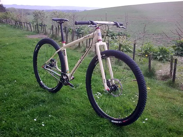 [/img]
But I bought one of these, (I can't get a pic of my Niner One9 off imgur for some reason so this will have to do.. )
[img]  [/img]
I've had plenty of road bikes during my time, but this is the best looking and riding one I've owned.
[img]  [/img]
Jaegher
[img]  [/img]
I'm enjoying this Merida at the moment.
The designer was clearly determined to get his money's worth out of his set squares.
As a graphic designer, with hair-trigger aesthetic sensibilities I'm a big fan of Intense. 90% of the time they get it so right, but when they get it wrong.... dear god!
Intense is a good shout, their frames usually have lovely proportions with a muscular, fast look.
What [i]are[/i] they thinking with the new clashy-clashy colour schemes though? Is that a thing that designers do, or is someone there colour blind and everyone's afraid to tell him?
Always thought my Breezer is a nice looking machine:
[img] http://www.retrobike.co.uk/forum/download/file.php?id=8245 [/img]
andykirk - MemberFor road, Cinellis, easily.
I agree, great looking bikes. I do also really like the look of kinesis frames.
MTB wise, none of them look really nice IMO, but that's ok, they are tools, you'd soon crash if you were looking at your bike when you were riding it 😆
I do like SC, but evil make the best looking FS bikes to my eyes. I don't have the balls to buy one though, I couldn't afford to replace it.
I loved my Nicolai argon HT, probably the best looking bike I have owned.
The brand doesn't matter they'll either look rubbish or good depending how they're setup. For example, a Pegoretti that looks awful
Anyone can take any frame and put loads of spacers, a high rise stem, various green things and over-stickered white rims on it. It's hardly an indictment of Pegoretti; his part in that bike is entirely splendid. I can understand that not all of his paintwork is everyone's cup of tea, but then it's not meant to be. Personally I love it: for me the radical paint on a conservative frame works far batter than a radical frame, which brings us to Flashy's vomit-inducing De Rosa contribution. One of the few brands that can really outdo Pinarello for hideous road bikes. Yet the Milanino in blue is a thing of unfussy beauty.
Its about proportions, garden gate bikes never look good.
You are kidding the saddle is way too high, thats set up for a picture not a rider.
You dissing my bike? 🙂
[img]  [/img]
Demon Frameworks.
[img]  [/img]
I don't think Tom knows how to make an ugly bike.
If there's an award for "Most Improved Mountain Bike Aesthetics", then Norco has to be in with a shout? If you look at their early 2000s North Shore stuff, the entire range was distinctively ugly, but their newer mountain bikes are really quite attractive.
[img]  [/img]
[img]  [/img]
[img]  [/img]
just got my pegoretti back from Dario after a repaint and a repair to the seatstay, built it up last weekend and reminded myself why its such a great bike by taking it for a spin, best riding/handling bike i have ever ridden.
MTB: Yeti
Road: Most of the plastic bikes look alike really but I quite like the current Cervellos
Cross/Gravel: Niner apart from the steel one.
Bikebouy's Cervelo, a lot to like there. I'd have one if I just had one bike, didn't want to race it, and lived somewhere the sun shone year round 🙂
MTB. Has to be the simplicity of Cotics (except, as has already been pointed out, the eyebleach that was the Hemlock). NS always look cool too though.
Road. No idea, but would probably be something with skinny steel tubes.
Moonmen bikes gets my vote consistently stunning!
A raw Liteville 301, with a nice patina of age/use gets my vote.
Stanton for me; really like the way their bikes look and ride. The new Slackline is particularly pretty.
Cotic for me.
A raw Liteville 301, with a nice patina of age/use gets my vote.
looks like a piece of agricultural equipment from a dairy farm.
The correct answer is of course...
[img] ![]() [/img]
[/img]
Field.
