One for those with good memorys...
Can anyone remember any bike company who have changed their logo or ID in the last 10 years ? maybe just the font on the down tube or the head tube logo perhaps ?
If not a bike company - any other major company thats done it successfully?
Many thanks, The Badger
The Badger - Member
???
[IMG]
 [/IMG]
well, this has started positively...
Kona seem to change their logo every few years... (apologies if this has already been posted, but I can't see that image above)
The font Marin use has changed, I had a 2004 with black and White logo lettering. Now it's more square.
Mars did it (not a bike co, but still). New one looks gash mind.
Trek have. Norco have changed their branding. As have Schwalbe. And Kona.
logo and name changing was dead trendy last time the tories were in power, I expect we'll see more of it again.
consignia 🙄
So far so good guys thanks for the help so far
Diamond Back to DB?
Cannondale have
I can think of loads that are OT: Peugeot, Vauxhall, Thames and Hudson. And also a few car models such as Fiesta, Ka. Bands often change or refine and update thier logos with a new album Radiohead, Bon Jovi and White stripes spring to mind.
Scott have.
All of them?
I'm struggling to think of one that hasn't.
Even well-known logos like Specialized's have been tweaked.
Gap, LOL.
Fill yer boots:
http://www.amitbhawani.com/blog/logos-past-present/
OK not bike related but gives you an idea of how logos evolve!
Orange seem to change just about every year
2007:
[img]  [/img]
2008:
[img]  [/img]
2010:
[img]  [/img]
Am I alone in preferring Gap's new logo?
Kona logo has changed quite a few times in the last 10 years or so, it used to be quite plain, now it looks like someone has half inflated it.
Bit like the half inflated wheel in the first pic... 😉
Sellafield?
Am I alone in preferring Gap's new logo?
yes
Sunday Cycles are now Sabboth..
HOPE, look at some old C2 brakes and the logo looks like something I'd have done in D&T, straight lines and constant radius curves, i.e. easy to CAD/CNC, now they anodize/etch its become much more complicated.
Kona I'd agree with
Oh! I like logos, me. 🙂
Cannondale's logo has changed over time, and is a good case study in how a company has attempted to update it's brand.
[img] 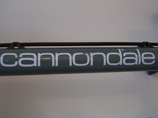 [/img]
[img] ![]() [/img]
[/img]
[img] ![]() [/img]
[/img]
[img]  [/img]
[img] ![]() [/img]
[/img]
IMO, I think the first one was the best. Nice, simple font, worked well in different colours. Was very recognisable, and classy and understated. I'm not a great fan of the current version, but it's not bad compared to some others.
As for other companies; I always thought that BT had the perfect logo before privatisation. Proof that Thatcher = bad design.
[img] ![]() [/img]
[/img]
[img]  [/img]
[img]  [/img]
Excellent branding. Distinct and easily recognisable. Iconic.
Then, along came Thatch the Snatch, and it all went horribly wrong:
[img] ![]() [/img]
[/img]
[img] ![]() [/img]
[/img]
I know what I'm talking about so shut up.
Guys - thanks for the quality responses, superb.
Oh, and it's compan[b]ies[/b] and memor[b]ies[/b], btw.
I've thought for a long time that Trek ought to redesign their logo, and they started to several years ago. Cannondale's logo I'm not sure about. I never really liked Microgramma/Eurostyle, even when it was fashionable, and God knows I had to Letraset enough of it, but somehow it does work pretty well on the fat frame tubes.
