- This topic has 391 replies, 133 voices, and was last updated 7 years ago by Cougar.
-
Adaptive STW
-
scotroutesFull MemberPosted 7 years ago
It’s the green one with your name on it in the “hamburger” menu
Chrome on Android has a “request desktop site” setting. Might be something in your browser?
aracerFree MemberPosted 7 years agoI don’t seem to have lost a Share button here 😉 https://chrome.google.com/webstore/detail/singletrack-world-forum-e/cpgdlmbifgbhcoigdoeoooakijdionop?hl=en-GB
(it seems to still work fine – though I really must get around to adding multi-quoting as it seems it will never happen otherwise)
JamieFree MemberPosted 7 years agoHold down the refresh button in the URL bar. A menu will pop up from bottom of the screen. Select request desktop version or words to that effect.
Edit:
 jambalayaFree MemberPosted 7 years ago
This might have been asked further up, but, where’s the profile button gone?
It’s in the menu icon (3 lines) at the top of the page
perchypantherFree MemberPosted 7 years agoCougar – Moderator
Constructive feedback good.Unconstructive complaining bad.
I did have a bit of a whine, purely out of frustration. It was an alternative to throwing my phone across the waiting room.
Here’s some constructive feedback instead.
I don’t have a premium subscription because I quite enjoy the ads. I love to hear about beautiful Russian single ladies who would like to date me or how I could blind a bear with a tactical torch. It makes a refreshing break in the puns if I’m honest and I like to think I’m doing my bit for Marks advertising revenue.
My enjoyment of the ads has been lessened however because I can no longer view the one at the top of the screen because it is obscured by the fixed banner and I can no longer view the one at the bottom of the screen due to it being semi concealed beneath the massive floating sidebar.This, combined with the headache inducing mixture of inappropriately huge or tiny fonts has led to me having a sub-optimal user experience and complaining about it for the first time ever.
I don’t want the old forum back and I’m not demanding a personalised version. I only ask that whoever is mucking about with it tries it out on iPhone before calling it good.
Merry Christmas.
edenvalleyboyFree MemberPosted 7 years agoThe ‘request a desktop site’ option solves alot of viewing problems for me. Although it does leave me with really small text and having to zoom in and out more – but alot better than without that option ticked.
Why the change to it all?
JamieFree MemberPosted 7 years agoNow I am on mobile it’s a bit weird not seeing poster or last post date.
Also, text input box doesn’t scale to screen.
Bit all over the place to be honest.
aracerFree MemberPosted 7 years agoBTW I didn’t really comment before on the changes as I thought I’d wait until I also experienced the desktop version. For me at least it’s a big improvement on before – sure I miss seeing the thread starter and time (though that’s not a huge deal for me), but being able to just read threads on mobile without having to zoom is great. Don’t seem to have any of the problems others are getting, though is it just non-Ps having issues? I’m on android 5.1ish
chakapingFree MemberPosted 7 years agoConstructive feedback good.
Unconstructive complaining bad.
My comment about whingers was aimed at the entitled pricks lecturing STW about how people don’t want to see ads these days, I should have been clearer about that!
Oh, and the **** saying stuff like “how about you test it properly next time, bozos?”
People can be so rude on the internet, eh?
😉
scotroutesFull MemberPosted 7 years agoAlso, text input box doesn’t scale to screen.
Working for me (Chrome/Android)
JamieFree MemberPosted 7 years agoIt’s weird. It does until I activate the text box, and it zooms in and breaks the wrapping.
iOS 10/iPhone SE/Safari
chipsterFull MemberPosted 7 years agoThanks Scotroutes and Jamba, just that **** banner that’s taking up 10% of an already small screen, now. 😕
WTF would I want that for?
Walks off to kick the cat. 😉B.A.NanaFree MemberPosted 7 years agoProper quoting as currently it is a joke – on Mac you have to even add an extra space before you paste the quote as the forum deletes the last ] if you don’t and thats regardless of the browser in use.
I’ve never heard that complaint before – can anyone else confirm?I’ve come to this a bit late in the day, but it was also always an issue for me for a long time on my phone (chrome on android), I always assumed it was an android issue rather than forum as stated above, but hasn’t happened in recent months and worth pointing out this is the only forum I use regularly, so still no idea if it was a forum or OS issue.
Generally, the only issue I have as a 50yr old bordering on probably needing glasses, but currently able to function in life without glasses, text sizing is generally about ok, apart from on the occasions when quoting makes text appear too small. However, I always want to have the option to zoom text (early mornings, my eyes seem to be worse). Otherwise, no other issues as yet.
nickjbFree MemberPosted 7 years agoI’ve never heard that complaint before – can anyone else confirm?
Still happening to me. Makes it very fiddly to post a quote in landscape as I can’t see the text input box with the keyboard on. Chrome on Android
scotroutesFull MemberPosted 7 years agoBoth brackets work for me (Chrome/Android and Chrome/Win10). I’ve never seen that missing bracket problem on any combination of browser/OS. Are you sure you don’t have one of the square brackets highlighted when you press PASTE and it’s that action overwriting it – or do you press Quote, then PASTE, then press /Quote?
whitestoneFree MemberPosted 7 years agoAre you sure you don’t have one of the square brackets highlighted when you press PASTE and it’s that action overwriting it – or do you press Quote, then PASTE, then press /Quote?
Just quoted your text, let’s see what happens. This is in Safari on iPad, all text looks fine.
bearnecessitiesFull MemberPosted 7 years agoJamie, thanks for guide. However although it pops up with that option as you showed, it just loads the same page!
Gotta say, I really don’t like it on mobile.
Lovely shade of green though.
B.A.NanaFree MemberPosted 7 years agoIn my case, curser placed next to [*/quote*], long press to bring up ‘paste’, ] is auto highlighted, so disappears when you press ‘paste’ and has to be rewritten. As I stated above, in my case, it stopped happening in recent times, but I can’t state a specific date it stopped or OS update or whatever. Personally I never really considered it a big deal, probably because I was aware of it every time, so could act on it i.e. rewrite it.
whitestoneFree MemberPosted 7 years agoHmm, top few posts on iPad are overlapped and hidden by adverts down the right hand side.
deadkennyFree MemberPosted 7 years agoedenvalleyboy – Member
The ‘request a desktop site’ option solves alot of viewing problems for me. Although it does leave me with really small text and having to zoom in and out more – but alot better than without that option ticked.Why the change to it all?
Adaptive design or “responsive” as we call it, idea being that the site should scale to a readable and useable size and layout for any device.
Resorting to the desktop version just means a phone is going to render it the old annoying way where you have to zoom in and scroll about. Not user friendly. Nice to finally see a responsive layout, if perhaps some issues for some.
Seems to work okay on Windows 10 mobile though. If fruity phones can’t cope, well that’s their problem 😛
scotroutesFull MemberPosted 7 years agoAh, right. A long press for me in the blank space doesn’t auto-highlight that ]
mikewsmithFree MemberPosted 7 years agoprobably mentioned already whats with all the white!!! Give my eyes a break
whitestoneFree MemberPosted 7 years agoThe overlap problem/bug is only in landscape mode, portrait mode is fine
aracerFree MemberPosted 7 years ago…and right there you demonstrate one of the advantages of proper quoting rather than copy/paste
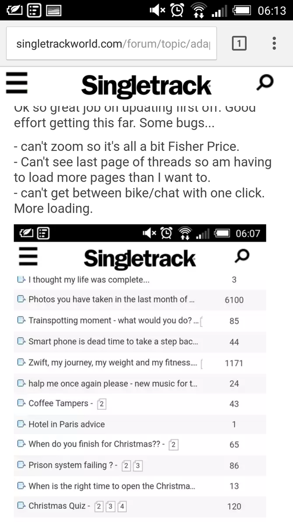
PookFull MemberPosted 7 years agoOk so great job on updating first off. Good effort getting this far. Some bugs…
– can’t zoom so it’s all a bit Fisher Price.
– Can’t see last page of threads so am having to load more pages than I want to.
– can’t get between bike/chat with one click. More loading.PookFull MemberPosted 7 years agoThen it displays like this… I find myself backing away from the phone to try to make it comfortable to look at.
Chrome on android
kayak23Full MemberPosted 7 years agoI’ve gotten in the habit of writing a full stop before I long press and paste now to get rid of the disappearing bracket ting. Easier to find than a square bracket on my Android.
Thought it was only me who it happened to. 🙂mikejdFull MemberPosted 7 years agoThe whole thing keeps flashing, posts disappear then reappear, the CRC adverts throughout the page are f***ing awful. I’m out.
cpFull MemberPosted 7 years agoAnother thought, the main menu navigation on mobile is in the furthest corner away for 90% of the population.
It’s not a nice user experience to shimmy the phone to get to the main menu.
CougarFull MemberPosted 7 years agothe CRC adverts throughout the page
Why are you getting adverts as a [P] member? Have you not switched them off in your account settings?
g5604Free MemberPosted 7 years agoAll the stw Dev should take from 99% of “complaints” is some people can’t handle change
TwodogsFull MemberPosted 7 years agoWell I’ve only had a quick look but it seems good on my android phone, but on Android tablet there’s a lot of white space and I can’t zoom….I hate not being able to zoom as my eyesight gets worse and worse. (Opera browser)
zippykonaFull MemberPosted 7 years agoI can handle good change but not being able to zoom on my ipad mini is a pain in the arse.
My android is OK but I preferred the old forum. On my mac book I think I prefer the new one.nickjbFree MemberPosted 7 years agoAll the stw Dev should take from 99% of “complaints” is some people can’t handle change
I hope they are more professional than that. The site looks pretty shonky with the random font sizes and some things are now much harder to do due to layout changes and text cropping. All fixable I’m sure but not if it’s ignored
leffeboyFull MemberPosted 7 years agoIdea- currently when shortening the urls for mobile you remove all of the page links if there is more than one page. How about leaving us the last page link only so we can go to the start of the thread by clicking on the thread title and the end of the thread by clicking on the last page link


The topic ‘Adaptive STW’ is closed to new replies.