
MegaSack DRAW - This year's winner is user - rgwb
We will be in touch
I quite like it, but looking at it critically, what could have been done to take a better one?
[url= http://farm7.static.flickr.com/6061/6092242057_e80ae1535e.jp g" target="_blank">
Ta
I like it. Just as it is, but i'm no photographer or artist of any stripe, i just like good pics 🙂
waited for a sunny day when the sun set behind the yacht 😉
personally, I'd have had the sea/sky line either lower or higher - it's too central.
maybe a slightly lower camera angle?
The only thing I'd have done differently differently is shift the horizon so it doesn't cut the image in half.
In this case, I reckon the beach is more interesting than the sky, so I'd have included proportionately les sky, therefore shifting the figure up...
+1 for camo16, I also think it doesn't need the boat. A lone figure looking out to sea rather than a lone figure looking at a distant boat.
Nice pic though
At the moment it's quite stark/empty which may well be what you like about it - you could crop it tighter around the figure and the boat to fill the frame more, but that could also change the mood of it. The boat & figure would then occupy more conventional 1/3s positions as well.
It works quite well as it is, but there are a few niggles.
The sky is maybe just a bit overexposed, more detail might've been nice.
The boat is very central, and there's a lot of "dead space". Maybe framing it to the rule of thirds would leave it better balanced.
A crop
[url= http://farm7.static.flickr.com/6187/6096183230_4c3154af27.jp g" target="_blank">
I'd have had the boat a little more to the right. but really, that's a small issue, I think it's a pretty good shot.
Perhaps some lions too.
You need a bit of "asymmetrical balance" - to achieve it, disparate things (including negative space - it all counts) need to be balanced vertically and horizontally. Your horizon is at the vertical midpoint and the boat at the horizontal midpoint, which is symmetrically balanced (it's the asymmetry that normally adds the interest) and the weightier subject is in the lower left quadrant, throwing the balance way off.
If you crop to roughly 3/4 of the width and height, taking away from the top and right of the frame, you'll have better asymmetrical balance.
There's no righteous rule of asymmetrical balance that you have to adhere to, but it's a principle which does play a part in building a pleasing image.
Have a look into golden ratio layout stuff
This is the first hit on google:
[url= http://photoinf.com/Golden_Mean/Eugene_Ilchenko/GoldenSection.html ]http://photoinf.com/Golden_Mean/Eugene_Ilchenko/GoldenSection.html[/url]
for the record, I like it 🙂
Dave
I'd have dropped the camera angle to to much lower almost at the height of the sand. Also the sky needs to look more dramatic with a few tweaks. Agreed about the boat too maybe be better without that.
I'd have dropped the camera angle to to much lower almost at the height of the sand. Also the sky needs to look more dramatic with a few tweaks. Agreed about the boat too maybe be better without that.
Nice. Moody colours. Ambiguous silhouette. Lead in lines in the sand. You can see what they are looking at. All good.
Generally I wouldn't normally go for cutting a scene in half like that, with the horizon on the centre line or placing the boat dead center - but it does sorta work for this shot because the symmetry emphasises the nice two tone effect.
Only thing I'd say is that the sky lacks a bit of detail at the top so I kind of lose interest as my eye scans up the picture. Try running a gradient filter over the top bit and see if you can get a little more cloud detail out.
[url= http://farm7.static.flickr.com/6181/6095646691_0032a2018d.jp g" target="_blank">
I need to have a play with the sky I think.
Interesting point about the camera height. Works as it is for me but it'd work at various heights I think. The one picky thing that bothers me now I look again is that the most prominent wave cuts right through the plane of the figure's eyes. And since the story in the picture is their view of the scene, I think that detracts.
Having their eye line in some quieter space, either between the waves and horizon or above the horizon, would work better IMO.
It's not a bad picture though. But you did ask 🙂
Agrees with [i]Try running a gradient filter over the top bit and see if you can get a little more cloud detail out.[/i] get some more contrast into the cloud - it looks a little flat.
Contrast, mmmm
[img]  [/img]
The one picky thing that bothers me now I look again is that the most prominent wave cuts right through the plane of the figure's eyes
Bugger - that's all I can see now, when I look at it 😳
Thanks for all the comments though, its a good exercise to go through.
Change the horizon, rule of thirds, my friend, rule of thirds.
Good pic.
I'd have done as Drac suggest above & shot really low down. Depends on how much more interest there is in the sky though, as you'd have relied on that to give a bit more interest. If it was just grey mush higher up, then it might not have worked.
With regards to tinkering with it after the event, I'd perhaps try a narrow, but long crop.
I'd also whack the contrast up a smidge. But that's all just personal taste stuff.
I think that second shot's a bit tight horizontally. Remember the story's about the space out there on the horizon as much as the boat itself, so you need plenty of negative space.
It's literally a balancing act - even with a structurally simple image like this the balance changes in all sorts of ways as you include/exclude areas. It's a case of playing with it to see when it just feels right. Find what's important in the picture (even if it's negative space) - that's what carries weight - balance that up; but all the time remember the clouds and the lines in the sand and the gradients and the waves all have a minor effect on that.
Have to say, I like this crop far less:
[img] 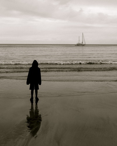 [/img]
It follows "the rules", but looks a bit too conventional to me.
The original was a non-standard composition, but it had a strong structure to it. In this crop you've lost those nice lead-in lines in the sand that were pointing directly at the boat.
GrahamS, I agree. The rule of thirds can produce some very lazy compositions.
Rule of thirds, with 2/3 being sky, plus some sexy filtering to bring out the cloud detail. That sky needs to look more brooding.
And I don't think it would work nearly half as well if it had been taken on a sunny day.
Rule of thirds is a starting point, but IMHO it's over-adhered to. To me it's just a commonly-used reference point of asymmetrical balance, it shouldn't even be a rule in and of itself. People work to that rule thinking that it's only the one or two focal points that affect the balance and structure of the picture, and that's not true. I think - again, IMHO - it's easy to get hung up on that and forget (both when shooting and when cropping) not only that everything else in the frame contributes to the picture visually and narratively, but that it also provides the foundations for the weight of the focal points to hang on, and affects the basic graphic balance as a whole.
"[i]In this crop you've lost those nice lead-in lines in the sand that were pointing directly at the boat.[/i]"
Spot on - the beauty of the original was the whitespace, that sense of boundlessness of looking out to sea. (The subtle lines did as much to draw in more space from outside the frame as they did to direct the eye towards the boat.) That crop loses that - IMO you'd be best to crop the minimum required from the top/right to restore the balance.
It follows "the rules", but looks a bit too conventional to me.
I'd disagree because for me my eye is drawn to the horizon, and that is smack in the middle.
One thing that can be good to try (as per [url= http://www.amazon.com/Photographers-Eye-Composition-Design-Digital/dp/0240809343 ]Michael Freeman[/url]) is to try marking up the structure of the image.
To [u]me[/u] I read your original:
[img] 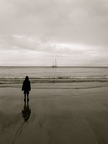 [/img]
Like this:
[img]  [/img]
Fairly strong overall structure, stuff going on at the bottom, not much going on up top.
(Incidentally, my own photos are rubbish so feel free to ignore my advice)
GrahamS - that marked-up image clearly shows why there needs to be contrast in the sky doesn't it?
It could do with a bike in it 😉
I think it could work better without the boat in it - make it look lonely and desolate - a single person staring blankly towards nothing.
I would Crop both top and bottom, boost contrast, sharpen, increase blacks to darken the picture, add graduated filter to the sky. Quick 2 minute shuffle does this.
Good pic though - has atmosphere which can be brought out with some post production.
[url= http://farm7.static.flickr.com/6202/6096250690_659f36a00f.jp g" target="_blank">
dazzlingboy's colour re-balance work for me!
🙂
Rules are there to be broken though. Same for example as using a grid layout, you can break the grid when you feel it is necessary.GrahamS, I agree. The rule of thirds can produce some very lazy compositions.
I think you should have asked the model to close their legs a little and fold their arms. They look somewhat uncomfortable (literally and in terms of the composition) and plonked in the image. As they are the emotional centre of the photograph, this discomfort colours the entire image (for me).
dazzlingboy's colour re-balance work for me!
And me
Time to fire up the [s]quattro[/s] Photoshop
I think you should have asked the model to close their legs a little and fold their arms. They look somewhat uncomfortable (literally and in terms of the composition) and plonked in the image. As they are the emotional centre of the photograph, this discomfort colours the entire image.
That's my son, that's how he stands, that's one of the reasons I like it. He didn't know I was taking the photo.
The pic would have been made for me if he'd have been holding a bazooka on his left shoulder, aimed right at the boat. 😀
I'd go for a taller crop myself and balance the shadow/highlights a bit(lighten up the foreground, darken the sky). nice image though.
[img]  [/img]
That's my son, that's how he stands, that's one of the reasons I like it. He didn't know I was taking the photo.
You understand the image differently because you took it; it has personal meaning. To other people, it's an exercise in subjectively projected response. Unless I'm told who the subject is in relation to to the photographer, it's irrelevant to me; it's a character in a scene. It's a great picture of your son, just not such a good one in terms of a general portrait. You see the difference?
This is, of course, only my opinion.
[IMG] 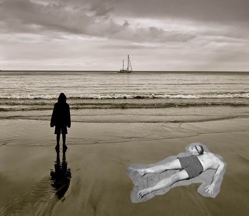 [/IMG]
[IMG] 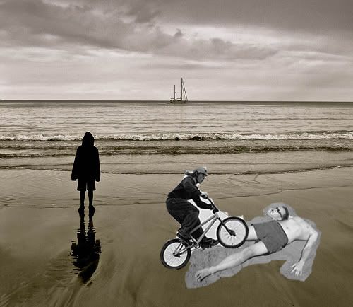 [/IMG]
that really wasn't worth the wait... 🙁
You understand the image differently because you took it; it has personal meaning. To other people, it's an exercise in subjectively projected response. Unless I'm told who the subject is in relation to to the photographer, it's irrelevant to me; it's a character in a scene. It's a great picture of your son, just not such a good one in terms of a general portrait. You see the difference?This is, of course, only my opinion.
Three Fish - you are right, sorry, I didn't mean to be antagonistic.
not enough?
[IMG] 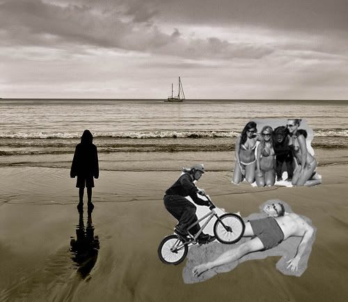 [/IMG]
gravitysucks, if you're going to go that far I believe a whale is obligatory.
seosamh77 has done pretty much what I was getting at, at the bottom of my first post.....that would have been my first attempt at a tinker with it.
mmm good point camo, although do you know whats better than a whale.....
[IMG] 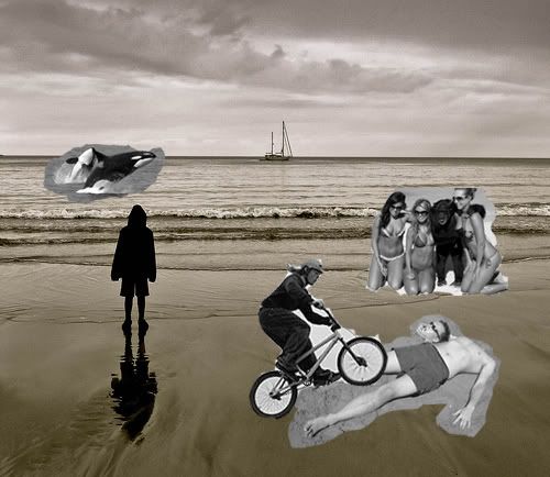 [/IMG]
[IMG]  [/IMG]
A killer whale! Genius.
When the student is ready, the master appears.
[IMG] 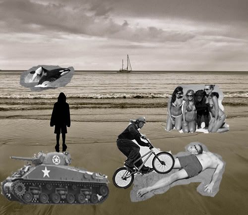 [/IMG]
gravitysucks, let's talk balance.
Aerial attack, methinks?
This post is not a post. It's a pseudo post. Ignore it. All it wants is attention.
I'm afraid this will be my last attempt, i'm afraid I went too far and may spoil it....
Aerial attack you say..
[IMG] 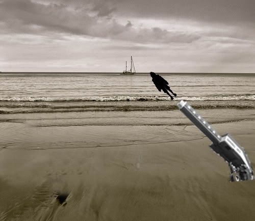 [/IMG]
I'm afraid this will be my last attempt, i'm afraid I went too far and may go to far and spoil it....Aerial attack you say..
😀
A very quick play - can't decide whether it is better with or without the boat....
[img]  [/img]
Probably would be better with a lower angle so the head bisects the horizon line and the viewer feels they are looking through the subject and at what the subject is looking at?
"[i]I think you should have asked the model to close their legs a little and fold their arms. They look somewhat uncomfortable (literally and in terms of the composition) and plonked in the image. As they are the emotional centre of the photograph, this discomfort colours the entire image (for me).[/i]"
As you said, your opinion.... but mine is the opposite. It's a natural pose, it's not uncomfortable-looking (I think folded arms would be, especially in near-silhouette from the rear), and it's also clearly - partly due to the pose - a child, which I think adds to the 'staring out into big space' theme.
.
it looks under exposed which leaves it very grainy
and the main focus is too dark agianst the background making it look like a flat cut out (very arty and atmosperic and all that) looks as if it has been drawn in. As for artistic merit of the composition, if you like it.
[img]  [/img]
I like the pic and the choice to convert to black and white works really well.
You could almost do with slightly worse weather which gives rise to rougher seas and angrier skies, but there's not a lot you could do about that! A shot like that also works well from a clifftop or rocky outcrop as it can also add a bit more forecround interest.
Using an ND grad would have helped bring out detail in the sky by balancing the exposure, but you can add it in most editing software. YOu could also have used a bit of fill flash to pick out a bit of detain in your son, but that depends on what you were going for with the silhouette. Experimenting with crops can also change how a picture feels too.
At the end of the day, photography is a personal thing and all that matters is that you enjoy your pictures, what the rest of us think is only our opinion in the end!
Anyone like my picture?
[img]  [/img]
You need a dog in the picture.....
[img]  ?zz=1[/img]
My effort fwiw...
[img]  [/img]
The first version of the picture you posted is my favourite. It is not because of the balance/positioning/light levels and all the other good stuff, just that it provoked thought. It made me think who, what, why etc. I didn't see it as a personal picture of a family member, more of the moment/scenario. Suppose it is all down to interpretation and what you want the picture for.
What's wrong with my pikture?
Your printer has run out of coloured ink, innit?
I love the original.. and I'd have shaved a bit off the right hand edge, like seosamh77. Perhaps wouldnt' have fiddled with the contrast as much. I love how bleak it looks, that's how things really are on a grey cold seaside day.
Good work OP. I like it because it's quirky like some kind of minimalist surrealism but it's a real picutre.
I think you could alter it for the better by cropping it, but otherwise as said before - a shame where the wave is breaking relative to your lad's position. If it was just above his head, that'd make it a nicer image IMO.
If you want a busy pictrure you just have to pick the right bit of water...
[IMG]  [/IMG]
(taken on phone so rubbish really)
[url= http://farm7.static.flickr.com/6067/6097799586_4864d9e46c_z.jp g" target="_blank">
[url= http://www.flickr.com/photos/stuartie_c/6097799586/ ]stuart's attempt[/url] by [url= http://www.flickr.com/people/stuartie_c/ ]geoffj[/url], on Flickr
Bit crude. New layer for the sky, adjust the levels and tweak hue and saturation = lots of noise...