Yep, entirely appropriate:
[img]  [/img]
Durr!
But we still know what it is for
That's only through previous knowledge though.
Who's this and what do they do?
[img]
 [/img]
Graham - is there something wrong with that? Am I supposed to know that is comic sans ( I am guessing) and is supposed to mean its not serious? all I see is a nice clear typeface
I really think you guys grossly overestimate the importance of this stuff and grossly overestimate how many people see it as you do.
Or you under-estimate how effective it is TJ...
[img]  [/img]
stumpy - but if the logo was simply the name of the company then you would know 100% of the names. So having fancy logos reduces recognition
That made me chortle and he has a very good point - in relation to 85% recognition of a logo
Beyond that I cant be bothered with this. I dont really see why companies spend so much money on this tbh.
It's not called Comic for nothing
I wish people would stop this assumption that companies spend ££££££££££££s on a logo. They don't - they spend it on a brand. The logo is just a component part of the brand.
Redux.
[img]  [/img]
I really think you guys grossly overestimate the importance of this stuff and grossly overestimate how many people see it as you do
You've already admitted it means nothing to you. So you can't really talk about its effectiveness, can you? There's a whole threadful of people telling you about the subtleties of branding and you're telling us we're all wrong or deluded.
Ask me to evaluate a poem in Mandarin, and I won't tell you it's meaningless. I'll tell you I can't say either way because I don't speak Mandarin...
Graham - is there something wrong with that? Am I supposed to know that is comic sans ( I am guessing) and is supposed to mean its not serious?
Yep. Humans find that choice of font very wrong for that letter as its bouncy handwritten-style implies levity, which obviously doesn't fit the subject.
Surely even on your planet that would be a little incongruous?
[img]  [/img]
Targeted at women in order to get them to associate the drink with a slim 'fit' body with an 'ideally' proportioned waist and chest.
Ho Tikh bo cho teng
Ho kianh bo cho peng
GrahamSYep. Humans find that choice of font very wrong for that letter as its bouncy handwritten-style implies levity, which obviously doesn't fit the subject.
To some people who understand this hidden language / subliminal meaning. To many of us we are completely oblivious of this
Ask me to evaluate a poem in Mandarin, and I won't tell you it's meaningless. I'll tell you I can't say either way because I don't speak Mandarin.
Thats my point FFS - this "language" you guys can all see is simply not there for many of us so like your mandarin poem it is meaningless to us. We don't speak advertising / media / graphic design / marketing so do not get these "hidden" meanings
TJ you say this
I see a fancy font and I think - "winker"
so if you saw a nice clear font do you not have a preference for that?
so you do express preferences. for simple, no nonsense, clear branding.?
Dear god! That's all i have to say on the matter
Jamie, I doff my hat to you.
😆
some peiople who understand this hidden language / subliminal meaning. to many of us wea re completely oblivious of this
No you're not!
You're comment on seeing Comic Sans, apparently for the first time ever, was [i]"supposed to mean its not serious?"[/i] - you immediately picked up that it wasn't a [i]"serious"[/i] font.
We don't speak advertising / media / graphic design / marketing so do not get these "hidden" meanings
I don't speak any of that. I'm a programming geek with Aspergers-like tendencies and I still see that mysterious hidden meaning - mainly because most of it is neither hidden nor mysterious.
Thom - I have a wish for clear fonts that I can read
Graham - I pulled that from the context. Not from the look of the font. All i saw was a clear font that was easy to read
They will offer a full service, including providing pall-bearers.
[img]  [/img]
Anything other than Helvetica is needless and wanton, flowery extravagance IMHO
You're comment on seeing Comic Sans, apparently for the first time ever, was "supposed to mean its not serious?" - you immediately picked up that it wasn't a "serious" font.
8)
this "language" you guys can all see is simply not there for many of us
Yep, but you are in the minority. Trust us when we tell you it's not a 'hidden meaning', it's a subconscious association. That's a significant difference.
Isn't there an online autistic spectrum test somewhere?
Its the emperors new clothes guys - this stuff is far less important than you think.
this stuff is far less important than you think
How dare you.
TJ, I think you ought to get in touch with the bigwigs at coke, pepsi, google, facebook, bbc, redbull, and all those other wasteful institutions, and quick mind, before anyone off here steals your insight.
I'm sure they'd be happy to renumerate you handsomely for your information that their money spent on visual/branding identity has been wasted. you could get, i dunno, perhaps 20% of their annual budget savings? 😆
This is a superb debate and it is really opening my eyes to how pointless branding is...
...sorry everyone, I couldn't find a sarcastic font
There is no intrinsic meaning in one font over another. Non at all.
There quite clearly is to me and I'm not in any way a "graphical" person.I wouldn't use a solicitor, accountant or funeral director whose logo was in Comic Sans - would you?
Comics Sans aka School Teachers Font....
this stuff is far less important than you think
So you keep saying but name me a brand that is successful despite not spending any money on branding.
Helvetica
funny pun from Hilter Hipster..
[img]  [/img]
[img] [/img]
/p>
I would say they were an environmentally aware printing firm (and no I don't recall ever seeing this logo before)
Next?
So you keep saying but name me a brand that is successful despite not spending any money on branding.
yeah, mee too
I would say they were an environmentally aware printing firm (and no I don't recall ever seeing this logo
I would have said it was water and gas utility trying to portrait a greener image?
Well, the leaf is certainly about ecology and the other images look like water and heat.
So it looks like a firm which recycles old kettles
I would have said it was water and gas utility trying to portrait a greener image?
From the two takers, one was wrong and one was questioning, so logo without background info means nothing, just like the London 2012 logo. The rest I assume didn't have the cojones to guess. 😈
[url= http://www.iberdrola.es/webibd/corporativa/iberdrola?IDPAG=ESWEBINICIO ]Electricity.[/url]
So just so we're clear TJ.
If you had been systematically framed for a murder that you didn't commit and (unable to escape to the Los Angeles underground) you had to find a law firm to defend you against some very damning evidence, then you'd be happy to go with any of these firms:
[img]  [/img]
[img]  [/img]
[img] 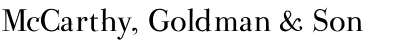 [/img]
[img]  [/img]
[img]  [/img]
All quite readable fonts, so they all must look like equally competent, serious law firms to you?
Really??
(Credit: fonts from [url= http://www.dafont.com/ ]dafont.com[/url])
Jamie - MemberEdit: Damn....waaaaay too slow.
From understanding the logo?
From previous knowledge/exposure?
From Google?
Why do I now have the desire to buy stuff? This is strange.
The rest I assume didn't have the cojones to guess
I didn't say anything as I had no idea what it was (apart from reminding me of something I once saw in the 1980s).
so logo without background info means nothing, just like the London 2012 logo.
well, yes, the argument has been made that the logo is part of the branding. Now that the olympic logo is well established, it can be used as a visual shorthand, as everyone know what it represents
Course, if we start not falling for all this shit, half of STW immediately become redundant...
No wonder they are all so desperate to make you understand how important it all is.
Oh and i didn't really think that the logo was for a kettle recycling firm.
Graham 3 readable, bottom two winky.
So this all supports Tandem. 😈 In that any typeface that is read without previous knowledge means nothing, and without this previous knowledge even Tandem can recognise a comic script as being comic. 😕
Conclusion, Tandem is trolling.
CharlieMungus - MemberOh and i didn't really think that the logo was for a kettle recycling firm.
Bless you, sweety pie. I thought you were being serious. MUAK!
In that any typeface that is read without previous knowledge means nothing, and without this previous knowledge even Tandem can recognise a comic script as being comic.
and some fonts tell him that the firm is winky
and some fonts tell him that the firm is winky
But he doesn't know why...
Graham 3 readable, bottom two winky.
well the very fact you've already dimissed some rather proves my point, but okay if it's just about readability then the top 3 are all pretty readable.
Of those I'd say number 3 is probably the most tricky as it has lots of silly extra bits on the letters:
[img] [/img]
So presumably you'd go for:
[img] [/img]
or
[img] [/img]
?
Conclusion, Tandem is trolling.
no, I'm sure it was a joke and we were all taken
No, no, no, definitely trolling, I'm sure, nobody could write that and believe it.
[img]  [/img]
Charlie - no the point you simply fail to get is fonts come in two types - readable and not.
I would happily use services of people using readable fonts, anyone using stupid unreadable fonts I would not. Thats the only criteria I judge a font on.
So the top 3 are fine - the bottom 2 are not.
tehre are a few folk daring to contribute on here that understand and agree with me - ta chaps
crikey - MemberCourse, if we start not falling for all this shit, half of STW immediately become redundant...
No wonder they are all so desperate to make you understand how important it all is.
Well the knife with your DNA on the handle is in the third drawer down, the "witnesses" are already giving statements and the severed head is in your Camelbak.
Good luck at the trial 😀
I'd choose the one with the best track record, not the one who spent the most on branding/marketing. The best way to describe the whole phenomenon is 'the emperors new clothes'.
You are assuming, from a position of arrogance, that the firm with the best logo is the best firm. People with actual life experience and a modicum of intelligence, like my granny, would tell you that you should not judge a book by its cover.
It's a house of cards, its a confidence trick, its all style and no substance, in the words of Mike Harding, Fur coat and no knickers.
[img][url= http://farm7.static.flickr.com/6137/5955024872_24be322b22_s.jp g" target="_blank">
I`m bored.
freehundred
man this must be one of the fastest growing threads on here ever.( sorry i have absolutely no valid comment to add to the discussion/keep going everyone 😉
Charlie - no the point you simply fail to get is fonts come in two types - readable and not.
Ok, sorry, I misunderstood. i had assumed you were able to read all 5 fonts.
( sorry i have absolutely no valid comment to add to the discussion/keep going everyone)
Don't worry, you'll fit right in.
Surprised no one in this argument has mentioned the 5-10 logo. Is it a 5 or a 10 or both?!
[img]  [/img]
oh aye,never noticed that before.
Surprised no one in this argument has mentioned the 5-10 logo. Is it a 5 or a 10 or both?!
Probably because it's the brand of the brave (in the real world), and has links to cycling (whatever that is 🙄 ).
You are assuming, from a position of arrogance, that the firm with the best logo is the best firm.
Nope. I'm assuming that a firm that thinks a comic font is suitable for a law firm doesn't take it very seriously and doesn't understand the effects that image can have on judges and jurors. Without any other information I'd say the first two firms are likely to show up in court wearing jeans and t-shirts with the case notes in a Postman Pat lunchbox.
You are assuming, from a position of arrogance, that the firm with the best logo is the best firm.
No. We're assuming, from paying attention to the world around us, that the most successful companies take branding seriously, and that there is a valid reason for this.
[i]Emperors new clothes[/i] is being overused on this thread. The problem is those arguing against the effectiveness of branding are doing it from a position of ignorance. And the problem with pointing that out is that it'll just get me called arrogant.
The branding industry isn't knocking on the doors of big business, convincing them to buy snake oil. Big business realised all on its own that a striking, recognisable brand was a valuable asset, and an industry then developed around providing that service. Just as industries develop around providing any service, from window cleaning to beef burgers.
A brand, to put it simply, is the much like the clothes a company/organisation wears.
You can go to an interview in a suit, or you can go to an interview in a shell suit. One is appropriate, one isn't. They may well both be practical, they both hide your modesty and provide shelter, but they both say something about you. Very different things. The practicalities behind the clothing, the skills you might have will be tainted when you dress inappropriately, and can be fortified if you dress appropriately. You could be the most perfect potential employee in the world, but you're not going to get the job if you can't convince anyone of that fact.
A branding specialist helps you dress your organisation appropriately. For better or worse, we live in a world where the visual is very important.
There's more to a brand than simply the aesthetic, much more. But for the purposes of this thread I'll leave it there.
I feel like I should quote this again:
You are assuming, from a position of arrogance, that the firm with the best logo is the best firm.
The real proof of the power of branding is actually that that's definitely not the case. Nobody says the better branded company is [i]better at its job[/i] than the rest. It'll just likely be the most [i]successful[/i] one. Which is, I admit, quite depressing.
Like I said earlier, find a successful brand that doesn't have a developed and considered brand. You have five minutes. There's some right crap out there on the market that people buy because it's been branded well, and likewise they'll no doubt be countless really good products that fail to sell because they're branded badly.
Detractors of branding rarely realise how much they're influenced by it. Rarely do they actually fully understand what branding is. They might not directly make purchases based on branding, they might not be directly affected by it. But the world around them certainly is. And in a world where big business is unfortunately king, and the pound in our pocket we spend every day is of far greater democratic value than the vote we get to cast every half a decade, branding plays a huge part in the lives of all who inhabit it.
Case study. A modern day mid-range Mercedes is no better, in the real world, in any way that matters, than a similarly specced Ford Mondeo. Yet people happily pay a premium for that three pointed star on the nose. That's branding. That brand speaks to people, and it extracts money from their pocket. Whether good or bad (and I happen to think it sucks, to be honest) it is what it is. It happens every day, day in day out. Our society is built on such things.
Pointing that out isn't arrogant. I don't feel superior for knowing about branding, or saying it. It's what I do for a living, yes, so I feel I should try to explain, to those who are doubting it, what I categorically know to be true.
However I don't feel the need to justify it. I've never had to sell my services. People come to me for help, and they go away happy. If it was snake oil sales I couldn't make a living out of it, as I'm a crap bullshitter.
the kerning is piss-poor on all the examples.
TJ is visually unaware. (only skim read the thread but it's a given)
jackthe dog - we are not arguing from ignorance - we are arguing from a different perspective - one you cannot admit to as to do so devalues your entire trade. Once agiain yoiu confuse the attruibutes of siomething with its branding. To many folk it sells on its attributes not on its branding
Of course marketing brings products to the attention of the masses and clever advertising can assiciate your product with sertain attributes in they eyes of the gullible.
However you need to accept that for many of us we see straight thru it.
Also the toss over fonts and stuff - thats what it is. fonts have no inherent meaning, logos only need to be recognisable from a distance and tell yo uclearly who0 the company is. One of the best ever is [img]  [/img]
red triangle to be recognisable from a distance or for the illiterate. name of product.thats all a logo needs, thats all it can do
Apart from say - here is a winky company that thinks style over substance
the kerning is piss-poor on all the examples.
Yeah that's because I just used the preview function on dafont which doesn't do any kerning, but the fonts make my point adequately themselves I think. (except to TJ obviously).
However you need to accept that for many of us we see straight thru it.
Hold on a minute, so now you say you can see it, but see straight through it? Whereas previously you just didn't see it?
I think you still need to identify a successful company which didn't pay attention to branding.
red triangle to be recognisable from a distance or for the illiterate. name of product.thats all a logo needs, thats all it can do
Yeah, but why such a winky font?
one you cannot admit to as to do so devalues your entire trade. Once agiain yoiu confuse the attruibutes of siomething with its branding.
No, I don't. I've done [i]exactly[/i] the opposite.
Did you read my post?
how would you market TJ to the masses?
Once agiain yoiu confuse the attruibutes of siomething with its branding. To many folk it sells on its attributes not on its branding (sic)
Why does Coca Cola outsell Pepsi, when Pepsi always wins the blind tests then? (sorry, forgot, you're [s]sticking your fingers in your ears and going lalalalala[/s] ignoring me, aren't you?)
MrSmith - Member
how would you market TJ to the masses?
Deserves a new thread.
To many folk it sells on its attributes not on its branding
I genuinely think you'd be horrified at how small a minority of people in our western, consumerist culture actually buy based purely on the attributes of the product.
If more people did, we wouldn't live in the consumer driven world we do.
Oooh! Oooh! I know this one. Pepsi is sweeter than Coca Cola, so in a small volume sample it's preferred, but in a normal serving it's too much and people prefer Coke. I read about it in a marketing book* 🙂Why does Coca Cola outsell Pepsi, when Pepsi always wins the blind tests then?
*Therefore likely to be total bobbins.
*Therefore likely to be total bobbins.
Depends on the marketing book you read and whether you believe it without thinking, or whether there is a link between advertising and marketing budgets and sales irrespective of the quality of the product.