
MegaSack DRAW - This year's winner is user - rgwb
We will be in touch
...for a letter of application?
I guess Comic Sans is a no go 🙂 , it's currently in default Times New Roman but that looks a bit old hat, it's been 8 and a half years since I last applied for a job and I really want this one.
Arial 12pt is what I use.
Cheers sands, that's what I use at work.
[url= https://designschool.canva.com/blog/resume-fonts/ ]https://designschool.canva.com/blog/resume-fonts/[/url]
Depends what the job is. Comic Sans could be ok if you're applying for a job in a nursery. Papyrus in a yoghurt-weaving mung-bean bothering health food shop etc. Helvetica for creative industries etc etc...
I'd have said Cambria or Georgia, so I'm quite pleased to see them both on the list linked to by jambourgie. Not sure I'd go for a san-serif font but they have some nice examples on the list.
Nice find. Hopefully will never need to make another CV but bookmarked anyway.
jambourgie – Member
^^^ Good link
LOL at Arial being #3 of ‘The Worst Resume Fonts’
Gill Sans MT for me.
Like Arial but a bit more stylish.
Its for a secondary school teaching job, from one school to another, I'll have a look at jam's link.
stick with the classics, helvetica, go with light.
OK, I've ditched Arial and gone for Cambria.
NEXT QUESTION:
Block paragraphing or just left justified?
Usually I'm very decisive. Honestly.
What's the difference?
Arial is perfectly suitable if you are applying for a technical/engineering/operations type job.
Most places tend to use it as their "house" font.
Besides, the only reason is was #3 worse on that link is because it's common. It's common because it's clear and easy to read.
Block paragraphing or just left justified?
By block I assume you mean "fully justified"?
I always used full but was recently told that left is "better". Play around until you are happy with the look.
Personally I always use narrow margins, I think the standard margins are too wide on Word. JMO. 🙂
So subjective. Cambria's nice but a bit textbook-y to my eyes.
I like internet-specifc fonts like Corbel. So easy to read...
[img] 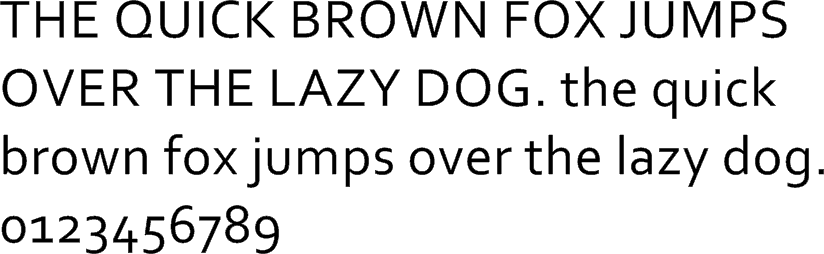 [/img]
Dunno what you mean by block paras? Not centred I hope? Always justify left IMO.
Arial 12 is MASSIVE though - I think 11 would be better.
I'm a fan of calibri, myself.
Just mention you can teach Physics/Maths as a second subject, and any old font will do 🙂
I did my CV in Calibri, got the job 🙂
Calibri used to be my favourite, then I forgot what it was called.
😳
Might give it a whirl again sometime.
vickypea - Member
I did my CV in Calibri, got the job
I did mine in Wingdings, still waiting to hear back...
Surely Wingdings is only for applications to GCHQ??
Rachel
Great link Jambourgie!
For years I stuck with Tahoma thinking that it made me look 'modern' and 'forward thinking', but I'd definitely just bang it out in Calibri or Arial now. Whichever way I am loath to use anything with serifs, maybe because I'm dyslexic and they make the page look even more impenetrable, or maybe it's because they are to fonts what plastic doric columns and stone effect rendering are to 1930s suburban housing lol
Applying for a position in the A-Team?
Choose 'Stencil'...
[img]  [/img]
Arial is a modified licence-free version of Helvetica. There's always Univers, but that's not as nice to look at as Helvetica, in my opinion anyway. Garamond is a bit of a classic, I'd tend to go for a serif face myself, but there's a lot of well-designed sans fonts around.
Gone are the days when you would just have a quick scan through the Letraset catalogue...
As with most things in life, helvetica, helvetica or helvetica. This is the ultimate compliment it is possible for one human being to pay to another....
[img]  [/img]
And never EVER justify type. It's horrible! A crime against typography! And just lazy!
Arial isn't a version of helvetica. fair bit different.CountZero - Member
Arial is a modified licence-free version of Helvetica.
Arial is most definitely not helvetica
Nearly always use Arial. 10 or 11 point.
Occasionally drift into Tahoma or Verdana for a while...
Arial is a bit boring!
Another Calibri (Light) user here.
10 point.
Left justified. Not fully justified - which is what I think you mean by 'block'. Fully justified works for magazine & newspaper columns but creates odd line breaks in longer documents.
As long as your application letter is legible, has a font size of at least 10pt, has kerned line spacing or 1.5 line spacing, hits all the right notes, has no typos or egregious grammar errors, and is not in Comic Sans or some other 'novelty' font it'll be OK.
Sans serif will give it a more modern look. Favoured fonts in a recent 'let's talk about CVs' session I was in were Verdana, Tahoma, and Helvetica.
Few people like serif fonts. And sadly, Times New Roman was judged 'old school' and worthy of instant rejection. No one raised the idea of Courier 🙂
Arial is fine. Many organisations use it as their internal standard so it's familiar. If you think you need to change font to make your CV or application letter better then you've pretty much accepted you're not getting the job.
kerned line spacing
Is there such a thing?
Also, this game is remarkably soothing. 84/100 on my first attempt, got a zero for one of them which dragged the average down.
88/100
In your face flaperon! 😛
Good fun that.
[s]You want to make the right kind of

That isn't it.[/s]
Ah. Just looked at link.
94/100
In yer face jambourgie! 😀
Just don't send the CV as a Word document to a recruitment agency. It'll be modified to hell and end up a different font anyway. Then if you get the interview you end up confused being asked questions about stuff you've never done but is listed on the CV by the agency.
Convert to PDF (they could still mess with it, but it discourages them). And always take your own copy of the CV to the interview.
Anyway, Calibri is nice in emails as it's a bit compact and doesn't come across as in your face. On a CV, Helvetica is cleaner and a little larger so encourages you to stop waffling and keep it brief to fit it all in (if you hold to the two pages only rule, which I firmly do).
binners - Member
As with most things in life, helvetica, helvetica or helvetica.
I love Helvetica as much as the next guy, but only in the right context. It was everywhere in the noughties (comedown decade). It's the font that says "youth culture - sanitised and re-packaged for your safety"...
[img]  [/img]
[img]  [/img]
[img] ![]() ?itok=VArjs766[/img]
?itok=VArjs766[/img]
Basic Sans is my current favourite...
https://www.fontspring.com/fonts/latinotype/basic-sans
And if you like buying your fonts - Designcuts have some great deals from time to time...
https://www.designcuts.com/product/complete-font-lovers-library/
92/100. couple of erratic scores in there, considering it gave me 100/100 for most. Clearly I fundamentally disagree with the one that I got 72/100 for! 😆 (and lets no mentioned the 55! 😳 )
I'm an old fart
Times New Roman always and justified!!
Arial is a modified licence-free version of Helvetica.
No, it really isn't.
It was designed as a drop in replacement for Helvetica, but based on one of Monotype's own families... Google will tell us which one… I'm sure. It isn't a modified Helvetica or AG.
92-100
let down by [i]yvess[/i], whoever he is!