If someone says they want text in a document produced in the following ways;
Gotham Regular 11/13
Gotham Black 18/18
Gotham Regular 9/10pt
Gotham Light 6/7
What do the various bits mean.
I'm used to just being given the size required, the bit after the '/' is confusing, as is the 'Black' and 'Regular' stuff. It's not helped by them asking for stuff as just '18pt' in other places which is what I was expecting throughout.
Also, what does '80pt with -25 tracking' mean?
Ta.
The 'regular' or 'black' is the weight of your font.
With your numbers, they're your point size followed by the leading
Your tracking is how close you kern the letters in together. -25 means they'll be closer together than when you initially type them out
What are you putting it together in? Please don't say Word. Word is a very blunt instrument for handling type. If you do it in Illustrator or Indesign, you can enter all this information and set your type styles up acurately
9/11 means 9pt with 11pt line spacing (leading).
Tracking is to do with closing/opening up letter spacing.
Black and Light are font variants.
Being done for a custom report in MS SQL Server Reporting Services.
I'm beginning to think someone's trying to make it difficult on purpose...
!! "if I was going to get to there, I wouldn't start from here" springs to mind..
Sounds like they're assuming you'll be putting it together in more advanced software.
Giving someone detailed type specs using Microsoft software is like giving them a Ferrari and asking them to service it with a hammer
My cut of Gotham doesn't have a 'Regular'. in this case 'Book' can be used instead.
This is the Character panel from illustrator:
[img]  [/img]
A= Font name = Gotham
B= Font style = Regular/Black/Light/etc
C= Font size = 11pt in your first example
G= Leading (line-height) = 13pt in your first example
H= Tracking (letter-spacing) = -25 in your last example (I think this is measured in 1/1000 em)
Edit: Just seen your software - erm... scratches head...
one of the developers just said;
"It does sound like they think we have super software rather than microsoft software."
We'll see what we can do.
Thanks for info 🙂
wwaswas has just downloaded a crack of Photoshop, watched a couple of YouTube tutorials and is now setting up as a freelance graphic designer. 😉
Being done for a custom report in MS SQL Server Reporting Services.
In that case, mail them back and ask if Comic Sans will do.
There's a screensmart version of gotham too if it's for viewing online, reads much easier.
[url= http://www.typography.com/fonts/gotham/webfonts/gothamssm-book ]http://www.typography.com/fonts/gotham/webfonts/gothamssm-book[/url]
Do it in Courier New and tell them if they want to make it look pretty they can give it to Marketing.
So this is for a web service?
If so, throw it back at them and ask them for reasonable font sizes for legibility on screen - 6pt text on screen? Nooooooooooo.
6pt text on screen? Nooooooooooo.
In "Light" - that's obviously for the bits they don't want people to read 😀
My guess is these font guidelines are actually for something else and someone just copy/pasted.
My guess is these font guidelines are actually for something else and someone just copy/pasted.
Agreed.
In "Light" - that's obviously for the bits they don't want people to read
😀
In that case, mail them back and ask if Comic Sans will do.
😆
[img] 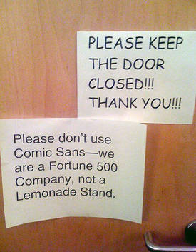 [/img]
you need to [url= http://dontpaniconline.com/magazine/arts/this-human-flesh-font-is-the-worst-thing-ever/1 ]flesh those fonts out[/url]!
This is really taking me back! I've still got a treasured clear plastic typescale that I've had for over thirty years, which has scales along the centre for checking the leading on printed text, and a 12pt scale along one edge, it was never used to cut with using a scalpel, the sorry fate of many plastic rules in the studio.
Gotham Regular 11/13
Gotham Black 18/18
Gotham Regular 9/10pt
Gotham Light 6/7
That would be referred to as 11 on 13, 18 solid, 9 on 10, and 6 on 7, back in the day. *sigh*, I really miss my old job. 😐
One word, CountZero:
"Copyfitting"
😀