
MegaSack DRAW - This year's winner is user - rgwb
We will be in touch
Are there any graphic designers in the house?
I need some advice on types of high res images to use for logos please.
Uh oh!
What's the question?
Will there be pie charts?
The advice is, don't use an image in a logo. Stick to vector graphics.
HTH
fire away. What do you need to know?
Oh... all logos should be vector based so resolution is not an issue
Fire away
Another one here Danny (Adam, we spoke yesterday on the phone...)
Lol - no pie charts
Basically I need to print some large banners with my company logo. The jpg's I have of it are pixelated when blown up. The person who designed them sent some supposedly higher res pdf and psd versions which are frankly no better and the image has a rough edge when increased in size.
What do I need to ask him for so he delivers the correct version? Someone mentioned vector images does that sound right?
Edit - hi Adam
Logos usually work better if secretaries design them in powerpoint using the rgb colour palette
Vector would be best as it's not resolution dependent, failing that ask for images at 300ppi and as big as possible. Ask for all fonts to be outlined.
[i]the image has a rough edge when increased in size.
[/i]
Tell him he needs to sharpen his crayon 😉
You need an .ai or a .eps file. If he's done a logo in photoshop, then he's a twonk
Tell your [i]designer[/i] how big and what res the banner will be printed at and get them to do the math(s).
You need an .ai or a .eps file. If he's done a logo in photoshop, then he's a twonk
binners as you well know anyone with a cracked copy of photoshop can do this stuff just as well as these so-called 'designers', for a fraction of the cost too! 🙂
For banner printing, you can get away with 100dpi at actual size, assuming he's created them in Photoshop or similar.
But, if he just bumps up the res, you'll still get stepped edges - you can't add detail just by adding more pixels.
As others have said, they would be best redrawn in Illustrator then they are infinitely re-sizable.
You're right Grum. I find the benchmark of a good logo design is a clumsily applied 'bevel and emboss' filter 😆
Most digital printing tends to use a 72 line screen, so you can get away with that as long as you're not enlarging the file and printing at 100%
You need an .ai or a .eps file
what, you're still using those, I thought Illustrator PDF's were the modern currency? 🙂
Send it to me. I can re do it in Word
you can increase the res but 10% or less at a time so it does it more smoothly, set up an action, but yep vector still the way to go.
With my limited knowledge: banners don't need to be mega high res as the viewing distance is usually quite large. You don't need anywhere near 300dpi.
People used to use a program called genuine fractals to blow things up, but I think latest versions of PS are pretty much as good. There are different algorithms within PS you can use to enlarge images, some will work better than others for what you want.
Making massive files like this might beast your computer.
Obviously best thing is for them to sort out a proper vector logo though.
http://singletrackworld.com/forum/topic/for-the-sensitive-designer-types
(since it got ignored at the time 🙂 )
Neninja.. ignore these guys, no offence, but they clearly don't know what they're talking about.
Have sorted it for ya. No charge for this, just pass on the favour
[img]  [/img]
needs rainbows and spokey dokeys. And a teddy bear.
You need an .ai or a .eps file. If he's done a logo in photoshop, then he's a twonk
Unless it is all in Smart Layers.
Rainbows don't print well on modern dot matrix printers. Plus they look like stripey sausages to colour blind people.
I'll consider the teddy bear for the next draft, point taken about the spokey dokeys.
This thread is missing Mrs Toast and rainbows
Unless it is all in Smart Layers.
... and given the information we have so far, what are the chances of that? I'm still going with my previous statement...
[i]
If he's done a logo in photoshop, then he's a twonk 😉
[/i]
Wheres Mrs toast? This thread is crying out for her contribution
If its not drawn in paint, its not professional
Do you work for a cat finding company?
In all seriousness, logos don't need to be all vector. Try telling .aol their logos are wrong:
[img] ![]() [/img]
[/img]
So I need a rainbow ai vector paint smart layer eps teddy bear image.
Thanks all - much clearer now
joey - will you pass over copyright for my new logo?
[pedant]Shirly the "logo" is th "Aol.". The other bits are just photos... [/pedant]
Try telling [b].aol[/b] their logos are wrong:
Oh the irony. 🙂
From the very article you got that image from...
[i]My snarky two cents: The long term problem here is the original name decision — America, On Line? Six syllables (which forced initials) plus a counterproductive meaning — the Web is inherently and joyously global, isn’t it? AOL should now have faced up to this fundamental identity problem, which has been compounded of late by a performance reputation problem, and fixed it with a name change.
“Instead, we have a design solution that diminishes, lower-cases, reverses and virtually hides the initials, as if apologizing for them. (It’s a visual equivalent of “if you have nothing to say, talk faster and louder.”)
“To be sure, mutable wordmarks (visual play, around consistent letterforms) can be fun. Certainly, MTV and Nickelodeon showed you can get away with it on television, and Google has shown it can work on the Web. But are these particular “Aol.” letterforms a strong-enough visual anchor? Not clearly. Verbally, they are still a hole in the hull.
“And are we now expected to write not AOL but Aol? (I refuse to add the period, in text.) And thus to speak it as a-awl, or a-owl? The punctuation of the logo introduces uncertainty of the name in text applications… which is not a good a way to build a stronger brand.”[/i]
When you posted those Aol logos I thought you were taking the piss. Just Googled it and they're actually serious?!!!! But its under the heading "AOL Rebranding Disaster". Looks like a 12 year old has done it in word 😯
The fish certainly doesn't find it funny
Just nick a logo off the website.
Sorted.
Aolol
As Binners implied [url= http://www.27bslash6.com/p2p2.html ]Pie Charts?[/url]
Yeah go on then, I hereby pass on ownership to you.
A little pro tip for you: if you've already got a half decent copy of the logo, then load it up on screen (needs to be full screen for best results), then place the monitor face down on a photocopier. Scan the screen, print out the results on a really big bit of paper. Place the photocopy on a flat surface, and take a photo with a high res camera, then copy that pic to the computer. The increase in pixels = an increase in resolution.
Ha, I'm not saying I approve of the Aol. logos, just using it as an example of a logo/branding system that isn't vector based. Yes, the text bit is obviously vector, but the images aren't, and without the images, the logo is nothing. It's all about the application innit
It may be about application, but that branding makes the London Olympic logo look like Nike! It's so bloody eart-shatteringly awful, it's staggering that anyone had the nerve to invoice them for it! My 8 year old could do better.
I think I'll stick with my original statement about designing logos in photoshop 😀
You really shouldn't need to tell him anything bar what you need it for, then he should be advising/supplying you the correct version.What do I need to ask him for so he delivers the correct version? Someone mentioned vector images does that sound right?
Post up the jpeg of the logo for a laugh, I'd like to know why he used photoshop instead of illy. I'd be wanting a specific reason for this or demanding he recreates the logo as vector. And supplies it as eps, ai or pdf.
I think I'll stick with my original statement about designing logos in photoshop
The clue's in the name - [b][i]PHOTO[/i][/b]shop...
Can we see the logo then? I'm intrigued now. It's got a photoshop 'bevel and emboss' filter on it, hasn't it? 😀
[img] 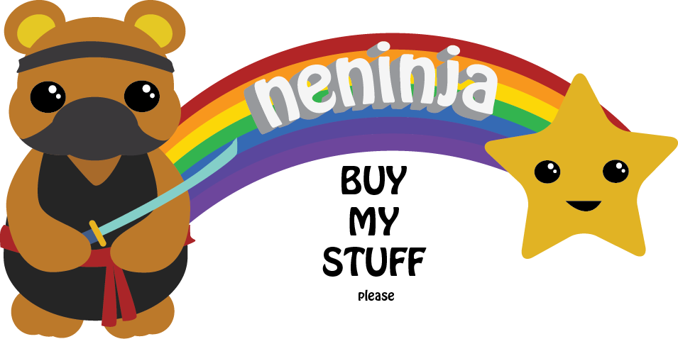 [/img]
No graphic design thread is complete without some Mrs Toast ACTION!
This may as well be closed down now.
The work of genius! 😀
The work of genius!
No beveling or embossing there. A proper logo that would look equally as good on the side of a building or a business card.
Word is all you need
binners - Member
You need an .ai or a .eps file. If he's done a logo in photoshop, then he's a twonk
Oh, so true. So very, very true.
I am really enjoying this thread, it takes me back to a previous life, one where, generally speaking, those who didn't have a clue left it to the experts.
Now, a quick browse of the magazine shelves in WHS, and everyone's a chuffing expert.
Which is partly why I'm no longer doing the job I really loved. 🙁