Forum menu
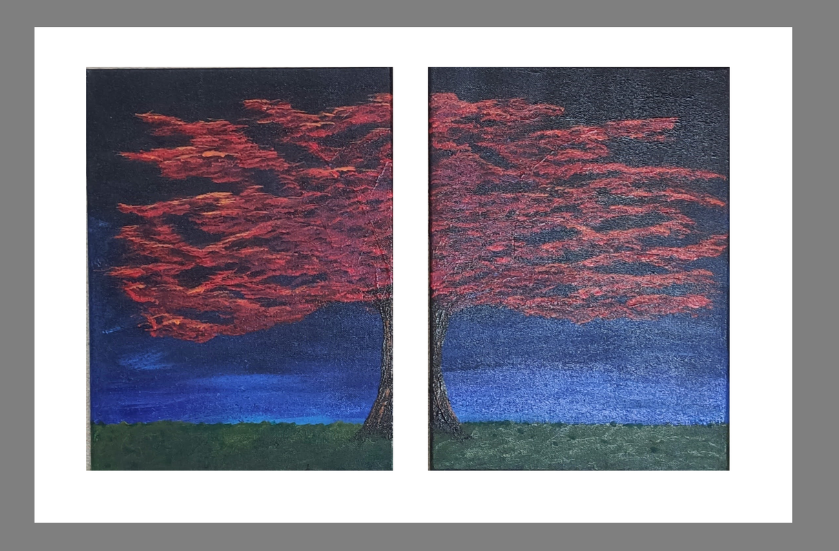
I am about to mount two shallow stretched canvas side by side on a mount board with a frame around the whole thing. The picture below should make it clearer. At the moment it shows the pictures against a plain white mount with a grey frame skilfully created using MS Paint.
Before I try to create the physical frame using an MDF board and shaped wooden frame I would like your thoughts on what colour the mount should be and the frame. The natural wood will be a light pine but obviously can be painted to any colour I want. It is being mounted on a white wall.
Thoughts Please.
Probably not want you want to hear (?) but I wouldn't fix canvas stretchers on mount board. Mounting board is for framing prints. I’d put the canvases individually in black or dark grey (or white) tray/floating frames and mount directly on the wall side-by-side.
ie two of these but stained dark/black (or white)

https://www.thesweetbeastblog.com/2018/06/25/how-to-make-your-own-canvas-float-frame/
I used a tray for a different picture and it looked good but for this the specific request is for both canvas in a single frame.
It gets quite specific. The two pictures side by side with a 1" gap between and a 2" gap around with a 2" frame surrounding that. That bit is nice ands specific but when it comes to colours she wants the pictures to stand out but subtly and not be garish.
Given that the pictures are quite dark I was thinking of a lighter, but not white, surround with a dark frame. I am interested in your thoughts now you have a better knowledge of the customer request.
The way you have it arranged the white frame is more eye-catching than the artwork itself. The vertical white band in the middle has become the focal point. I am not sure this is what you really want?
I would think again about the frame colours, and also consider mounting the two canvases off centre in the final arrangement. Also maybe decrease the space between them at the trunk.
It's your painting though so it's what you think that matters.
(I wrote that before your reply above)
I hang all my canvases unframed with the messy edges left unpainted and exposed.
I understand my aesthetic may not be for everyone.
Agree about the white being distracting which is why I say a pale colour, not white. A pale blue picks out the light bit of sky just above the grass on the left quite nicely and then a dark frame.
I think a thinner frame than 2" though
Colournoise - I do that too for some, use canvas board traditionally framed for others, trays for others. My main challenge is with choice of complementary and contrasting colours as p7eaven has noticed.
I am interested in your thoughts now you have a better knowledge of the customer request.
My thoughts at that point or more in the realm of a sympathetic glance and ‘good luck!’
request is for both canvas in a single frame.
Compromise? Wouldn’t be faffing around with mount board (unless sealed under glass) it stains, discolours, gets insect wee/poo on it etc. Why not instead spec a colour for the backboard of the tray frame? ie if I was in your position I’d be able to bend at most to fixing the stretchers in a doublewide tray frame.
Equidistant spacing (sides, bottom and centre) following the central gap between the two canvases? or museum-mount/museum-mat’ style ie bottom-weighted calculated by golden mean/ratio as a guide. (I sometimes double that for small prints/paintings - it’s subjective of course)
https://www.framedestination.com/blog/resources/bottom-weighting-and-the-golden-mean
Definitely wouldn't make the mount a light colour as a one inch gap in the middle makes it look like you're looking out of a window (unless that's the look they want?)
The mount board I was thinking of was a sheet of painted MDF so it would basically be what you are saying about the tray frame.
The sizing, spacing and gaps I will take your advice on equidistance. I don't think the bottom weighting would be necessary for the size of painting and the room it is displayed in. I understand that is more for larger pictures and where you look slightly up at them.
Funny you should mention the split making it look like the view out of a window, the tree is loosely based on an oak tree I see out of my office window with a pane devider right up the middle of the trunk.
Thanks all. I live to learn
^ apologies OP for some reason I thought you meant literal ‘mount board’ ie the card stuff used for mounts and apertures!