
MegaSack DRAW - This year's winner is user - rgwb
We will be in touch
When looking at this logo - what do you think it 'spells/says'?
[img] 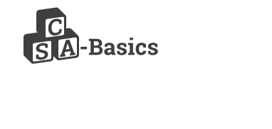 [/img]
i.e how do the blocks read to you?
(Try not to be influenced by the previous replies)
Ta muchly!
DrP
CSA - Basics....
CSA Basics
Yep, CSA - Basics for me too.
I suppose it could be read as SCA but yeah, I initially read it as CSA too.
CSA basics
but because I'm a bloke, I wanted to see 'SAC'
Yep read it as CSA too.
Is there a prize?
The prize is the eternal warmth and glowy feeling you (probably) get in the cockles of your heart, knowing you've helped a (fairly) decent human being help others...
Plus you'll all have a new carbon Di2 road bike waiting for you when you get back from work....
Cheers all!
DrP
CSA Basics...For Me.
Scab asics.
(Running shoes that make your feet bleed..?)
CSA basics
For fear of looking stupid, my immediate reading of it was SCA basics..............but that probably says more about me thatn the logo to be honest.
SCA Basics
CSA Basics
Is it supposed to look very childish?
^^
Yes, it is...like 'ABC' building blocks...
Might even add in a bit of primary colour too..
DrP
I'd read it as probably CSA Basics, but can't be sure, and find it really annoying that someone would make it deliberately ambiguous. They would still be kids building blocks if they were arranged in a line.
SCA-Basics was my first interpretation, with a possibility of CSA. Does that mean no carbon road bike for me? 🙁
I read it initially as SCA (reading left to right) )but then immediately thought it could be CSA (top to bottom, left to right).
It's the sort of logo that works when the letter sequence is obvious "ABC or XYZ child care" for instance but otherwise it's ambiguous. I would avoid it.
Is it Banana Carrot?
If you're designing it, how about carrying the building block theme through the word "Basics"? It just seems bolted on at the minute, and a readable word in the same format would help parse the first bit correctly.
Maybe.
the 'basics' doesn't follow the perspective line of the bricks and looks a bit bolted on.
MrsToast will be along to add some rainbows and teddy bears to brighten it up for you.
[img] 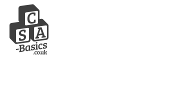 [/img]
[img] 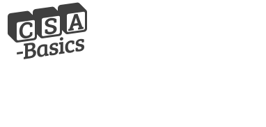 [/img]
The text under the stack makes it read top-bottom more naturally...
I really like the idea of the stack, as it's meant to be like building/ABC blocks...
The linear one does read easier, but isn't in to form I'd like...
DrP
CSA Basics here.
Reading down, and left to right, is what we Westerners do!
it's meant to be like building/ABC blocks...
In a line is less ambiguous but you could have each block at a different angles to make it seem more 'childish' (marginally corny though).
The text under the stack makes it read top-bottom more naturally...
It does, and if you're determined to go with the stack that seems like good compromise, although either ditch the .co.uk or pull it to the same angle as the rest.
Also I would vary the angle of them slightly rather than having them uniform. No more than 5 degrees but just enough to make them look stacked by a child's hand.
[edit] What sharkbait said.
CSA Basics for me, so I'll take the road bike in green please, size large.
I'd purge that hyphen from the logo. Looks weird, whether the Basics is on the side or down below.
Just a thought.
The hyphen is in the web address though....
(BTW - It's not me ''making these' - wood, metal, and flesh is more my preferred medium! I've got an arty mate on it!)
Will play about with angulating the blocks a bit, and trying red/yellow/green block styles...
Cheers for the input 🙂
DrP
Also I would vary the angle of them slightly rather than having them uniform. No more than 5 degrees but just enough to make them look stacked by a child's hand.
Neat idea, wonder how that would look with 'CSA' in a normal type font and 'basic' in blocks, angled slightly as mentioned above?
[edit] they all read CSA Basic to me btw.
Doesn't matter if the hyphen's in the web address unless you're dead set on using the logo as a definite illustration of your domain name.
I'd rather have CSA Basics as the logo, with 'www.csa-basics.co.uk' beneath somewhere, than have a web address logo... personal choice, but cleaner and nicer IMO - especially if it's for a junior audience.
child support agency was my 1st thought
I'd rather have CSA Basics as the logo, with 'www.csa-basics.co.uk' beneath somewhere, than have a web address logo... personal choice, but cleaner and nicer IMO - especially if it's for a junior audience.
This, definitely.
Top row of blocks, C S A
Bottom row of blocks, - B A S I C S
..especially if it's for a junior audience...
It's not.
It's for trainee doctors! But the concept is that the components being taught are at a fundamental/basic level (a lot of the audience struggle with English as it's not their first language)
A book on the market:
[img]  [/img]
has a similar approach...
DrP
I didn't know Canada had a Space Agency until this thread!
What kimbers said. And in my mind they have some baggage to sort out.
CSA Basics
I read it as CSA and a quick googling indicates that the commonest layout is to have the letter A as the top block, then B and C below, thusly
[img]  [/img]
TBH the blocks at the moment look like a dodgy logo for a painter & decorator. To make them look like kids building blocks then they need the letter on each side of the block as in SR image above
How about writing/drawing on a tablet screen?
edit: SR just beat me to it!!
TBH the blocks at the moment look like a dodgy logo for a painter & decorator. To make them look like kids building blocks then they need the letter on each side of the block as below
Good point - I'll feed this back to my buddy!
His payment in beer and chips is going to be incredible...!
DrP
SCA Basics
I read it as SCA at first glance but quickly realised it was CSA Basics. I think, as it is, it's really clumsy with the hyphen and the Basics. How is it going to be used? Speaking as someone who enjoys working with a very talented designer, I'd say that it's important not to get wedded to an idea (however clever it is) if it doesn't actually work. But I can't suggest anything better at the moment...
How about writing/drawing on a tablet screen?
Comic Sans.
[img]  [/img]
Vivid primary colours. Faded letters on other faces as SR and can we have a lower case b in basics?
[b]Basics[/b]
[b]basics[/b]
Funny - now basics is looking like a strange word!
OK, skipping straight to the reply box, to avoid influence. CSA Basics.
Logo thread you say? Hope you had a mood board/focus group...
[img]  [/img]