<div class="bbp-reply-author">Jamie
<div class="bbp-author-role">
<div class="">Member</div>
</div>
</div>
<div class="bbp-reply-content">
As we’re sorting stuff out, can we have it so clicking a link opens a new tab?
Just shift click a link.
</div>
That opens in a new window, it's control+click for a new tab but it would be nice if STW behaved in the same manner as every other website and forum that I use.
I normally use my laptop one handed 😉 and often forget to right click and open in a new tab which inevitably leads to me accidentally closing the tab which STW was on, and even if I remember then you still have to reload the page via the back button.
It's the most minor of complaints but it is the shittest way of doing things.
Sorry, but I wasn’t about to read through 56 pages of posts, just to see if it had already been mentioned.
And if everyone who finds it an issue actually mentions it, then it will give some indication of whether it is a general problem, or one person being a bit grumbly. If one person complains about it and then no one else does (because they can see someone mentioned it 54 pages ago) it will probably look like it’s just that one person with the issue.
Anyway – let’s see if the quote worked?
Don't include the username and membership status when selecting text to quote. (Says he, hoping that this works as it did before)
Text colour has been improved which makes things a lot better. I'm not a UI expert, but I guess a Serif font might also make things more readable? (personally I'm finding this fine now I think, but I have good eyesight and I'm on desktop - I suppose I should try on mobile, but I'm feeling somewhat reliant on the extras I have available on Chrome desktop!)
[i]Jamie wrote:[/i]
How hard would it be to have a quote button next to edit/reply etc?
Well I have a quote button, so it's clearly not all that hard to add the required elements (though is the bolded user name irritating as I think I've seen suggested - I'll drop that if so?). No sidebar here and fullish width text too. None of these things are terribly difficult to do, and nor would it take a huge amount of time to test them in the multiple test environments...
edit: actually I reckon the bolding is irritating myself with the current forum look - removed and I'll drop it
[b]jimjam[/b] wrote:
<div class=”bbp-reply-author”>Jamie
<div class=”bbp-author-role”>
<div class=””>Member</div>
</div>
</div>
<div class=”bbp-reply-content”>If you’re on a desktop, there’s a keyboard shortcut for it: Shift-Alt-D.
ÐHmm, let me try on Mac.
Î
</div><div class=”bbp-reply-content”>
Nailed it.
</div>
‰ ÞʼÍÓ̦Œ̇Á·Ð̵̱̋̊№Æ»”’̧̉̉̉̉̉̉̉̉̌̌̌ ̨̃̃„„„ŒŒÞÞÞÍÓÍÍÍ”””ÁÁÁ̉̉̉̉̉̉̉̉̉̉̉̉̉̉̉̉̉̉̉
̉̉̉̉̉̉̉̉̉̉̉̉̉̉̉̉̉̉̉̉̉̉̉̉̉̉̉̉̉
̆Á̉̉̉̉̉̉̉̉̉̉̉̉̉̉̉̉̉̉̉̉̉̉̉̉̉̉̉̉̉̉̉̉̉̉̉̉̉̉̉̉̉̉̉̉̉̉̉̉̉̉̉̉̉̉̉̉̉̉̉̉̉̉̉̉̉̉
EDIT: RUNS LIKE A DREAM NOW!
Wow, that's truly impressive - how on earth do you do that?
😆 at how italics make it even better!
Would be good if they could just pick a text size and go with it. Have to zoom in to reply then zoom out again.

I hope I'm not going crazy here but back in the wild old days of the internet, before every thread was about Trump and Brexit, I seem to remember forum software was a thing. I'm not making that up am I? People used to buy forum software? IIRC there was even some free forum software out there in the ether that you could just "download" into your "computer" and bam = forum, as opposed to growing some misshapen and malformed forum larvae and constantly feeding it in the hope that it'll eventually evolve into something with a quote button.
I'm not any expert of internets and perhaps I'm just showing my naïveté. Perhaps these off the shelf solutions don't support the right type of animated pop up gif?
Perhaps these off the shelf solutions don’t support the right type of animated pop up gif?
I called that weeks ago.
It was interesting to see problems occurring live as things such as inserting adverts into people's posts caused various unforeseen issues.
I called that weeks ago.
It was interesting to see problems occurring live as things such as inserting adverts into people’s posts caused various unforeseen issues.
But were they adverts for advertising products or were they adverts advertising posts on Facebook advertising the fact that sexy and exciting threads you're contributing to on STW are being used as adverts to lure non STW folk to join STW and hopefully sign up to pay for the privilege of contributing to the adverts which lured them here in the first place?
I don’t think we need pages and pages of people saying the same thing.
Well, it don't look like they've got the bleedin message yet, does it?! >:(
Ah, good. I wondered where the gif thread had gone
There are a lot of teething problems, but I do think things are slowly getting better (having initially been made a lot worse).
One thing that does get my goat, however, is the assertion that "This can only mean something good is coming" when the site is taken down. I know this is just a holding pattern, but it is corporate-speak BS - something that I am not alone in getting wound up by.
On the other hand, "This can only mean that a change is on the way and this change will initially be total rubbish, but after enough people have complained it will get better in increments" is a bit wordy.
I'm sure some of STW finest could make it more concise and punchy........
Pushing the envelope there Danny.
Af those who think they’re hilarious to clutter the thread with cheap shots and silly gifs please stop. All your doing is burying any genuine posts or bug reports. Cheers.
On the other hand, “This can only mean that a change is on the way and this change will initially be total rubbish, but after enough people have complained it will get better in increments” is a bit wordy. I’m sure some of STW finest could make it more concise and punchy……..
Suck it up, snowflakes?
On my iPad/iphone in portrait view, then all i see is the posts, which is great.
When I tap on a menu/page/number/topic title, then there is no screen acknowledgement of my 'click' ( i.e. a box/colour change as per pother fora) so i can't tell if its been picked up until the page loads
At those who think they’re hilarious to clutter the thread with cheap shots and silly gifs please stop.
My ironyometer just spaffed itself all over the carpet, and would have covered my shoe but fortunately it is on the other foot. 😀
Had an interesting one a minute ago where page 57 link was taking you to the reply box, but that was probably just due to posts being deleted.
Had an interesting one a minute ago where page 57 link was taking you to the reply box, but that was probably just due to posts being deleted.
Cheers I’ll add that to the list
Ok I'm back. Still frustrating as I used to love browsing on here at lunch.
UI "sans serif must be easier to read" comment... . That's exactly the opposite of the truth. Serif majoritively is easier to read.
Elena for example is a good modern choice for text heavy applications:
https://typekit.com/fonts/elena
Smashing Magazine use this well on their blog articles.
Also the same person that choose the typeface probably also had some strong incorrect opinions on line-height which is why some are complaining on being dizzy!
GTMetrix simple scan shows the worst loading site I've seen this side of 2006.
https://gtmetrix.com/reports/singletrackworld.com/jh8o5N7i
13.3 seconds
8.8mb
615 requests! (WHAT)?
This page has 102 external Javascript scripts.
This page has 24 external stylesheets.
Page speed score 27% (quite generous considering).
There is no way this can sit on top of anything "good to come".
Gutted.
[i]alexxx wrote:[/i]
Elena for example is a good modern choice for text heavy applications:
https://typekit.com/fonts/elena
/blockquote>Is there a standard font which is similar to that I could try? I'm not a web/UI designer (though I'm trying to acquire a bit of knowledge about that for professional reasons) but I can hack webpages in my spare time and currently viewing the STW forum in Helvetica (clearly that's also Sans, but it seems preferable to Montserrat). I tried Elena and thought it looked a bit rubbish until I realised it's just defaulting back to Times New Roman (or something like that) as clearly it's not finding the font and it needs adding in (I could add a font, but not paying for the privilege!)
Oh and in case anybody else is interested and has alternative ways of injecting code into webpages:
[code]
body {
font-family: Helvetica !important;
}
[/code]
Drac
Af those who think they’re hilarious to clutter the thread with cheap shots and silly gifs please stop. All your doing is burying any genuine posts or bug reports. Cheers.
Not so long ago you were arguing the exact opposite thing against me. I suggested thread rules in an original post and a forum culture of staying on topic. Your reply was
[b]Jimjam that sounds a terrible idea. A forum is a conversation so it can and should be allowed to drift away. It’s not a official meeting where we need a chair to step in if someone moves away from the subject.[/b]
I've just checked and there's no mention of staying on topic or "rules" that need adhered to. It's safe to assume that the thread is descending into banter because it's one of the few threads that's getting any turnover and the thread about thread turnover was closed. Ironing.
Depends on the system you are on aracer - but any typeface installed on your local machine is accessible for you to see in your browser. You only really want to use a web friendly font though (not all are).
If you're on OSx try "Palatino" don't forget a healthy line height 1.8 at 16px font size should do.
You'll also find adding to their margins on their topic and reply p's helpful. Go margin: 30px 0;
I think Cougar and Drac have got a bit muddled up, and they are both playing bad cop.
If you are on Chrome you can open the developer tools, then click on the "Elements" tab which will show you the page markup in a hierarchical format. On the right of that is the styles box. One of the first elements listed is "html, body". You can change the font here by clicking on the font name and putting in another valid font name. Obviously you need to know what fonts are called*. The changes are live and the page updates immediately so you can see what several fonts look like very quickly.
*"Times New Roman", "Arial", "Helvetica", "Garamond" might be a good set to try.
In case you font whingers haven't seen the "Ooh looks pretty" thread, you may be interested to know the official line on this new thread:
<Mark
... we are aware of fonts.</span></div>This one is the one we have chosen. We like it.
and
the font size is right at 16pt text. Any less and Google penalises a site’s SEO rankings
Nice. Well, my sub is up in March, we'll see if that's renewed.
And quoting is still ****ed.
[i]alexxx wrote:[/i]
Depends on the system you are on aracer – but any typeface installed on your local machine is accessible for you to see in your browser. You only really want to use a web friendly font though (not all are).
I'm on Windows - would like to try a Webfont as that's what the STW standard Montserrat is (Lora looks OK as my first thought), but that's not simple enough to do as a side job so will have a try this evening when I'm not supposed to be doing paid work.
the font size is right at 16pt text. Any less and Google penalises a site’s SEO rankings
Hmmmmm.
Not so long ago you were arguing the exact opposite thing against me. I suggested thread rules in an original post and a forum culture of staying on topic. Your reply was
I was?
And quoting is still ****.
Don’t copy in the username just the text.
Found this:
If you ever wondered if Google looks down upon websites that use questionable font choices, such as if a website decides to use Comic Sans, the question came up in the latest Google Webmaster Office Hours. More specifically, whether Google takes font choices into account when judging quality, such as whether hand written dont type would lead Google to treat the content as not as serious as similar pieces of content in other font types.
“No, as far as I know, we don’t do that at all. So if we can crawl the page and see the content, then that works perfectly fine for us.
The only situation where I could think of this being a bit tricky is if you are using images instead of text on a page, then obviously us doing OCR over the images is hard on its own, and as far as I know we don’t do that at the moment. On the other hand, if we have to do OCR over handwritten images, then that essentially makes it impossible for us to find out anything.
So if you are using normal text and are just swapping out a fancy font because that is kind of your corporate style, or you just feel like using a fun handwritten style font, then that’s totally up to you. That’s not something that we would demote a website for or assume it’s to be taken less seriously.
So feel free to use Comic Sans if you want, feel free to use kind of a more corporate type font if you prefer, that’s totally up to you.”
That said, [size=25]font choice can certainly impact user experience[/size]
You don't like our font.
Noted.
Oh and in case anybody else is interested and has alternative ways of injecting code into webpages:
<code class="bbcode-code">
body {
font-family: Helvetica !important;
}
Ooo, that is interesting. Had used that to hack about with webpage content for funsies, but never actually edited the page elements.
Still 9 seconds for the page to load from clicking - I genuinely don't want to keep labouring the point, but the suggestion was there was a temporary slow down due to poorly gerbils or something, but it's been about a couple of weeks now. Is this just how it is?
Still 9 seconds for the page to load from clicking – I genuinely don’t want to keep labouring the point, but the suggestion was there was a temporary slow down due to poorly gerbils or something, but it’s been about a couple of weeks now. Is this just how it is?
Well, only 1 second more than the global average isn't that bad* 😉
*Washington post is 22 seconds
No, it's not how it is. But migrating servers takes some time.
"jimjam
Not so long ago you were arguing the exact opposite thing against me. I suggested thread rules in an original post and a forum culture of staying on topic. Your reply was <snip>"
This isn't a discussion thread or conversation, it's being used to improve and fix the forum and user experience, it's obviously not the same. By all means go and derail the EU thread though but this one has a job to do.
As pointed out, if on Chrome then you can just Ctrl-Shift-I and change the font in the Styles on the right (though if you're on Chrome you can run my extension - font selection will [b]definitely[/b] be in the next release! I'm currently running Georgia here, I think that's my favourite so far - does anybody know what the font was before?)
Speed seems fine for me now - that's an issue where they've given reasonable explanations of the reasons for the problems (I'm hoping Mark is noting that I'm not inherently negative about everything - some things are an inevitable part of migrations and to be expected as temporary problems).
[i]Northwind wrote:[/i]
By all means go and derail the EU thread though but this one has a job to do.
Sorry, I'm just doing exactly what you told us not to do, but I'm curious exactly how you would tell when the EU thread had been derailed? 😆
Not sure where your stats are from Mark but you'd wish you were as fast as the Washington Post today... a breezy 5 seconds!
https://gtmetrix.com/reports/www.washingtonpost.com/zeuy1KXj
55 JS files and 4 style files and a 1/3 less requests... and thats being kind as their home page is busy.
Typeface for SEO is a nuts argument.
Any site being over 2 seconds load time blows any sensible SEO argument on elements out of the water.
Google want usability to be key. Time to browse is a monumental marker of a sites ability to provide use to its user base.
Any site being over 2 seconds load time blows any sensible SEO argument on elements out of the water.
They’re moving servers so there will be issues, hopefully when done the new server will help eliminate these issues and it’ll be less than 2 seconds.
[i]aracer wrote:[/i]
does anybody know what the font was before?
Just to answer my own question in case anybody is interested, I was kicking myself that I didn't save a cached version of the old site, but then I remembered that somebody did:
https://web.archive.org/web/20170911005314/http://singletrackworld.com/forum/topic/our-forum
"Helvetica Neue" it seems, though that's a paid for font, but it does explain why Helvetica feels familiar...
edit: actually it seems it falls back to Helvetica when that isn't installed, so for most of us that is the default STW font.
the disparity in fonts sizes on this site is becoming intolerable, I'm hunched over the keyboard with reading glasses on the main forum to read the small low contrast stupid coloured text only to be confronted super sized higher contrast text once i've gone to a topic. as for the edit text another font and another size ffs make your minds up
Speed seems fine for me now – that’s an issue where they’ve given reasonable explanations of the reasons for the problems (I’m hoping Mark is noting that I’m not inherently negative about everything – some things are an inevitable part of migrations and to be expected as temporary problems).
Yep, don't disagree they'd given a reason, there was just a suggestion that is was for "an hour or so", and that was Saturday. There's a balance between saying "have you fixed it yet? What about now?" which I agree isn't helpful, and pointing out that people are still having issues that they may have expected to be fixed.
If the answer is "server migration means it'll be slow for a month" then so be it.
Sunday was for a different reason they moving host now in order to give a better customer experience.
Klunk is it possible you can provide screenshots? Thanks
It sounds like server migration is ongoing - could be a day or two knowing how these things go (hamster dependent). There was a specific issue reported with a network card on Sunday which explained the treacly performance then - it's certainly a lot better here now than it was.
Will the buttons at the top to easily navigate between bike, chat and classifieds etc be returning, as in pic? If not it would be helpful if 'Forum' had a drop down!
[img] 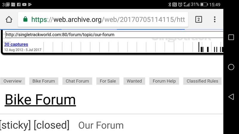 [/img]
I mean that when i look in “Profile” and under “topics started”, none of my Classifieds topics are in there…
Ah right. Noted, ta.
this is as big as I can go before i get the silly newline menu bug...

[url= https://preview.ibb.co/gJxsoH/Forum_text_size.pn g" target="_blank">https://preview.ibb.co/gJxsoH/Forum_text_size.pn g"/> [/img][/url]
[i]Drac wrote:[/i]
Klunk is it possible you can provide screenshots? Thanks
It's a standard thing Drac, I'm sure it's not specific to him. The index page is 12pt Montserrat, the topic text is 16pt Montserrat and the reply box is 12pt Consola. I presume they'll make the index 16pt if only to improve the Google score 😉
