- This topic has 166 replies, 52 voices, and was last updated 7 years ago by justinbieber.
-
Attitudes to processing images
-
BadlyWiredDogFull MemberPosted 7 years ago
Funky – I reckon that runner pic uses an off camera flash, you can see the blast of light coming in from the right of the frame (check the shadows) and maybe there’s one on camera too to fill in. That’s what makes the runner really ‘pop’. Clever use of light is really an art and creates a very rewarding image when done right. Some heavy vignette and a cool temperate applied.
He’s in the wrong place on the trail, which jars with me., looks like he’s about to fly off the edge. The off-camera lighting is obtrusive. And his pose is a bit exaggerated. It’s kind of cartoonish and unnatural. Which is fine if that’s what you’re trying to achieve.
Doesn’t look or feel like any reality I’ve ever experienced, but presumably that’s not the point of it any more than magical realism in writing is intended to represent ‘real life’. I don’t like it much, but hey, so what?
justinbieberFull MemberPosted 7 years agoI used to be massively in awe of photographers who seemingly do everything in camera, until I realised that everyone I looked up to did something in post, no matter how little or subtle it was.
I’ve also had a bit of shift in work and what I take photos for – I’ve done a few jobs recently where clients have asked for a very specific look in order to enhance the mood or vibe of a scene to fit with a campaign. Having the correct composition and exposure makes things easier, but I’m firmly in the camp of post processing images.
As an example, I’m in the process of putting together a series of images based around winter riding, so I’ve dropped the vibrancy, boosted the clarity and erred on the cooler side of things with white balance.
zokesFree MemberPosted 7 years agoI’ll respond, seeing as my picture seems to be creating a bit of vitriol.
Well, my response wasn’t meant as vitriol, more as constructive criticism. But, if you want to post two versions of a mediocre image and ask for a critique then don’t be too surprised when you get one 😉
Honestly, it’s not particularly well composed and framed poorly. I feel relatively confident in saying that because a few months ago I paid for a couple of days 1-on-1 with a pro who sells landscapes for >1k a pop. Half of that time was actually spent critiquing my portfolio, usually with the same criticisms I’ve just raised. My suggestions above stem directly from this critique of my own work.
gofasterstripesFree MemberPosted 7 years agoI can’t believe we’re at page three and no-one has mentioned a calibrated monitor?!?!
Unless you work on a monitor that is well calibrated when tinkering with your images, you’re going to mess them up.
Unless the persons viewing your images is doing it on a also well-calibrated monitor, then they don’t know they’re seeing the image as you did when you processed it…..
Colour calibrated printing is a given though, right??
eg – my nice Dell is broken and I am using a POS 28″ HD iiyama* – this is why you’re not seeing any comments or images from me – because I know the colours are inconsistent.
*nothing wrong with iiyama, but this one is wildly inaccurate
AlexSimonFull MemberPosted 7 years agoAs soon as you use Raw, then you’re committed to having to do a certain amount of processing just to get a usable image.
Personally, there are definitely photos which go beyond a photograph and more into design/art.For example, someone mentioned removing the clutter in Geetee’s friend’s image. If that was done so that I couldn’t tell, then that’s all well and good imo.
Whereas some of those colour casts/split tones that could never be seen in real life really pull me out of an image.
Hard to explain, but for me it still has to believable that I could have witnessed it with my own eyes.
For example, these are too much imo:

(all images from unsplash)
geetee1972Free MemberPosted 7 years agoWhich is one of the things that make it not really much more than a family snap as one of the judges points out.
Making a wonderful picture that works on both the level of fine art and family snap is what this photographer is all about – that’s precisely his craft and he’s very good at it if you look at his Flickr account.
The photographer was quite lucky to have had the camera ready set up for aperture and shutter speed to be perfect to capture that image.
As with anything you make your own luck and it’s part of the skill/craft/art of a good photographer (in this genre) to be able to anticipate those moments; to recognise the pattern of events that is leading you up to that moment when you just know a brilliant photograph will result. It’s most evident in every brilliant photo journalist for example (and the reason why the best advice anyone ever gave was f/8 and be there).
Or it was staged and loses the sponteneity which it’s being judged on.
I can assure you it wasn’t but your point is well made. Staging things and trying to make them look unstaged is both contentious and difficult to do.
bob_summersFull MemberPosted 7 years agoOut of interest, if you require the colour to be an accurate record of what was seen during the composition, how do black and white images sit with you?
geetee1972Free MemberPosted 7 years agohow do black and white images sit with you?
Well quite. That question cropped up on a recent thread on the subject as well. I wrote some thoughts on my blog as a result of that discussion.
bikebouyFree MemberPosted 7 years agoI like those 4 images up there*^
Isn’t it interesting we all have different thoughts on images.
AlexSimonFull MemberPosted 7 years agobob_summers – Member
Out of interest, if you require the colour to be an accurate record of what was seen during the composition, how do black and white images sit with you? B&W is very interesting. It’s obviously a filter, but it isn’t normally one that pulls me out of the image.
I like those 4 images up there*^
Me too (maybe the second one is a bit ordinary), but for me they are images based on photographs, not the photograph. If that makes sense.
jimjamFree MemberPosted 7 years agobob_summers
Out of interest, if you require the colour to be an accurate record of what was seen during the composition, how do black and white images sit with you?
Don’t go asking awkward questions of the post processing puritans.
TheArtistFormerlyKnownAsSTRFull MemberPosted 7 years agoWell, my response wasn’t meant as vitriol, more as constructive criticism. But, if you want to post two versions of a mediocre image and ask for a critique then don’t be too surprised when you get one
No worries – I can take constructive critcism – in fact I’d rather receive it with the goal of becoming better at photography.
I posted the picture for responses about the level of processing, but it veered off a bit towards composition, which is fine. Without going back there, I’m not sure where I could have taken the photo to frame it better. The drain was actually pretty central in the original shot, I think I conciously took it off centre slightly, but that may not have worked.
I suppose, I went up with the intention of recreating/putting my own take on some dramatic shots I’ve seen taken up there in the back of my mind – if it doesn’t work for some people then that’s fine. I enjoyed taking and editing it, so that’s a partial result as far as I’m concerned.
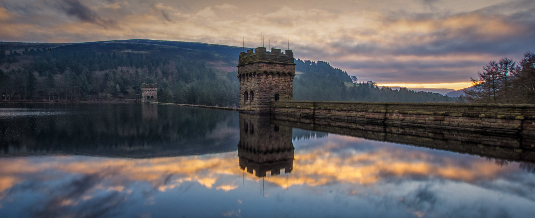
Out of interest – and I’m prepared for it to be ripped apart, what is the take on this one? It’s had an ND grad added PP, a skylight filter and some shadow detail brought out iirc. The first problem I see with it when I look back at it now, is the water being bluer than the sky, the sunrise in the background being slightly blown out and bringing out the shadows has given the trees in the background a bit of an artificial look – I did want to bring the detail of the dam wall up though, rather than it being in shadow – maybe that hasn’t worked at all, or maybe I need to become a bit more adept at editing specific areas of a picture?
[url=https://flic.kr/p/QzFKSo]DSC00434-Edit[/url] by davetheblade, on FlickrandytherocketeerFull MemberPosted 7 years agoof those 4 images up there^
#1 is ok.
#2 doesn’t do it for me.
#3 is alright. tells a story as one of a series of photos (although since landscapers are aiming for one true keeper, that probably wouldn’t be it).
#4 not my cup of tea, but I don’t do photos of people.Processing Raw to Photo is essential, so no, it’s not cheating. If it is then sending your old 110 or 126 instamatix to Boots or Truprint is cheating too, and Polaroid is the only true way.
Global adjustments are fine in my book. Excessive adjustments like what Serge Ramelli does are impressive, but are art, not photography imho.
I loathe most HDR. Mainly because it’s overdone and awful.
gofasterstripesFree MemberPosted 7 years agoB&W is very interesting. It’s obviously a filter
Heh, not on my Huawei P9!
redthunderFree MemberPosted 7 years agoI always carry a sketchbook and draw what see if I got time. Makes you observe more and ingrains the detail into memory.
When I look back at an old sketch…everything comes flooding back….light, colour, temp, wind, how I felt….:)
I cant hardly remember anything from the thousands of photographs I’ve taken on a given subject.
The camera is for snaps and a capture of a moment in time.
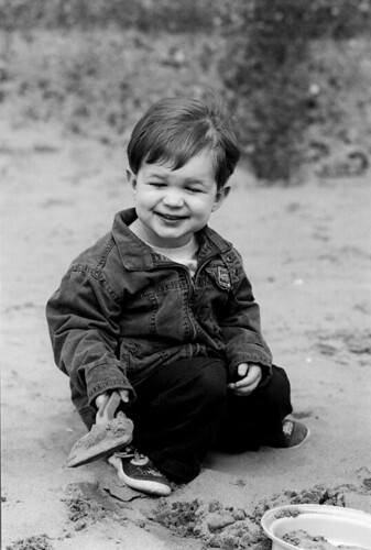
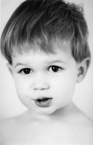
fishaFree MemberPosted 7 years agoHere is one of mine. A pic of the wee fella …
Left: Original RAW file dumped straight out of LR … no edits/adjustments at all.
Right: Edited through LR. Slight crop, B/W, contrasts etc. To me, just seems to make the pic pop a little more. Esp in the eyes.
molgripsFree MemberPosted 7 years agoart, not photography
What is photography if not art?
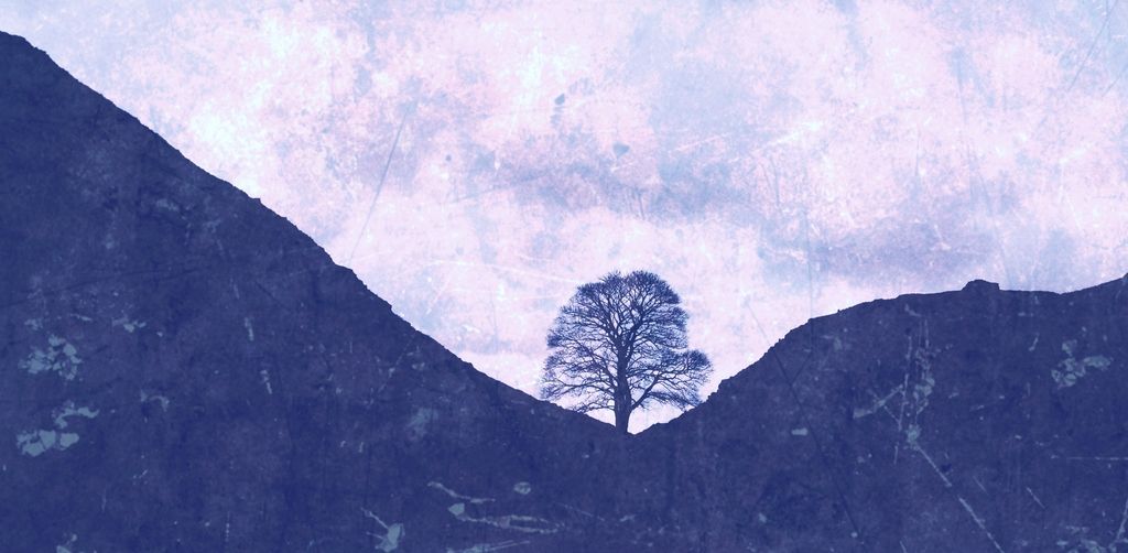
Re the hole in the reservoir image – for me, I must admit that the subject is the problem. A big ugly hole in the ground sort of photo-bombing a landscape. Either really focus on the big scary hole, use those geometric lines and make it look like something other than a bit of infrastructure; or don’t have it in the shot at all. The fact the horizon’s not flat ruins the landscape part of it if you were trying to juxtapose.
All my humble impression of the pic, hope you don’t take it personally.
AlexSimonFull MemberPosted 7 years agoTheArtistFormerlyKnownAsSTR – For me that Howden Dam photo is just on the right side of believable. The only thing pulling my out is the fringing above the treeline.
MrSmithFree MemberPosted 7 years ago“Out of interest – and I’m prepared for it to be ripped apart, what is the take on this one?”
one thing people always seem to get wrong with these kind of images is the brightest part of the sky is always going to be the sky itself not the reflection of it. the foreground reflection should have the same treatment as what it is reflecting.
as for colour/mood changes then i’m all for it. i go ape with my images all the time.
righogFree MemberPosted 7 years agoFor me photography is not a hobby as such, I don’t study it or spend a vast amount on equipment, but I have always enjoyed it both for family type stuff, but also artistically for landscapes. I also occasionally paint landscapes, but these are to capture the feeling of a place rather than a facsimile of the scene.
Processing Images is one of the great benefits of digital photography for me. The number one thing for me is the ease of cropping. either to capture a great scene or face in an otherwise average shot.
I remember a thread a couple of years back ( Rocketdog’s if I remember rightly ) Autumn riding pictures. There were a few disparaging comments regarding over processing of the pics which I was guilty of ( as were others ) however the snaps I had taken on the iphone simply did not convey the way I saw the light on the day the processing of the images captured the feeling a lot better than the as took images.
Below is my favourite image I taken/made recently, it has very little to do with the as took image and all about the processing.
TheArtistFormerlyKnownAsSTRFull MemberPosted 7 years agoAll my humble impression of the pic, hope you don’t take it personally.
Not at all.
I hadn’t gone up there specifically to shoot the drain – it usually looks better with water flowing down it anyway. The shot wasn’t taken for the landscape aspect – there’s plenty of that around, without sticking a drain in the forefront of the shot.
The pic wasn’t meant to document anything really – everyone know’s it’s there and has seen it plenty of times – the intention was for a striking image (whether that has worked or not is debateable – obviously. Lot’s of people in FB land love it for example). Straightening the horizon skews the drain, so unsure on that one.
CougarFull MemberPosted 7 years agoI think the main problem with overblown HDR is everyone’s doing it, and mostly badly. My take is that they’re a bit like black websites – everyone’s allowed to create just one.
fishaFree MemberPosted 7 years agoTheArtistFormerlyKnownAsSTR …
Its quite dark overall and you can see the pseudo fade between the tower and the trees behind trying to brighten the tower, but keep the trees dark. Common in software effects. I like the subject overall though.
I changed it slightly, and made the dam frame the sunset … would be better with the original photo but hey …
molgripsFree MemberPosted 7 years agoStraightening the horizon skews the drain, so unsure on that one.
Yeah – so you were standing in the wrong place. Hard to correct that in PS 🙂
jimjamFree MemberPosted 7 years agoTheArtistFormerlyKnownAsSTR
(whether that has worked or not is debateable – obviously. Lot’s of people in FB land love it for example). S
My camera has a tone mapping feature (aka HDR) where it composites five different exposures together. I recently took some photos at my BJJ club, one of which I shot using this “HDR” feature, the rest without. I uploaded 30+ images which were either colour or black and white with some adjustments for brightness, contrast and hue….and the “HDR” image.
Well everyone in Facebook land immediately lost their shit for the “HDR” image which was my least favourite by some margin. People react to something novel whether it’s good or not. I can still remember getting my hands on Photoshop 3.0 around 1996 and going nuts with the filters along with everyone else in my class. I think the bubble burst when a lecturer went around the room pointing at peoples work saying lens flare/swirl/spheriphy/trace contour/invert …..stop using bloody filters!
TheArtistFormerlyKnownAsSTRFull MemberPosted 7 years agoI’m more intrigued as to what your BJJ club is 😯
roneFull MemberPosted 7 years agoTo the chap above who mentioned calibration. He’s bang on . A lot of the time we’re wasting our time certainly in iffy colour environments like browsers.
It would be the third thing I buy (an eye1 or something) after camera and monitor. I would then learn about colour spaces.
Also you can’t adjust a photo by committee as it will end in tears. 🙂
bob_summersFull MemberPosted 7 years agoWell everyone in Facebook land immediately lost their shit for the “HDR” image which was my least favourite by some margin.
I think that often just what people want. A mate takes a lot of cycling photos which he HDRs and uploads to Instagram with an inspirational caption and gets hundreds of likes. Not my cup of tea but people like it – he’s even had a bit of work off the back of it.
jimjamFree MemberPosted 7 years agoTheArtistFormerlyKnownAsSTR – Member
I’m more intrigued as to what your BJJ club is
C’mon now, google is your friend here. I’ll post the images in a minute.
Edit- files are too big.
MrSmithFree MemberPosted 7 years agoTo the chap above who mentioned calibration. He’s bang on . A lot of the time we’re wasting our time certainly in iffy colour environments like browsers.
i’m viewing this thread in a profile aware browser on an Eizo CG class graphics monitor (D65, 120 C/M2, G2.2 98% A1998 colorspace) the images don’t seem to gain much by doing this. 😕
poahFree MemberPosted 7 years agoI like both photoshoped and natural images. I think people forget that there were different films that give various depths of dynamic range, sharpness, grain and colour saturation. You are unlikely to use Fuji velvia for a portrait. RAW images are as unprocessed as you can get and they are normally flat, unsaturated and lack sharpness. any jpeg has been processed in camera or through a computer.
some pictures are clearly made in photoshop as the light is totally un-natural with others are quite subtle. as far as B&W goes, it has to be film.
Kodak plus-x 125 – bronica ETRS
Fuji neopan 400 EOS5
justinbieberFull MemberPosted 7 years agoLol at MrSmith!
Interestingly, now that lots of images are viewed on mobile, in particular Instagram, I can be fairly certain that an image I upload will look the same on my iphone as it will on everyone else’s iphone. Desktops/laptops are a completely different matter, but 9 times out of 10 it won’t actually make all that much difference to the overall image.
johndohFree MemberPosted 7 years agoNot read the whole thread yet but Ansel Adams was a big influence in my days at college – he had a very technical approach to photography with his use of a zone system which I tried to adopt for my own photography – it is a method that starts in the camera and right through to the processing and printing stage.
redthunderFree MemberPosted 7 years agoSketch from the last ride. Severn Estury with extra mud.
Ink and mud, hair spray for post processing 🙂
@gofasterstripes
Thanks for the comment 🙂jimjamFree MemberPosted 7 years agoOkay so here they are for reference. Not looking for any specific crique or criticism, rather illustrating what people reacted to.
This is the image people reacted to the most – overwhelming I would say.
Here’s another image of Gav which really got no response. There were many similar images of him because he was instructing that night but only the “HDR” one garnered any kind of FB like and comment frenzy about how cool it was.
And here’s my favourite shot from that evening
…which incidentally got a lot of likes and postive response on instagram.
Edit: Great sketch redthunder, I like the style.
TheArtistFormerlyKnownAsSTRFull MemberPosted 7 years agoSee, I’m not a fan of the HDR of the guys above, but I think the content is better than the 2nd pic. The 3rd one works for me
gofasterstripesFree MemberPosted 7 years agoWhat I was mostly getting at is that if you process the image, you should be doing it on an accurate monitor. If I process on this screen, you’ll vom over your Eizo.
RustySpannerFull MemberPosted 7 years agoI think people forget that there were different films that give various depths of dynamic range, sharpness, grain and colour saturation.
HDR is to today as Kodachrome was to the 70’s and grainy HP5 previously.
It’ll define an era of images.


The topic ‘Attitudes to processing images’ is closed to new replies.