
That is me, that is. 😳
.
I am stuck with faffing with a word templated ( 🙄 ) document from a colleague that I need to add some way of indicating Scottish or England & Wales. The 'best' I can come up with is like this.
.
Any suggestions...and no I am not allowed to get rid of it from Word, as (words) need to be editable from this template...
[url= https://farm8.staticflickr.com/7526/15990907485_4bcbd1cf56_o.jp g" target="_blank">https://farm8.staticflickr.com/7526/15990907485_4bcbd1cf56_o.jp g"/> [/img][/url][url= https://flic.kr/p/qn4zFt ]1[/url] by [url= https://www.flickr.com/people/88555557@N00/ ]matt_outandabout[/url], on Flickr
(It *is* for charity, and the kids... 😉 )
Some may not recognise the flags. How about
[img]  [/img]
[img] 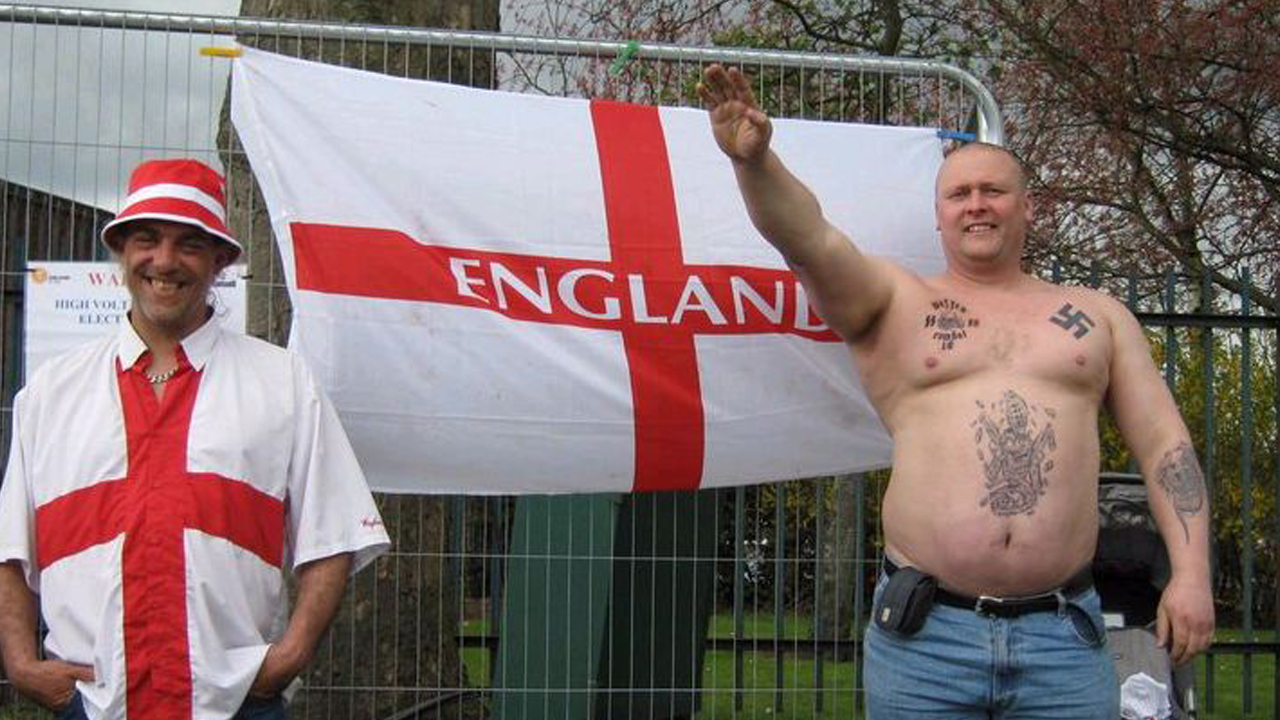 [/img]
[img]  [/img]
Two a bit funny, one quite offensive.
[i]one quite offensive.[/i]
I hate moobs too
Which is which though Flashheart, that's the question!
alcoholism (and funny clothes)
Nazism (and moobs)
bestiality
come on CFH which are funny and which is offensive?
OP, probably best to stick with flags.
OP, probably best to stick with flags.
I was planning this, unless text is better...
Daffodil, Rose, Thistle?
50/50 diagonal split Wales/England flag?
Or moobs, and a kilt.
Two a bit funny, one quite offensive.
the one i am is offensive, whilst the other two are just a laugh. right?
Nazism (and moobs)
That's a bloke with sacred Hindu symbol tattooed on his manly chest waving to his mates.
I like the idea of the diagonal split of the flags, but then the thistle, rose and daffodil idea might be a little less nationalist.
FTFYThat's a [s]bloke[/s] singlespeeder* with sacred Hindu symbol tattooed on his manly chest waving to his mates.
*check his right moob
You could just extract the relevant parts from the Union Flag which would simplify things:
[img]  [/img]
[img]  [/img]
It's a bit messy having different sized icons.
Can you use an outline map of the British Isles with the relevant England/Scotland/Wales bits filled in? Might need colour to work well though.
Comme ca?
[img] 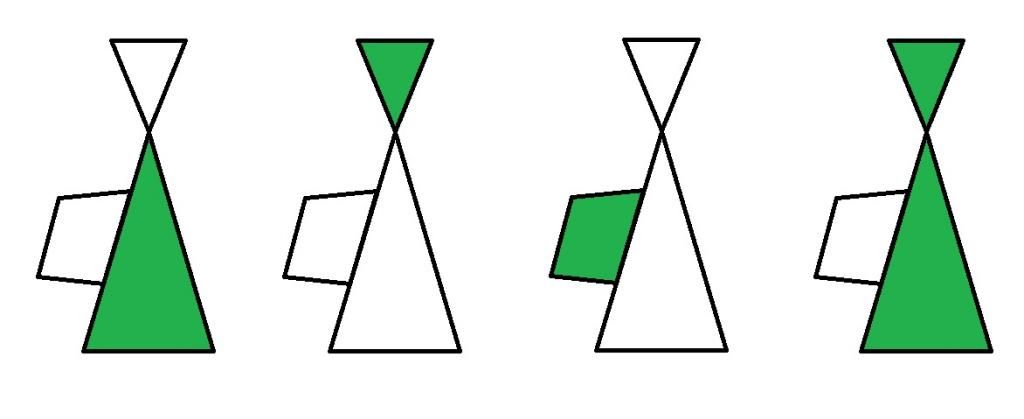 [/img]
Hmmm, still not perfect, but then I am bodging it...
[url= https://farm8.staticflickr.com/7487/15990798202_dc63a6e400_o.jp g" target="_blank">https://farm8.staticflickr.com/7487/15990798202_dc63a6e400_o.jp g"/> [/img][/url][url= https://flic.kr/p/qn42ch ]2[/url] by [url= https://www.flickr.com/people/88555557@N00/ ]matt_outandabout[/url], on Flickr
Looks alright. Better sans moobs.
Better sans moobs
Is that a font joke?
Do a Saltire crossed out, Ghostbusters-style.
Is that a font joke?
Only if he thinks he's a comic.
seriffic ! well done
(flash, I was trying so hard to be equitable with my lazy, cheap stereotyping - where did I go wrong ? 🙁 )
Can you not just write the names of the relevant countries?
Fat bloke with the swastika.. just what level of care do you think he will receive if he is ever hospitalised?
Can you not just write the names of the relevant countries?
I said that. Apparently it looked unbalanced to have two names vs one, and Sco or Wal/Eng didn't cut it either....
My next bid was to pay a proper designer to sort the whole template out properly...apparently that costs... 😉
OK, how about a big version of something like this
[img] 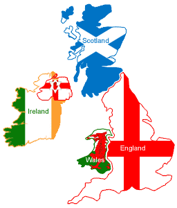 [/img]
as background with one (maybe transparent ?) text box over scotland and then another over E&W ?
Not sure how Scotland and England match the requirements in the text, Wales is the imperial measurement of land mass/area, and Belgium the metric equivalent.