
MegaSack DRAW - This year's winner is user - rgwb
We will be in touch
Aftertoon STW..
I was just having a browse through the BBC website, and came across this -
[url= http://www.bbc.co.uk/news/entertainment-arts-15577818 ]BBC Link - Clicky[/url]
Some of them are pretty decent, some not..
What do we recon?
Josh..
(Needs to take some Valium)
It's like, 'how can we make these Lympics even shitter than they are already, considering we've cocked up just about every aspect of it so far?'.
This is just taking the piss:
[img]  [/img]
Although I quite like these:
[img]  [/img]
[img]  [/img]
But this is just further evidence that Tracey Emin should never be allowed near any artist's materials, when there are so many other unknown artists out there with real talent:
[img]  [/img]
But tbh, they cooduv farmed the project out to an A-Level art class and got far better results.
Those posters are rubbish*.....
I was going to use a word that rhymes with rash & starts with g, but am genuinely not sure if that would be acceptable on here today (or any day for that matter), even though I use it all the time to mean 'rubbish'.
This one is good...
[img]  [/img]
I've been dealing this week with LOCOG and I've never come across such a load of cobblers in the name of 2 weeks of sport.
I wonder what all these clots are going to do once it's all done, and all the money has gone.
I quite like Rachel Whiteread's, but then again I am colourblind 😉
[img] 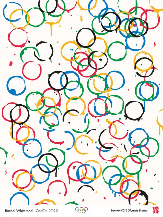 [/img]
The words ones good, not really representative mind, but good, so too the stopwatch and the other one with a stopwatch in it.
Rest are plop.
Perhaps this should lead to the subject for the next stw artists do art thread, 'design a poster for the London Olympics'...
Give me strength...
[img]  [/img]
I've seen better things on the fridge at my friends house done by their 2 year old.
the coffe rings one ^ is great.
the rest is shite.
I've seen better things on the fridge at my friends house done by their 2 year old.
Think they got that one covered as well hp 😉
[img]  [/img]
If there was only some way of combining something iconic about london and the olympics..... 😕
not strictly a poster, but something along these lines....
[img]  [/img]
Give me strength...
apparently, in that one the small black dot represents a tennis ball, and the large pinky one a wheelchair wheel.
Yeah, course it does. Right. Ok.
What a joke. And these people are being paid for such shit, are they?
(Wishes he was a famous artist and could earn thousands for doing very little indeed)
Riley, who began her career using only black and white patterns, started to experiment with colour in 1967, the same year she began painting stripes.
****ing luddite.....
quite un-inspiring posters, IMO
I quite like Rachel Whiteread's, but then again I am colourblind
See, when I did art at school, if someone had put a dirty coffee cup on the paper, I would have thrown it away and started again. Genius.
I like the cup-rings one too. Makes me think of what's left after a massive party, when everyone's gone home happy 😀
The blurb says there's a "figure" in that blue one, but I can just see what looks like a frog, or possibly a tortoise...
[img]  [/img]
[img] http://80.249.98.16/mhill/barney/images/grinch.jp g" target="_blank">http://80.249.98.16/mhill/barney/images/grinch.jp g"/> &sa=X&ei=qgq0TsLFENGq8APsk9yTBQ&ved=0CAwQ8wc4Nw&usg=AFQjCNES_ut0565Vu45dammTP1bSehHeHg[/img]
I think you're all being quite mean.
It was really sweet that the Olympic people let the local junior school do the colouring-in posters. And the toddlers will be really upset if they see the horrid things being said about their efforts.
I like the cup-rings one too. Makes me think of what's left after a massive party, when everyone's gone home happy
Actually that's a really good interpretation, and I can see that, which makes it kind of 'work', dun't it?
I think most of them are a complete crock of...
Actually that's a really good interpretation, and I can see that, which makes it kind of 'work', dun't it?
Haha! You like an art!
I'm not sure why we need posters? The olympics are pretty comprehensively sold out, and everyone has got to be aware they're going on.. Are the posters just to remind folk who couldn't get in, what they're missing out on?
Haha! You like an art!
😳
(Sidles off quietly)
Truth be told not a lot but on the upside at least some artists have had a short ride on the gravy train
Share the [s]love[/s] money
[img] [/img]
Has someone just screenshotted the commodore 64 loading screen there?
Very disappointing posters...I genuinely wanted to like them as I believe the games will be much better with public support behind it but once again it seems all style over substance: at the end of the day you should be able to glean from a poster what the hell it's advertising which some of those fail miserably
at 🙁
A couple of the Paralympic ones come across as really patronising with the love bit.
Its like saying you are sort of shit but i have so much sympathy with your predicament of having no legs and you look like you are trying so very hard and being so very brave going along on your wheelchair around the running track.
Are the posters just to remind folk who couldn't get in, what they're missing out on?
if the poster are anything to go by then those who didn't get a ticket aren't going to be too bothered....
Highly amused by the stereotypical 'art critic' on BBC News this morning, talking tosh about the toddler's blue swirly picture.
Couldn't the creatives at STW come up with a range of Olympic LOL Katz posters?
Couldn't the creatives at STW come up with a range of Olympic [s]LOL Katz[/s] posters?
...5 minutes later....
[img]  [/img]
I like Tracey's. The original was even better. Apparently it said:
"Even though I don't come first, I still like sex".
Elfinsafety - Member
(Needs to take some Valium)
It's like, 'how can we make these Lympics even shitter than they are already, considering we've cocked up just about every aspect of it so far?'.
Couldn't agree anymore if i tried.
Found this different angle but just has crap

I saw that art critic on the beeb - it is our fault for not looking at them long enough to understand them...he completely reinforced the idea that it is only art because a famous artist did it.
I think they're ****.
I saw that art critic on the beeb - it is our fault for not looking at them long enough to understand them...he completely reinforced the idea that it is only art because a famous artist did it.
What have I now go to pretend i am in an Art Gallery watching how the rings
all come together
Sounds like the Da Vinci code But finding the way to win medals LOL
it appears that the UK Olympic design brief is:
"Modern, Abstract and Challenging"
A great point was made on the Beeb earlier "did they know who the artists were prior to selecting the works?" It's a load of balls that they award these things to people on the basis of their "Pedigree" rather than merit of the finished product.
Bollocks to having hours to stand and stare to establish in inner meaning of a load of pics, the should be self explanatory, example being some guy hobbling into the job centre to get his benefit cheque then breaking the 100m record in his quest to get to witherspoons for opening time? Would show the UK in a more realistic light, would also help us re-in force the benefits well will all reap from this farce (spectacular event)
Edit: sorry, it could also be a woman hobbling into the job centre - to bring balance to my point
Just seems to be a large waste of money to be spent on something thats so temporary
Tracy emin boils my piss! She tossed something off in 5 minutes, and as good as said so. Even she's given up pretending it's not just more horse-cock nowadays! Some of the others aren't that bad to be honest. As pieces of art. As posters? Well ... They're not are they? They're paintings. Or in Emins case, a schoolboy-standard. doodle. Why not go the whole hog and draw a spunking cock and balls?
Here's an idea though. Why not get some of the worlds best graphic designers, who happen to be British, to do the posters. Or can we also presume you'll be getting the electritions to do the catering too?
Or in Emins case, a schoolboy-standard. doodle. Why not go the whole hog and draw a spunking cock and balls?
That made me laugh - it would go with the logo then... I still can't see "2012", only the "Lisa Simpson blowjob" 8)
1) Irrelevant
2) NICE
3) Meh
4) Paul Smith is consulting his lawyers
5) Chewbacca is consulting his lawyers
6) ATP are consulting their lawyers
7) Bertie Bassett is consulting his lawyers
8) zzzzz
9) Seriously?
10) ...
11) 'Seriously, they went for it? I was just ****ing about!'
12) That's what the BBC test card looked like during the Summer of Love.
A couple of the Paralympic ones come across as really patronising with the love bit.Its like saying you are sort of shit but i have so much sympathy with your predicament of having no legs and you look like you are trying so very hard and being so very brave going along on your wheelchair around the running track.
I agree, awful.
The cup rings one is the only one I really like as well. What a bunch of chancers - fair play to them if they can manage to get paid for this bollocks.
If you didn't know they were Olympics posters, you'd struggle to identify what some were supposed to be representing.
okay, i rather like the whiteread one and i'm taken by the hodgkin one even if, and i like hodgkin, it does;t make much sense.
on the grounds of balance tho i just showed them to ms swiss and she says she will leave the country/is ashamed to be from london/will only speak greek while the olympics are on. it was the gary hume that broke her and sent her shouting thru the house
Grums right, complete bunch of chancers.
it was the gary hume that broke her and sent her shouting thru the house
Understandable. That actually made me angry.
Angry that someone with some actual talent coon't have had the chance to produce something wonderful and iconic.
Trouble is, that the 'art establishment' is a far too introspective self-serving bunch of back-slapping shysters. It's the St Martins/Goldsmiths/RCA types who are actually dragging British art down to such a base level, it's damaging our culture. Young artists just end up doing stuff in the style of the ponceratti, rather than exploring their own unique talents. 'British Art' has become a self-perpetuating commercial machine, with little real craft or skill. 'Concept art' is bollocks; everyone's a 'concept artist'.
The likes of Tracey Emin et al should be had up in the Tower, for Treason. ****s.
Or can we also presume you'll be getting the electritions to do the catering too?
I say get the 'artists' to clean the loos. It's all they're good for.
a variety would have been nice. Rather than just the 90's brit art satcchi divs. Maybe one or two to please the herd but they should have chosen different areas of design or art.
Personally I don't like any of them especially hume but then again, he's always been shite.
Couldn't agree with you more Fred. Their smug self-satisfied and superior little mutual masterbation group can't comprehend why everyone else in the country regards their output as utterly ludicrous twoddle. They're all actually so huffy and superior though, that to them this is just further evidence of how right they are.
What a bunch of self serving strokers! Its embarrassing. Yet again!
I love some of Hodgkin's work. Not this though. It's a huge shame (and I say this as someone struggling to start a career as an artist) that new talent was never used. I know lots of people who would have relished in the opportunity to produce some work for the event.
My girlfriend said this looks like they opened it up as a blue peter competition and these are the entries that made judges laugh most.
+1 on all that Elf has said.
Are they supposed to appeal more to children?
Elfinsafety - MemberIt's like, 'how can we make these Lympics even shitter than they are already, considering we've cocked up just about every aspect of it so far?'.
Have we ...thought all the buildings were built on time and to budget and look fantatstic to boot. What exactly has been cocked up given that they are still months away.
These posters are good. We have a rich and diverse artistic history that most countries would die for. Why not get Riley to design a poster. Would rather have that than some graphics graduate designing something he thinks is 'fitting'. Whiteread, Hodgkin, Hume .... artists that are deservedly recognised for the work they have done to date.
I like them, not sure what people want???
As for Fred , we all know he hates(or if previous threads are anything to go by, doesn't understand) conceptual art ...doesnt means its crap.
They're just posters, some good , some less so , dont think we would ever be criticised for getting internationally recognised artists to have a stab at promoting the games. Lighten up. 🙂
Trouble is, that the 'art establishment' is a far too introspective self-serving bunch of back-slapping shysters. It's the St Martins/Goldsmiths/RCA types who are actually dragging British art down to such a base level, it's damaging our culture
you've got that wrong.
the stronger a culture, the stronger the counter culture. sometimes things have to be really shit in order to accelerate and enable change.
no prog rock - no punk rock. for every action............. etc.etc.
sometimes you just have to let things get on with themselves but british culture is hardly being killed.
Bridget Riley was doing coloured stripes when Paul Smith was still at school. Shame she's not moved on though. She even got the colours wrong!
Some of them are nice, some are interesting, a few aren't my cup of tea and a few more are just rubbish.
I'm not a massive art buff, but I don't quite understand what you lot expect - paintings of people actually running and wheeling their wheelchairs about?
Trouble is, "proper" olympic posters could shade into fascist-propaganda chic awfully easily. So we get bizarreo-bobbins instead.
Anything which isn't either a bit shit or Nazi-themed has already been uised to advertise the London Underground. 🙂
"swimming": Howard Hodgkin. (Aged 7)
well i can agree with elf up to a point.
but 'young artists just end up doing stuff in the style of the ponceratti' is both glib and demeaning. not only are there plenty of 'old' artists but in fact loads of just plain artists doing the exact opposite of that. in fact, living in that london, elf should be tripping over them if he cared to look.
as for 'concept art is bollocks'. aside from the obvious fatuousness of such a statement... actually i can't go on with that.
but i do agree that is art that gains (financial) favour with a certain type of person or put another way “For people who like that sort of thing, that is the sort of thing they like.” paying it attention gives it a relevance it's dying to have. and going off on one a la elf gives it creedence it doesn't deserve.
perhaps we could have a thread with out own designs for olympic/paralympic games. better than another moany thread surely? elf could make something interpretive out of wood maybe?
(i should declare a bit of an interest as i did bid for one of the regional things for the cultural olympiad)
None as good as the original one suggested:
[img]  ?w=444&h=300[/img]
you've got that wrong.
I jolly well have not, and I shall explain why...
the stronger a culture, the stronger the counter culture. sometimes things have to be really shit in order to accelerate and enable change.
Thing is, it's the ponceratti sponsored shyte that gets obscenely disproportionate coverage and promotion, whilst other forms and artists go unnoticed by the majority. The masses end up thinking that this sort of guff is 'art', become dissillusioned and turn away from appreciating art in all forms.
Look mate; I've bin involved in art in That London's Famous London for over twenty years, gone to thousands of exhibitions, shows, galleries etc. Known countless artists of all description. Therefore, I think I've got a pretty bloody good idea of what art is, and certainly more than many of the ponceratti whose only experience is mainly through formal institutions such as the aforementioned. I've met loads of people lie this, and they are very narrow minded in the main, and generally really quite unsure of their own minds.
I'm not wrong, I'm right. Ask Binners. I'm just honest is all; the emperor is [i]naked[/i].
Oh, and I went to one of those fine academic institutions. 😉
A mate's wife is an 'art critic'. She knows F-all about art. 😆
As for Fred , we all know he hates(or if previous threads are anything to go by, doesn't understand) conceptual art ...doesnt means its crap.
You know nothing about my knowledge, understanding and appreciation of art, this much is obvious. 🙄
And I know enough to say something's crap if it actually is.
as for 'concept art is bollocks'. aside from the obvious fatuousness of such a statement...
The concept of 'concept art' is bollocks. All art stems from a [i]concept[/i] within the artist's mind...
It's just a label to give to something that the ponceratti seek to commercialise, in order to maintain their positions within the art World.
Trouble is, "proper" olympic posters could shade into fascist-propaganda chic awfully easily.
Well, the Lympics is about teamwork and the individual working for the greater good of the group, and strength through unity, so praps a 'fascist' framework ain't that bad really. 🙂
Anything which isn't either a bit shit or Nazi-themed has already been uised to advertise the London Underground.
Far from being too upset over this particular Lympic travesty, I am happy with the fact that the vast majority of visitors to London during the games (and at all other times) will go away with the image of a truly iconic piece of design uppermost in their minds...
[img]  [/img]
perhaps we could have a thread with out own designs for olympic/paralympic games. better than another moany thread surely? elf could make something interpretive out of wood maybe?
Good idea, that.
Actually, I feel like doing something to express my feelings and emotions through [i]the medium of dance[/i]....
Binners; would you care to join me?
It's really interesting from an outsiders point of view to see how one of the most iconic sporting events in one of the most iconic cities in one of the most iconic countries in the world can manage to avoid using [i]any[/i] of the familiar iconography that would seem to be the ideal solution.
It's a massive corporate beanfeast, and it really, really shows.
I think quite a lot of people are confusing design and art, including the people who thought it would be a good idea to get a load of conceptual artists to create the posters.
What about my attempt?
[IMG]  [/IMG]
The vertical lines in Color Palette (pictured) indicate the direction of something or other - I can't quite decide what but I'm sure you can use your own imagination to work out the connection between this picture and the Olympics. Aracer started to experiment with colour in 1985, the same year he discovered Windows.
[img] [/img]
Copy cat copy cat sitting on the doormat
Actually I take that all back, it's nothing like Mr Smiths work, unless of course you turn it on it's side.
[img]  [/img]
We've already established that Smith followed Riley...
That poster of hers evokes the image of a blurred running track, as a camera pans along it. To me, anyway. So it sort of works. I wonder how I'd think about it outside the context of the Lympics though.
Fashion design; there's another field where poncitudity is rife...
Martin Creed, the guy who did the podium poster was interviewed and asked what it represented, he said 'a podium'
.
unbridaled genius
if I see the Emin one I will be tempted to add to it with my own special blend of brown 'paint'
Look mate; I've bin involved in art in That London's Famous London for over twenty years
i feel your pain. on the 2012 poster evidence you'd have been better off in st ives.
the point i've tried to make is that sometimes things have to be this poor for things to change. not everyone is thick, if you've picked up that contemporary art is shit then others will too. that will facilitate change............
eventually 8)
And I know enough to say something's crap if it actually is
Just because you think its crap doesnt mean it is.
The concept of 'concept art' is bollocks. All art stems from a concept within the artist's mind...It's just a label to give to something that the ponceratti seek to commercialise, in order to maintain their positions within the art World.
That statement is boll ocks.Proof in itself that you dont like/understand 'conceptual' (not concept) art.
Are you saying Klein, Beuys, Le Witt (or dare I say it Hirst) are any less valid as artists than say Rothko, Freud or Matisse.
For someone who claims to have seen and spoke to 1000's of artists I find your views on art naive and basic.
Right. This might be that the pictures aren't rendering properly cos I'm browsing on my phone, but does that one with all the words say "arse piercing rod of muscle" at the bottom?
😯
These posters are good. We have a rich and diverse artistic history that most countries would die for. Why not get Riley to design a poster. Would rather have that than some graphics graduate designing something he thinks is 'fitting'. Whiteread, Hodgkin, Hume .... artists that are deservedly recognised for the work they have done to date.
Recognised by who? By poncey arty types? The thing is, no matter how "good" those posters might be according to "art lovers", for the average man in the street, they're still wy b***s. Whoever commissioned those appears to have totally missed the point (or maybe I have, and the Olympics really is totally corrupted).
That statement is boll ocks.Proof in itself that you dont like/understand 'conceptual' (not concept) art.
Concept, conceptual, whatEVER.
I understand art. And I also understand what is a load of bollocks. Simples.
For someone who claims to have seen and spoke to 1000's of artists I find your views on art naive and basic.
Stock response whenever someone criticises something that's nowt more than a load of dressed up cobblers. Change the record. I could just as easily say that you're easily taken in by bullshit and pretentiousness. See?
The thing is, no matter how "good" those posters might be according to "art lovers", for the average man in the street, they're still wy b***s. Whoever commissioned those appears to have totally missed the point (or maybe I have, and the Olympics really is totally corrupted).
Aracer's got it. The Lympics are for [i]everyone[/i], not just a bunch of self-serving mutual mental masturbators pretending to be clever...
I find the world of art quite hard to understand.
I like the stripes one, and I like the cup rings one, and I quite like Bertie's hat. They're nice to look at.
When I went to the Tate Modern, some of the stuff was nice to look at, some wasn't.
What I cannot for the life of me get my head around is some of the utter guff that comes with it - this represents this and so on. It just doesn't make any sense to me.
Why not just draw something nice, and let folk enjoy looking at it. No need to complicate it surely?
Can't believe I've contributed to an art thread 😕
I don't want to get into chat about the merits of art, or whether it's just blobs and doodles and other rubbish, even though it obviously is 😉
But, some of those I just can't connect to the olympics at all. Even with the explanations half of them still seem like they could just be stock art with a bit of mumbo jumbo attached. Yeah, that totally represents a wheelchair, obvious isn't it. The leaves? No, no idea what those are for. Isn't the wheelchair tennis held in a forest? No? Ah well.
i think they are great for various reasons.
but mainly because they boil the piss of the visually unaware.
the Munich 72 posters are worth a look.
What I cannot for the life of me get my head around is some of the utter guff that comes with it - this represents this and so on. It just doesn't make any sense to me.
So what? This is why art is art, it only has to mean anything to the artist.
Recognised by who? By poncey arty types? The thing is, no matter how "good" those posters might be according to "art lovers", for the average man in the street, they're still wy b***s.
But as has already been established, the man in the street has already had their chance at tickets, these posters are not aimed at generating interest in the games or selling tickets, they are the artist's interpretations of what the games mean or represent, that is all. They only have to mean anything to the artist.
I understand art. And I also understand what is a load of bollocks. Simples.
Clearly you don't.
elf, you clearly can't distinguish between concept and conceptual art regardless of your opinion of it. a shame given your claim you've been to so many shows. is it that you somehow feel thwarted?
a representative example. i'm no fan of video art so much so i hesitate to call it art, i can cite many examples and of why this is so and unlike yourself don't have to resort to comedy posturing in order to do so (tho i can if i want to - douglas gordon, you occupy a special place in my zone of dislike). my daughter, on the other hand, who has no art training but has been going to galleries since she was wee, loves the stuff. i gain great joy and some insight by tagging along with her to such things. she has neither being gulled by 'the establishment' nor has she been disillusioned. rather the opposite in fact.
similarly, back in the day i used to do environmental art classes for high school kids. was it based around notions of conceptual art? it could be argued so. what was certain was that the kids loved it and me, i count it as one of the more quality things i've done in my life. what dissenting voices there were, were such as yours with all the same dismissiveness and all the same certainties. it seems a peculiarly joyless position (and one that feeds on the very things it supposedly protests against).
i love creativity in daily life. i think it's great that a bunch of well known artists have got involved at all even if, looking at it, it's not really to my taste. i hope it inspires (or at leads goads!) people into doing something themselves. but that's just me