I took some pics of my kids on the weekend, and cant decide between these two.
I plan to blow one up for my wife on a big canvas as a Christmas present (cant afford to do both)
Please help me choose......
Number one
[img] 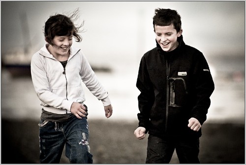 [/img]
Or, number two
[img] 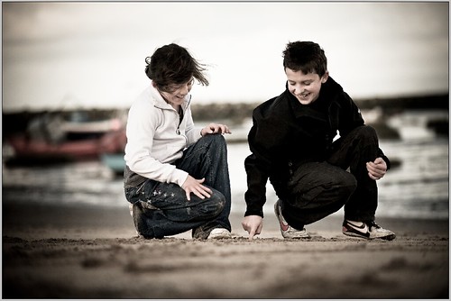 [/img]
the second
Agreed. Number 2 is a great shot, really natural feeling.
No1
yep. No.2
both very good pics, but #2 should go to print.
I like the composition of 2 more... BUT you can see their faces more in no. 1, which I think is important for something to go on your wall like this.
No 2 makes them look younger somehow.
Depending on the size of canvas you'll need at least 1 1/2 inches for the wraparound on all sides. No 1 may be a bit tight on the top edge but you may be able to manufacture it in photoshop (esp if hung on the wall where you wont see it)
Great pics, No2 is better
no.1 it has a better view of their faces.
No. 2. Excellent work!
strange, number 2 looks a lot LESS natural to me, I prefer 1.
both great, for me, if i could only print one it would be #1
At first I thought number 2, but I now think number one is best, if it fits onto canvas ok. It seems more natural. Great idea for a present btw 🙂
2
Lovely pics but canvas is for oil paintings. Photos should be on paper. Nice paper. Textured paper maybe. Nice frame. But not canvas. That's bogus.
I like number 2 and would probably opt for that one. Before printing i'd crop some of the area to the left of your daughter so that the kids are in the middle; they're slightly off centre at the moment.
No 1 for me on the faces in no2 your daughters face is too obscured.
1
No1 for me
Could possibly do 2 prints by cutting it in half?
#1, but if the vignetting is artificial, crop it a bit and get the kids off-centre.
Have you tried in B&W?
Although No2 is a great shot, i reckon your Mrs would prefer to see both their faces.
No1 Daughter might also throw a paddy if you hide her face....
Number 1.
Personally I would Photoshop some of the space out from between them, making th appear closer together
MM
No 1 for sure.......
Thanks to y,all for the comments - food for thought
really appreciate it
Kev
2 is the better picture, though I would print 1 because you can see more of their faces.
No 1 looks better to me.
Number 1. Seems less forced in some way. Ps you see the faces better which as they are your kids might be important.
No1 is better to me, more natural leave more open to the viewer. No2 is good but looks more like an advertising shot.
No 1 for the face reason mentioned already.
Although - have you tried #2 with a square crop. I reckon that would look great. I like square crops!
1 for me.
#1
they are great - number 2 is I reckon the winner in my book, although its a hard choice
have oyu thought about an alternative to canvas - say either a print laminated onto acrylic or a box frame - these deserve a better texture than canvas - and those two mediums might be good for it.
I have a pro account with Loxely Colour - they produce fab prints - not cheap, but I know they have some offers on 20x16 box frames and 20x16 wraps (which come either as a canvas or photo finish) - give them a try (you owuld need to register, but thats a doddle given that I registered when I wasnt even trading properly)
number 1! Whilst I normally a huge lover of the desaturated tones with a vignette, i think the vignette needs to be a little less obvious. Nice shot though.
I also think numero 2 looks more staged! Funny how we all see 2 photos so differently!
1
No1 for me.
So totting up including mine...
18 for #1
9 for #2
how hard would it be to go back and take more? not trying to peev you off but if its not too much trouble then try and get a mix of the two pics. like folk have said,the faces are in pic 1 and it doesnt look as staged but the 2nd pic has a nice depth of field.Pic 1 has been photoshopped a little too much up the centre and its distracting me.Maybe its just me though as i always start to question pics that have been altered instead of enjoying them.
Like the pic on the homepage right now. Its a nice pic but the sunlight alteration distracted me and put me off taking in the moment and trying to live it a little.
number one has a moment in time feel to it rather than a set up one if that makes sense
I took over 500 pics at the beach that day so there will be more with both faces.
Its really subjective though isn't it.
IMO, the first picture.
Like em both. Have you got a third? Maybe you could a nice triglyph, rather than one big shot?
First one looks good to me - loving the windswept look!
#1
#2 for me, in #1 their arms look a bit unnatural, like they are doing zombie impersonations.
#1 😀
Both great photographs
No1
I prefer No.1
You can see their faces a lot better and the lads jacket in No.2 is a black featureless blob. It's got detail in No.1....
Both superb shots though. 🙂
Havig said that, No.2 is a better composition and has a nicer background.... Very close call.....
1 looks far more natural to me.
I changed my mind - kind of...
get them both, in the grand scheme of things not that expensive depending on the size you buy and I am sure your wife will appreciate it - it is a very nice and thoughtful present indeed...and will provide you with 2 great pieces of artwork for years to come - I personally think that people don't print enough of their pictures and appreciate what they mean - rambled about it recently on my blog http://photographyonthehill.co.uk/blog/holiday-snaps.html
#1
Both good shots. I prefer number 2 as a photo, more interesting and I like the DoF of the background..
As a portrait, I think #1 is better as most have said, you see more of your daughters face. However I would remove the mast(?) just behind your daughter that cuts through her head.
What about #2 background & #1 foreground.