seosamh77 - Member
jimjam - Member
Scribbletrackworld.
perchy is still dominating the naming comp, by some distance!
Well if the aim is to come up with a terrible name, yes he's kicking my ass 😉
19/31
Nanka, changed a bit.
One of my favourite target characters from "Out of the Pit".
#inktastic
#inktober2017
#nanka
#fanart
[url= https://farm5.staticflickr.com/4453/37741366566_ff2bcf9d8e_b.jp g" target="_blank">https://farm5.staticflickr.com/4453/37741366566_ff2bcf9d8e_b.jp g"/> [/img][/url][url= https://flic.kr/p/Zv5noE ]Nanka Gas Cloud[/url] by [url= https://www.flickr.com/photos/58162507@N07/ ]SGMTB[/url], on Flickr
I don't know what a Nanka is Redthunder but I like that. My [i]VVitch[/i] themed piece turned out to be far too complex to make a decent start on. No time today anyway, just back from 30k in the pissing rain too so it's beer and Netflix time.
Here is Black Phillip from the film, I didn't do this today but I am posting him to bump the thread and he was (will be) part of my composition.
[img]  [/img]
Class. So much variety 8)
Was up in the attic looking for my old motorbike gear for my eldest's Terminator cozzy and found an old sketch pad. No idea i'd kept it but some of it is eerily perfect timing considering the 2000AD stuff. Dates from around 91-92 and was background work for a college project. Used metallic spray cans and can't get a decent photo.
[img]  [/img]
[img]  [/img]
[img]  [/img]
[img]  [/img]
Sporadic but here's a couple of fast and dirty landscapes. First one is after something I saw on Pinterest. Second is North Devon coast near Bursdon Moor
[img]  [/img]
[img]  [/img]
Love your style Malvern those are superb. You have a gift at creating depth with the ink.
Euro those are bloody awesome. You work as an illustrator?
I'm stumped for the time being. I shall return however! 😆
Also can't bike hope you'll be back soon and haven't taken the laugh to heart, you need an ability to laugh at yourself in this game. We all make unintended gaffs! 😆 need the ability to be self critical and to take the piss out yourself!
I'm still going, just hospital stuff getting in the way, got some scribbles I'll share in a bit, rubbish as they are compared to you lot, I can still see improvement and more importantly pleasure 🙂
[img]  [/img]
[img]  [/img]
Sharpie
[img]  [/img]
Bics
[img]  [/img]
[img]  [/img]
[img]  [/img]
That Mongrel looks superb. Very Kevin O'Neill.
Quick one yesterday. Some faux Celtic nonsense. The theme was 'clouds' so I give you Cloud Gate:
[img]  [/img]
you get it! 🙂I can still see improvement and more importantly pleasure
And love those landscapes Malvern, what are you using? Is that brush and ink over sketches or using software or something else? I love all these different styles that you guys produce, so different, from portraits with hardly any marks or shading through to the full spray paint stuff, inspiring stuff, and great to see it all being shared.
20/31
Pencil, digital ink. Dont really want to fiddle my original pencil drawing anymore.
[img]  [/img]
[url= https://www.flickr.com/photos/58162507@N07/37775857942/ ]20/31 Pencil, digital ink.[/url] by [url= https://www.flickr.com/photos/58162507@N07/ ][/url] - [url= https://play.google.com/store/apps/details?id=com.dariogf.flickr2BBcode_lite ]Flickr2BBcode LITE[/url]
Found the negitive filter as.... accidental x-ray. Shows all the lines and construction. Well I think its cool. 🙂
[img]  [/img]
[url= https://www.flickr.com/photos/58162507@N07/37775876602/ ]20/31 Pencil, digital ink, and negative filter. I like the accidental x-ray look :)[/url] by [url= https://www.flickr.com/photos/58162507@N07/ ][/url] - [url= https://play.google.com/store/apps/details?id=com.dariogf.flickr2BBcode_lite ]Flickr2BBcode LITE[/url]
Loving everthing on this thread so far... keep them all coming.
Inkworld
ArtTrackWorld
A horse with a massive rear spoiler.
Those jockeys are really missing a trick. 😉
And love those landscapes Malvern, what are you using? Is that brush and ink over sketches
Exactly. And thanks!
@PP.
Its swords jockeys should be using... it would make the racing really interesting 😉
Great pics Cantbike. Really like the first one and the postures.
Malvern, those lanscapes are great. I gave Japanese style ink landscapes a go last night but couldn't get any depth to them so in the bin they went. I can do it with watercolour but I'll be damned if I can do landscapes in greyscale using only ink.
I can do it with watercolour but I'll be damned if I can do landscapes in greyscale using only ink.
I make my own ink/paint from black pigment and water, sometimes adding a binder. This makes me ask what is the difference between ink and paint? A watercolour wash vs an ink wash? The broad definitions for both paint and ink are 'pigment with binder'. I have experienced tremendous difficulty creating tone when the pigment dries/stains the support the very second it is layed in. This has me experimenting with various binders and papers. I won't go into it all but suffice to say the type and quality of paper is at least if not more important than the medium. I sketch on cheap watercolour paper or Seabright sketchbooks, but the minute I move to (say) Waterford NOT - the whole scenario changes - absorption, intensity, tone, all are affected. As is the thickness of my wallet 🙂
perchypanther - Member
A horse with a massive rear spoiler.Those jockeys are really missing a trick.
😆
redthunder - Member
20/31
excellent sense of motion in that!
*Seawhite sketchbooks
jonm81 - [url= https://www.craftsy.com/blog/2014/05/ink-wash-techniques/ ]interesting blog - try these ink wash techniques[/url]
@Twirlip, what type of pen do you use? Love that style! (someone commented earlier that it is reminiscent of the old FF books, which is spot on!!) I notice there are a few Rotring bits & bobs reduced on Amazon at the mo...
Cheers Malvern Rider. I can't view that blog at work for some reason but I'll have a look through it tonight.
For the ink I was using watered down India ink from Winsor and Newton. I generally use either their hot or cold pressed watercolour paper too depending on what finish I want. As for the water colour paints I normally stick to the liquid tubes as I have not had any luck using pans. Maybe it's just more practice that is required.
Great stuff. Loved the Mongrel stuff Marty. I must dig out my sketchbooks at some point, possibly once Inktober is done and we officially change the thread title to Scribbletrackworld™®©.
Anyway, my prompt for today is Lone Wolf and Cub, and I have done something. Needs finishing so will get to posting later if I get another half hour at it.
@Malvern Rider, do you base your landscapes on photo references or from memory/imagination?
If using a reference do you try to break it down into positive an negative spaces or do you go by tone? Or neither of those? I like the style and might give it a go at some stage.
@zilog6128 I've been using two. I've got a Pentel Brush Pen which is good for stuff like this:
[img]  [/img]
This is Day 3. The prompt was 'poison'. It's supposed to be Alice Cooper. From a photo.
I've also got (and I think this is the one you've asking about) a Platinum Carbon fountain pen. It's a little bit like a dip pen in that it doesn't have the usual ball shape at the end of the nib that fountain pens designed for writing usually have. Instead it has a square end a bit like a dip pen.
Linky: [url= https://www.amazon.co.uk/Platinum-Carbon-Fountain-Super-DP-800S/dp/B006CQT87W ][/url]
Sometimes I combine the two. The success rate varies. Unless I really think it through (planning is everything) I usually end up with clashing styles.
thanks, yeah it was specifically the 2nd style I was referring to, although both are very cool!
do you think this is similar to the fountain pen you're using? [url= https://www.amazon.co.uk/Rotring-1903641-ArtPen-Sketch-Fine/dp/B000CS9SDA/ref=lp_7692976031_1_9?srs=7692976031&ie=UTF8&qid=1508494372&sr=8-9 ]https://www.amazon.co.uk/Rotring-1903641-ArtPen-Sketch-Fine/dp/B000CS9SDA/ref=lp_7692976031_1_9?srs=7692976031&ie=UTF8&qid=1508494372&sr=8-9[/url]
@zilog6128 Ish. This photo shows the nib of the Rotring:
[img]  [/img]
And this is the nib of the Platinum:
[img] 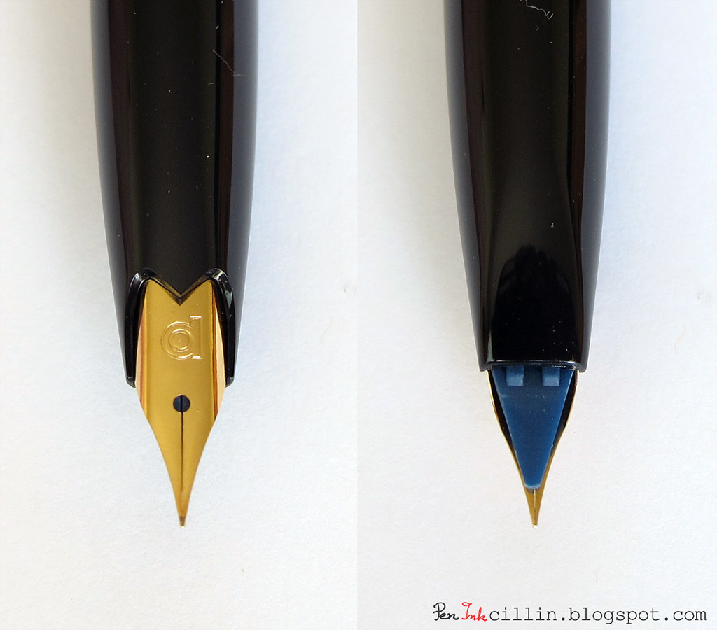 [/img]
There's a rounded shape to the Rotring. It's hard to see but the platinum just stops. It's super fine and doesn't have that ball.
I took the second photo from [url= http://peninkcillin.blogspot.co.uk/2012/07/platinum-carbon-desk-fountain-pen-review.html ]here[/url].
I reckon the Platinum is going to be half the width of the Rotring. Maybe narrower. I wouldn't buy the Platinum to write a letter with but to draw, it's ace. So precise. And it looks cool. Though the barrels tend to split.
( long-winded ramble alert)
jimjam I use (variously) photographic reference, sketchbook reference (moreso of late) direct memory, and imagination/memory at different times. Sometimes in combination. I started a self-taught 15yr graphic arts/design for print career in the 80s drawing primarily with Rotring/ink yet midway became frustrated and went to art college. Began painting with acrylics, fantasy, pop art, LOTR stuff etc etc. Again became frustrated with my tendency to keep everything 'tight' and it felt derivative so knocked the whole thing on the head for nearly a decade.
What I somehow (doh!) had so far failed to explore/describe was my innate interest for nature/the landscape. So at 30yrs I picked up a digital camera and then pursued so-called fine art landscape photography. This (though successful and fortunately well received) ultimately brought frustration once more. I then came full circle to painting as no matter how hard I pushed my photography it couldn't inspire within me hardly a jot of the elation and 'familiarity' I felt looking (say) at studies of landscapes by Constable, Corot, Whistler, Sickert or Turner. So once again went off to study hard. The National Gallery and RA became magnets at this point.
I got lucky landing traditional oil-painting classes/mentoring with a successful painter/author. He first coached me to work in monochrome (basic tonal painting) and it took a good while to begin to 'see' beyond linear perspective/form into the natural world which was also a lot about aerial perspective and movement. This 'tonal painting boot camp' began with still-life observation of classical sculptures. Learning how to first divide into complex 3 dimensional forms into forced planar surfaces described by using just three main tones (dark, mid, light) and then gradually increase the range of tonality without (this is the trick) 'muddying' the work by overworking/blending. Keeping it fresh. I still find this to be a frustrating challenge.
I then went on to study George Inness et al/Tonalism, combining this new (for me) learning with what I had learned to date via both photography and classical oil-painting tuition.
Had to work hard ad shifting my mental block, moving from outline to tone/mass. In recent years signed up with contemporary American tonalist Dennis Sheehan and enrolled in a distance-learning course. Strongly recommend you look him up on youtube. His loose approach was immensely useful to me in that (likewise) I've somehow spent decades being outdoors as much as possible (both for leisure and work) and the landscape, weather, seasons etc eventually 'soak in' to your memory allowing a more fluid response when you come to paint/draw.
One evening the sun was setting and I was in a field with a big canvas, big brush, and two oil colours. I didnt paint what I could see in the field, I painted what 'the paint' seemed to want. And fast! Sun had set after 35 mins by which time I was finished. I stepped back and was so amazed at the outpouring. A few random loose flourishes of dark and light had become a scene full of moonlit trees, pathways and a shadowy brook. It was rough and had a green cast but I kept the painting as the 'eureka' example.
Lately I find myself becoming tired with imagining endless sunset pathways. (Sheehan never seems to tire of this!) Maybe as I get older that peaceful walk in the woods to the setting sun becomes a motif for mortality. I need to step back awhile and engage in some other stuff. Then I see an Atkinson Grimshaw and get suckered in again! Plein Air is my friend here, it gets me out of the 'tunnel'.
If using a reference do you try to break it down into positive an negative spaces or do you go by tone
Yes and yes.
negative and positive space
tone
linear perspective
aerial perspective
chroma
motion/implied motion
Additionally - composition, emotion and style are also studied and yet do evolve naturally as part of a process. I don't find any of the processes I use to be 'black or white' (ha!) as my workflow is more typically energetic and emotive. So ensues a battle between dry technique/formula vs wild abandon/intuition
True that!
<3 inktober
@twirlip: thanks!! That platinum is cheaper, too 😀
zilog, have a look at dip pen nibs and holder? Still inexpensive, still great, reliable and expressive
As for the water colour paints I normally stick to the liquid tubes as I have not had any luck using pans. Maybe it's just more practice that is required.
Jon I use both ready-filled pans and tubes. I squeeze the tubes into pans. Worth splashing out on artist quality paints (I too use Windsor and Newton watercolours) as that was a huge leap for me, they just work better in every way. Even if you just stock up with a limited palette of say three primaries and an earth tone Then stick at developing techniques.
PS maybe youtube Tim Wilmot, I find his slow methodology easier to follow.
Thanks for that reply. Good to hear that other people have had careers (for want of a better word) in the creative industries as random and circuitous as my own.
I've never ever been interested in trying landscapes because of the camera really. I've always enjoyed landscape photography, and I'm always looking for a certain type of sparse or non traditional landscape but so far no interest in painting them, however having moved back to the country after 18 or so years in the city I've been more and more curious to find some way of exploiting some of the skills I have to somehow portray the landscape around me (part of that is probably down to the camera not actually cutting it).
Interesting stuff.
Thanks, will check that out!
Interesting stuff.
That it is, would like to hear more of peoples creative experiences/journey. It's great reading.
Thank you for sharing that. Fascinating stuff.
Talk to me about paper, I've entered the land of colour.
my 140 gsm cartridge paper ain't cutting it for these pens, the paper gets very wet, very quickly and warps, I can handle the warping, but it crumbles the paper very quickly too, which is most annoying, i'd like to use these fairly heavily and mixing and blend colours..
Am i just better getting some heavy duty water colour paper? I don't really want to start stretching paper on a board for scribbles.
This is my first attempt with them.
We'll call this 20 as it's a first. (and for no other reason just to keep me on track! 😆 )
[img]  [/img]
^
140gsm is fairly thin paper for wet work. I make my own blocks from 300gsm watercolour sheets by binding/edging with Copydex. The top sheet dries flat and then gets removed to begin anew on the next.
Maybe try a decent sketchbook (it may cockle a little, but so what for sketches) I find Seawhite sketchbooks to be useful and I go at them with knife, pigment, water etc.
or else some ready-made blocks?
[url= https://www.jacksonsart.com/jacksons-eco-papers-sheets-blocks ]Jacksons have a sale on these[/url]
^ not sure if these are smooth or rough though?
*edit - they're smooth, just watched the video 😳
Not sure if rough or smooth is better tbh, don't really have much experience to go by, never really considered the actually media as such and always just used what's available. Used to wet the paper, stretch and tape for water colour in school, but that's a flaff when I just want to scribble, mind you would probably do that if I ever do anything beyond scribbles.
tbh I think it is just a case of buying decent quality heavy 300gsm paper.
cheeers, I'll probably just experiment and see what's what, rough v smooth is an interesting thought actually.
very vibrant these colours, so I'll probably need somethign that can handle alot of water/use of the blending pen.
might just need a wee bit of patience as well not to break the paper with these, gonny take a fair wee bit of experimenting to tame them anyhow.. Or just stay vibrant. Might get some water colours too, actually wonder if I've got any kicking about.
[img]  [/img]
should probably stop using the black too.
tbh I think it is just a case of buying decent quality heavy 300gsm paper
it'll take more water and other punishment, but just know that it will still cockle unless held flat when drying, either by tape, grips or in a glued block.
cool.
[img]  [/img]
no sure if these pens where a good idea! 😆 I should probably make use of youtube!
gets a lot more interesting when you start splashing water all over the shop. This is still rubbish, but aye defo need more robust paper. And a fair bit of time invested in these.
[img]  [/img]
I'm never going to finish thus, or if I do I will quickly ruin it so posting anyway.
[img]  [/img]
was supposed to be this guy
[img]  [/img]
Yagy? Retsud? from Lone Wolf and Cub - the leader of the shadow clan.
