
Oooh looks nice...
... hang on a minute? Turquoise? WTF?
pictures?
A bit disappointing IMO.
http://www.bbc.co.uk/news/uk-17457729
[img]  [/img]
I think that the Altanta 96 kit was the best recently.
Have you seen the pic of Sir Chris in the kit. More to the point, his thighs 😯
[img]  [/img]
[img]  [/img]
Whats that thing with brakes, gears and wobbly forks doing behind him?
get a good roast dinner out of those thighs
In Cycling Weekly the other, er, week, they revealed that Sir Chris can leg-press 630kg...
What is with all the black - or is that just my computer ??
Good color and all that, especially on the Kiwi team and the All Blacks.
Forget the kit, look at the Ennis.
Some reaction on Twitter said the designs were "too blue" and looked like they were for a Scottish rather than a GB team.One, @donaldjdonald, said: "Turquoise, white and blue is the new red, white and blue apparently. Did someone forget to order the red dye for the Team GB Olympic kit?"
Asked about the criticism, McCartney told the BBC: "I wanted to start with the Union Flag, but I'm really aware the red, white and blue are in other people's flags and it's qute confusing when you are watching... is that America, is that France?
"I wanted to make it slightly more delicate and have more texture.
"It's very recognisable still, I've represented all the parts of GB. There's a lot of red in there, but in a non-traditional way."
Not convinced, Stella. I think it looks good as a design, just not very GB and I really think that the Union Jack is a great bit of design in itself. I think that the GB cycling kit looks brilliant and it's never confused for US or French kit.
[img]  [/img]
Gopping - are they sponsored by network Rail
Not doing anything for me I'm afraid. The kit above looked great imo
TandemJeremy - Member
get a good roast dinner out of those thighs
Enough meat for an entire Harvester me thinks.
Not enough red in the design.
And forget CH's thighs. I'm more interested in Jess Eniss'es's.
That is all.
EDIT: "There's a lot of red in there, but in a non-traditional way" ... ah, I see, turquoise is the less traditional version of red. I can see how they're easily confused. idiot.
It's all a bit wrong really. Looks like the corporate theme for a really dull company, and doesn't say 'GB' to me at all- Scotland maybe.
I see what she's saying about wanting to do something different with recognisable elements like the Union Jack etc. but it hasn't come off- the baby's gone out with the bathwater.
Gopping - are they sponsored by network Rail
😀
Looks like the kit's already been through the washing machine 50 times, but they forgot to use Daz ColourFast.
And WTF!!!?
[img] 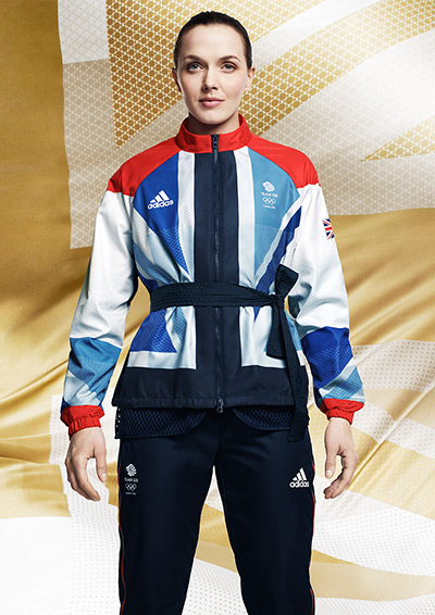 [/img]
Has she taken up Judo?
Absolutely hideous, but given the Lisa Simpson logo, I guess it was only to be expected.
WTF is the X-factor thing on Iduwo's top?
This is what happens when you mix arty farty fashion designers with Germans!
Individually, I quite like the designs. Together, in the photo above, they look gash and insconsistent.
And not using red in the union flag? WHY? That's the ID, it's the 'brand' of the UK. How was using turquoise allowed to get past an idea???
jfletch - Member
This is what happens when you mix arty farty fashion designers with Germans!
I'd put good money on Adidas not making a lot of the kit - It's quite common for the current kit manufacturers for a given sport to make the kit but to put the Adidas (or whatever) branding on it.
the BMX kit...how to make an athlete look very unathletic. Brilliant.
I was just thinking that about the BMX kit, is it just the kit???
Why is an Ice Hockey Goalie's kit being modelled?
[i]I was just thinking that about the BMX kit, is it just the kit??? [/i]
It's not Shanaze making it look unathletic, put it that way. Proper animal.
This really annoys me.
Designers? I've shit 'em.
IT'S THE MOST ICONIC FLAG IN THE WHOLE WIDE WORLD, IT'S RED AND WHITE AND BLUE AND IT ALWAYS LOOKS GREAT BUT YOU STUPID MONKEYS HAVE SAT IN YOUR STUPID OFFICE AND MANAGED TO COCK IT UP.
HELEN BLOODY KELLER COULD HAVE DONE A BETTER JOB YOU TOSSPOT DIMWITS.
So, overall, I'm not that keen.
Is it just me who is wondering if they are going to go to hell by suggesting that some of the legs in that top photo are somewhat more toned than others?
Couple of things spring to mind regarding the colour choice
1: (like her dad) No taste?
2 : Colour blind?
3: Printer was running out of coloured ink?
How much has it all cost ?
I like it. Especially with Ennis in it.
What is it with heptathlete shapely figures? Oh my.
Designed by Stella McCartney.
Keeping up the family tradition of being over-rated and crap but getting paid lots for it.
Ennis? Shapely?
She has the figure of a little girl; 'ave a word!
Oh, dear god
You know the other day, when it appeared that "dozy bint" was inappropriate terminology, ...
I appear to be the only person in Britain that thinks they should have dumped the Union flag element of the design altogether. Much prefer something like the national cycling jerseys that feature the colours but don't make any further reference to the flag.
Oh and AndyP I may have to leave the country for my comment but you are surely going to hell for yours 🙂
Massively disappointing is an understatement. Hope McCartney wasn't paid for that crap design. Can't even get the Union flag right - epic fail.
At least Chris's bikes the right colour.
Perfectly adequate but a bit disappointing and could easily be much better. Pretty much sums up the whole thing, let alone the GB kit.

jfletch - MemberThis is what happens when you mix arty farty fashion designers with Germans!
Yeah, but it was Adidas and our Stella that did the design bit. Can't blame the manufacturers for that.clubber - MemberI'd put good money on Adidas not making a lot of the kit - It's quite common for the current kit manufacturers for a given sport to make the kit but to put the Adidas (or whatever) branding on it.
I think if the turquoise bit was just changed to red it would all look rather good.
Ha - Wiggo posted "Oh Dear, The Olympic kit!!" on Twitter which is about the first 'personal' comment he's made in ages and it's now disappeared. I wonder who pressured him.
"it's important we're all singing from the same hymn sheet", etch no doubt.
Too late to delete it 🙂
This is what you get when designers who operate in an emperors new clothes environment are tasked with coming up with an actual decent popular design.
As noted above, Blue Peter would have been a better and cheaper option.
It's all about press though isn't it.
How many team strips do we know about? None.
How many countries will know about ours? Lots. Because it's McCartney, it's our olympics, there's controversy, etc, etc.
Job done.
Anyway - we wont care come the olympics, nor will we care about the logo (which I think it perfectly fine), or other elements that seemed important at the time.
Nice kit generally but to take the red out of the flag is bizarre. Still in the current day and age, the only people you can legally discriminate against are the English!! But in this case NI too!
Imagine designing a non-blue version and then seeing some SNP vote-jokey going on about, if there was any more evidence needed for why we have to have full independence. Those Sassenach B******* have eradicated us from the flag now!!
The only upside, is that if anyone wanted to buy the cycle kit, at least it doesn't shout team GB at you like the old stuff. So you wont look quite so silly.
You wouldn't take the yellow or red or black out of the German flag, how wrong would that look...?
Bradley its part of the absurd angst we have about our nationality!
More pics
loving those [url= http://singletrackworld.com/forum/topic/my-new-road-race-weapon ]green tyres[/url] 😀
Sorry. But I like the cycling kit. (apart from that weird jacket Vicky is wearing)
In that last pic of the lady on the bike on the first page (apologies for not knowing who it is) there is absolutely nothing to distinguish which team she is riding for, am really disappointed with the kit, as said above our national colours are RED, WHITE and BLUE
That's the former world champion, multiple national champion and best hope of a medal in the women's RR, Lizzie Armitstead.
There's a bit more red with the GB Olympic edition Oakley Radars
http://www.selectism.com/news/2012/03/22/oakley-team-gb-olympic-sunglasses/
mdb - Member
Forget the kit, look at the Ennis
+1