
Originally posted by Deadlydarcy but had to be taken down.
https://twitter.com/weatherchannel/status/1040305773664980993
Ooh - that's very effective!
Meanwhile in the Philippines.
For a moment I though the cool bit was the coastline looked like dragons 😉
I saw that earlier and was trying to figure out a way to embed it.
It seems to suggest that many folk can't visualise 3ft, 6ft and 9ft.
It seems to suggest that many folk can’t visualise 3ft, 6ft and 9ft.
Or that they can't extrapolate how that relates around them, translating the numbers to landscapes is probably quite easy at times, but when you are worrying about heaps of other things it's a really good way to show it and to kick people out of complacency,
You mean they can't translate it to how tall they are?
Maybe floods are Darwin in action.
You mean they can’t translate it to how tall they are?
Are people 3ft, 6ft and 9ft? How tall is your neighbours fence? How about I ask you while you are packing up your belongings and trying to decide if yo evacuate or not and where your kids are and what your elderly parents are doing.
We could express measurements in units and expect that to translate instantly to people or we could think about better ways to communicate. Obviously some people are clever enough to be able to visualise everything instantly even when under extreme pressure or stress.
Which part of this diagram is more useful
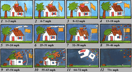
I mean we all know how fast things move and what the difference between 30 and 32mph is.
It seems to suggest that many folk can’t visualise 3ft, 6ft and 9ft.
I think the point is to make people aware of what’s likely to happen to you and your surroundings at those surge levels.
i just thought it was a pretty good visualisation - and a nice use of tech. 😀
It seems to suggest that many folk can’t visualise 3ft, 6ft and 9ft
Jeez. Lighten up. Its a useful infographic to demonstrate an important health and safety issue.
Always good to see some classic Billy but always good to see some really well thought out and clear messages in emergency situations. It's really interesting watching some people process information, visuals work for nearly everyone.
Was sat in a room with some smart people trying to work out what 10,000 car wheels looked like as a volume, we talking football pitches here?
A really good bit of advice was that your audience should get what you are saying within a few seconds, without having to think about it. That got that across.
Jeez. Lighten up
+1