Might just change the wiper seals and leave the rest.
An entirely innocent comment, but when combined with the pictures above....... 🙂
molgrips - This link is REALLY REALLY REALLY NSFW! You have been warned!!
EDIT: There was a link, now it's gone!
Loco logo supposed to be one side of a fork leg
I can't see that, can someone explain please?
xiphon & maccruiskeen genius, made me laugh.
There also isn't a word (that I'm aware of) for that thing where a man and a lady share a bath, and the man farts and the lady has to try and bite the bubbles.
Deserved quoting.
If that is what I think it is....delete before the banhammer falls.
Edit: Damn my clicky fingers....it is what I thought it was 😀
a Swedish goat site.
I still don't get why the garmin logo is 'clever'
?
I still don't get why the garmin logo is 'clever'
Personally, I don't think it is super clever, but its the N of a compass....and seeing as they make GPS stuff its quite apt I guess.
Hurt myself laughing at Captain Flash
I still don't get why the garmin logo is 'clever'?
Me neither. It's not like you need to be a genius to work it out. I kept looking for something more subtle and was rather disappointed with the explanation TBH.
Loco logo supposed to be one side of a fork leg
Me too. I can see how it looks like pac-man, though and if I really squint it almost says locoI can't see that, can someone explain please?
I don't get the last three pics...
You need to be more open in your interpretation
[img] 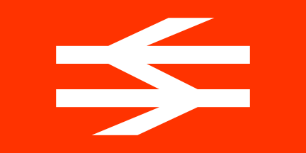 [/img]
[img] ![]() [/img]
[/img]
[img]  ?1285053531[/img]
[img] ![]() [/img]
[/img]
seen this around Munich:
[img] ![]() [/img]
[/img]
always thought this was good, too:
[img] 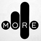 [/img]
I got the rude ones earlier btw, but couldn't really think of anything to say. Not even 'lol'.
I don't get the last three pics...
I got the rude ones earlier btw, but couldn't really think of anything to say. Not even 'lol'.
?
I wonder whether the goatse ones are intentional or innocent.
Maybe trying too hard with the Garmin logo but I saw the white space above the N as the triangulation from the crux to the three satellite points as in GPS.
I still don't get why the garmin logo is 'clever'
?
Me neither. It's not like you need to be a genius to work it out. I kept looking for something more subtle and was rather disappointed with the explanation TBH.
so it's logo with a triangle on?!!
Wunhundred!
[img]  [/img]
I still don't get why the garmin logo is 'clever'
?
Me neither. It's not like you need to be a genius to work it out. I kept looking for something more subtle and was rather disappointed with the explanation TBH.
Each to their own - I just thought it had merit creatively. Simple, functional, describes the business perfectly. Having a logo that requires the viewer to be a genius isn't necessarily a good thing.
I just liked how a simple and inoffensive design suddenly took on new meaning when I 'got' it.
The British Rail logo ^^^^ is amazing though - one of the best pieces of informatics around.
Is it just me who sees all these logos as really winky?
all it needs to do is tell you what the company is.
All the "cleverness" just detracts from thsi - Like LOCos logo.
Seems to me like a circle jerk
I don't suppose you would appreciate anything to do with brand profiling though TJ - after all, you like to sit naked at home eating value baked beans.
😉
There's some great ones on this page:
http://www.graphicdesignblog.org/hidden-logos-in-graphic-designing/
maccruiskeen - Member
I'm not a graphic designer - but there isn't a word (that I'm aware of) for words that look like the thing they describe so onomatopoeic will have to do.
Yes!
TeeJ is immune to all kinds of advertising and marketing, doncha know 🙂
I'd put the BR logo as one of the best because it's so recognisable without words, genius.
TeeJ is immune to all kinds of advertising and marketing, doncha know
Indeed. He is known as the 'Incorruptible One', in advertising circles.
Is it just me who sees all these logos as really winky?all it needs to do is tell you what the company is.
I can't decide if it'd be a good thing or a bad thing if TJ was in charge of commerce and business.. 🙂
Apparently the NHS logo has 98% *UK* brand penetration (ie, 98% of interviewed respondents in a survey recognised the logo).
I assume the remaining 2% are either blind or pathologically stupid.
[img] ![]() [/img]
[/img]
all it needs to do is tell you what the company is.
I suppose logos aren't needed then, really. We could just write the names in black Arial and be done.
Indeed. He is known as the 'Incorruptible One', in advertising circles.
mrs deadly reports from the agency where she is freelancing today, that she heard coming out of a brainstorming session..."Yeah Tris, that's the best thing you've ever come up with it, but it ain't gonna crack TJ"...and this is as far down as Bristol!
jackthedog - Memberall it needs to do is tell you what the company is.
I suppose logos aren't needed then, really. We could just write the names in black Arial and be done.
Yup 🙂 Hence why the NHS one is so good - it just says what it is in simple clear text.
Loving the attacks on me - emperors new clothes again?
Always loved the Office of Government Commerce (OGC) logo.
.
[img]  [/img]
.
or if you turn it on it's side......
.
[img] ![]() [/img]
[/img]
Loving the attacks on me
Can someone do a sense of humour logo for TeeJ please? FFS TeeJ, can't you see it's just teasing, no matter how much you'd like it not to be 🙂
Sorry DD - yes I knew it was teasing. Loss of nuance via text.
Those aren't attacks TJ. That's just your (drug-induced) paranoia.
OCG on its side is genius!
Nowt drug induced about my paranoia. Just because I'm paranoid it does not mean you are all out to get me
Just because I'm paranoid it does not mean you are [b][i]not[/b][/i] all out to get me
FTFY 🙂
TandemJeremy - Member
Nowt drug induced about my paranoia. Just because I'm paranoid it does not mean you are[b]n't[/b] all out to get me
FTFY
😆
Of course the NHS 'brand' is massive and much, MUCH more than just Frutiger Bold Italic reversed out of a Pantone300c box. The last time I looked, there was about 12 different sets of brand guidelines for different users and services of the NHS brand.
Which is where the logo / brand argument kicks in. A logo is a tiny component part of a brand...
Woo!
I'm always the one saying "EDIT: Beaten to it...again".
Thanks druidh.
|and the NHS is not a brand. 🙄
brand
Now, now...this is only going one way...it's all been good natured so far 🙂
Yeah - I got the "You move too fast" box!
http://www.nhsidentity.nhs.uk/
This website is a central resource for all those involved in developing NHS communications. It contains detailed guidance on how to apply the NHS [b]brand[/b] to communications materials, and provides access to free downloadable guidelines tailored to specific audience groups.
Brand = Name.
you can call a cat a dog but it remains a cat.
Thats just part of the money wasting circle jerk
Or just stick your fingers in your ears, sing "laa, laa, laa" and pretend you can't hear.
you can call a cat a dog but it remains a cat.
Snot really the point though. It's the difference between calling a cat a cat, a scabby old moggy, a beautiful silky feline, a finely honed killing machine etc etc etc.
Not at all Druidh - its simply not buying it. 🙂
I pity anyone who believes in all this stuff and who wastes their life and / or money doing it.
TeeJ straying across the complete bolllocks line. Somebody lasso him and drag him back...purleeeassse! 😮
TandemJeremy - MemberNot at all Druidh - its simply not buying it.
I pity anyone who believes in all this stuff and who wastes their life and / or money doing it.
TJ Why would you keep posting on a thread about a subject that you're clearly against / not interested in or don't 'get'?
are you trying to convert people?
Paying someone good money to design a logo for the NHS - what did it achieve?
Is it just me who sees all these logos as really winky?all it needs to do is tell you what the company is.
But just *how* you do it can give a very different impression of the brand...
[img]  [/img]
I pity anyone who believes in all this stuff and who wastes their life and / or money doing it.
Believes in what stuff?
Doing what?
M_F, Style not important, the image is still the same.
Uh oh.
He's hooked one!
1 and 3 do what is required equally well - the rest look winky
MF - my point is the difference is only to people in your world who care about logos - the rest of us it makes no odds to at all
DenDennis - I'll butt out again
[s]the rest of us[/s][b]ME[/b] it makes no odds to at all
You under-estimate the effect brand has on most people TJ.
Are you seriously telling me that the above examples of your STW username evoke no differing feelings in you about what TJ - The Brand is, what he stands for, what he does? (Rhetorical question by the way).
I'm going to design a TeeJ brand...
*opens InDesign*
*scratches head*
*pages Jamie*
1 and 3 do what is required equally well - the rest look winky
You just proved us right by choosing two from a list. If it really was meaningless you'd have said they were all the same.....
TandemJeremy - MemberDenDennis - I'll butt out again
sorry, I didn't want that. I'm quite enjoying the discourse now on TJ- the Brand.
1 says to me TJ in brogues, man about town, snappy dresser.
3 says no-nonsense, designer glasses, bootlace tie, britpop TJ
by the way, for the record I hate branding/marketing as much as your average Bill Hicks but to deny its effect would be putting to waste rather a lot of corporate$$... What is Red Bull for example? marketing Tosh but they have certainly got rich peddling it
Oi you lot, I was enjoying this thread - more interesting and rude logos please!
Also, the competition to design a TJ logo starts now...for me, currently #5 best meets my perception of TJ the [s]brand[/s] man.
MF - and I believe you vastly overstate it.
Those 5 - as I said 1 and 3 convey the same information clearly and concisely - my name. The rest are just annoying as they are not clear.
there is no other information there - just clear name or unclear name. this other information only exists if you know the "language" and most of us don't know it and dont care. its like the handkerchief in pocket thing for signals about your sexuality.
Okay TJ - thanks for your feedback on stage 1. As you preferred the simple serif faces we have progressed the concepts using several different cuts of more traditional serif faces....
[img]  [/img]
MF is it possible to have it written in a font that doesnt have curly bits or spikey bits on the edges of each letter.... something blocky and stright... possibly with a helmet on top of the 'J' but twist the upper 3rd of the upright in the 'j' to show rotational forces? maybe have the whole thing under close control on a lead?
curly bits or spikey bits
Sillyphilly. Serifs.
Needs a helmet on a jaunty angle...or casually hung from the J 🙂
I'd love to help, but I don't have the clip art for that 😉
I'd love to help, but I don't have the clip art for that
You mean you won't be doing it in Word? 😯
*sacks m_f*
The kerning on those last two TJ logos offends my eyes. 2:a is pretty bad too. 😕
Needs more EPF if you ask me.
Or of course we could look at stacking/weight combinations - the simple bold one suggests maybe you are in construction or engineering or something, the fine cut males you look like a hairdresser.
[img]  [/img]
And we haven't even introduced colour yet....
The kerning on those last two TJ logos offends my eyes
Jeebus I didn't do any kerning! Way too much faff on my lunch break.
You just proved us right by choosing two from a list. If it really was meaningless you'd have said they were all the same...
[img]  [/img]
Evidently! 😀Jeebus I didn't do any kerning!