What we're seeing with "HDR" images on social media is that people are reacting to the gimmick or novelty of something new.
Like polaroids it will be back in 30 years or so as a retro filter and you'll be able to tell your grandkids it was crap the first time round!
colournoise - Member
bikebouy - Member
See, I love the tree pic colournose posted. Very nice, processed with care as to not obliterate.colourNOSE? Heehee.
Erm, sorry about that 😳
I don't normally criticise other people's photographs but really, in this case, I will make an exception.
What the very **** were you trying to do with this?
[img] https://goo.gl/ZBO0Ea [/img]
It's utterly dreadful! I mean what is going on with your phallus shaped colour of the patch of sky around the tree, which doesn't remotely match the rest of the sky.
I'm happy for you if you like it and I don't think it makes you a bad person but oh my word it is gash!
Now come here and give me a hug I feel bad for having trashed it.
😆
And there we have it. Two completely polarised opinions of the same image just a few posts apart. Why I love art.
Please don't feel bad... I have thick skin - having fun with all this is way more important than worrying about what people think about the results (like I said, if my salary depended on my photos I [i]might[/i] feel differently).
What was I trying to do? Push things until they break I guess. Why does one patch of sky need to match the rest?
I might see if I can dig out some examples of my paintings at some point - might shed some small light on what I do with photos.
"I want to do everything in the camera and Photoshop is cheating"
Unfortunately the camera cheats as well.
The last two nights I have been taking photos of the aurora in northern Norway. The photos are pretty spectacular - bright green bands of light, shapes etc. Thing is - your eye doesn't see that - just general wispy areas of brightening in the sky, like a funny cloud. So I am using the camera as a sort of tool to see what I otherwise could not, or to represent nature in a different way. So where does the "image manipulation" process actually start?
What the very **** were you trying to do with this?
Well, if you were to ask me, I'd say that picture is all about capturing what a hot sunny early summer day feels like to be in. Brightness, colour, dazzling light in the sky, the rich colour of the woods and so on. I think it does it quite well.
It's impressionism with a camera, isn't it?
molgrips - Member
It's impressionism with a camera, isn't it?
Not the specific art movement I'd have chosen, but not a bad interpretation...
If it helps, in the dim and distant past, my dissertation was about the Romantic landscape movement in art and literature and it's influence on 20th century and contemporary abstract painting.
gofasterstripes - Member
Unless the persons viewing your images is doing it on a also well-calibrated monitor, then they don't know they're seeing the image as you did when you processed it
I've given up worrying about it. I don't do prints and I know from experience everyone else's monitor will be all over the place in (un)calibration and my photos will look different on each one. I concentrate on the image and enough levels to make it stand out somehow and it tends to work okay enough on most monitors. Though I occasionally find what pops out at me on my monitor looks dull on many others.
That said, many (majority now?) viewing photos on the web are using high gloss and contrast glass on tablets and phones that does bring out the colours. A little too much in some cases, but what I notice gets likes is loads of contrast and loads of colour, even if the picture is average. Also, smaller screens hide imperfections 😉 . Likewise when posting on Instagram and Facebook. There's a lot I'm happy posting on there that would look rubbish full scale, though you can enlarge them but few do.
Thing is, photographers may judge a photo by the technical skills of how it was shot, composed and techniques used but slate something that is just initially impressive because it blows the senses but isn't a skilfully shot photo. The latter is what a lot of people will prefer though.
Bit like films. No substance but loads of eye candy and action sells more tickets.
Colournoise - I don't feel bad, but I'd still give you a hug just in case there was any doubt on either side.
I will comment here in the best way I can, which probably isn't that good because I don't have any formal 'art' training.
I think the problem I have with the approach your describing is one of incongruence between the aim of expression and the medium you choose to do that through. There's no rule to say you can't use a camera to create a piece of impressionistic art, I've tried it myself (see below as an example) but I always find the results to be less than satisfactory.
[url= https://c1.staticflickr.com/9/8657/15461161854_dbed2b6ef8_o.jp g" target="_blank">https://c1.staticflickr.com/9/8657/15461161854_dbed2b6ef8_o.jp g"/> [/img][/url][url= https://flic.kr/p/pyfuL7 ]Brighton Front[/url] by [url= https://www.flickr.com/photos/geetee1972/ ]Greg Turner[/url], on Flickr
I think the problem is that like it or not, photography as a medium is painting with nature's light, not your own. If you try to stray too far from what nature gives you, it jars and feels contrived. Painting however, is all about your light; it's entirely your canvas so you have more creative freedom.
It's for this same reason that a lot of studio photography doesn't feel as much like 'fine art' to me as available light photography. It's not to say it's cannot be done (there are many fine art photographers, especially portrait photographers, whose work with added light is sublime and clearly fine art) but it is hard to do without it jaring, just like trying to be impressionistic with nature's light.
Does that makes sense?
Personally I think if a photograph is pleasing to someone, even if it's only the photographer, then it has worth, regardless of whether someone else thinks it's gash.
With regards only capturing a true representation of what the eye sees. Fair enough, if that's your preference. I think this is missing out on utilising what both the camera and editing tools can achieve - be it simply making a dull photo brighter and more interesting, or doing something completely abstract.
geetee1972 - Member
Does that makes sense?
Absolutely. And I won't dispute that it's a totally valid viewpoint, even if I obviously don't agree with it on a personal creative level.
I think that the fact that photography isn't necessarily the best medium for trying to do what I do is one of the reasons I'm still drawn to it...
Not the specific art movement I'd have chosen
What would you compare it to then?
Genuine question, cos I know next to bugger all about art, I'm a proper heathen 🙂
I really like that pic geetee..
Think it's ace.
molgrips - Member
Not the specific art movement I'd have chosen
What would you compare it to then?Genuine question, cos I know next to bugger all about art, I'm a proper heathen
If I had to pick one, it would probably be Expressionism, although as a painter I'm more of an Abstract Expressionist (with a tiny bit of traditional landscapist thrown in) really.
Not mine, but three of my favourite painters...
[img] 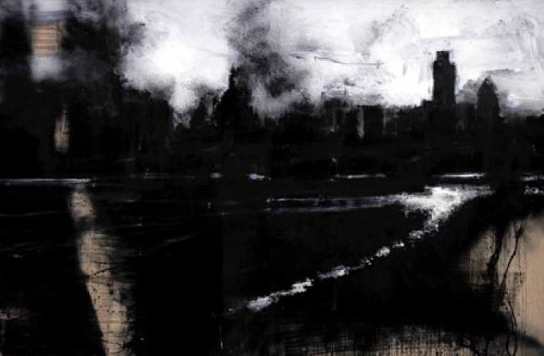 [/img]
[img]  [/img]
[img] 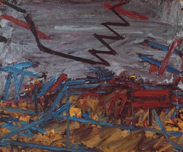 [/img]
If I had to pick one, it would probably be Expressionism
*fires up google*
I really like that pic geetee..Think it's ace.
Thankyou. It's not actually achived through post procesing funnily enough. It's simply shot through a very worn, faded and mottled perspex window on Brighton front. Same with this (I went through a 'phase')
[url= https://c1.staticflickr.com/8/7542/16295960832_41001fe4f9_o.jp g" target="_blank">https://c1.staticflickr.com/8/7542/16295960832_41001fe4f9_o.jp g"/> [/img][/url][url= https://flic.kr/p/qQ24pW ]Through a Glass Darkly 2[/url] by [url= https://www.flickr.com/photos/geetee1972/ ]Greg Turner[/url], on Flickr
Photoshop is for winners 8)
@Geetee1972, unfortunately I'm going to have to completely disagree with this point (in as much as you can disagree with someones opinion over art 😆 )...
I think the problem is that like it or not, photography as a medium is painting with nature's light, not your own. If you try to stray too far from what nature gives you, it jars and feels contrived. Painting however, is all about your light; it's entirely your canvas so you have more creative freedom.
Photography is all about controlling the capture of light on a film (or sensor). You control where you point the camera, you control your aperture, focus point, shutter speed etc. Why not control the light you have available too? One could argue that by choosing to shoot at a particular time of day, or in a particular room, that you are controlling the natural light available, and therefore it isn't natural anymore. So why not take it one step further and introduce your own light if it suits?
So why not take it one step further and introduce your own light if it suits?
Well you can, I did say that. I said that added light photography is an entirely valid and indeed very important genre. MrSmith could not do what he does (so well) without the added light. I personally think that the skill needed to be a really good studio photographer is far in excess of what most photographers, myself included, are (currently) capable of.
The question is not whether it's a valid genre, it's whether it's 'art'. If we can for one moment agree that art is not just something we point at and say 'hey that's art'; that there has to be some validity behind that statement (in the same way that I can't point at a chicken and call it a duck and that be a universal truth).
I said that added light photography is materially much harder to create 'art' from; not anywhere near impossible, just difficult. A studio fashion shoot for instance, that results in an editorial spread in say Vogue, isn't really art, though it may have artistic merit.
I will give you two really good examples:
[img]  [/img]
This was taken by a young and up and coming NY based fashion photographer. It's sublime. It is unequivocally art and yet it's execution clearly shows the photographer to be a skilled studio shooter.
[img]  [/img]
This image however is not art. Not remotely. Yes you can disagree and you can say 'to me it's art' but I don't think many people would agree other than to make a point about the democratisation of art (which I also agree with). The image above is well executed, well lit, great colour etc. Technically it should be art, after all it ticks all the art boxes right? But it lacks something fundamental. It lacks soul. It has no depth other than in the. The signifier may well look like it should be art, but the signified, the meaning and feeling that the signifier conveys, is shallow. It's just a photograph of well lit woman in a colourful dress. Meh.
But the arguments become pointless because really what we are trying to decide when we disuss what is art (and what is not) is what is truth, beauty and love. If we as a race are trying to figure out what matters, unelss we want to conclude that everything matters equally, we aren't going to get anywhere simply by shrugging our shoulders and saying everything is art is we want it to be. Though that may be true.
Why not control the light you have available too?
Yes, that was exactly my point. As a photographer we have to work to control the light that is available and make the best of it. When we take a step beyond that, and add our own light, we change the aesthetic. It makes it harder to create something that has deep artistic merit (though I say again, not impossible).
I personally don't think the top BW photograph of the model is all that good actually - Its subject matter is OK, but its execution I think is actually quite poor. I do see your point regarding the differences of the two photos, but the top one does nothing for me. There is a lack of contrast across the image as a whole making it quite flat, dark and dull to the point that despite a large aperture and smooth bokeh that would normally bring forward the subject to draw attention, the model does not in any way differentiate itself from the background tones.
Same photo - some basic adjustments to lighten but not blow highlights so as to increase the range, and a vignette around the model to give some more contrast between the subject and their background. To me, the model now is no longer lost into the background.
[IMG]  [/IMG]
I don't like the skin tone now, though.*
*Dislaimer: uncalibrated monitor 😉
Bob - fair do's - its a type of photograph which is going to be very influenced by what its viewed on. Eye of the beholder n all that.
I took lots of sunset photos in Africa which, when printed, looked great. However, they didn't accurately depict what my own eyes saw; the photos recorded reality within the limitations of a film camera. Arguably they looked even better than reality.It's a bit like the old hi-fi argument, where "true" hi-fi should reflect the real experience of being there as much as possible. Well, to be frank, I've been to lots of live concerts where the sound quality was pretty dire and I'd be gutted if that's what I had to listen to on my hi-fi at home.
That is a really interesting point to me. Do you want the viewer of a photo to simply think 'OK - that is how it was at the time' , or do you want the viewer to look into the photo and imagine being there, in that scene they are looking at. It a subtle difference, but to me, the latter is what makes a good photo. Something where I look and begin imagine being there.
Same with that music analogy. Does a true hi-fi experience take you exactly how it sounded at the time as a pure replica of the moment then, or does it create a stage of sound ( not necessarily exactly as it was at the time ) that allows the listener to immerse themselves in such that they can imagine being there in that stage of sound.
Random thoughts on this thread:
Do you want the viewer of a photo to simply think 'OK - that is how it was at the time' , or do you want the viewer to look into the photo and imagine being there, in that scene they are looking at.
Neither, I want to take them somewhere else.
I have to say that a bunch of IT geeks looking for absolutes in transient ephemeral imagery of kid pics/sunsets is quite amusing. You can't apply logic and a spreadsheet to photography.
This is why people often struggle with the cost of high quality imagery, some middle manager who has done an MBA see's it as a line item cost to be trimmed like the photocopier paper or the 20 laptops for the sales team.
"Cost is only a factor in the absence of value"
Anyway back on topic.
Art? No, not really but then i think pencil drawing copies of photographs is just draftsmanship and nothing to do with art, there is an art to photography in the same way there is an art to making a good pizza or making a bespoke suit.
I just have an aversion to 'art theory analysis' it's an image, it either moves you or doesn't, but don't expect it to be universal. Which is one of the key differences between film and photography, film is almost a handholding of narrative while a photograph lets you construct your own story which might be different from somebody else's.
Which again is why it's pointless to post snaps of your kids/hole in the ground and expect broad appeal or a consensus of visual worth.
feel like I'm back in art college now sitting in a small group looking at slides of Max Ersnst when I would rather be making pictures or going ape with Photoshop.
MrSmithAnyway back on topic.
Art? No, not really but then i think pencil drawing copies of photographs is just draftsmanship and nothing to do with art,
What about still life? What's the difference in practical terms between using a photograph of a subject for reference and using the subject? Plenty of great artists will block out quick sketches with a live subject then differ to a photograph to finish their piece.
there is an art to photography in the same way there is an art to making a good pizza or making a bespoke suit.
That's craftsmanship.
which is why art also carries the dictionary definition of a skill or craft acquired through practice. (edit, cross posts with JimJam)there is an art to photography in the same way there is an art to making a good pizza or making a bespoke suit.
Being neither a photographer nor an IT geek, I find it interesting to hear all sides of the argument on this, be they from middle managers or consumer goods studio photographers - neither is less valid than the other IMO 😉
@GeeTee - There are good photos and there are bad photos. Just because one is taken in a studio doesn't make it more or less likely to fall into one category or the other. Personally, most street photography leaves me cold and uninspired, but if it floats someone else's boat then so be it - I'd rather look at a nice landscape or action shot, but that's just me.
Regarding the two images you put up, the B&W one is interesting, but looks nothing more than a snapshot, and I don't rate the studio shot either. The lighting is odd and the composition is awkward, probably because it's been taken out of context. In a double page spread advert with some copy and logos, it might make more sense. Humph...
*wanders off to open up photoshop*
geetee1972 - Member
I will give you two really good examples:
The BW image taken by an “up and coming NY based fashion photographer”.
… yet it's execution clearly shows the photographer to be a skilled studio shooter.
Huh? It’s an available-light street portrait.
I struggle to see what this has to do with fashion photography. It reminds me of those ‘Apprentice’ TV shows where they are tasked to make a commercial and end up trying to be Cecil B. DeMille without any shots of the product.
To me, it looks like a poor man’s Tom Daley who’s lost his shirt and covered himself with a piece of 1980’s bedlinen.
The Pink dress photo you juxtapose “This image however is not art” was never intended to be ‘art’.
From the info of your posted image:
Winter collection – Formals and casual wear 2014 release! (scroll down 7 photos)
It is an image intended to show-off and ‘sell’ the dress – which it does well.
I.e. this dress covers the bust / has straps but is backless / will swirl out if the wearer dances at a party.
I do like your own image ‘Brighton Front’.
However, FYI, whenever you post images on STW, they always look too dark on my monitor.
I am well aware of this curious effect (put it online and it appears darker) with my own images. So, whenever I have finished PP, if the photo is going online, I will usually tweak it a bit (E.g. increase gamma).
colournoise - Member
I post-process according to the Spinal Tap mantra...
Applause 🙂
Huh? It’s an available-light street portrait.
Yes it is, albeit one shot on a large format camera. That picture won an international portrait photography competion. I love it; I love this style of work and the art for me is clearly evident. If anyone is interested the body of work it's taken from is here:
[url= https://www.lensculture.com/articles/ethan-james-green-young-new-yorkers ]Ethan James Green on Lensculture[/url]
and here:
[url= http://ethanjamesgreen.com/gallery/portraits/ ]Ethan James Green[/url]
He's a fashion photographer and a lot of his editorial work is shot in this style. I say you can clearly see the evidence for his experience as a fashion photographer because of the way he's composed the image, in particular the pose of the model.
If you look at Richard Avedon's work, and compare his fashion/editorial work with say his portraits from 'In the American West' (a body of work that is utterly sublime) you can see the evidence of one informing the other.
However, FYI, whenever you post images on STW, they always look too dark on my monitor.
Yes this is a real problem for me. I recently put together a book on Blurb where all the images came back too dark. I have got a technical gap in my skill/knowledge here that I would very much like to fix. It's not how I intend the pictures to turn out.
Just because one is taken in a studio doesn't make it more or less likely to fall into one category or the other
I never said it did, I said that it gets harder to execute as art versus editorial.
A little footnote. At least someone out there thinks my horrid non-photos are worth looking at...
[img]  [/img]
[img]  [/img]
[img] 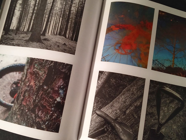 [/img]
[img] 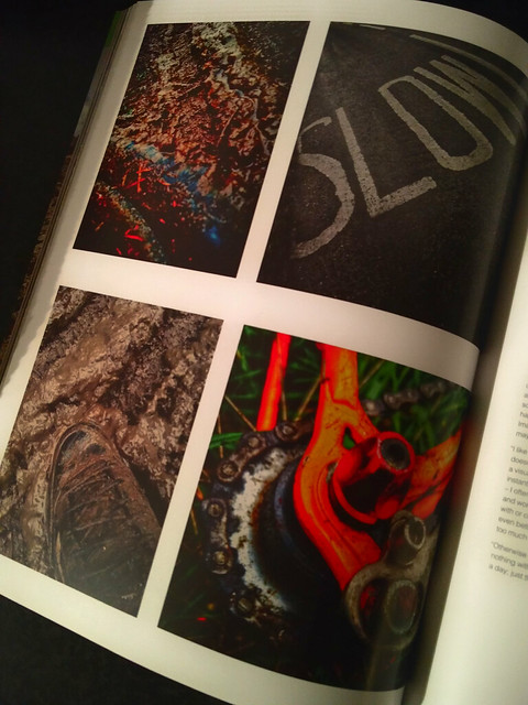 [/img]
😯 😀
Well bloody hell, that's ace.. well done you.
Nice one.
