Forum menu
Myself and my girlfriend are opening an MTB guiding/holiday place in the fjords of Norway next summer, exciting stuff, and I would like to ask you guys some advice on our logo, I thought this was an ideal group to ask.
We had originally designed a logo back at the start of the year as we had a load of stickers printed, we're now away to get some t-shirts printed and some big decals for the van and suddenly decided the logo didn't seem very good. It was more of an emblem than a logo, so we had a go at refining it as we thought it would look more 'professional' and more like a logo if it was simpler.
The original logo was this (ignore the black, it was just because I uploaded a .png):
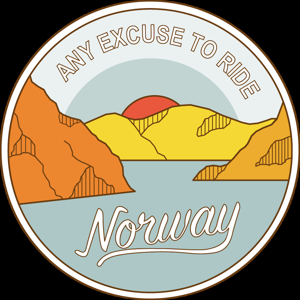
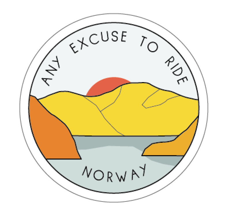
We've now refined it to this:
With a possibility of using the same thing in black and white:
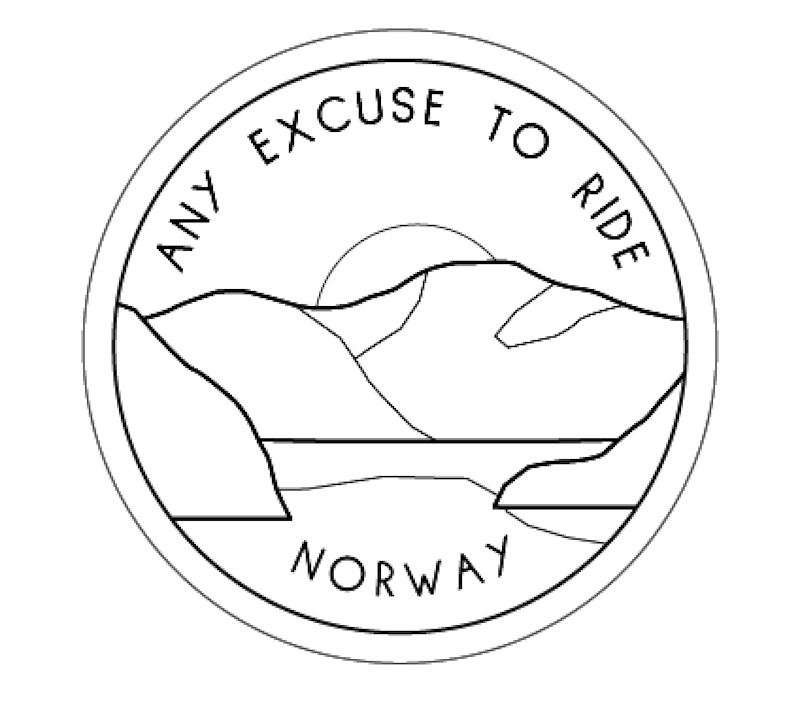
It would be great to hear what you think, good or bad or what you think might improve it.
Middle one looks like a fried egg under some croissants.
Am a bit confused really. What is the name of your company?
I like it, but it does look like a tourism advert for riding in Norway rather than a specific guiding company.
How about the circular outline being a knobbly tyre?
<div id="post-10291026" class="bbp-reply-header">
<div class="bbp-meta"></div>
</div>
<div class="bbp-reply-content">Am a bit confused really. What is the name of your company?
</div>
<div class="bbp-reply-content">
Presumably the OP is posting under their company name. In which case, I'm not sure about the logo, but the name might need some workshopping... 😉
</div>
Middle one is the best of the 3, though I would probably start again from scratch to be honest. Disappointed company name isn't liked to your user name too.
https://www.instagram.com/_any_excuse_to_ride/
https://www.youtube.com/channel/UCY69lhqeYztG_2nnC4xesGA
<p>I prefer the original, as a design it stands out and looks like it could easily be on a t-shirt, sticker or whatever.</p><p></p><p>But I'm also confused as to the company name. ANy excUSe to ride?</p>
Seems to me the water is the dominant part of the logo which would suggest some kind of boating company to me. Personally I'd look at a differnt font, too.
Doesn't really explain much or even indicate mountain biking to me, quite a lot of water for a mtb emblem. If this is designed to catch the eye maybe a web address on it
The knobbly tyre outline is a cracking idea btw
Is it supposed to be
"Any excuse to ride Norway" or
"Any excuse to ride; Norway" or something else?
The first picture emphasises that Norway is separate (different font) so I personally would read that logo differently. As others have said it sort of seems like the new logo is an advert for Norway as a country not a specific guiding company.
Anyway, nice stealth add on here.
Just me?
![]()
1st - I would never book a holiday off someone called anus
2nd - the sun/egg yoke thing makes me think about Japan, not Norway
3rd - I don't know why but I don't really like it as a logo
4th - liking/not liking a logo isn't going to sway me one way or another when looking for a holiday destination
I was thinking goatse.....
The font choice needs a serious re-think, it is, without putting too fine a point on it, bland and boring. I’m not going to make any suggestions, I was never a great designer, I specialised on finished artwork, photoshop and Illustrator stuff, but I know when a design needs a bit of work on it. I’m at least fifteen years out of touch with it all now, though, there’s a couple of people on here who really know their stuff!
From this thread, 'Any Excuse to Ride Norway' is the name of his company. Maybe the layout with Norway separate doesn't convey that. But I'd also expect to see something bike related in the logo.
Top one is most aesthetically pleasing but looks dated to me.
None of them tell me what you do or even hint at it. For me a logo needs to tell me what you do. And probably these days have a Web address.
Modern logos that people are used to seeing seem to be simpler - I'm thinking of Google material design, apple icons, etc. Drop shadows, 3 colours, clean type font.
It doesn’t scream Norway at me, just generic hills.
Needs a Blue Parrot. Supine and bereft of life.....but on a bike
Hiya Will, If your target market is middle aged whingers, take heed of the above 😃.
Otherwise I kind of agree, it's not clear what the company does. I think it isa a great blog name, but perhaps isn't clear for an MTB guiding company.
perhaps just the addition of 'MTB' or something. Ride and Norway mean powder snowboarding to me!
It is crap. Go and start again.
"any excuse to ride...Anus" ?
I quite like the first one graphically, but see what you're saying about trying to simplify it. I can't help but read 'Noway' rather than 'Norway'. Perhaps the font needs to be similar if it's to be read as one.
I feel like the colours are almost a bit too warm for Norway. I've been there and it was one of the most stunningly beautiful places I've ever seen, but it wasn't overly warm. The colours slightly contradict the destination if you know what I mean.
Also, it doesn't tell me what you do. Some sort of indication that it's mountain biking would help clarify it I think.
Nice though. Best of luck with it. I'd absolutely love to ride in Norway. 👍👊
I like it.
RM.
"Affjordable MTB Guiding, Norway" would work better as a name. Appeals to both those who spot the J and those who think it's going to be inexpensive.
The logo doesn't work for me because it doesn't show a bike and it centres on water, which is difficult to cycle on when warm.
The long winded name doesn’t help. Knobbly tyre would be good though as the logo doesn’t shout “riding”
[img]  [/img]
Sorry, want to be constructive but I just don’t like any of them and the font is way too weak to work on lots of stuff. I will try to doodle an idea or two if I can find the time.
I asked my partner who does this kind of stuff for a living and she prefers the first one, but would suggest using a solid colour for the font rather than the outline. Also, the Norway part may be slightly too prominent compared to the rest.
Agree w/some of the above regarding the logo being focused on water and no indication of MTB. I think that you need to change the perspective of the logo from looking in towards land to looking out towards the sea/water. Perspective more like these photos:
Google images should give you some ideas...
I like the retro feel of the colours, however:
I don't like the company name (sorry) it feels a bit clunky to say, and on the logo it doesn't look like the name of a company, it looks like a generic tourist "message"
Norway: Mountains, Fijords...... and forests. The Norway in your logo doesn't look like the Norway that most people imagine.
I actually really like them visually - but I don't think they are effective company logo's.... sorry dude.
Firstly, love the sound of what you do.
Secondly, change your user name!
Thirdly, I like the overall feel of your logo - kind of thing that would look great on t-shirts. However, it says bugger all about what you do.
I would bring the sides of the fjords to the foreground and maybe have the stylised outline of the front of a bike or similar - make it clear it’s about bikes. I do like the suggestion of a knobbly tyre outline - but don’t think that will make it clear enough.
Also, in the ‘About’ section of your YouTube channel put some copy of what you do and your channels - web, email, instagram, Facebook etc...
Ignore. Late night + Punk IPA + half-arsed graphic design don't mix...
Ignore. Late night + Punk IPA + half-arsed graphic design don’t mix…
It wasn't that bad.
Not coming from any kind of art/ design background ..it wouldn't grab me by the nuts if I was looking for a guiding company in Norway ..
Why don't you use a company name that just says exactly what you do for starters ....maybe something like" MTB Norway " ..with "guided holidays " underneath or around the bottom of the logo ..
I also think the logo itself is too" soft " ..my perception of Norway is that it's a rugged tough country ..not something warm and fluffy like your current logo ..
Sorry ..no offence meant ..and best of luck with the venture
Basically what the others have said - for me it would work as a T-shirt print (graphically, I'm not sure it sells the company) although there are some issues, but as a logo? No chance. There's no way that's going to work as something the size of a tuppence on a letterhead or Twitter profile pic.
Modern logos have such a range of jobs to do - at such a range of sizes - that simple and bold is the way forward. You've picked a bugger of a long name too, which isn't the most descriptive, which makes it even trickier to distil the essence of what you do into a tiny space.
On the plus side, if I ever have the money, guided riding in Norway sounds ace.
Best subtle advertising on STW evah 😀
(ps. How much for a week in the fjords?)
(pps. I commented on anus' username yonks ago and he seemed confused that I thought it was weird)
Too many words. I would go with
"RIDE NORWAY".
That's the copy sorted.
Now on to the pictures...
Is Norway yellow, orange and ... what is that, taupe?
Those aren't the colours that come to mind when I daydream about fjords and stuff. Green and blue, I would've thought .. ?
Caveat: I am neither a graphic designer, nor copywriter. (Nor branding expert.)
Can I have a discounted tour of the fjords though, please, Anus?
Bum logo.
Forget the logo. What’s the domain name, Facebook and Twitter handles? Without those registered first, I would not start on a logo. The concept of fjord is good, coloura plleasing, but I can’t see a memorable name to search.
Head to godaddy and start bashing domain names. That’s what I did. Then register the Facebook and twitter accounts. Then make the logo. And I agree the fonts don’t work forget outlines notbstrong enough
something with fjord and mtb perhaps? A few are still available.
Fjordfocus.com is still available. Nice pun and easy to remember.
colours that come to mind when I daydream about fjords and stuff. Green and blue, I would’ve thought .. ?
You're thinking of the plumage
FjordEscort would be better
FjordEscort could provide night time activities after a hard day with FjordFocus
Yeah, the limiting factor here is the company name. It's long and clunky.
I’m not sure what the question is. Are you asking for our adviCe, or asking us to adviSe you?
Gnarway?
Are there no trees in Norway?
I genuinely didn't realise that was the company name. Way too long. Is there any company outside of hairdressers with pun names which consist of more than one or two words? Jeez, even the thought of having to type that into an email address fills me with fear! anus@anyexcusetoridenorway.com?
Agree with above, whats wrong with just "Ride Norway"
Agree with above, whats wrong with just “Ride Norway”
+1. You can still use the slogan "Any Excuse to... Ride Norway" on t-shirts and branding and the like. Reads better in my opinion than "Any Excuse to Ride... Norway"
Ride Norway is taken already. You can’t go for the low hanging fruit. But any excuse to ride is a fine strap line underneath. You just need something catchy for the main title.
Fjord Explorers?
Bike Norway?
Watty
I’m not sure what the question is. Are you asking for our adviCe, or asking us to adviSe you?
And the difference is..?
Advice is a noun and advise is a verb.😉
bikenorway.com is £1700 and norwaybike.com is £10 as is bikefjord.com . I'm afraid fjordexplorer.com is also £1700.
Whatever you choose, get a name that is catchy, easy to remember and has both Facebook and Twitter accounts available. Then focus on the logo. I rather like the line "Any excuse to ride", but it is a strap line not a company name.
Advice is a noun, advise is the verb of giving the said noun.
It's amateurish and complicated to reproduce, and the typeface looks like you designed it too. Pay somebody to do it for you. Get an art student to do it if you don't want to pay full commercial rates. As somebody has already said, an amateurish look isn't necessarily a bad thing for a guiding company, but I'd still get a professional to do a cleaner, easier to read and reproduce job.
Pronounced differently too. Advise is pronounced "advize."
I suppose the subject is kinda correct if it's a contracted form of "can you advise on..."
(Edited for typo, apologies)
[i]Advice is a noun and advise is a verb[/i]
Pronounced differently too.
I know that. It wasn't the question. Duh
[sneaky edit]
[i] Advice is pronounced “advize.”[/i]
No, advise is pronounce Advize. Advice is pronounce Advice.
Aurora rides - maybe a styalised mtb constellation over a fjord/pine forest with the strap line any excuse to ride Norway.
Advice is pronounced “advize.”
I'd have said advice is pronounced advice to rhyme with dice or mice, i certainly wouldn't use a z. Advise is to my mind advize to rhyme with wise or dies. Potato potato though i guess.
I’d have said advice is pronounced advice to rhyme with dice or mice, i certainly wouldn’t use a z. Advise is to my mind advize to rhyme with wise or dies.
That's precisely what I was saying, yes. (I wasn't suggesting spelling it with a 'z'!)
Ah, shite, I see what you mean, that was a typo. I'll go back and correct it.
Something along these lines ?

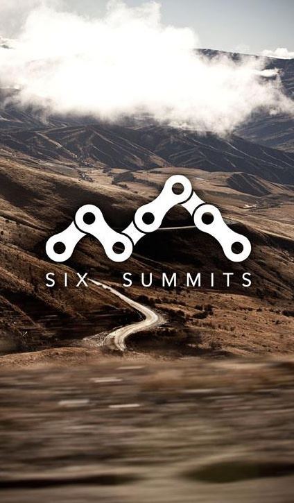
or maybe something incorporating chain links? Maybe 3 x chain links to form the N of Norway, or maybe to form a mountain silhouette similar to this?
or this

Anyway, good luck with everything
I’ll go back and correct it.
You should have just edited it then pretended i made it all up, that's the way things used to work pre-update anyhow.
I think tyres or chains on a logo looks a bit cheesy. It is trying too hard to tell you that it is a cycling company.
As a previous poster stated, think about your 'brand' and in particular if you can get those names on Instagram, Facebook and web domains - no point in spending a lot of effort and money to find those names already taken. It'll probably eliminate lots of options. A dot.no domain will be a darn site cheaper than .com but bear in mind that web domain registration rules could change post Brexit.
In terms of the logo, doesn't look like anything to do with Norway - colours too warm and typography is weak. Norwegians love their national flag - why not include that if you don't use the name?
Mountains need more jagginess
Ace Norwegian Uplift Service ?
Name change needed.
Imagine collecting punters from the airport, you would get fed up saying it.
It will get shortened to Ride Norway anyway, or as in A Quick Release - AQR. AERN, AETRN
Vehicle graphics (What I do) It would be tricky to make this big enough to read from across the airport car park or the street. Most vans and minibuses would suit a longer, landscape format.
It would look OK on a sweat or T, but the van is likely to be your most visible asset.
So, Mr Anus.... how you enjoying our advise?
So, Mr Anus…. how you enjoying our advise?
Probably feels like we're all being arseholes tbh
Riding with Anus in Norway, we'll ride right up the cracks!
What about "Ride Lights" as a name (referencing Northern Lights) which fits with supported bike tours. Could have slogans like 'Nordicing around' or 'Norway I'm riding that'.
Anyway... better do some work for my employer now.
Fjord transit
In line with the fjord puns...
Unfjordgettable MTB
Norway You'll g Olso with Us! erm Ltd.
IGMC
On the contrary, you’ll go Slartibart-fast
IAGMC
Fjord Prefect was a bit of an arse.
Hope it is afjordable. Perhaps a discount for birthdays, to encourage fjord fiestas
Bloody hell it was a typo! Advice is what I was asking for and thank you for all of it, I wasn't expecting so many responses! I appreciate all the comments but I think, in typical fingers in the ears fashion, in the end it probably won't change much from the middle of the 3. Some useful points in there regarding scalability and colours which i'll take on board and I enjoyed the puns! (favourite has to be Fjord Escort) but as someone else said I think any bike parts in the logo are just cheesy, I don't think a logo necessarily has to 'say' or show what the company does, most logos in the world don't do that, but they are catchy and become synonymous with a brand. So no chainlinks or tyres i'm afraid.
Lets see... A couple of things to explain which people have mentioned a lot.
The name - we have registered the company as Any Excuse To Ride Norway with an 'official' shortened name of Ride Norway, so both will apply and in lots of instances we will only need to write Ride Norway. The name has come from the fact I have had a blog/website for years called Any Excuse To Ride which also has social media channels linked to it, we thought it would be sensible to continue that since we already have quite a following via the website, Facebook and Instagram all under the name of Any Excuse To Ride. So yes I already own the domain and social media handles.
The irony of lots of people saying it doesn't look like Norway have anything to do with Norway is that it is actually a trace of the view straight out our kitchen window but never mind...
I've also thought about changing my username now that i'm going to be a business owner but i'm thinking that it is almost an advertisement in itself as it always seems to garner some attention! Hopefully enough of you will trust that i'm no anus in real life to book a holiday with us in the future anyway 😉
We didn't really intend it to but once we got it to this point we kind of thought it looked similar to the vintage rail posters for places to visit in the UK... anyone?