What on earth is that? What are they using it for? A spirit stick to ward off demons and roadies who shave their legs?
I assume it's for resting feet on, either for the rider if it is some sort of E-bike, or for a child on a top tube seat? Doesn't look very safe of course.
I know its mentioned above but I'll mention it again - 32" wheels. Its getting a bit silly now isn't it. We really are in the realms of marketing figuring out what to do next to make things "better" and its "oh, we'll just make that bit bigger".
Don't want to get told off for discussing 'function' again (😉) but given how immediately 'right' my first ever 29er felt, I'm quite keen to try 32", and perhaps because I'm confusing form and function I actually quite like the look of them.
As far as new developments go, I think bigger wheels is a far more interesting/relevant and functional 'new thing' than internal cables or electric gears, but there I go discussing function again 😂
32 is pretty normal looking really as you can pretty much just tweak a 29+ frame, hell even normal 29er forks with a A-C of more than 480mm will take a 32 without any drama.... If you want to make your eyeballs vomit you need a 36er......or an E-bike!
My entire bike collection is the two wheeled equivalent of something that would be found in the deep ocean with boggley eyes and mouths in funny places, but compared to any Ebike ever made they are Dita von tease.
the full suss 32inchers look a bit odd at the moment, but there are some rigid ones that look lovely especially in larger sizes.
rigid bikes can end up looking wierd with the need for a big fork clearance (suspension corrected forks); long head tubes, spacer stacks and risers just to get the bars in the right place. the larger wheel eliminates that but for smaller riders or those wanting a racier position I guess it goes the other way. Flipped risers and 90mm headtubes look almost as silly.
Pole full suspension frames. All of them.
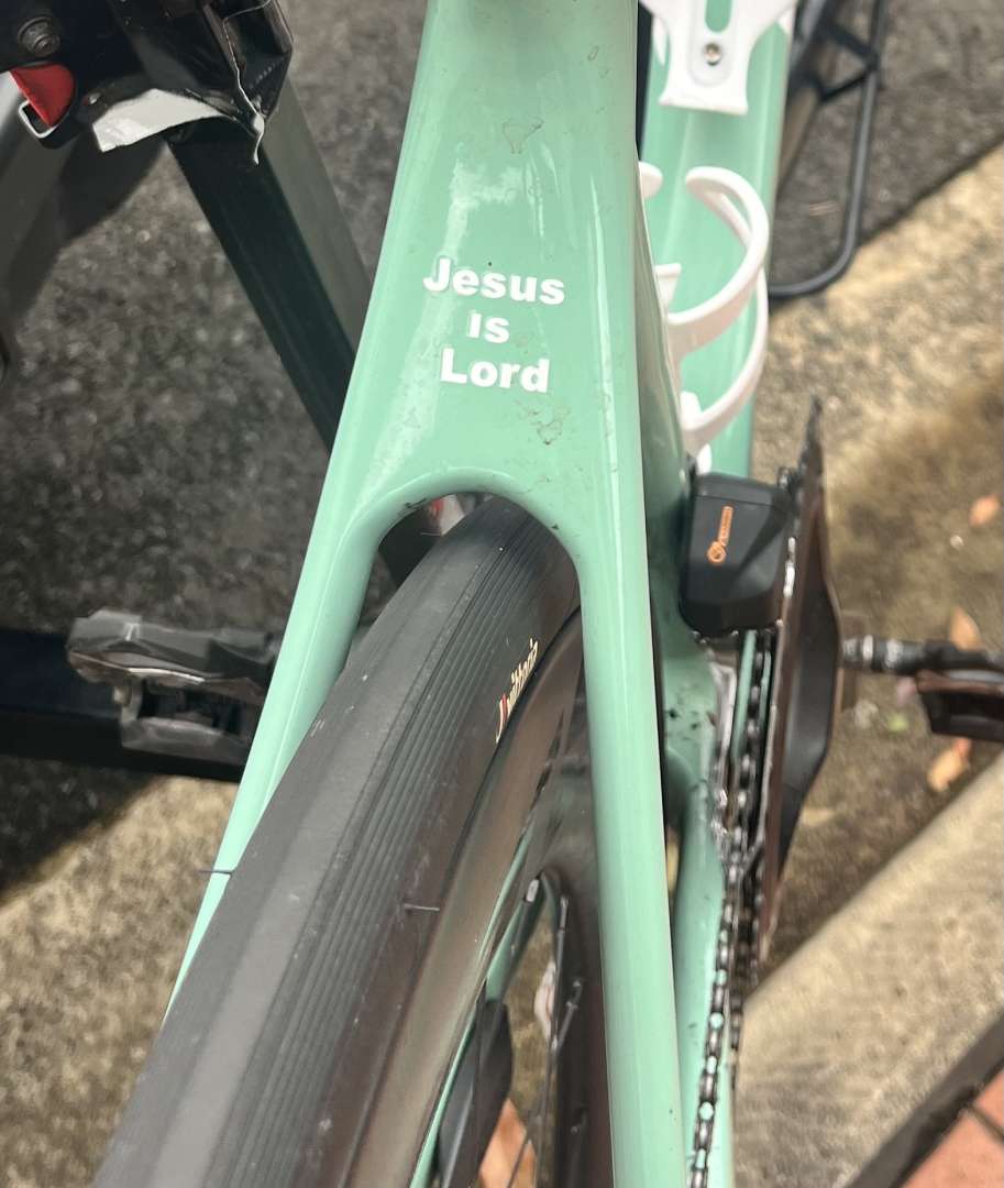
I loath the garish logos on bikes and components. Any that are stickers get removed as soon as I have the parts
Have we said TT / triathlon bikes yet?
I generally pride myself on being a function over form guy but everything just seems not in proportion.
As this is about aesthetics and not function - this is an interesting watch!
Pole full suspension frames. All of them.
Surprised to read they're trying to make a comeback and their frames look the same and are made the same way. Whats the phrase about madness being doing the same thing and expecting a different outcome???
Have we said TT / triathlon bikes yet?
I generally pride myself on being a function over form guy but everything just seems not in proportion.
There definitely seems to be an ethos of making them as ugly as possible, I wonder if it's a marketing thing whereby they try to distinguish them as much as possible from 'normal' bikes and/or accentuating the aero credentials as boldly as they can.
on the pole bikes thing, I really liked the evolink frames and their hard tails were fab, (slightly biased as I have both an evolink 131 and a Taival hardtail) but the cnc glued things have all the appeal of a melted welly
As this is about aesthetics and not function - this is an interesting watch!
I wish I'd never sold my Azonic Hammer. Way ahead of the curve.
There definitely seems to be an ethos of making them as ugly as possible, I wonder if it's a marketing thing whereby they try to distinguish them as much as possible from 'normal' bikes and/or accentuating the aero credentials as boldly as they can.
Must be something in that, making the silhouette as distinctive as possible so it's recognisable.
I'm to usually one to defend the UCI's decision making, but someone in the TT world needs to get a grip on things, seeing a load of MAM*ILS riding around with six empty water bottles stuffed into their jersey because it's only bending the rule just looks shit. Either give them genuine freedom to design whatever they like (recumbents, velomobiles, whatever) or just adopt the UCI rules that say it must still look like a bike and be functional.
*and ladies.
Don't want to get told off for discussing 'function' again (
) but given how immediately 'right' my first ever 29er felt, I'm quite keen to try 32", and perhaps because I'm confusing form and function I actually quite like the look of them.
Yea, I'd happily have one in the flat-bar-gravel / bikepacking / Stooge / Singular Swift sort of niche.
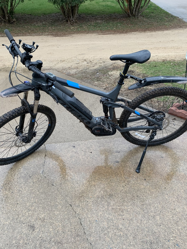
Just remembered another bike related thing that makes me reel in disgust and makes my teeth feel chalky. I mean this bike is a great example for this thread tbh and has features we've all already discussed, the phone holder on the handlebars, the garish oversized mud guards... It is missing a handlebar bell however, which would be the final addition to prompt the owner to shop for a neon helmet to go with their high vis jacket but I digress, that's not it...
it's the kickstand 🤢
- Oilslick
- Fully black bikes (you can do better)
- Brown / Beige / Earth coloured kit - looking at you P(e)N(i)S/MAAAAAAAAP
- Handguards (has this ever been an issue?)
- Mega deep carbon rims
- Massive fat tubes on frames
- Overly wiggly, curved, or bent tubes on frames
- 2x or 3x on any bike (1x just looks better)
- Those little race team name/flag stickers
- Every Ibis bike ever
- Top tube feed bag thingies, behind the stem
- Phone mounts
- Bungee/clamp mounted lights on bars (I have them, but I don't like them: under stem/Garmin is absolutely the way)
- Red anything
Yea, I'd happily have one in the flat-bar-gravel / bikepacking / Stooge / Singular Swift sort of niche.
So not really a MTB then, at least in the modern sense of what MTB is!
To be honest I can't think of a single instance I'd want bigger wheels than 29 for anything involving fun riding, even 29 is pushing it for me.
So not really a MTB then, at least in the modern sense of what MTB is!
Probably not but I'll bet they work amazingly well off-road in general. Think Pinkbike showed they were faster too on an XCO test course.
What’s the issue with red stuff? Did a Ferrari close pass you all? Can’t say I have any issue with a singular colour (purple isn’t my favourite, but it can look OK in the right places)
I'm not a fan of red either, blue looks pretty crap on a bike (and car) as well. Only exception would probably be a dark metallic burgundy like the Stantons they do in that colour, or something like the teal Bird Forge looks pretty cool for a blue-ish colour.
My favourite colour for a bike is just raw though, and my current mtb is black, so what do I know 🙂
- Every Ibis bike ever
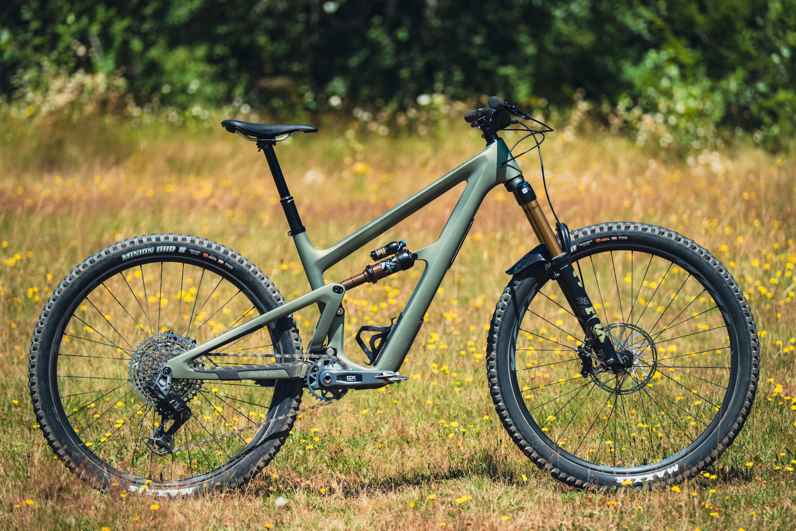
Even though it goes against my "hardtails shouldn't have bendy tubes etc" mantra, the DV9 is a lovely thing I reckon:
[pic]  ?w=2000&quality=75[/pic]
Coloured stuff - ok in moderation. Seems to be a weird fetish in some circles, especially during my brief encounters with members of the Orange Bikes facebook groups who'll adorn their Fives etc with every single item Hope make, usually in orange or purple. I'm kinda the polar opposite - coloured frame, all components in black (yes, even Hope!).
- Every Ibis bike ever
Even though it goes against my "hardtails shouldn't have bendy tubes etc" mantra, the DV9 is a lovely thing I reckon:
[pic]
NURSE. Good God no.
Love my Ripmo, but **** me, it's an ugly bike.
Look how much better they've made them by adopting straight lines
I like how they've strategically placed the crank arm to hide the horrible squared off BB area though 🙂
I like how they've strategically placed the crank arm to hide the horrible squared off BB area though 🙂
Thats definitely one for this thread - downtubes that kink to meet the BB. Awful.
the downtube kink has a purpose at least. without it you'd have no water bottle (and the corresponding aesthetic displeasure of having to carry water on your person); as well as possibly a shorter bodied shock.
the top tube kink on the hardtail above, is small enough to have about 5mm effect on standover (and looking at the size of the dropper, thats not going to be troubling the rider at all); but big enough to make it look like something's fallen on it in the garage and broken the frame.
Yeah and by all accounts the Ripley/Ripmo are nice riding bikes so it probably wouldn't put me off owning one, I'd quite like a Ripley AF actually. Apart from the BB area it's quite a nice looking frame I think.
Super slack head angles - look like someone's landed off a massive kump too hard and bent the frame!
"high" helmet peaks. Visually bulky/ugly, and useless for keeping wind/rain out fo your face. I really like having a peak on a helmet, but as this style seems to be prevalent at the monent, I've ended up buying a peakless helmet and using a lightweight roadie cap underneath it...
Deep section rims. Just look wrong on anotherwqise svelte road bike.
Peakless helmets with roadie caps underneath.
"high" helmet peaks
Specialized Ambush being just about the worst 🤢
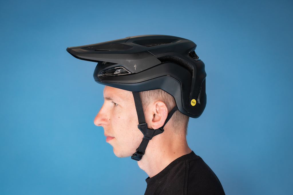
Peakless helmets with roadie caps underneath
🤣
One of the MTB YouTubers wears his peak so far up it must slow him down. Can't remember if it's Sam Pilgrim or Tommy C Hype as they all start to blend into one after a while.
I'm not a fan of red either, blue looks pretty crap on a bike (and car) as well. Only exception would probably be a dark metallic burgundy like the Stantons they do in that colour...
Ohhh yeah, alright, I'll bend, they're tidy.
That new Ripmo is not gopping, but that BB kink aint it. We're just talking aesthetically displeasing, right, so it doesn't matter if it's functional?
The top tube hump, bought a bike cos it was the right price for the type of intended riding, but pretty it aint!
stickers on top tubes with a name next to a little flag, can make any bike look crap
I like Production Privee bikes but some of their latest graphics hurt my eyes
DYEDBRO.
stickers on top tubes with a name next to a little flag, can make any bike look crap
Unless you're good enough to carry it off.
I've just been in Calpe for a week, it's Pro Central out there at the moment. Loads of teams on training camps. The difference between the pros (and the good / high-level amateurs) is night and day. The pros will drift past effortlessly on climbs, chatting away, spinning easily while any "normal cyclist" looks like a complete bag of spanners in old / mismatched kit, wonky pedalling style, pockets bulging with crap.
On which note, the cycling-related thing that I find aesthetically displeasing... Other cyclists.
For the avoidance of doubt, I do actually include myself in this. Pros look cool. We do not. No matter how cool we think we look, we are anything but.
Pros look cool. We do not. No matter how cool we think we look, we are anything but.
Other than a lid, I don't wear cycling clothing so I actually look pretty sweet.
Unless you mean riding, then I probably resemble that statement.
On which note, the cycling-related thing that I find aesthetically displeasing... Other cyclists
Oh god, I've just realised that the thing I find most aesthetically displeasing on my bikes is ME 😂
In any given race photo I'll be gurning or tongue out or just doing my slightly scary intense stare at some minor obstacle out of shot, not to mention the absolute horror show from my last XC race with the tongue out, helmet squint and look of complete terror going over a two foot log-drop 🙄
Pros look cool.
To other roadies. To normal people, some sweaty, lycra clad, coordinated bicyclist with stupid glasses does not look cool. Sorry.
Same goes with XC. It's not a cool thing. Even Nino throwing a table into a small rock garden still looks gawky to most people. Danger looks cool. Riding on a road does not look dangerous. XC doesn't look gnarly.
More extreme looking DH stuff (Hardline etc) looks dangerous, and most people don't think they could do it, so Jo Average is far more likely to think it looks cool. Sam Reynolds upside down on a 110ft gap is so far from what normal people even optimistically think they could do, so it looks cool. Go to any action sports event and watch people doing dirt jumps, and it just looks cool. It's perceived difficulty. It's why skateboarding is cool, and scooters are for kids :p
BMX and dirt jumpers look cool not just because of what they're doing, but because they're not wearing pro kit. A sponsor kit will never be cooler than a tee and shorts. Even if they're sponsor provided.
NB. Jo Average is not 40+ and into cycling.
To other roadies. To normal people, some sweaty, lycra clad, coordinated bicyclist with stupid glasses does not look cool. Sorry.
my wife just thinks they look like Keira Knightly and have spindly little arms.…. But hey, she married me so her standards are pretty high 😬
Yeah, we'll just write Specialized in large white letters, that'll do
Aren't a huge number of Americans functionally illiterate? (20%?) So they are just catering to their customer base i guess? (And then 50% for reading below a 6th grade level...)
Pros look cool.
To other roadies. To normal people, some sweaty, lycra clad, coordinated bicyclist with stupid glasses does not look cool. Sorry.
Same goes with XC. It's not a cool thing. Even Nino throwing a table into a small rock garden still looks gawky to most people. Danger looks cool. Riding on a road does not look dangerous. XC doesn't look gnarly.
More extreme looking DH stuff (Hardline etc) looks dangerous, and most people don't think they could do it, so Jo Average is far more likely to think it looks cool. Sam Reynolds upside down on a 110ft gap is so far from what normal people even optimistically think they could do, so it looks cool. Go to any action sports event and watch people doing dirt jumps, and it just looks cool. It's perceived difficulty. It's why skateboarding is cool, and scooters are for kids :p
BMX and dirt jumpers look cool not just because of what they're doing, but because they're not wearing pro kit. A sponsor kit will never be cooler than a tee and shorts. Even if they're sponsor provided.
NB. Jo Average is not 40+ and into cycling.
This is exactly why Brage Vestavik is the coolest person in mountain biking at the moment, as not only is he doing crazy stuff on his bike, he's doing it in jeans and a t-shirt. Same with that kid at Rampage in baggy jeans and Vans slip on. Infinitely cooler than everyone in pro kit or race pyjamas, plus he had the skills and style on his bike to back it up.
Never mind the pro's vs mamils
Mr 'my emtb is my first bike' - full waterproofs (most of the year), saddle at half the height it should be - everywhere, full face and glasses bimbling round Swinley in turbo and 12th gear all the way
Mr 'my emtb is my first bike' - full waterproofs (most of the year), saddle at half the height it should be - everywhere, full face and glasses bimbling round Swinley in turbo and 12th gear all the way
That's a different topic entirely, I think there is a new sub-culture of e-bikers who don't even identify as cyclists but are basically motorcyclists taking advantage of access to the trails, I've seen groups when I've been out on the MTB and they were clearly MXers first, cyclists second. Not a criticism or slur, just an observation.
https://enduro-mtb.com/en/the-best-enduro-mtb-review/instinctiv-kodiak-mx-review-2026/
petty much everything on this bike…
from the silhouette to the triple kashima which has been bolstered with the gold chain, inverted shock, bizarre cabling (partly due to gear box I’ll concede)
https://enduro-mtb.com/en/the-best-enduro-mtb-review/instinctiv-kodiak-mx-review-2026/
petty much everything on this bike…
from the silhouette to the triple kashima which has been bolstered with the gold chain, inverted shock, bizarre cabling (partly due to gear box I’ll concede)
That site and it's partner emtb site really wind me up. Absolutely hate they way they write their articles, but the straw that broke the camels back was the piece they did last year on the future of emtbs where they got all the big brands together for a big let's evoke some feelings circle jerk. Almost made me want to sell my bikes and take up golf or something.
I’m prepared to be told I’m wrong on all counts here… but I think enduromtb is all written in German, then translated for the international version. The translator is not the reviewer. There might be one translator for several reviewers.
And I think there was an advert for the job of “translator” a year or two ago. You didn’t actually need to speak German, you’d just have to correct and flesh out the auto translated articles. I think they wanted someone who knew bikes and spoke native English - implying that previously they had someone who could translate but had no real idea what they were writing about.
How much artistic license they are allowed I’m not sure, but they have some bits that can only be terrible literal translations.
And I think there was an advert for the job of “translator” a year or two ago. You didn’t actually need to speak German, you’d just have to correct and flesh out the auto translated articles. I think they wanted someone who knew bikes and spoke native English -
I toyed with applying for that job..... Native English-English speaker with fluent German.
I bumped into some of the enduro mag team in Finale a few years back. They could ride and seemed like a good crew.
They used to have a more international team with folks from the UK.
their Fives etc with every single item Hope make, usually in orange or purple.
And then mince their way down every trail.
Here’s one I saw this morning.
Integrated frame storage - burritos boxes, hatches, whatever - burns my eyes.
Poorly fitted riders with half a tool box and loaf of bread in their jersey rear pockets.
Pink bikes
Sorry guys, you know who you are 😎
So not really a MTB then, at least in the modern sense of what MTB is!
Some of us still ride natural trails that haven't seen significant spadework in thousands of years :p
The marketing spotlight is currently on everything looking like it's just off the Garbanzo lift in Whistler, but there's more to MTB than that.
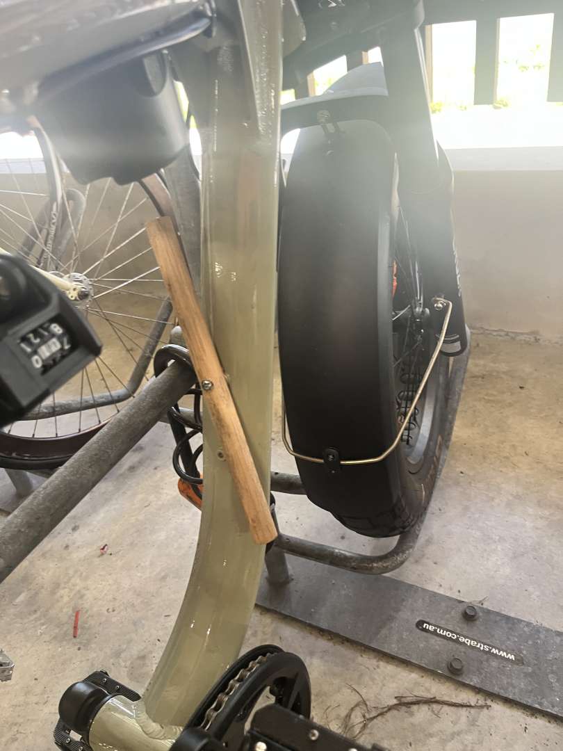
This bike has been wrapped in tubes for at least 5 years. Looks like the head tube has been given a reprieve now… but still. What?!?!
This bike has been wrapped in tubes for at least 5 years. Looks like the head tube has been given a reprieve now… but still. What?!?!
It's a thing in urban / commuting / courier riding. Wrap everything in inner tubes to hide what it actually is and protect the frame & paintwork from knocks and scratches.
It's also a good way of forgetting about any water that happens to get between the rubber layers and sits there corroding things from the inside....
Shitty rim stickers.
This bike has been wrapped in tubes for at least 5 years. Looks like the head tube has been given a reprieve now… but still. What?!?!
It's a thing in urban / commuting / courier riding. Wrap everything in inner tubes to hide what it actually is and protect the frame & paintwork from knocks and scratches.
It's also a good way of forgetting about any water that happens to get between the rubber layers and sits there corroding things from the inside....
I happen to know that this guy is an accountant
don't think it's been mentioned here yet but TT bikes I find are an attack on the eyeballs too
Have we had gravel cranksets yet? Not that cranksets have faces per se, but most gravel cranks look like Voldemort with his missing nose.
Pretty much all helmets look crap, peak or no peak.
Bikes with masses of seat post and a top tube angling steeply upwards to the bars - looks like two different bikes welded together basically any large road bike by specialized.
1x on anything other than a mtb
White lycra shorts
Triathletes
Bikes with masses of seat post and a top tube angling steeply upwards to the bars - looks like two different bikes welded together basically any large road bike by specialized.
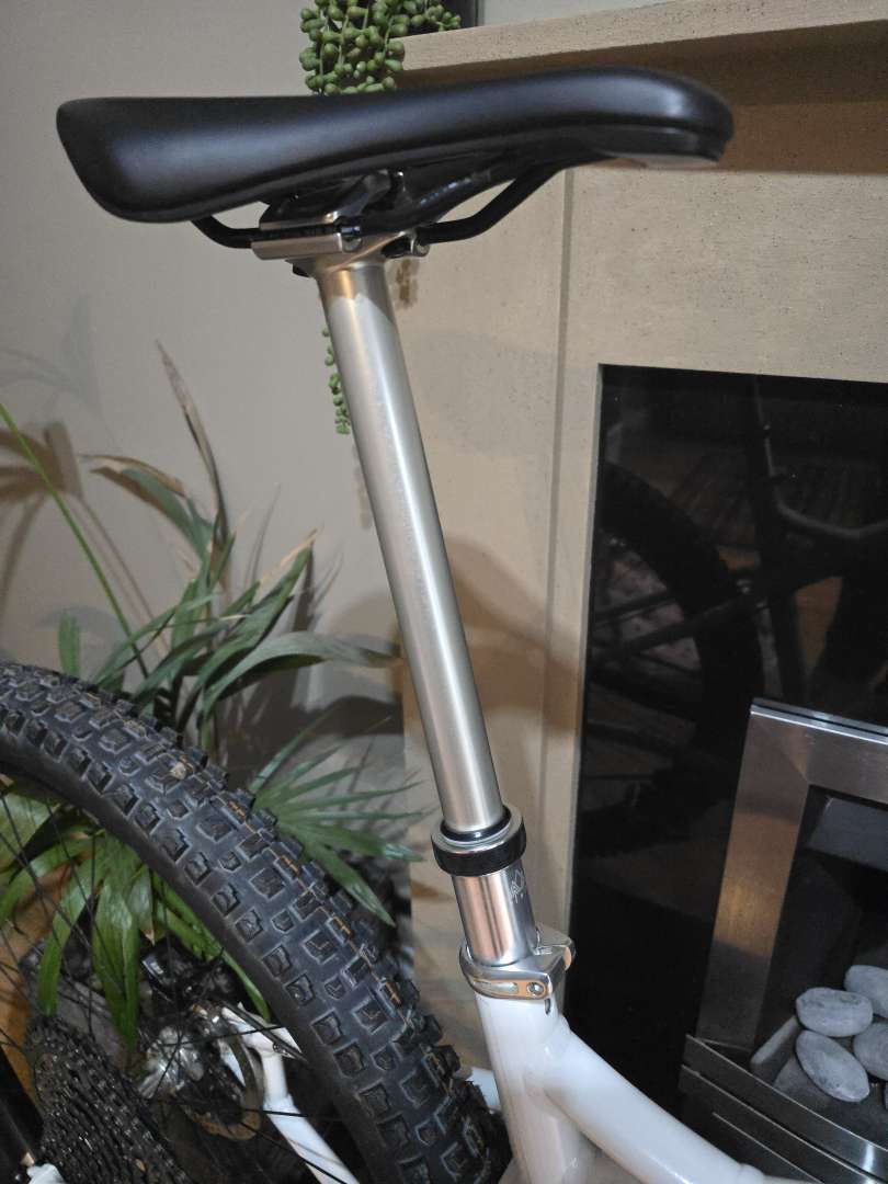
Anything with >170mm travel of dropper post sticking out just looks wrong. I'm still unconvinced there's much benefit beyond 150mm. Bring back delta frames, or at least a seat mast/brace.
Agree on the road bikes too though, someone needs to sit down with a clean sheet of paper and figure out how to get some straight lines back into 58/XL and larger road frames. I guess the issue is the less 'normal' someone's height is, the less normal their proportions are likely to be. e.g. I'm 6ft with the legs of someone 5ft9 at most 😂. So they need 'compact' frames that can accommodate someone 6ft4 whether that's in the torso or arms and legs.
I surprised no one has complained we're all a bunch of moaners in this thread yet. I've been sitting on the Alan Partridge "oh come on Alan, it's just a bit of fun" gif for a couple of weeks now, but it looks like everyone just enjoys a good whinge about things they don't like. Brilliant 😊
Trafitional cotton cyclist caps look absolutely foul, and that's being polite. I work with a buck tooth danish guy who wears them and it is a sight I'll never quite forget. High brim helmets like the Specialized though look awful and see, a deliberate attempt to keep syclists socially excluded.
Here's an odd one. I like the look of gravel bikes in steel and carbon, but Ti ones all look the same to me , and not in a good way.
Here's an odd one. I like the look of gravel bikes in steel and carbon, but Ti ones all look the same to me , and not in a good way.
Yeah I've always thought that, a nice Ti bike is a lovely thing but there's too many of them now, and at the end of the day they're all just dull grey frames with black forks 😂
I do like it when they do one of those paint jobs that is raw Ti in parts and painted in parts.
Long, low, and slack bikes where the rider has slammed the seat as far forward as it will go (looking at you @GMBN). Go down a flipping size!
Long, low, and slack bikes where the rider has slammed the seat as far forward as it will go (looking at you @GMBN). Go down a flipping size!
That's about getting the riding position to be further forward on climbs so the front end doesn't lift (equiv of a steeper seatpost) rather than a fit thing per se.
I'll raise you with downward angled seats a la Chris Porter - I don't care how practical it is going uphill, it must be awful on the flat and just looks shite.
I'll raise you with downward angled seats a la Chris Porter - I don't care how practical it is going uphill, it must be awful on the flat and just looks shite.
There seemed to be a recent trend for doing similar on gravel and road bikes but I couldn't figure out how it wasn't torture, I imagine if you're light, putting out big watts AND pedalling high torque/low cadence everywhere, then you might not give yourself ulnar nerve damage.... 🙄
Oh, and it looked awful (staying on topic!)
Hmm...
Vertically mounted shocks.
Any pedal that's not black.
Tri-colour bikes, to my eyes the frame should be one colour (or design) and I'd prefer a single secondary colour for 'bits' black works best, but if you want an Orange stem, forks, bars etc fine, but I can't mix them and if I'm honest, if you're going to do that, a black frame works best because the parts you can't (or shouldn't) get in colour will need to be black.
Coloured fork lowers, RS Red or all the colours Fox have done. I hate the peachy orange, and the gold is appalling. The Green with gold flakes they do is nice in isolation, but you have to be really careful with frame colour so it doesn't look like a dogs dinner.
Kashima, I just don't like gold. It's gaudy, which rules out all the coloured Fox stuff for me anyway. I think the green lowers with black stanchions would look great.
I really struggle with the Spesh asymmetric frame braces.
I love tanwalls, but again, you have to have the right frame colour to go with them. Blue frame, tan walls and coloured parts... oh no.
**Obvs this is just personal preference, and doesn't represent a judgement of others tastes or the ability/performance of any of the stuff mentioned.
Any pedal that's not black.
Meh, silver are loads better for not getting beaten up. And look better on the right build - imo if course
Silver pedals look good on certain frames (solid colours like black, red, dark green, blue), along with a silver stem and silver hubs.
Also not a fan of coloured fork lowers, other than silver Pikes (again, only on certain frames).
Kashima would be nice if Fox could stick to one specific shade, but even then it would have to the Holy Trinity of Kashima for it to work aesthetically on a bike (forks, shock, dropper).
Long, low, and slack bikes where the rider has slammed the seat as far forward as it will go (looking at you @GMBN). Go down a flipping size!
It is quite likely the bike fits perfectly for it's intended purpose - descending.
But for winch and plummet riding with steep climbs (aka FOD where GMBN do a lot of filming) having the seat slammed forward makes sense.
Agree it looks shit, but riding a bike that is too small is far worse.
Exactly, it's not really sizing, it's effective seat tube angle. Some people like it steeper than a frame might be built with for steep climbing, and it doesn't affect reach when you're standing on the pedals.
And as a bonus, it helps a dropper work a bit more smoothly as your weight is more in line with the post.
Also not a fan of coloured fork lowers, other than silver Pikes (again, only on certain frames).
For some reason, I really don't like silver Pikes. But then, I have green Lyriks, so what do I know 🤣
Speaking of coloured fork lowers, Tommy C Hypes new bike, a bright pink orange stage with red zebs 🤢
Mind I suppose quite fitting for a bloke who spits everywhere on camera like its still 1996 and Gascoigne is still cool
Any pedal that's not black.
Meh, silver are loads better for not getting beaten up. And look better on the right build - imo if course
yeah im with you on this. silver is the colour for pedals because they dont look scratched, any anodaising including black quickly looks crap after riding somewhere rocky
components other than this should be black though.
only on frames that are white, grey or black will I accept coloured components can look good.
The Thomson set-back (i.e. bent) seatpost on my gravel bike..
components other than this should be black though.
Dunno, I got bored of all black components. Apart from the gaudy orange Hope stuff on my Kenevo (goes with the baby blue) most stuff I add to my bikes lately has been silver, not just pedals