New Grupetto Mottarone SL. I'm not a roadie, but have to admit that looks nice.
[img]  [/img]
Nah that looks wrong, they can"t decide if it should be modern or retro, its the biking equivalent of a mock tudor housing estate.
[img] http://t0.gstatic.com/images?q=tbn:ANd9GcQqeYaGoUfze_waXBajF-IMS4mKpkA2az0838-vxaO7NDFSLBS4 [/img]
I'm still not 100% sure on the seatpost/stem colours, but otherwise I think they manage to pull it off myself. Horses for courses, s'pose.
Hideous.
Dump the wheels.
Ditch the seatpost
Put the bars where they're meant to be and cover in cream or brown tape.
And it might be a step in the right direction.
Maybe.
Meh.
£2000 for a carbon frame with no race history, with no competitive presence, that's a lot of cash for a paint job.
Seatpost & wheels look like they've been taken off another bike (some kind of cutting edge thing with large graphics all over it) and the bars look like they aren't at the right angle.
Colours are nice though (but the G on the fork leg doesn't suit the rest of the design).
[img] 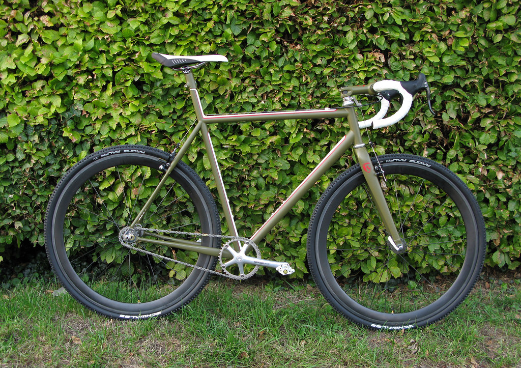 [/img]
I think that colour scheme would look great on a TT bike.
Titus are they clinchers if so what and from where?
no
Looks like they are
New Grupetto Mottarone SL
Looks a bit like an old Breezer. Paint job i mean- i like the paint but not on that bike.
Would rather have the Breezer.
It'd look nice in stealthy black....
It would look nice if it was a mountain bike.
No, fugly and expensive, what's going on with the bars? Rebadged dedacciai? I found their website quite irritating too.
Ditch the seatpost
You mean take a hacksaw to the frame 😯
Hideous
+1