[img]  [/img]
Qoroz Bikes: What a great looking frame.
??????????
bloody hell it's an early 90's Kirk magnesium resurected!
Looks like a Kirk Revolution!
Edit: Beaten to it! I quite like it...
Huh? That's not a Qoroz, that [i]is [/i]a Kirk, look at the components, nowt modern there.
How else are you going to carry that 5 litres of oil home?
We had a customer who regularly brought in a Kirk, truly horrible thing!
Huh? That's not a Qoroz, that is a Kirk, look at the components, nowt modern there.
It was Qoroz bikes commenting on it on fb, it is a kirk. A precision first edition apparently. Hideous.
Also, now that the initial shock has worn off a little, bar angle?
Did Kirk make road bikes?? I kind of like that, have always fancied adding a Kirk to my collection 😆
I've just been sick in my mouth
that saddle bag is way to small, you can only fit 24 inner tubes into it.
Why is there a cordless vacuum cleaner on it?
It's no more hideous than a lot of current bikes festooned with garish colours and huge logos and stuff.
I vaguely remember that there was a UK pro who road one back in the 90's, [i]very[/i] briefly.
A very rigid and unforgiving ride - you could ride over a postage stamp and tell whether it was 1st or 2nd class.
I knew [u]psychlo[/u] would be interested 😀
Did you see the y-framed road bike on the US-bay?
you could ride over a postage stamp and tell whether it was 1st or 2nd class.
LOL! 🙂
It's no more hideous than a lot of current bikes festooned with garish colours and huge logos and stuff
He has a point you know.
no he hasn't
Half way down the uhhh....seat tube (I'll call it that, but not sure) there appears to be a lock of some kind?
Is it a lock or part of the [s]mecchano[/s] bike frame
It can't have been ridden much - or it would have snapped by now.
It's a lock. Someone is obviously worried about their fence getting nicked and used that "bike" as some ballast to hold it down.
Fugly bike and amazing to see an unbroken one.
I used to have that exact same Campag lo-pro water bottle... Might still have it somewhere, it was pearlescent. Mmmmmm.
i actually quite like that - i am being serious
so, is that the correct angle for a brooks then ? ooyah ! 😯
I had a Kirk MTB breifly, guess it was my first MTB (I did have a BSO "atb" before it) I liked it but nowt to compare it against. E-stay design quite a bit of give in it, certainly not harsh. Flexy and **** someone (who probably hadn't ridden one) at 6th form said.
He has a point you know.
no he hasn't
No I do look:
[img]  [/img]
[img] 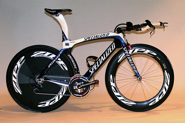 [/img]
[img]  [/img]
Gopping. Truly nasty. You'd think having spent all that money on R+D, they'd spend a few quid on getting someone with an actual sense of aesthetics to do the graphics.
Cooee bike companies! I'm cheap! 🙂
Gopping. Truly nasty. You'd think having spent all that money on R+D, they'd spend a few quid on getting someone with an actual sense of aesthetics to do the graphics.
Brief: We've built a bike that we believe to be the fastest available and it WILL win races. It's got lots of nice wide aero tube profiles, we'd like you to put our logo and corporate colours in as many places and a big as possible to reinforce our brand identity, because this baby is gonna get splashed across the front of all the cycling mags...
How exactly would you improve on that???
He didn't say those bikes don't do the job intended, he said they were gopping and he has a point
oh ok I take it back you do have a point, as a mountain biker I hadnt considered road bikes.
D0NK - MemberHe didn't say those bikes don't do the job intended, he said they were gopping and he has a point
He said he could do a better job, I'm just wondering how.
I think they look ace, they do exactly what they're supposed to do very well...
He said he could do a better job, I'm just wondering how.
It woon't be difficult. TBH, most of the logos get lost in the mess of colours and stripes and that anyway.
I can understand that [i]you[/i] might not understand this, but anyone with a half-decent sense of aesthetics would. 😉
My eyes, OH MY EYYYYYYEEESSS, IT HURRRRTTTTSSSSS
How exactly would you improve on that???
[img] http://billboards.typepad.com/.a/6a0120a5498222970c0120a5592054970c-pi [/img]
Simple, but effective.
Bit of a fail on the actual bike construction front though.
Had 2 Kirk MTBs, snapped them both at the steering tube 🙁
Elfinsafety - Member
I can understand that you might not understand this, but anyone with a half-decent sense of aesthetics would.
I suspect the brief put more emphasis on standing out like a sore thumb in magazines than being the suitable for using in pictures on the walls of babies' bedrooms.
I'd love to see your interpretation of the brief, given that you have such a refined sense of aesthetics... 😉
mmmmmmmagnesium
like :thumbup:
You can park your car on one or take the wheels off and use it as a Black and Decker Workmate.
http://forums.serotta.com/printthread.php?t=32112&pp=40
Both the spesh and the scott look nice, considering that they are function first race machines, with logos all over.
I can understand that you might not understand this, but anyone with a half-decent sense of aesthetics would.
[img]  [/img]
To the 'man in the street' or lads flicking through Shortlist those Specialized's and that Scott are gonna look amazing. The branding stands out amongst the paintwork and tube profiles and people are gonna see those and drool. I think Scott have done a sterling job combining the branding and also the corporate colours and graphics on that, although, like Elfin, I personally would prefer something a little more discreet but that is purely personal preference and I certainly couldn't come up with anything better myself if I had to fill that particular brief.
That Kirk though, christ. 😯
I've seen that Scott tt bike up close and it is lovely. Something designed to go as fast as possible with no compromise. Brilliant bike, and good looking too. What task was the OPs bike designed to do best???
Both the spesh and the scott look nice, considering that they are function first race machines, with logos all over.
The actual bikes are lovely; the graphics are gopping.
Anyway, bakacha:
[img]  [/img]
Don't start giving it, sunshine. 😉
There's clearly only one way to settle this.
www.hotornot.com
Anyway, I look good there, and you know it 😉
Heh!
😆
That's really quite disturbing, that site. 😯
Anyway, I look good there, and you know it
You look gorgeous darling. 🙂
Fred, if I saw that staring back at me from the mirror every morning, I think I might have a rather distorted sense of aesthetics too... 😉
Has anyone got any of that warping software where you can blend 2 photos together to find the perfect half-point? I just want to test a theory...
[img] http://images.pictureshunt.com/pics/p/pineapple-5535.jp g" target="_blank"> http://images.pictureshunt.com/pics/p/pineapple-5535.jp g"/> [/img]
the mtb version didn't look quite as bad.[img]  [/img]when I was 15 I thought it looked pretty cool.
(not mine, pic pilfered from retro bike)