Here’s the cover shot from Issue 93 that’s currently dividing office opinion. In the style of Mitchell and Webb we’re asking: what do you reckon?
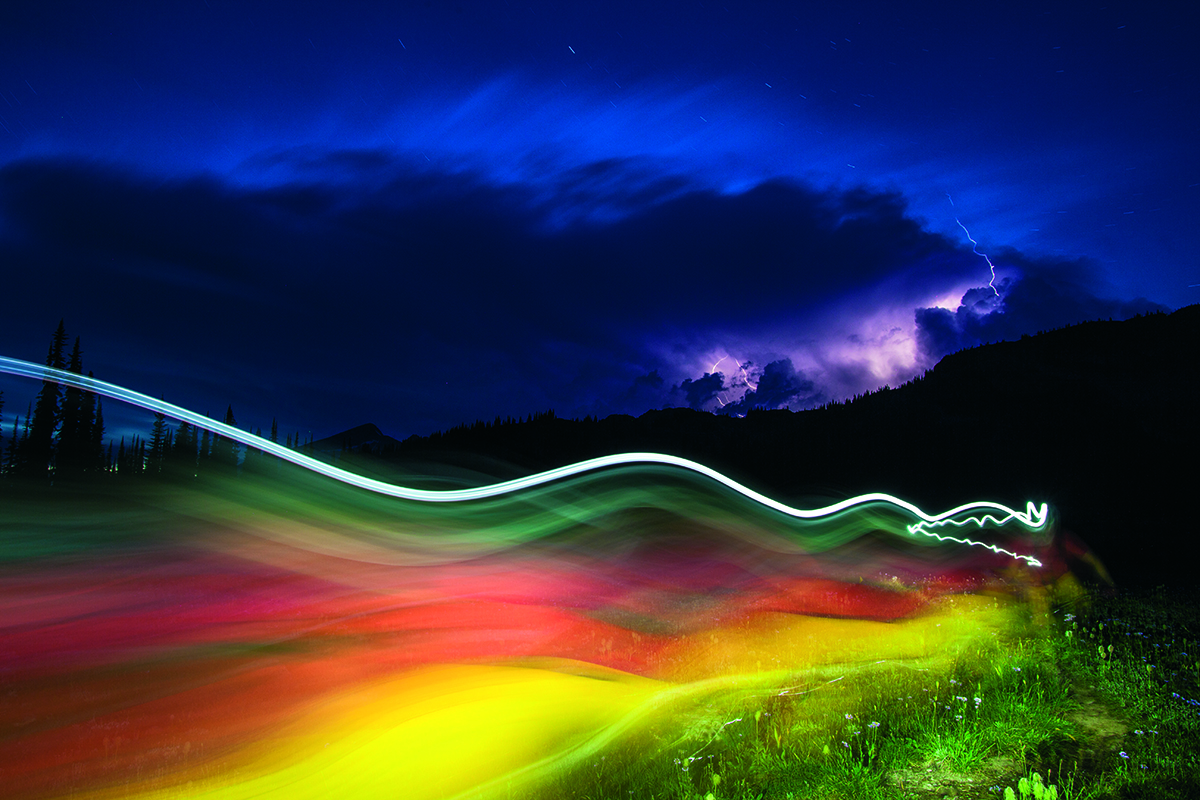
“It’s always been on my list to try and capture a mountain biking image with lightning in it, but the shot had remained elusive and sketchy at best. A trip to Sol Mountain Lodge, B.C. finally presented that opportunity while we were spending a couple days up there riding some of the newly developed alpine trails they’ve been building over the past few years. After a full day of riding and shooting, a big storm was building around dusk and still a way off in the distance. We set out with tripod and lights and started snapping off shots as the light show and storm grew closer. Once I saw this image with Nash’s bright colours streaked across the frame and multiple lightning strikes in the background, I was more than stoked with how the evening turned out.”
Ryan Creary.
For more on what’s in issue 93, click here.


Like it.
Truly outstanding and unique shot. Excellent cover selection.
#like
As a subscriber, I’ll receive the mag no matter what’s on the cover. As a shopper, I’d pick up a different magazine, one with a bike on the cover, preferably in a pretty or interesting location.
great pic – I don’t pick mags for the front cover – its the content that matters – as long as that is in its usual excellent guise no probs with me -stoked or not
Having got my issue through the post today I have to say the cover shot looks awesome. I’m glad you went with it as it’s definitely one of my favourites!
Very pleased about the feedback for this cover- thank you. We had six different cover shots to choose from. All the others had bikes and stunning landscapes on them, one even had a well-known rider on (no, not telling you who!). I was initially against it as my mind is primed to choose a cover which will shift copies in WHSmiths, but am really, really pleased that Jorji took the opportunity to have a good photo just for the sake of good photography. It’s certainly my favourite since Issue 74’s helicopter shot, though we’ve had a few crackers since then. I hope that you enjoy the issue, and remember to download the wallpaper from the MagArchive for your gadgets.;)
It looks like he’s riding with no pants on.
Is it just me that can see a bloke in a red top wearing a neon outlined cowboy hat running towards me, trouserless with his manhood on display?
Check out the detail on the rhs, the little zig zag line goes straight through his heart… poor fella.