Viewing 34 posts - 1 through 34 (of 34 total)
  • Does anyone recognise this logo?
  • mastiles_fanylion
    Free Member

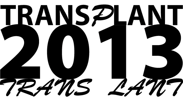
    I am designing an identity for someone and have come up with the below (initial rough idea). But I have a nagging doubt that I have seen it before – does anyone recognise it????

    mike_check
    Free Member

    😉

    mastiles_fanylion
    Free Member

    LOL but no…

    🙂

    Olly
    Free Member

    rings a bell of that with the + there on the left

    Jamie
    Free Member

    I first thought of this:

    …so nowt to worry about.

    thegreatape
    Free Member

    Here maybe?

    mastiles_fanylion
    Free Member

    It is specifically the arrangement of the initial 't'/cross element that I think I have seen – I have scoured the interweb without success and just don't want to go to client with a concept that has been done (especially as it is my fave of the ones I have done so far).

    Tracker1972
    Free Member

    Maybe..

    scu98rkr
    Free Member

    Did Dettol have something like that at one point ?

    grynch
    Free Member

    tomalsop
    Free Member

    🙂

    My wife does a bit of logo / identity design and you do get a bit convinced you recognise just about anything. But that may just be because it's a great logo!

    It's also not dissimilar to the Take That logo…

    But they have the cross piece on both halves.

    mastiles_fanylion
    Free Member

    And whilst I am here, let's have a little brainstorm 😉 It is for an organ transplant event which is specifically NOT for any one type of transplant so I cannot use hearts (or any other body part) to convey it. So what things spring to mind when I say 'transplant'? Also have been told they don't want blood droplets (as they work in that field separately anyways).

    Jamie
    Free Member

    So what things spring to mind when I say 'transplant'?

    [img]http://www.osheasflowers.com/images/spathiplyllum-lilly-plant.jpg[/img]

    HTH :mrgreen:

    geoffj
    Full Member

    I reckon your pretty safe. The only 'similar' ones I could find were:

    mastiles_fanylion
    Free Member

    LOL at the presidente!

    woody2000
    Full Member

    Transplant, phoenix from the flames innit. Life from death and all that. 🙂

    Or a bad movie?

    "Transplant:2013 – The Slashening"

    😀

    chrisd
    Free Member

    no.

    jackthedog
    Free Member

    Holby City and Casualty both use the 'medical cross a T' device

    http://www.bbc.co.uk/drama/holbycity/
    http://www.bbc.co.uk/casualty/

    tomalsop
    Free Member

    How about something to imply transplantation within the type itself? Such as a character in a different typeface or colour to the rest?

    Maybe with the "donor" and "recipient" words stacked either side of the date?

    mastiles_fanylion
    Free Member

    How about something to imply transplantation within the type itself? Such as a character in a different typeface or colour to the rest?

    Maybe with the "donor" and "recipient" words stacked either side of the date?
    Your image link is broken – but it sounds similar my option two… 🙂

    I did get even more 'creative' inserting numbers between letters but it all got a bit too confwesing.

    nbt
    Full Member

    NIC EIC logo

    mastiles_fanylion
    Free Member

    Jackthedog – that might be where I have got it from. I think my interpretation of it is different enough – ta ! 🙂

    mastiles_fanylion
    Free Member

    Just seen this very clever use of it….

    thegreatape
    Free Member

    I prefer your second one.

    mastiles_fanylion
    Free Member

    I prefer your second one.

    Unfortunately it loses all medical connotations though…

    thegreatape
    Free Member

    Yeah. Lines up nicer though 🙂

    theOCDape

    GaryLake
    Free Member

    I think you're fine with it. I do think the placement of the T/Cross is a bit awkward. I'd like to see the top of the T inline with the rest of the characters.

    I wouldn't be sure without seeing it but I want to put put the 2013 inline with the end of the last T as well…

    mastiles_fanylion
    Free Member

    I think you're fine with it. I do think the placement of the T/Cross is a bit awkward. I'd like to see the top of the T inline with the rest of the characters.

    I did say it was just an initial idea (crikey – have you seen the gawd-awful kerning especially on the '2013') – just Mac-ed up a couple of sketches but will be progressing next week.

    I wouldn't be sure without seeing it but I want to put put the 2013 inline with the end of the last T as well…

    I would be more inclined to overlap it slightly – push it right to the edge of the 'T' and it will look like it is falling off. Probably.

    skidartist
    Free Member

    Theres a mark used by proof readers used to show that two letters or words need to be switched around/transposed that might be useful

    deadlydarcy
    Free Member

    I'm not so sure about it at all. Will you be doing it in word m_f? My wife's nephew has just got himself a pc and he's really good with word. He's started using paintshop and his girlfriend says he has a good eye for colour too.

    I'm not sure about the concept though, can you come up with say, 6 different ones? Wouldn't be able to pay you yet, but there's a good chance of more work if you can. I'll probably get my mum to have a qick look over it too. She used to cut up wallpaper to cover my school books when I was a kid and she was really accurate with that kind of stuff.

    😛

    skidartist
    Free Member

    Darcy – you're every graphic designers worst nightmare / stroke / most likely client. 🙂 🙂 🙂

    My brother has had clients bring their 7 yr old kid in to the agency and have the kid art direct. He's even had the proprietor of a fairly sizeable high street chainstore turn up with a drawing of superhero done by his school-age nephew, adamant that it should be the key element of their whole campaign. Not something like the drawing – it – the very drawing.

    cheers_drive
    Full Member

    LOL @ deadlydarcy
    This was the funniest thing I've seen in ages:
    http://www.youtube.com/watch?v=VfprIxNfCjk

    deadlydarcy
    Free Member

    Not something like the drawing – it – the very drawing.

    😆

    mrs deadly will love that…wait till I tell her.

    deadlydarcy
    Free Member

    cheers_drive, that's the one, I ain't that original.

Viewing 34 posts - 1 through 34 (of 34 total)

The topic ‘Does anyone recognise this logo?’ is closed to new replies.