Viewing 17 posts - 1 through 17 (of 17 total)
  • Binners, put your crayons down; a font question
  • IHN
    Full Member

    What’s the font that the

    “a blockquote code em strong ul ol li font strike center u hr.”

    message at the bottom of the post editing box is in?

    I’m sure it used to be called Terminal or something, what everything on Windows 3.1 looked like…

    Stoner
    Free Member

    is it not courier?

    lemonysam
    Free Member

    It depends – the font family is: “Monaco, ‘Courier New’, monospace;”. So if you have Monaco it’ll be that, if not then Courier New, if not then whatever your system’s default monospaced font is.

    edit: p.s. This is a question for us aesthetically minded code monkey, not the crayola mob.

    binners
    Full Member

    I think ocra is pretty close

    zinaru
    Free Member

    its Courier New

    IHN
    Full Member

    Courier will do, thanks chaps

    the-muffin-man
    Full Member

    Consolas (it’s probably on your PC)…

    http://www.identifont.com/similar?ALX

    maccruiskeen
    Full Member

    What’s the font that the

    “a blockquote code em strong ul ol li font strike center u hr.”

    Be careful now – in a thread where myself and other luddites questioned what all that runic gibberish at the bottom of the page meant I copied pasted some of it into the thread and broke the page so much thread had to be taken outside by the mods and shot

    nbt
    Full Member

    The stylesheet says it’s Monaco for preference, Courier New if Monaco is not available, or Monospace as a fallback

    Stoner
    Free Member

    in which case none of us then know what IHN can actually see, hence there being three very different candidates put forward, courier, consolas and binners’ freaky one.

    IHN has said that courier is closest, which is what I see on my computer (Win 7), those on Fisher Price Apple machines probably see something completely different?

    maccruiskeen
    Full Member

    we see everything differently, even when our computers are switch off

    molgrips
    Free Member

    In case you are confused:

    Webpages have to be displayed on lots of different computers, and they don’t all have the same fonts installed. Generally speaking, Windows will have one set, Mac another, Ubuntu another etc. So you can specify a font in a webpage, but if it doesn’t exist it’ll just use the default, with crap results.

    So you specify a list in terms of preference, which is what lemonysam is talking about. And possibly the reason why Stoner is seeing it differently to you – he’s probably on his Chromebook and they could have different fonts.

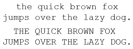
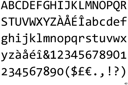
    Any system though will have a default font and a default monospace font. Monospace being one where all the letters are the same width. It looks crude but it’s important for such things as code where the spacing is important.

    j4mie
    Free Member

    I found a really handy app called “What the Font”, you take a photo of some text, give it a few hints what characters are what, and it (usually) tells you what it is.

    Fabulous.

    slowoldman
    Full Member

    we see everything differently, even when our computers are switch off

    Indeed.

    Cougar
    Full Member

    This is STW. It’s obviously the font of all knowledge.

    CountZero
    Full Member

    IHN has said that courier is closest, which is what I see on my computer (Win 7), those on Fisher Price Apple machines probably see something completely different?

    Probably, that’s why most design/print studios worldwide use Macs, because it’s too dangerous to allow the staff to have access to scissors, scalpels and glue, and they’ll scribble all over the walls if crayons and markers are left around.

    CountZero
    Full Member

    By a strange coincidence I’ve just found this on Flipboard:
    Think Retro: Apple’s fonts have always been as classy as its products
    http://www.macworld.co.uk/news/mac-software/think-retro-apples-fonts-have-always-been-as-classy-as-its-products-3597456/
    Wouldn’t entirely agree with everything written here, Motter Tektura was a shitty font even when it was new, and I was never that fond of the particular version of Garamond, for that matter, but it’s an interesting look at how type becomes synonymous with a product.

Viewing 17 posts - 1 through 17 (of 17 total)

The topic ‘Binners, put your crayons down; a font question’ is closed to new replies.