Home Forums Bike Forum Best bike frame graphics/decals

Viewing 17 posts - 1 through 17 (of 17 total)
  • Best bike frame graphics/decals
  • jamesfts
    Free Member

    So we’ve had the best headtube badge thread how about a best frame graphics?

    I’m not after inspiration of my freshly powder coated frame honest.

    davidtaylforth
    Free Member

    Most of Dario Pegoretti or John Slawta’s graphic/paint jobs look awesome.

    LeeW
    Full Member

    First generation Intense Hard Eddie is pretty cool.

    stevied
    Free Member

    Snakeskin?

    davidtaylforth
    Free Member

    Badass

    Northwind
    Full Member

    I’m quite partial to a big Cotic wrap- enough that I got Slik to design me one for the Hemlock since Cotic never did one for that model. Simple and effective.

    IMG_2742 by Northwindlowlander[/url], on Flickr

    jamesfts
    Free Member

    Weirdly was just about to post the Cotic ‘wrapped’ graphic. Also like the simplicity of the old Charge bikes.

    Didn’t think I’d have to say this but… I probably won’t be going for snakeskin or flames.

    bikebouy
    Free Member

    Was a huge fan of Kleins Attitude Pink/White/Green fade BITD but not too sure it works all that well today.

    Fat City Cycles “Yo’ Eddy” too, subtle black and Lime Green decals, could be brought right upto date that, sort of Enduro colourway ( :P)

    I’m a fanbouy of black bikes with lairy graphics so most of the current Santa Cruz bikes I like the look of.

    The BAUM roadies (corretto etc.) are nice but think they trade on the paint job these days instead of the bike build.

    Old Skool Colnago Master in Plum Red was a corker too.

    My TCX is nice in Blue, better than this years boring Black/White/Blue blocks.

    Looks 695/795 in Mondrian are to die for.

    stevied
    Free Member

    I probably won’t be going for snakeskin or flames

    Boooooorrrriiiinnnngggg!!!! 😉

    This is lovely though:

    monkeysfeet
    Free Member

    The Kinesis Decade Virsa graphics are great. Loads of details.

    davidtaylforth
    Free Member

    What brand is the bike?

    jamesfts
    Free Member

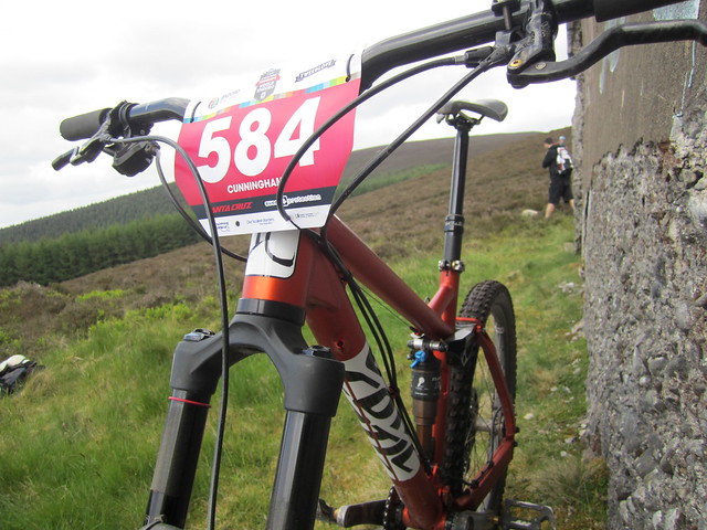
    Commencal but I won’t be any using any of their graphics/logos on the frame (unless it’s followed by …are a useless shower of *****).

    stevied
    Free Member

    Maybe just change the spelling….”COMMICAL” ?

    jamesfts
    Free Member

    Too subtle I think Steve.

    I do like the 917 Shan but think the Gulf colours have been over used a bit these days – maybe not in the mtb world admittedly.

    Northwind
    Full Member

    Thing with the Shan is it gets so much credit for good looks- and it’s all about their choice of colours, because other than that it’s just a completely normal hardtail, with a slightly ugly seatmast brace. So you’ve got to give credit where it’s due there.

    I love this Reign

    And this Snabb

    phutphutend
    Full Member

    I need help designing the logo/decals for my Starling Cycle brand, I’ll try and pull together a prize for the solution I adopt.

    See here: https://www.facebook.com/StarlingCycles

    jamesfts
    Free Member

    Have to say some of the fluro-matt colours Giant are using at the moment are really eye catching, theres a green/yellow one locally that looks spot on.

    I’ve gone the opposite way though and powder coated my frame matt black so relying entirely on the graphics. Part of me is thinking a subtle gloss black as everything going back on the bike is black and without graphics but then I’m also toying with something lairy to contrast it.

    it’s just a completely normal hardtail, with a slightly ugly seatmast brace

    A good description of my hardtail too.

Viewing 17 posts - 1 through 17 (of 17 total)

The topic ‘Best bike frame graphics/decals’ is closed to new replies.