
Subscribe now and choose from over 30 free gifts worth up to £49 - Plus get £25 to spend in our shop
...and made it really crap? When it used to be quite good?
Their graphics in general seem to have been 'refreshed' for the worst, the text and logos on the new road range look like something you would knock out with MS Word and a printer at home...
It’s evolved over the years. This latest version follows the current trend of being less interesting, more corporate… cleaner but more anonymous. Hopefully, in a few years, we’ll have a return to distinctive and characterful.
Looks like Cannondale are now selling their bikes in MEC in Canada. Much like Intense.
Remember what Halfords did for diamondback or was it GT?
As someone who owns a fairly boring black Caad, I still think the current range is bland beyond belief. They used to look stunning but there's not a single bike that you could lust after in the range right now.
In fact my initial comment was too nice. It's actually really bad, devoid of any character whatsoever and instantly forgettable. Maybe their graphic designer had a wage cut.
As seems customary with Cannondale it’s more of a rotation than a redesign. Almost works for me (FWIWIAAGD) but there’s no accounting for taste 😎
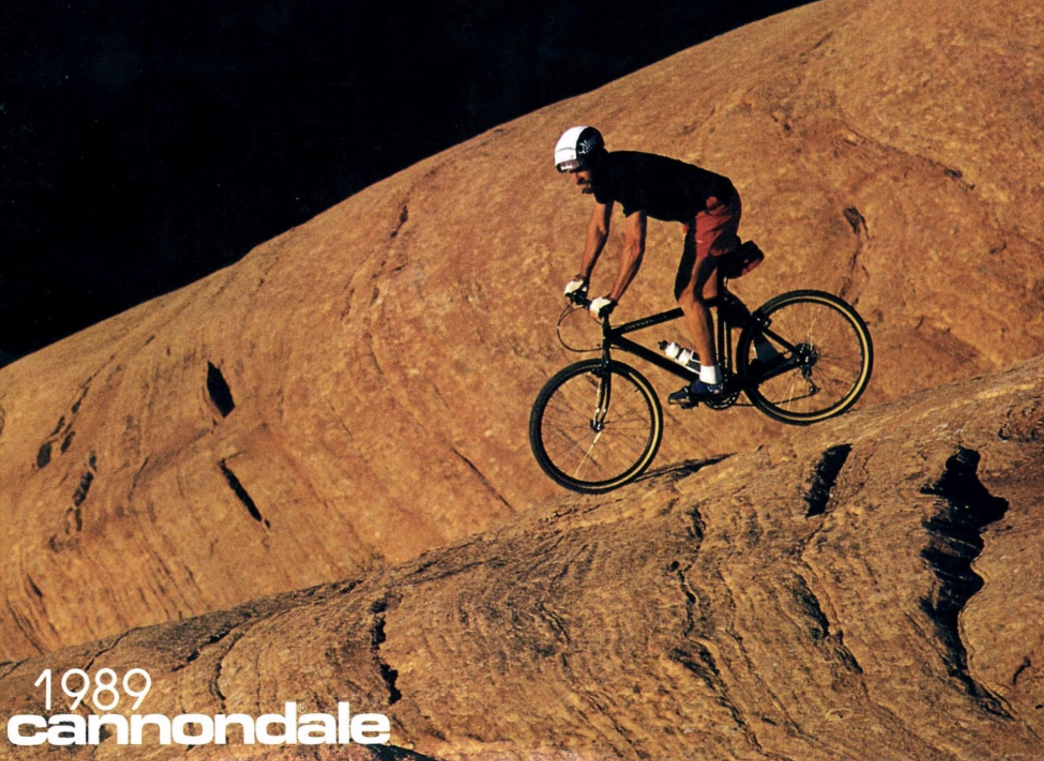
The 1989 outing had tighter kerning with a compressed typeface. I liked that more
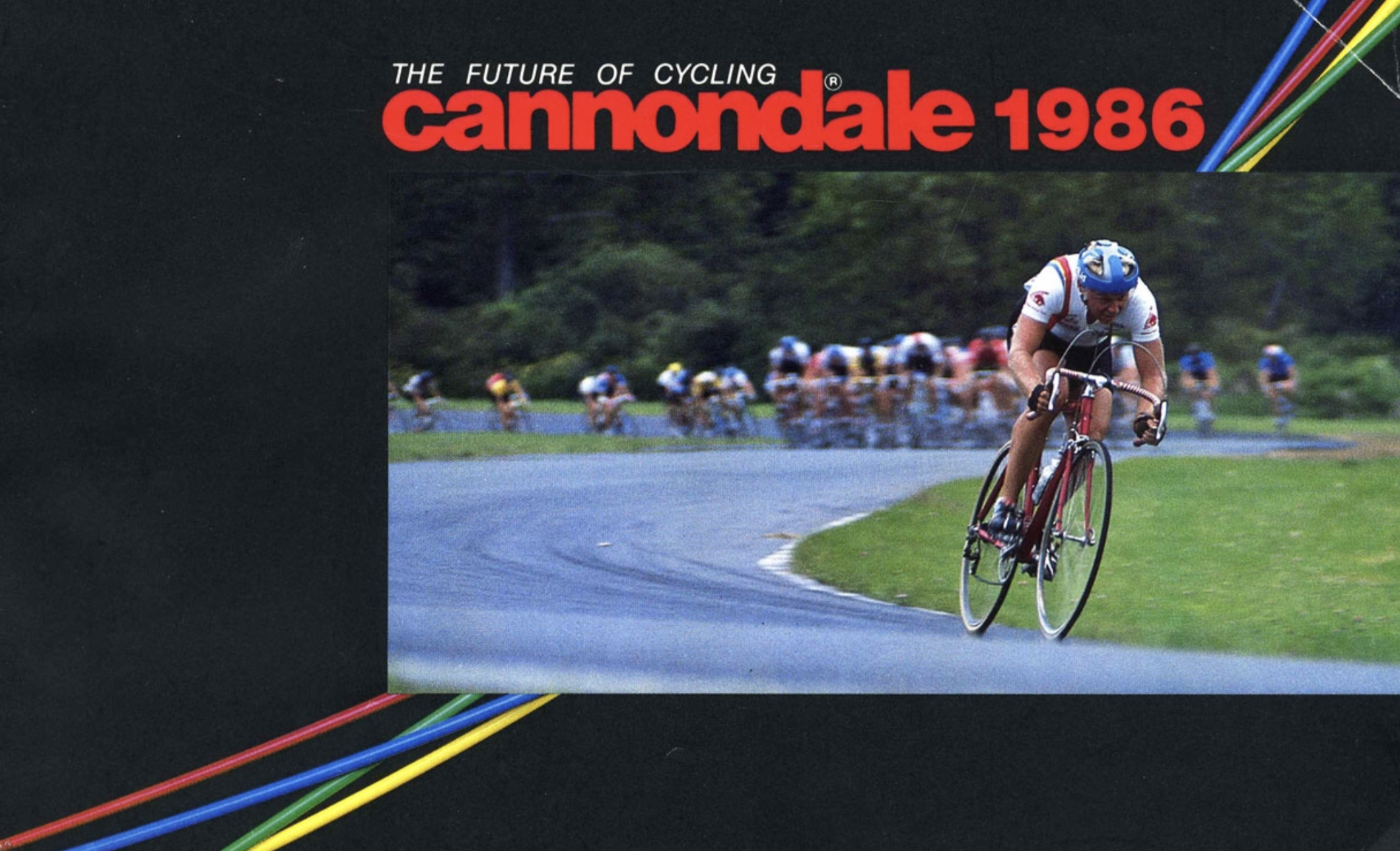
The 1986 version was closer to 2020. I liked that less:
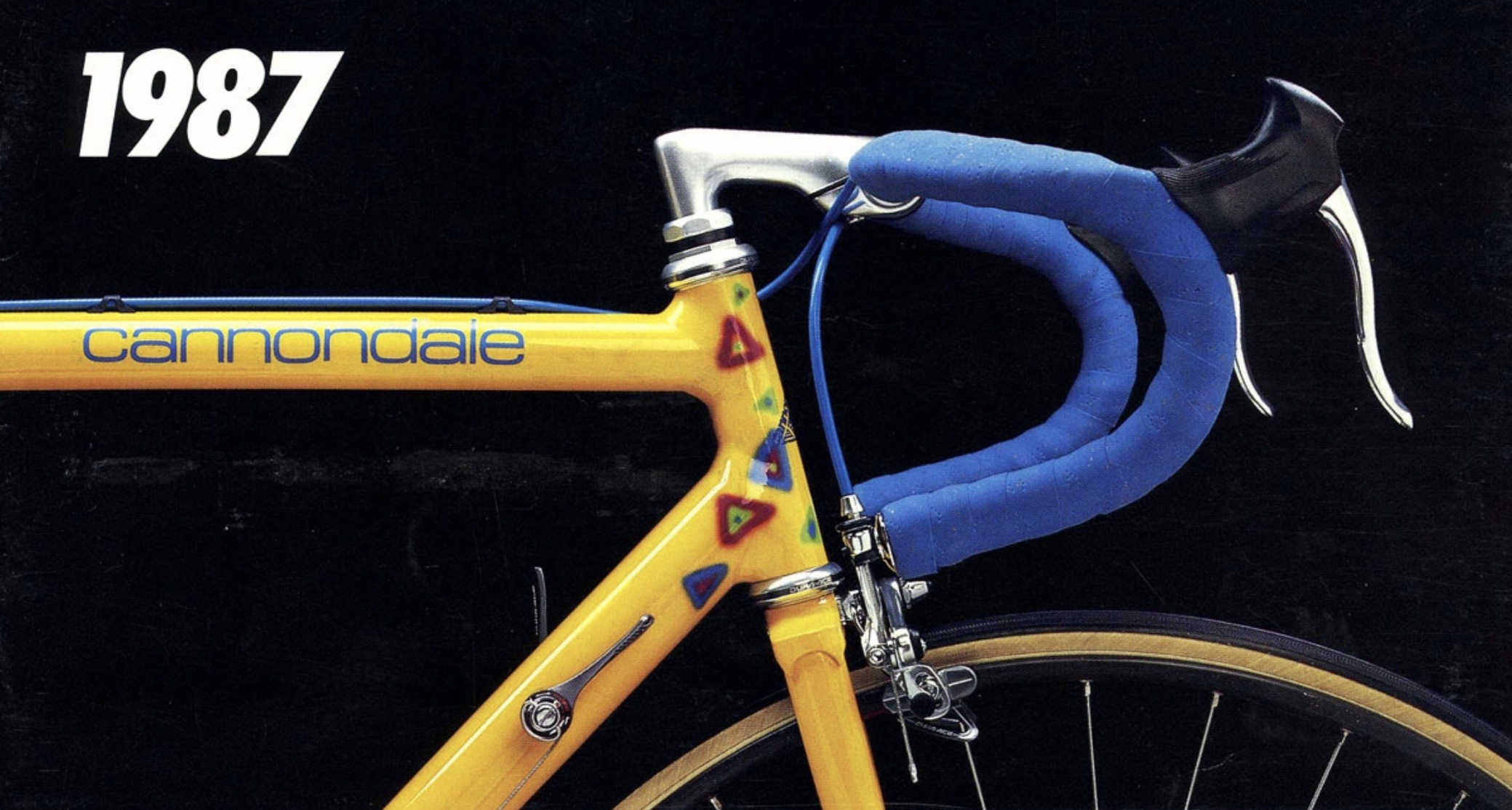
Of any so far I preferred the lighter lower-case font of the late-80s
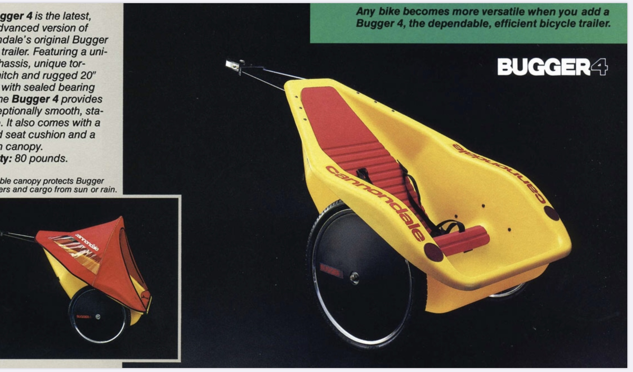
Slight derail,- what ever became of the bugger? ‘Any bike become more versatile when you add a bugger’. <— Allegedly
Not the same as that one at all… you can see why they didn’t go back to that… it looks very dated (I’d love to have that on my bike though… it’s lovable… the new one is just functional).
On the contrary, I think the current logo and graphic design of Cannondales is the best in the bike industry. It just looks so simple, classy and understated. To the point where it almost blinded me to the fact that the Habit wasn't the right bike for me.
More importantly, they’ve got a £9000 Xc hard tail on their website- how much? Etc.....
A fine presentation Malvern Rider! Bravo!
'89 and '87 logos = Cool
Mr Potato I fully agree, the old CAADs looked great. The new ones are bogging.
Kelvin, I went back and edited/expanded before seeing yr comment - and slightly agree. Think it’s the same typeface family (some custom gothic font) just differently arranged.
*erratum
The
19861985 version was closer to 2020. I liked that less:
The 1986 version OTOH looked good IMO, kerned in to the max and even overlapping:
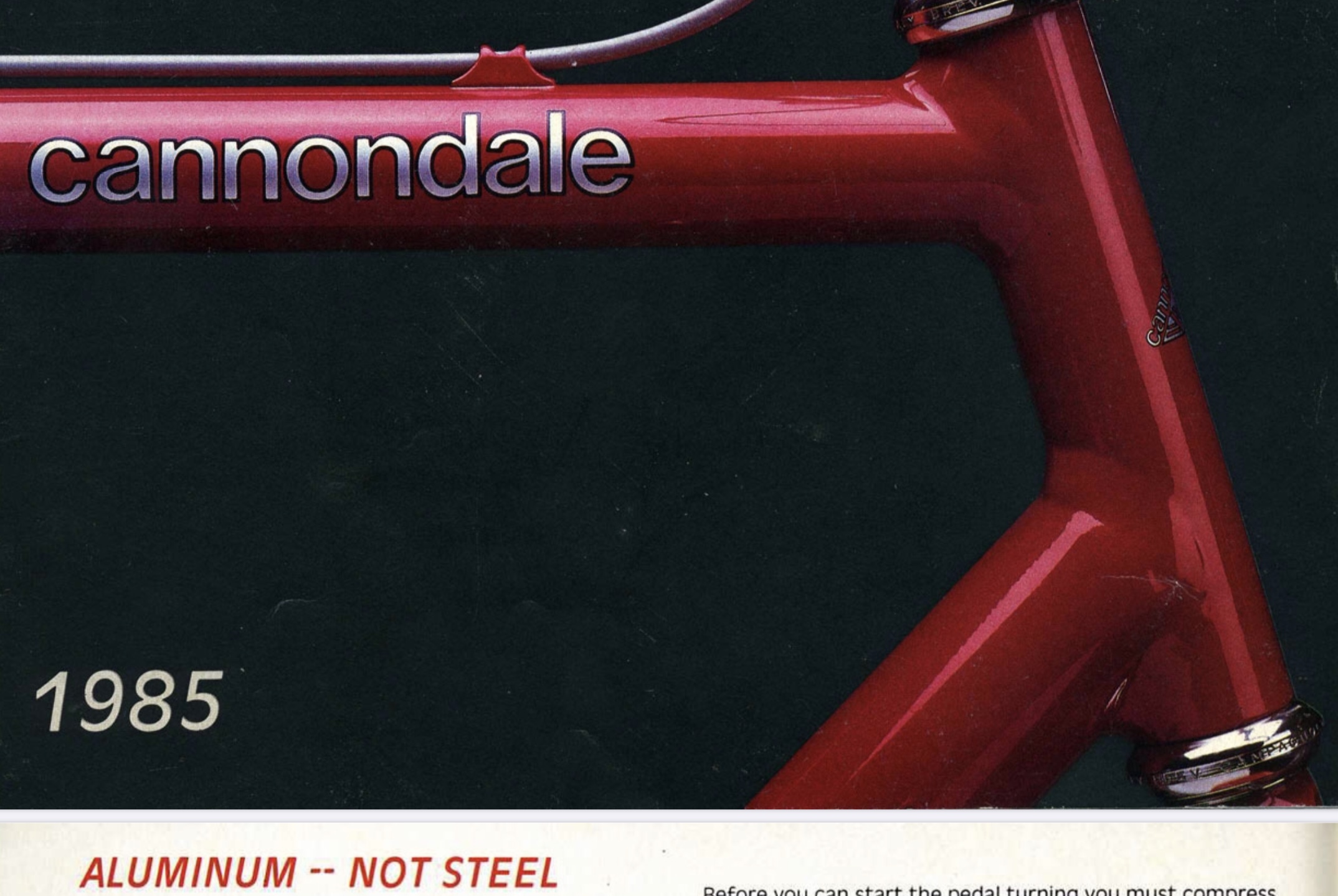
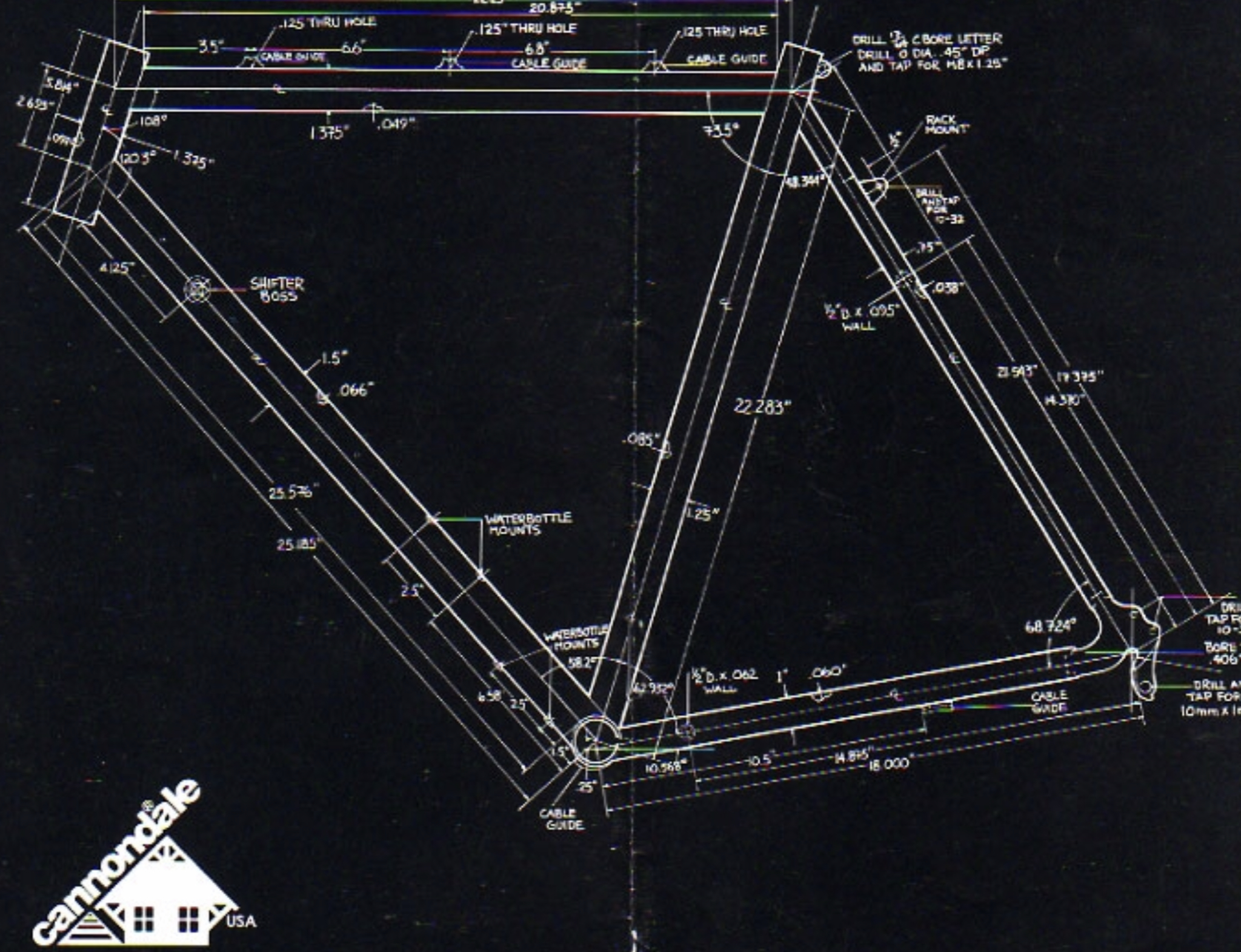
For a bit of completion here’s the earliest example I can find of their logo being used for ‘The Aluminium Sport Touring Bicycle’ (tend to forget they started out as a precast-concrete-then-internal-combustion-engine-then-bike-trailer-then-backpacking and bikepacking luggage designer/manufacturers)
1983:
Slight aside - I had a Cannondale ‘Silk Tour’ for a short while and it was a very rapid, beautifully-constructed touring bike, complete with a road-version Headshok Fork. Early gravel!
Great contribution Malvern Rider.
Off the top of my head I don't think Cannondale made a single bad-looking road bike until the CAAD13.
Just googled CAAD12 - one of the best looking road bikes.
Just googled CAAD13 - they need to sack the new manager.
I am too thick to be able to post photos as backup.
i miss my 2002 f800 ht in matt black with lefty fork. bloody awesome mtb.
I’ve got a Caad12 105 disc which came in a really nice subtle colour scheme (dark grey with light silver and hints of blue) and I like it a lot. In other specs there was a black one with white writing I think (Ultegra disc?), and a beautiful purple one which I think was Dura Ace disc.
Caad13 paint jobs and graphics are just minging. Why go to the trouble of making a good frame even better (more tyre clearance / mudguard mounts / flexier seatstays) and then make it look so gross?
I use to be a Cannondale fanboi. The first one was a 1990 SR400 road bike. I've had hardtails various road, CX bikes, full suspension from the Super V with head shock to the first edition of the Jekyll with the Lefty and the Cedric Gracia edition Gemini DH.
I had every brochure from 1990 until the early 2000's. I did lust over an SR1000 with a full Mavic groupset back in the day.
To me, they lost their way when they went into motorbikes that eventually screwed the company up then moving all production to Taiwan.
Changed hands completely after the motorbikes, yes? Lots of good things since, just never quite the same.
…and made it really crap? When it used to be quite good?
You mean Cotic? 😈
I think everyone’s being a bit over the top?… is it the affect of lockdown, I mean I just went on the website and the font in the logo on the top does look slightly different but that’s it. The writing style on a lot of the bikes still hasn’t changed from what I can see ( I currently own two Cannondale hardtails).
Some proper digging there Malvern Rider! Ta.
'....over the top' ...on STW? Never.
i miss my 2002 f800 ht in matt black with lefty fork. bloody awesome mtb.
That's my sometimes used commuter bike albeit with pace carbon rigids. 👍
They always looked a bit bland, IMO. Wasn't so long ago you'd get a ban just for starting a Cannondale thread on here.

I use to like the Cannondale Sobe colours.
Mrs_oab still bemoans not having her F900SL.
The down tube was coke can thin. The headshock actually worked well for a 7.5st rider. The wheels were light. It absolutely flew along.
It looked teh shizzles as well, even in beige.
#ThemWereTheDays

‘89 logo ftw.
Rocky Mountain have changed theirs a few times too, sometimes for the worse.. but no matter what they do, none of them will have as shit a logo as Canyon! Rear slanting font is just grim.
Agree with the ‘89 logo… and I still have that catalogue somewhere.
Don’t agree about Canyon… their logos are paired back but still highly distinctive… strong work.
Will someone post a pic of the new logo ? I can’t find what you’re talking about ? The logo hasn’t changed, as far as I can see, since their original Adidas beater. And I’ve had Dales since forever and still run 2 now
Canyon logo is very good IMO. Not my favourite but as Kelvin says highly distinctive and different.
I think my own faves are Nicolai and Cinelli. Oh and Mavic.
While googling for an image of the MX400 I came across this article in Motorcross Action from May this year MX400 about Cannondale's attempt at making a motorbike.
Thanks Kuco… I’d miss-remembered so much about that bike… thought it was an off the shelf engine, and in house suspension… doing it the other way around seems very strange considering the experience of the mountain bike designs. Very odd. Lesson there for many brands going into ebikes… use someone else’s working motors, don’t reinvent one.
I should have said Motorbike company because they did actually make a motorbike, just not a very good one.
Was alway disappointed that the 3.0 series I bought back in the 80's had a horizontal top tube and looked like a gate unlike the sloping top tube bike that had been on the floor in another shop. Never sure why that was, perhaps it was a size thing.
I sold my Stars and Stripes F2000SX to someone on here, regretted that for a long time afterwards.

Will someone post a pic of the new logo ? I can’t find what you’re talking about ?
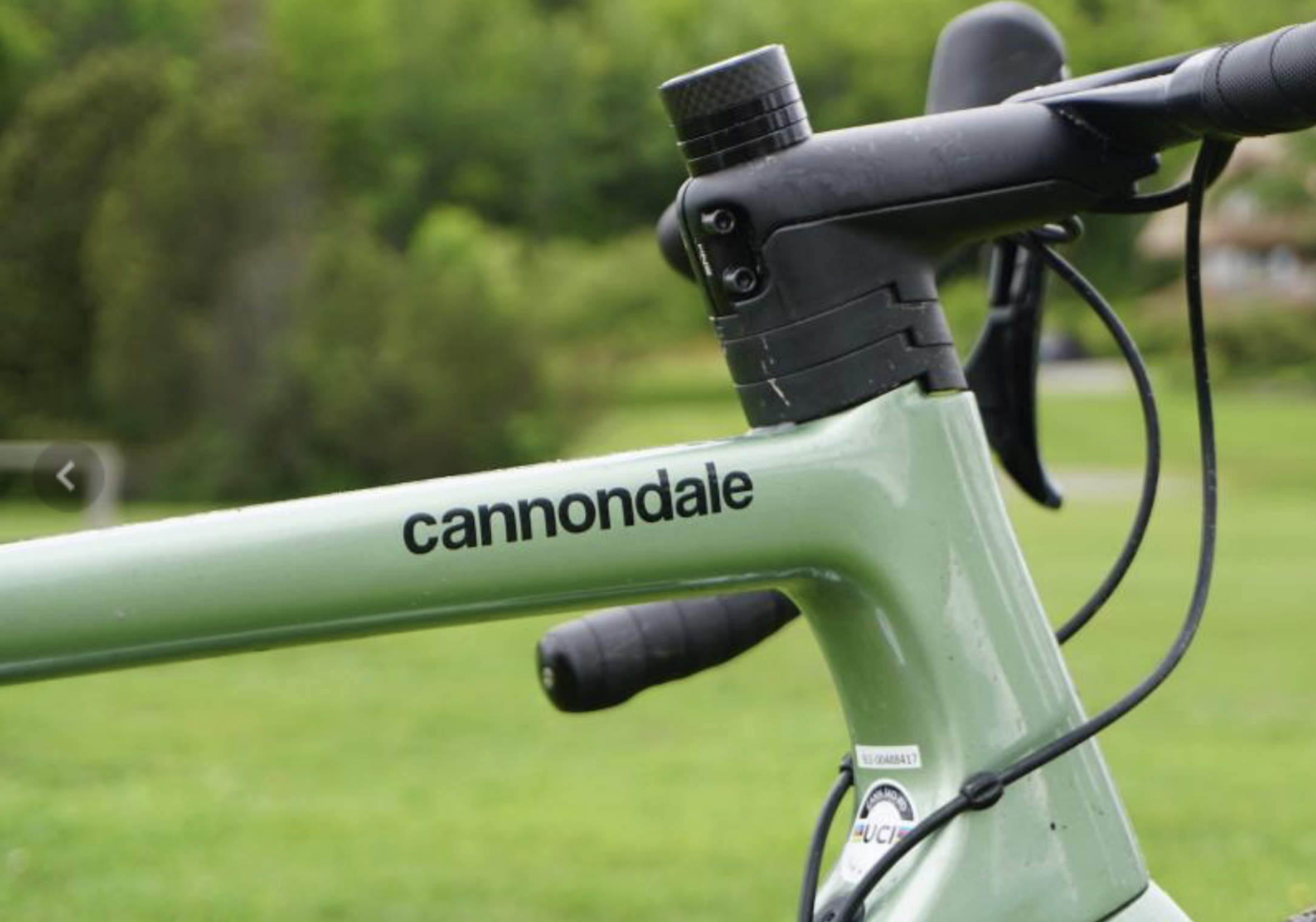
Something doesn't look right about it, like the letters are different sizes or they maybe don't sit on the same line. The Cannondale logotype I mean not the Letraset one.
Should we write to Cannondale and tell them we'd like it changed?
It is basically like they've put zero thought in at all.
That font is pretty much the default Apple font (Helvetica something). It's like they just couldn't be arsed to come up with anything.
It is very “default”, but references some of the older logos posted above very well. Less charm, more cooperate. You can see the thinking behind it.
As someone who owns a fairly boring black Caad, I still think the current range is bland beyond belief. They used to look stunning but there’s not a single bike that you could lust after in the range right now.
Have to agree there - long time CDale fan, owned quite a few, but the current range is not stiffening the sinews. Some fine bikes no doubt, but outside of the superX there's nothing that really stands out to me.
Not keen on the new look of the jekyll at all, but perhaps it rides great.
I like Helvetica, but Eurostile Extended is THE cannondale typeface as far as I'm concerned.