
Subscribe now and choose from over 30 free gifts worth up to £49 - Plus get £25 to spend in our shop
I'm a bit rusty on Excel, but here's what I'm hoping to do:
I'm a Craft & Design teacher and hoping to go through anthropometrics with second and third year classes. I'd like to be able to measure their heights, for instance, and be able to show their heights (say, a class of 20) as a graph thus:
[img] 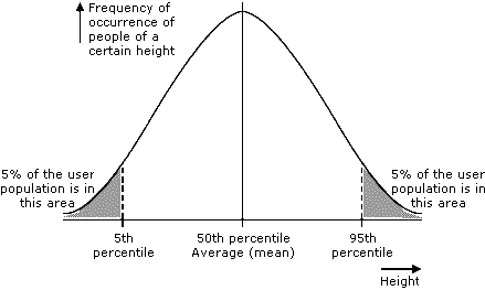 [/img]
I'm kinda looking at PERCENTILE and PERCENTRANK functions but not too sure how to use these functions...
Any help (I know that there are lots of Excel experts on STW) gratefully received.
TIA.
i would suggest using the Frequency() function to do a count, create bins/ranges into which to group the class by height, by using Frequency gives one axis. The other i can't think of as my brain has been fried on a Cognos course.
Why do you assume the 50th percentile corresponds to the arithmetic mean?
use tools>data analysis>histogram for graphing distribution.
youll need to define your own bins, but you can use rank and percentile to help you do that.
Thanks all.
Stoner; that looks like what I'm after...
prego