Forum menu
[i]aracer wrote:[/i]
does anybody know what the font was before?
Just to answer my own question in case anybody is interested, I was kicking myself that I didn't save a cached version of the old site, but then I remembered that somebody did:
https://web.archive.org/web/20170911005314/http://singletrackworld.com/forum/topic/our-forum
"Helvetica Neue" it seems, though that's a paid for font, but it does explain why Helvetica feels familiar...
edit: actually it seems it falls back to Helvetica when that isn't installed, so for most of us that is the default STW font.
the disparity in fonts sizes on this site is becoming intolerable, I'm hunched over the keyboard with reading glasses on the main forum to read the small low contrast stupid coloured text only to be confronted super sized higher contrast text once i've gone to a topic. as for the edit text another font and another size ffs make your minds up
Speed seems fine for me now – that’s an issue where they’ve given reasonable explanations of the reasons for the problems (I’m hoping Mark is noting that I’m not inherently negative about everything – some things are an inevitable part of migrations and to be expected as temporary problems).
Yep, don't disagree they'd given a reason, there was just a suggestion that is was for "an hour or so", and that was Saturday. There's a balance between saying "have you fixed it yet? What about now?" which I agree isn't helpful, and pointing out that people are still having issues that they may have expected to be fixed.
If the answer is "server migration means it'll be slow for a month" then so be it.
Sunday was for a different reason they moving host now in order to give a better customer experience.
Klunk is it possible you can provide screenshots? Thanks
It sounds like server migration is ongoing - could be a day or two knowing how these things go (hamster dependent). There was a specific issue reported with a network card on Sunday which explained the treacly performance then - it's certainly a lot better here now than it was.
Will the buttons at the top to easily navigate between bike, chat and classifieds etc be returning, as in pic? If not it would be helpful if 'Forum' had a drop down!
[img] 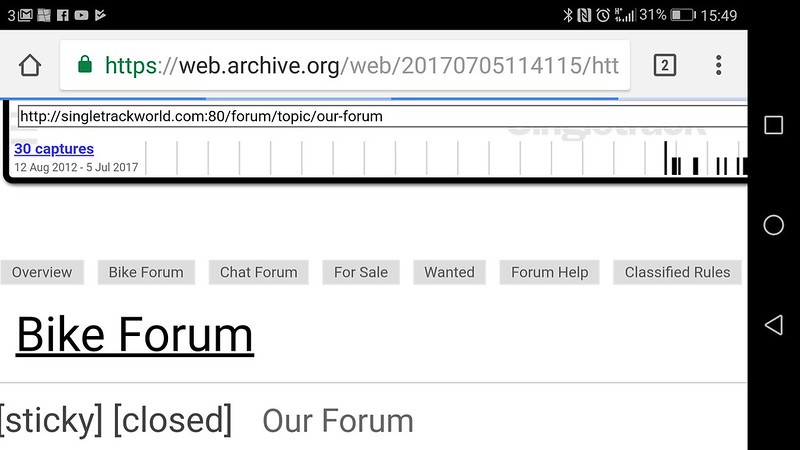 [/img]
I mean that when i look in “Profile” and under “topics started”, none of my Classifieds topics are in there…
Ah right. Noted, ta.
this is as big as I can go before i get the silly newline menu bug...

[url= https://preview.ibb.co/gJxsoH/Forum_text_size.pn g" target="_blank">https://preview.ibb.co/gJxsoH/Forum_text_size.pn g"/> [/img][/url]
[i]Drac wrote:[/i]
Klunk is it possible you can provide screenshots? Thanks
It's a standard thing Drac, I'm sure it's not specific to him. The index page is 12pt Montserrat, the topic text is 16pt Montserrat and the reply box is 12pt Consola. I presume they'll make the index 16pt if only to improve the Google score 😉
Cheers Klunk.
Aracer others have claimed that and yet screenshots have proved otherwise.
So search is back according to https://singletrackworld.com/forum/topic/our-forum/
Search is back on – the search in the classified and for sale forum only searches the last 3 months of post history.
This doesn't seem to be true though.
Search from forum root; https://singletrackworld.com/forum/search/dmr%20trailstar/
Has results from wanted from 2010 (WTD: Steel Hardtail Frame)
Search just in classifieds, page five has data from 2010 that is not even in classifieds!
https://singletrackworld.com/forum/search/dmr+trailstar/?f=classifieds/page/5/
[i]Drac wrote:[/i]
Cheers Klunk.
Aracer others have claimed that and yet screenshots have proved otherwise.
It's in the markup - I doubt the scripts not running which means I'm not getting buttons changes the styles. Where was there a screenshot showing different styles to those I reported?
Why does that bloody annoying sidebar of shite encroach onto the main window when i zoom in using a trackpad on my macbook?
[img]  [/img]
[img]  [/img]
Edit - Well, that image insert didn't work
You don’t like our font.
Noted
I like the font.
Premier Icon
DracSubscriber
Pushing the envelope there Danny.Af those who think they’re hilarious to clutter the thread with cheap shots and silly gifs please stop. All your doing is burying any genuine posts or bug reports. Cheers.
Posted 6 hours ago
I genuinely didnt realise this was THE official UAT thread. I guess that’s why it was made a sticky. It could have been made clear in the thread title, though.
Don’t worry, I won’t darken this thread again. Or probably STW at all.
It wasn’t directed at you DannyH sorry for the confusion.
Font is fine, great, happy with it. ON THE IPAD.
On PC its wrong. But hey, it’s Mark’s forum, so the users of it can just go **** emselves eh.
Oh the gubbins on the right has changed! Thats so much better (on the iPad anyway).
So it look like this is the formatting style that we're stuck with? Pity as looking at it for more than 5 minutes makes my eyes hurt, especially the white/grey choice (far too much white, strange how it was fine on the old version) and the different font styles and sizes between the main forum page, the thread and the typing window. The other stuff is just annoying so I'm out of here for the forseeable. Pity as I like the place and I have a few things to flog, off to Ebay instead I think.
Might be better but it's still shite. Please give us the option to get rid of that effin sidebar.
You need to step away Dezb, You are starting to move from critical to just rude now.
Ahhhh....much much better, thank you
thanks for mostly sorting the sidebar. much better than it was.
perhaps that was the plan all along - make something really horrible to go there then change it for something better thats still worse than no sidebar...!
not wrong though
especially the white/grey choice (far too much white, strange how it was fine on the old version)
I don't understand this. I mean, I'm not arguing, I just don't understand - it's the same colour scheme as the old forum isn't it, only with a different font?
We've deliberately designed it to look the same as the old forum because we know people fear change. The colour scheme is as Cougar says.. it's the same as it's always been. Even that godawful olive colour has gone now.
Yup looks the same colours to me.

Any chance of removing the STW repeating watermark on either side of page in desktop mode? I find it makes the page look 'dirty' (if that makes sense) and tends to draw my eye away from the stuff in the middle - perhaps because it is so faint I try and work out what it is
Site is starting to work much better now although the lack of the previous single click to get back to the main forum overview is still slightly painful.
Mark
Subscriber
We’ve deliberately designed it to look the same as the old forum because we know people fear change
Thanks for the customer facing response, love to hear the behind the scenes one
On serious feedback the font is harder to read and definitley not as easy on the eyes a lot of others.
Also please fix the swift key thing qyicklq or quickly
the lack of the previous single click to get back to the main forum overview is still slightly painful.
Can't you just click the menu bar where it says "forum?"
On the mobile site, you can click the up arrow to return to the top (or scroll) and then click anywhere in the path Home › Forum › Chat Forum › Forum Update to go to the relevant section.
Links at the bottom of threads would be good though.
please fix the swift key thing
I'm only guessing but in the grand scheme of things I can't see this being a top priority. It'd be fairly low on the list if it were me due to it being a subset of a subset of users affected and there being plenty of other keyboard options. It's on the list though.
We’ve deliberately designed it to look the same as the old forum because we know people fear change. The colour scheme is as Cougar says.. it’s the same as it’s always been. Even that godawful olive colour has gone now.
I am now of the opinion that that the age old adage of “y’a can’t please all of the people all of the time” ought to be deployed.
Theres too many folks diving in with a wish list longer than a book of work for a £400m IT system transformation over a 14mth delivery schedule.
If you believe all the noise, it’s a steaming pile of unusable chicken sitting in a warehouse near Rugby and some kids are going hungry.
When in actual fact the layout and font and segments for comments are fine, the sidebar can be gotten rid of by double clicking the comments and the ads are acceptable, the watermark is a feature.
I would now start to take all those with a pedantic pessimism attitude and deal with them accordingly..
By ignoring them.
Good forum upgrade, appreciate all the hard work you guys have done and will continue to do over the forthcoming period until YOU guys are satisfied with it.
Content is key, a platform for contribution is welcomed and thanked for.
Can’t you just click the menu bar where it says “forum?
Yes, but both methods, desktop and mobile, require scolling all the way back up to the top again or clicking somewhere else first. It used to be just one click at the end of reading a thread. It's not a dealbreaker by any means but it's like taking the tool you use most and sticking it at the bottom of your toolbox because it looks best there
But, as I said, it's all getting better and more useable by the day so I'm happy
On PC its wrong. But hey, it’s Mark’s forum, so the users of it can just go **** emselves eh.
I'm fine with it as I'm sure many other users are (now the leading has been increased a bit) - works fine on all my Apple and PC devices. From 27" 5k iMac to cheapy HP laptop. Can't see why you are getting in such a strop.
Good to know you don't know...
ImI alsoa guessigu itsitit impressive to break somesomet doddod sinoles
Do you know if the pic post spannings past mobile screens so you have tot rotate to cancel iti is on the list?
Yes, but both methods, desktop and mobile, require scolling all the way back up to the top again or clicking somewhere else first. It used to be just one click at the end of reading a thread.
Bottom right of the screen is a "Scroll to top" button. It's hard to spot as it's (another) shade of grey.
Content is key, a platform for contribution is welcomed and thanked for.
I've read some pants in my time here, often my own, but that's Grade A 🙂
New subtle sidebar is a massive improvement over the eye-melty, distracty one.
Happy to take that as proof that STW towers are trying their best to balance their needs with our wants and I shall go and throw peanuts in others threads as per usual.
Good work hamsters.
BearN..
Thanks, you were on my mind when I posted it.
Premier Icon
DracSubscriber
It wasn’t directed at you DannyH sorry for the confusion
Sorry. Genuinely. Came home in a bit of a stinker of a mood, read your post and assumed it was aimed at me. Then compounded my poor judgment will a daft attempted flounce. Which I obviously couldn’t back up as I am logged back in now.
The direction of travel of the site is good from what I can see. A couple of weeks ago it all just seemed chaotic, but Mark has explained the rationale. People may disagree with the method, but someone always will. Once all the gremlins are sorted, I’m sure most of this will blow over. At risk of stating the bleeding obvious, the quicker everything is ironed out, the more happy everyone will be......
We’ve all done that DannyH.
Yup pretty much sums it all up.
<p>Here's some pictures of the non existent font size inconsistency issues:</p><p></p><p> </p><p>
 </p>
</p>
Cheers Squirrelking no one has claimed they don’t exist it’s just we can’t replicate the problem so with pics that helps see the issues.
Can’t see why you are getting in such a strop.
Attitude of the replies probably.
<p><p>Tongue in cheek, I know it's not necessarily visible. Reported my last post with P's all over it too with more info.</p></p><p></p><p>No doubt you'll see the wonky member names and P symbols too.</p>
@squirrelking > is that Firefox? The site renders very differently in FF from every other browser, or at least did last time I looked. The floating menu bar is transparent too.
<p>Nope, Chrome managed through Browsium Catalyst though not a current version (blame IT)</p><p></p><p>WOW! weird thing when editing, deleted the old P tags and the whole message got deleted from the end as if I was holding down backspace!</p><p></p><p>Was going to say, menu bar appears and disappears depending on if I have just scrolled up or down. Up for menu, down for none.</p>
I wonder if that’s what causes you font issues too squrrielking, I had to google what it was and it appears to be some sort of emulator for browsers.
<p>Kinda, we only use Chrome for web content whilst IE6 gets emulated on a newer IE for older applications.</p>
IE6 😲
So yeah, two things here.
1) you're using an old version of a relatively unusual product. That sort of platform is kind of an edge case.
2) from what I know of it, Browsium chooses a rendering engine for different sites based on IT policies. I suspect that it's offering up Gecko (Firefox's engine) for STW. Whether you can override it as a user I'm not sure. Might be worth looking in the settings to see if you can change it to Blink (Chrome) for this site?
IE6 😲
Wow. IE7 was released over ten years ago now. An application requiring a browser shipped with Windows XP at launch is... special. You must be in a very specialised industry, or one that doesn't like to spend money.
(That said, I was asked only a couple of years ago to help with a "server" that no-one could understand, uplifted from a legacy customer's site. It was running Windows 3.11...)
[i]Drac wrote:[/i]
Cheers Squirrelking no one has claimed they don’t exist it’s just we can’t replicate the problem so with pics that helps see the issues.
Seriously? Do you have different markup to everybody else? On Chrome if I Ctrl-Shift-I on a post the Styles box tells me it's 16px, if I Ctrl-Shift-I on this edit box (or the index page) the Styles box tells me it's 12px (it also tells me the font in the edit box is Consolas rather than Montserrat everywhere else). Do you get something different?
On a positive note, I turned off the script which disables the sidebar to check spacing and probably won't be turning it back on, it's much better without the obtrusive difference in style.
Seriously? Do you have different markup to everybody else?
Does your view look like Squirrel's second screenshot? Cos mine certainly doesn't.
Does yours look anything like squirrelkings? Mine doesn’t do that weird thing with quoting.
A slightly wider white border on the lhs would be nice. The watermark keeps catching my eye as I move down the page.
But it's all much better now.
My experience was the same font issues as reported on the last couple of pages, that's running on PC with Firefox. So I find it hard to believe it cant be recreated.
And you've sort of sorted the SwiftKey thing but its still is sh*t.
Does your view look like Squirrel’s second screenshot? Cos mine certainly doesn’t.
No, because he has a load of buttons above his reply box 😆
Otherwise the only obvious difference is that the quote text isn't bold like in that, but I don't think that's what he's referring to. I certainly have the difference in font size between the posts and the reply box - from the markup https://singletrackworld.com/wp-content/plugins/stw-bbpress/templates/default/css/bbpress.min.css?ver=2.6-rc-6701 is included which has the following settings which apply to the edit box:
[code]
#bbpress-forums div.bbp-the-content-wrapper textarea.bbp-the-content {
width: 100%;
margin: 0;
font-size: 12px;
}
[/code]
So you can see why I was being serious then?
I can see how you missed the point, because he mentioned font sizes, not quoted text looking funny. Do you not have the different font size in the edit box (it's also a different font family, but that's less obvious)?
I don't want to make a big thing of this because it doesn't bother me that much, but it's clear from the stylesheets that the fonts are set differently (and it would also be incredibly easy to fix).
Can anyone select text for quoting on an iPad? My normal method of either press or long press doesn’t bring up the usual selection box. Was going to agree with epicyclo about the watermark but can’t copy the text
edit:and now it works. I wonder if maybe the page hadn’t fully loaded and just took a looong while
Nope you’ve missed the point, we know about the font size believe it or not it may have been mentioned i. When he posted his pics, people proving pics is better than an “I have font issues” we could see that there was something weird going on with the his quoting too.
Yeah leffeboy is there’s a hang while the page loads you can’t quote.
Except that he doesn't mention the quoted text as an issue - from the top of his post "Here’s some pictures of the non existent font size inconsistency issues", to which you replied "Cheers Squirrelking no one has claimed they don’t exist it’s just we can’t replicate the problem so with pics that helps see the issues." which is what prompted my comment. So no, I'm not missing the point at all - the quoted text is an irrelevance. I've even given a link to the relevant stylesheet (the 16px font size is set in the main source code, line 197)
Yeah like I said you’re missing the point.
What exactly is the point you think I'm missing here?
<p>The bits in bold in the quote box. It's closed captions for web browsers!</p><p></p><p>Incidentally can anyone else see HTML paragraph breaks all over my posts or is it just me? I also see a load of div> sub class 12 etc. nonsense on quoted posts too.</p>
<p>Here's a good example of what I mean. Not every post but literally nobody else is commenting which leads me to wonder if it's just me getting weirdness.</p><p></p><p> </p>
</p>
I'm seeing <p> breaks all over your posts but not anybody else's - the screenshot you give is of a bit which was all messed up though, I see the same as you there.
What he said. ^^
Been mentioned before, but the biggest 'issue' for me right now from a user experience PoV is the lack of feedback when clicking/touching a link or button. Small thing but just makes the site a bit weird feeling to use.
Did we ever find out what the point was that was being missed?
@squirrelking - the HTML tags in quoted text is due to people copying and pasting the user name as well as the text of the post.
Correct:
What he said. ^^
Incorrect (Note that I've copied Cougar's name and membership status):
<div class="bbp-reply-author">
<div class="bbp-author-role">
<div class="">Subscriber</div>
</div>
</div>
<div class="bbp-reply-content">What he said. ^^
</div>
Hopefully that shows it.
Not in Squirrelking’s case whitestone, whenever he types it inserts the <p> html code after he hits submit.
Ah, OK. That's weird.
Are we any closer to having a page that shows us the threads we've replied to (and not the actual posts, out of context)?
Can anyone select text for quoting on an iPad? My normal method of either press or long press doesn’t bring up the usual selection box.
I find you can't highlight/copy text once you started a reply. So you can copy someones post and then start typing your own post and paste it in, but once you're working in the reply box you can't scroll up to previous posts and highlight and copy from them.
I remember people were saying it would be good for the site owners to give some input rather than leaving it all to the moderators. It wasn't good. It certainly wasn't very professional.
So slow.
So washed out.
Preview borked.
And that floating header. WTF.
Could somebody just send me an email when everything's sorted please. Frankly I can't be arsed anymore.
Thanks
Marko