Membership expired?

Noticed the formatting on some threads is going missing (as pic below).
May be due to me quoting in the old typing in the HTML style rather than using formatting options.

Just started getting ads despite being logged in. See bottom left.
Android 13 on Samsung f20se.

Should be gone now
Yep, ads now gone. Cheers.
No matter what I do to update my profile cover photo, the old one keeps coming back.
So no update on the main full size advert which is usually hard to find the ‘x’ button to close? That there to stay regardless if full/paid member?
It’s so annoying, really puts me off logging in
So no update on the main full size advert which is usually hard to find the ‘x’ button to close? That there to stay regardless if full/paid member?
Not something I've seen. Sharing what browser/devices you see this on might help dev track it down. A screenshot could be useful too
Am I missing something, but as a full member why do I get a (currently temu) huge advert before I click off it to get to the forum? I’m signed in?
Yeah I'm still getting this, Android on Pixel 9
Apple iPhone 16
heres is this mornings advert 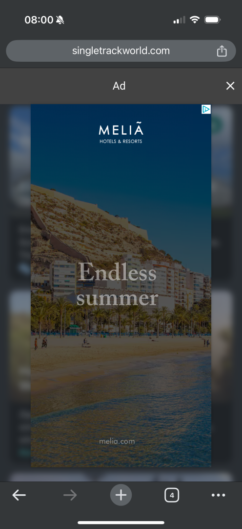
I'm having a rather different ad. issue (Windows & Edge). I keep hearing a rather irritating jingly tune & some lady nattering on about itchy dogs (presumably selling some sort of salve or balm for their easement).
It's somewhat disembodied & doesn't appear to be attached to any of the visible ads. I have (and therefore closeable).
Fortunately it soon comes to an end, but irritating all the same.
Hi everyone,
I'm looking into this now. Hopefully I'll have the ad gone shortly.
I was away last week on holiday, hnece the lack of updates from me. Ads are my priority right now. We've switched to a new ad supplier (Publift if anyone is interested). All ads on the site are in my direct control now (Where they display that is, not neccessarily what ads get shown). apart from this one ad called an interstitial. That is directly injected into the site by Publift. The way we control it and ensure that subscribers don't see it is with some logic that removes the Publift code from the header of the site so that no ads can appear at all for subscribers. It's a bit more complicated than I'd like but I'm sure we can get it fixed today.
Just checking in to see how things are coming along and whether it's time to re-engage with the site and re-subscribe. Looks like issues are being addressed so I will maybe give it another month. Going AWOL has highlighted to me that all I really miss from here is reading about other peoples (bike) adventures and related photos.
I've made some adjustments to the ads that I hope will have fixed the issue of subscribers seeing the insterstitial ad. If any subscribers are still seeing it please take a screenshot and send it to me at mark@singletrackworld.com and I'll do my best to get it sorted.
Well whatever has been done it seems to have completely distorted the presentation of the site for me every time a new page is opened, although it goes back to normal if the page is reloaded
Well whatever has been done it seems to have completely distorted the presentation of the site for me every time a new page is opened, although it goes back to normal if the page is reloaded
If it sorts itself on every reload, I suggest clearing your browser's cache, that'll probably help.
If it sorts itself on every reload, I suggest clearing your browser's cache, that'll probably help.
Thanks for the tip, unfortunately it didn't help 🫤
If it sorts itself on every reload, I suggest clearing your browser's cache, that'll probably help.
Thanks for the tip, unfortunately it didn't help 🫤
Okay I think it has sorted itself out now. It seems to have been because the font size wasn't going back to its 11pt default setting and kept automatically going to 14pt, I have no idea why that was affecting how the page was being displayed. Anyway it seems to be back on the 11pt default setting now, so I think it's resolved
No soddit it hasn't. When I load a page it goes automatically to 14pt but when I reload it it goes back to 11pt
Edit : Okay it seems to be random! Now it's working fine again 🙃
Why is the text in posted links/web pages etc so light and impossible to read?, see my screenshot below, and why does it take 5seconds to 20seconds to open a page or browse the site?, it’s aas poor as the old forum
on iPad/latest safari etc.

really enjoying the malware redirects.
i mean i get that trumps got some infection, but I'd really like to be able to read the latest on that thread.
A new formatting issue that I've only noticed on one thread so far. the 5K e-bike thread. The right hand side of the page is off the screen and there is no way to scroll or move the page to read it, so some posts are truncated and unreadable. Chrome on Chromebook. Edit to say, it's only the first page of that thread which does that, the second is fine, weird!

On android with firefox I can't find any way to post new topics. No buttons anywhere I can see
On android with firefox I can't find any way to post new topics. No buttons anywhere I can see
You have to be in the bike or chat sub forums, no the latest/overview page. See screenshot below (android phone).

Ah, thank you
I have the same issue with the ebike thread (Chrome on an acer Chromebook)
There's something funny going on with the image hosting. If I click on an image in someone's post, I get a popup to scroll images that seems to contain a few random images from the current page, not necessarily including the image I actually clicked. Some images are missing altogether from this and you can't get them in the large version popup. Images from different users are mixed together, as well.
Just checking in to see how things are coming along and whether it's time to re-engage with the site and re-subscribe. Looks like issues are being addressed so I will maybe give it another month. Going AWOL has highlighted to me that all I really miss from here is reading about other peoples (bike) adventures and related photos.
I kept the faith, finding it much better than it was and marginally better than pre-upgrade. Finding it much easier to add images and find the quote function very handy.
Re: trip reports, is there still a limit of five images per post? Would like to try writing some trip reports again but it's difficult to get each trip down to 10 photos let alone 5!
I've made some adjustments to the ads that I hope will have fixed the issue of subscribers seeing the insterstitial ad. If any subscribers are still seeing it please take a screenshot and send it to me at mark@singletrackworld.com and I'll do my best to get it sorted.
Thanks Mark, no more ads here 👍
I'm not seeing some posted posts again.
......and a double post glitch
Are we back to the old forum?, 15+seconds to open every thread page I click on, safari/iMac.
Are we back to the old forum?, 15+seconds to open every thread page I click on, safari/iMac.
Same here. So slow, I think the page has loaded, pick a thread to view, and I end up with a completely different thread opening.
OnePlus Nord running Android/Chrome.
What are you doing differently? Is this an issue with the mobile site?
Index takes about 5 seconds to load, pages about 2 for me. Posting could be quicker, this reply took maybe 11 seconds (and me editing to add the posting time just there took 4).
What are you doing differently? Is this an issue with the mobile site?
No idea what I'm doing differently. Nothing different to how I used to use the site for years. On mobile phone, go to STW forum on Chrome browser saved to phones desktop (makes no difference doing this or loading directly from Web search result) took 19 seconds to fully load the forum overview page. Further 5 seconds until the selected thread starts to load having selected the double arrow icon, then about 10 seconds til it gets to the last thread posted.
For the last couple of days it has been absolutely perfect for me (android/chrome) I can't remember the last time it was. I only clicked on this thread because although ironically the sticky function doesn't work but I could see the thread getting bumped up, I was curious to see what issues people might have.
Only issue is a 1-2 second lag on every click through. This is the only site I visit with such a pronounced delay to load a new page. Other than that it all seems to be working fine.
Ernie + 1. Well done STW tech. Also fine on Windows 11 and Firefox. It's even acceptable without software that must not be mentioned.
Down to around 3-4 seconds to load/refresh page now so it’s an improvement but occasionally it hangs for ages
edit #1 : I timed the above post and it took 10seconds to load from hitting the “post” button to showing up, Using 2018 iPad Pro/safari all updated.
edit #2 : Took 6 seconds for edit #1 to show up
edit #3 Took 3 seconds for edit #2 to show up, I think I’m getting somewhere with this posting delay
edit #4 :Nope, spoke too soon as it’s now back to 6 seconds
No idea what I'm doing differently. Nothing different to how I used to use the site for years. On mobile phone, go to STW forum on Chrome browser saved to phones desktop (makes no difference doing this or loading directly from Web search result) took 19 seconds to fully load the forum overview page. Further 5 seconds until the selected thread starts to load having selected the double arrow icon, then about 10 seconds til it gets to the last thread posted.
I use the mobile version very rarely (which is why I asked the question). How is it for you on a PC?
Still getting all the mobile ads, they disappear temporarily if I log out and in again. No idea how to screenshot.
All good for me, but I don't look to do anything fancy, just browse, read, attempt to post something amusing or my opinion and that is pretty much it. I'm not sitting on multiple threads looking to post on all so I'm not really seeing any delays in page loads or things like that, it is just doing it's thing. Given the database has a lot of entries I'm not expecting instant results.
Has been excellent for me for weeks now - last week had a single post (this one) not showing me the last posts but that seemed to sort itself as well.
Absolutely no idea what I do differently to those with issues - I don't think my post count is low, but it isn't in the big numbers, I login every couple of months and I use mainly my phone (latest android and chrome) or occasionally my laptop (windows 11 and chrome).
Same experience on both. It seems to be working well for me.
Can we do something about posted links.... I am unable to read the text as that light blue on white background. Quite frustrating. This screen shot on the skate shoe thread, lots of links, zero legibility

For some reason, on the latest FGF I've got adverts constantly playing in the bottom left corner of the screen (Chrome on Android 13, Moto g82)
When I then tried to access the forum from the hamburger, clicking the forum, or any other links didn't work but I started getting audio blasting out of my phone from the advert.
The only way I was able to access the forum was via my profile and then forum posts.
Image of the adverts -

Just want to test something
