What do you think of them?
Practically I see the risk of them clashing if you transfer them to the next frame, possibly less interest when selling due to frame suitability and being a bit marmite, and might stand out drawing good or bad attention.
Fox orange is a bit too common. Yellow is good on small things and big things but a fork is the wrong size to be yellow. DVO green has a nice pop. RockShox red is pretty neutral. Formula ultraviolet is a nice tone but a bit odd for those not in the know, my extended family would definitely ask why do have a purple fork.
I like them all on the right bike.
I bought some bright green fox forks that I was going to put on a metallic grey Solaris. I then bought a yellow Solaris frame as it was on sale, so had to send the green fox back and just go with black forks....
All of them are awful. While my policy is normally frame and forks can be whatever colour you like and everything else black or silver, there are limits of decency. They all clash horribly with any other colour, and none of them are "nice" colours - they're designed to offend the eye to attract attention. They make all world cup bikes look terrible.
If I rode a bike with an orange Fox fork I'd feel like a bell end, pretending to be a pro.
Remember when Marzocchi forks were red, orange, yellow or green and Roox made colour matched stems?
Always looked good on a polished frame, or maybe a black 8ne. Was all the colour a bike needed.
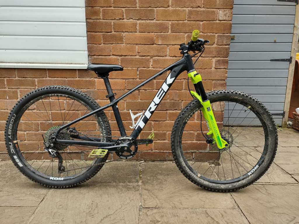
Got these Manitou Machetes on my daughter's bike. Just got her a new bike but am gonna keep these forks to put on a DJ/pump track bike. Just because of the colour....
I think the DVOnis a bit much because the crown is a matching colour too - think it would be better with a black crown.
Kind of like the purple on the formula.
When the red lyriks came out I knew I had to have some - no idea why. But I’ve got some and I love them.
Less keen on the orange or the yellow. And orange with that Kashima just seems wrong to me. But I just don’t like Kashima full stop - I dislike it on my x2 and would rather have black stanchions.
I think the DVOnis a bit much because the crown is a matching colour too – think it would be better with a black crown.
Oops grabbed a wrong image. They're black crowns nowadays.

DVO and Formula are nice on other people's bikes and I'd think how nice they'd be on my own, but I couldn't get one really. Fox orange and Ohlins yellow would rather kept out of my sight. So RockShox red wins. But in reality, the best fork product but in black.
I really like most of them on a raw alloy frame. However both my bikes have incredibly brightly coloured frames (day-glo lime/yellow and shocking pink) so the forks (and all the other parts) are BLACK!
Personally, I think the orange fox forks look banging on a black bike…
Me wanty.

Me no wanty, but they are different.
Silver pikes, blue sids... go with nearly everything
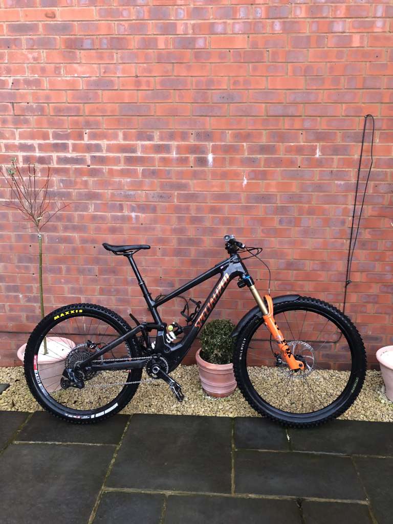
Orange forks on a black bike ok (and the gloss clear coat over carbon on the Kenevo is lovely in the flesh), but mismatched rims, tyres, shock spring / dial anodising. 🤢
Mate has a raw Bird with red Lyriks and coil spring, looks mint. Raw or black frames only for silly coloured forks, otherwise keep them black.
The others could all go with something I'm sure but I've literally never seen the red rockshox look good on any bike... The Ohlins could be ace if not for the logos.
But then, I once got really annoyed because my grey marzocchis were a sligtly different grey to my frame soooo
Remember when Marzocchi forks were red, orange, yellow or green and Roox made colour matched stems?
Remember? I was there mate. Black Identiti Krisis with Orange Z1's and full Roox kit. The stem was orange and I think the cranks were as well.
I haven't had a non-black fork since I had a white Boxxer in 2010. I'm an Ohlins convert but I wouldn't have yellow ones.
Orange Fox's definitely scream 'try hard' and look awful on 90% of bikes.
I'd have a red Boxxer on the right bike. It's hard to be offended by red. They look mint on the Airdrop Slacker for example.
I love them all, the bike world is full of grey and black components already. I really like the DVO colours and silver Pikes.
Personally I like them. Bit of a pop in an otherwise monochrome world of black carbon and anodising. It’s just marketing.
Everybody knows that they aren’t team-issue so the whole ‘trying to look pro’ thing is nonsense. It’s just an alternative colour choice.
It’s ultimately a very subjective thing. Different strokes for different folks. As a result it also doesn’t really impact second hand value because just as some people like them new, the same applies used.
On a black, raw, navy or dark grey frame, with black components, they can look good. But I personally wouldn't.
Yeah, I like them. I feel the same way about this stuff as I do about Burgetec, Hope or Chris King or IN stuff, I like colour, there's too much grey and black in the world already, and they can look nice. It doesn't follow that every execution of putting this stuff on a bike frame looks good, they mostly don't, but **** it, if it makes the owner of the bike happy, then who are we to criticise?
Do you have your name on the top tube?
Raw or black frames only for silly coloured forks, otherwise keep them black.
This.
They tend to make pretty much any bike look like some Walmart pile of cheap landfill.
Frame is bright? Everything else black. Makes the colour stand out and can look amazing.
Black frame? Coloured elements elsewhere but less is more.
I can't think of a single bike I've ever seen that hasn't been tainted by red, orange, yellow, purple, dayglo forks 🤮😂
It's all just personal taste of course but yeah, minging.
Saying that, I rode to work on my fatbike this morning which is completely dayglo.
But that's ok as it's a rigid fatbike and anything goes on them, plus it actually is cheap Go Outdoors landfill😊


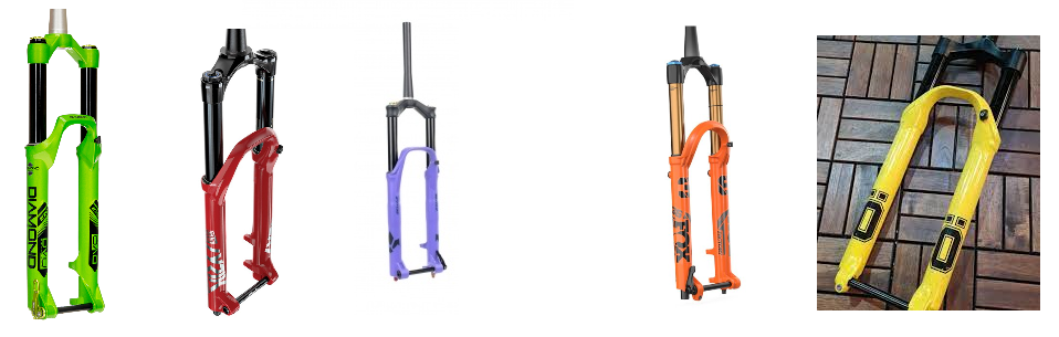
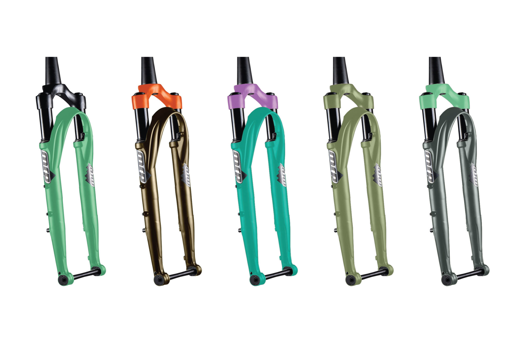
I'd like to see some copper, bronze or gold forks, those MRP forks far left look real nice, maybe a RoboCop paint job would look amazing with black stanchion forks, would look awful with kashima though.
I've a black Lyrik and a black 34 (like somebody else, I wish that didn't have kashima) on a raw and black frame respectively
Just to cheer 'em both up, I use silver spokes
There's so many men that are weird about colour, it feels like it should be a pathology
I'm just old and confused. Rock Shox are gold, bronze, yellow or red (blue sometimes); Marzocchi should be orange. Manitou are black and anodised, and Fox are found on motocross bikes.
You'll be telling me disc brakes are a thing next.
Loved the green DVO's on my last grey Transition
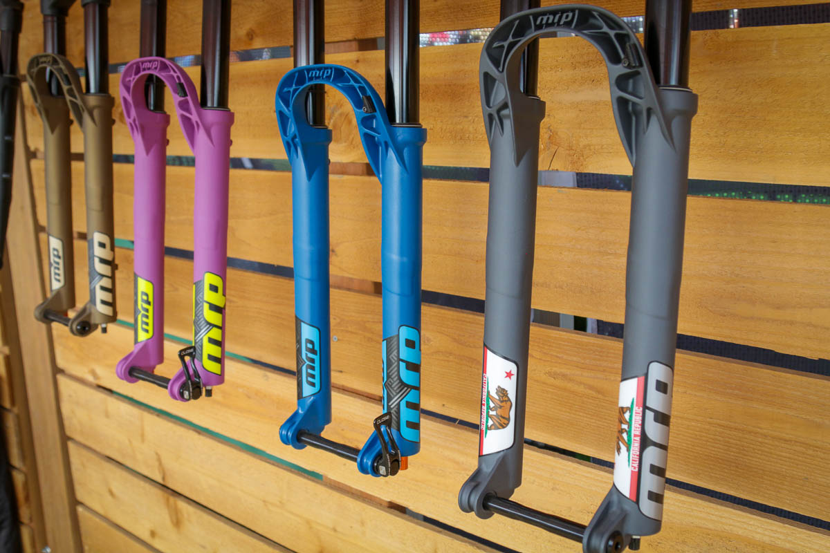
I need the Pink MRPs for my purple Cotic!
I'm all for them.
"I refuse to have Ohlins suspension on my Ducati 999 because the yellow spring, gold stanchions and blue sticker will clash with the red"
- No one ever.
Except Fox have stolen the Marzocchi Orange. I actually quite liked their poo-brown forks.
And Rockshox got greedy with red DH forks, yellow trail forks and blue XC forks.
I'm all for a bit of colour these days and have recently gone from very sensible black Ext fork and shock to full comedy spec ultraviolet from Formula.
Quickly realised this clashed with the frame so spent far too long stripping it back to raw carbon... then finishing it off with a load of holographic purple flake in the clear coat. Daughter loves, son doesn't get it, Mrs thinks I'm having a breakdown 😆
I’m quite dull and prefer black or white for forks - currently have Fox, Formula, Rock Shox and Ohlins on my bikes. I do think colour works well - especially on black, white grey or natural finish bikes. I have to say that the bikes pictured above in the thread all look great - although I have seen many that don’t!
On a similar but slightly different subject, I do like forks with graphics colour matched to the bike. As I said, though - I’m dull so don’t have any.
How do people feel about matching components on bikes? E.g. the same brand of shock and fork, bars and stem etc…
I love red lyriks ♥️
edit - and yet I’m allowed to go clothes shopping unsupervised 🤷♂️
Definitely depends what you put it on - black bikes FTW

I love those yellow Ohlins... i'd have them in a hearbeat.... Although only on a black (or blackish) bike.
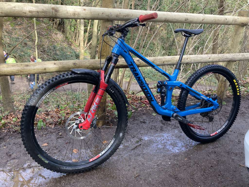
Think I'd prefer black on that Bird.... which frame is it? It's the nicest looking Bird I've seen by some distance, despite the forks 🙂

Possibly why the ones who think coloured forks look good on bikes are not allowed to go clothes shopping and their partners insist on buying their clothes for them. 😉
Just nipping in to say, very much joking. Sorry if that's not obvious to anyone 😊👍
I love the green forks on the Bird, I'm a sucker for green. How on earth did you get it to balance so well for that picture?
Yesterday I was actually looking for decals for a new fork before I even have bought the actual fork. Then I realized that this years family vacation will be so expensive that I can barely afford new decals for my old fork.
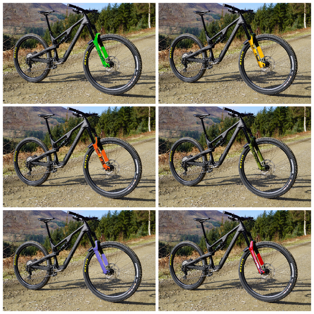
Posted on the forum before but:

My stance is clear. It looks awesome.
ETA I may or may not have a Dark blue/grey Scott race Jersey and a pair of bright yellow gloves for special days on that bike....
I think they are great. I always really liked having the sand colour Marz AM1s on an all black frame.
Planning on some ultra violet Formula's next as well.
I retract my stance on Fox orange with Kashima, it can be fine. I think it just looks bad in a product photo of the fork on its own against a white background.
Hot pink and Canary yellow?...go hard or go home with tasteless colour choices
Excuse my skills. I did at least use fork photos taken in daylight.
I've included the green Lyrik for comparison, but I don't consider it a signature colour.
Would look a bit more balanced with a matching shock.