New Look Ibis: Birds Are Real

by 51

Somewhere in a marketing department far far away, it is a time of drinks trollies and beanbags. Rival agencies vie to win the latest contract. The bearded young Peregrine sips a cocktail as Allegra stands poised at the whiteboard. Octavius and Bunty shower a glass wall with Post-Its. Brad scratches his balls in the ball pool. Across the street in a converted warehouse, Blake plays (craft) beer pong while Walker plucks at a banjo. Hopper records their thought bombs on the chalk wall.
At least, that’s how we imagine this press release, from Ibis, came into being:

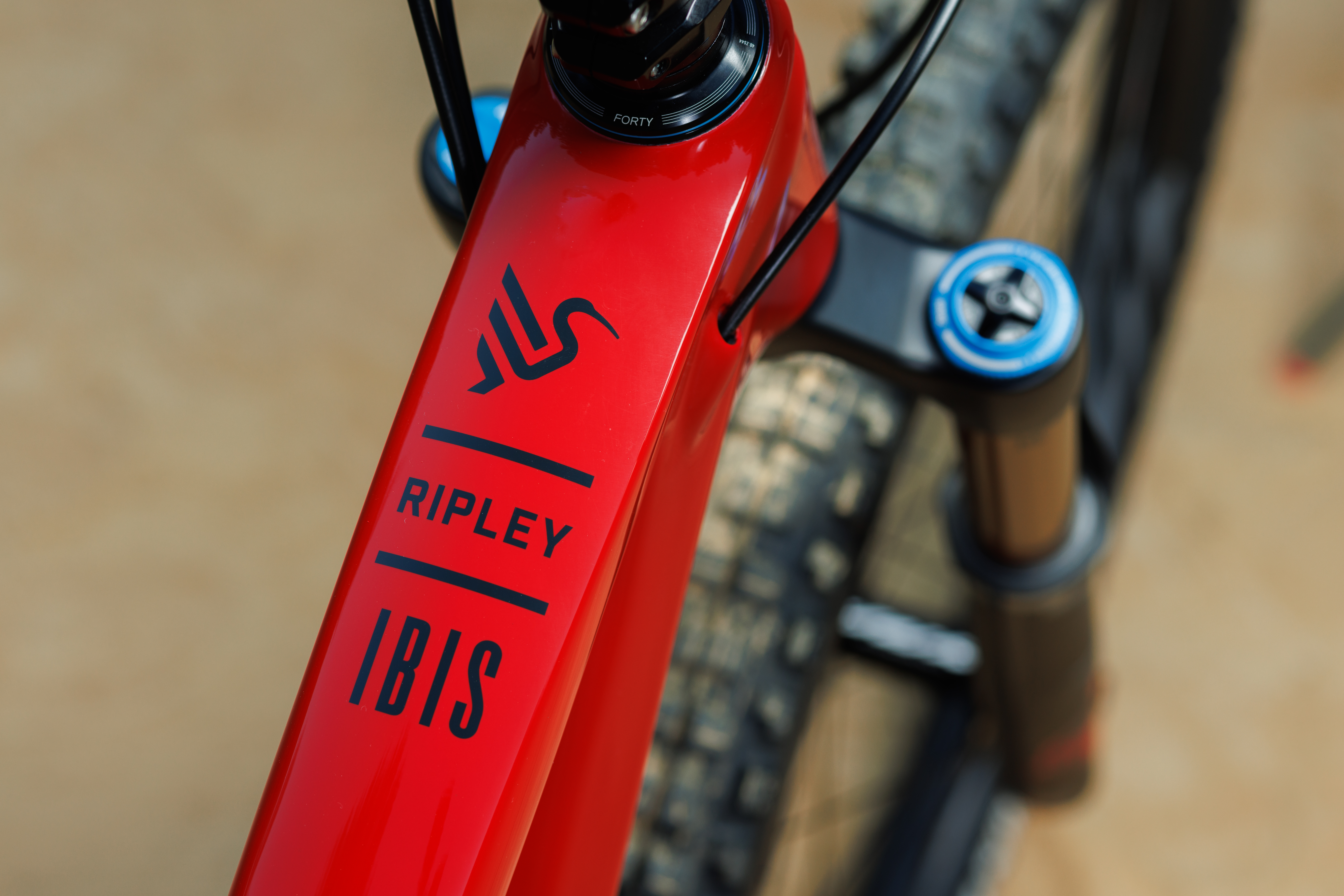
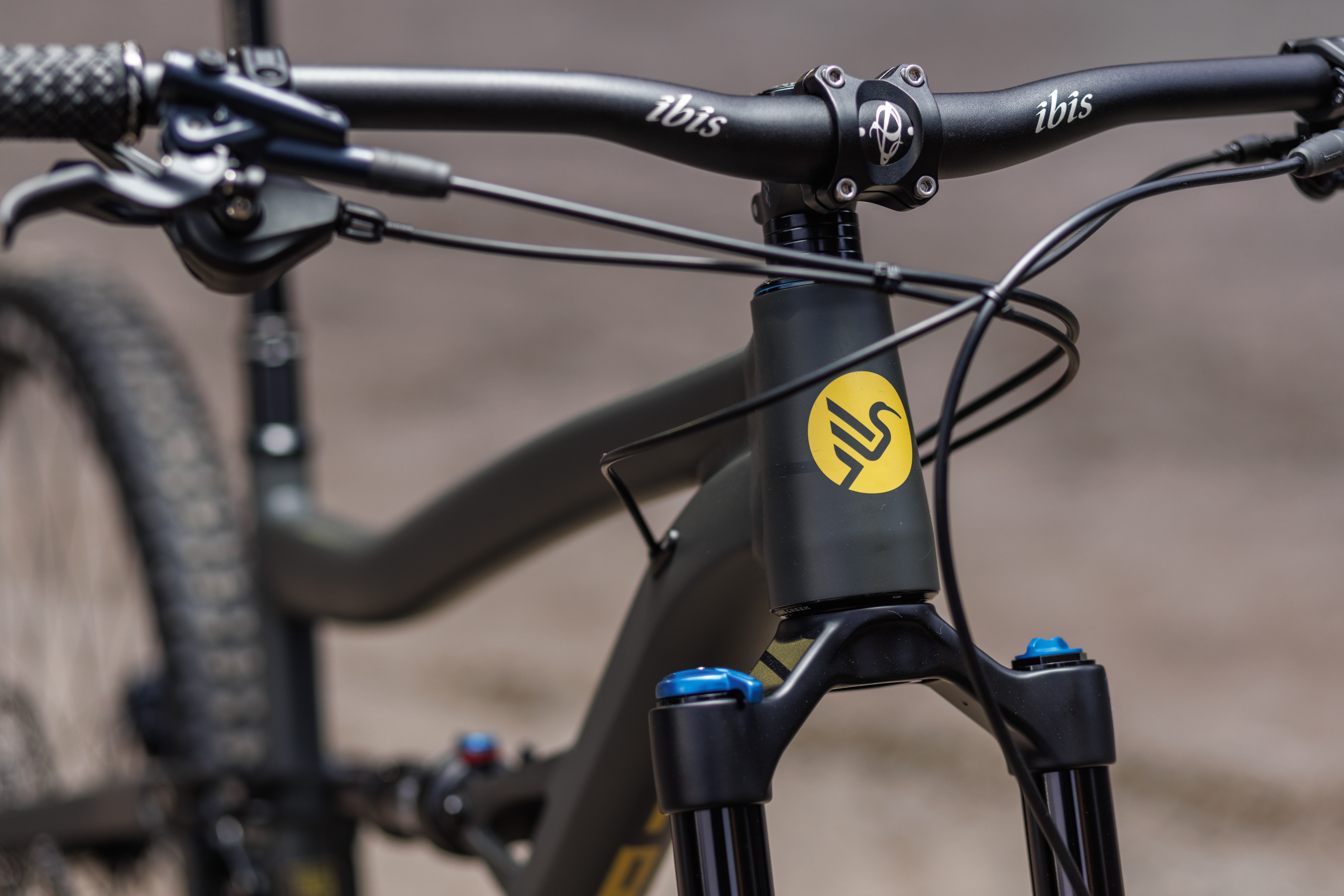
On Tuesday, September 27th, Ibis will have a radically different look. We are introducing a new logo, word mark, color palette, and typeface that shines a spotlight on the values of our brand.

When founder Scot Nicol was naming his newly hatched bicycle company in 1981, he decided to evoke the thrill of flight by choosing a bird. He liked that birds are light and can fly, which are both positive traits to associate with a bicycle. Strong, elegant, and fast, our new identity instantly evokes the connection between the bird and the brand.

By embracing the bird, we are strengthening the connection between the brand and its core values for a new generation of enthusiasts. Our iconic oval was created in 1993. That was a different time in the bike world and the world in general. We didn’t yet have a website (that came in 1997) and the tubes on our bikes were round, skinny, and made of Moron (more on the end) steel.

Our new visual identity pays homage to that hand-crafted past, while looking forward. The new Ibis bird projects strength as it takes flight, while the arced beak is reminiscent of the care we take with the surfaces in our designs.

We also implemented an uppercase IBIS to remind people visually that our company is no longer the soft “i” of interesting, but a proud and strong “I” that embodies the spirit of us as humans. These visuals are better adapted to the complex surfacing of our frames. They look stable and modern, like our bikes.

Since our humble beginnings, this blend of craft, elegance, and irreverence has been a mainstay of the Ibis ethos. Our new brand identity reflects this past, while welcoming a whole new era of riders to the flock.

Ibis press release, 27 September
Can you imagine being in the meeting where they came up with all that? And is it just us that thinks ‘…so…no metal headbadge, decals instead…?’. Don’t worry though, it’s not all new paint and fluffy words.

The Ibis Ripmo and Ripley now feature a UDH rear derailleur. To help differentiate them from current models, we’re using the names Ripley V4S and Ripmo V2S. The S stands for swingarm.

Both models receive a new UDH swingarm for maximum future compatibility, and move to a 55mm chainline. They also receive enhanced frame stay protection and upgraded clevis bushings. 

The 55mm chainline, which is 3mm wider than the previous standard, allows for a wider and stiffer chainstay. The clevis pivot bushings have more consistent sealing to keep out the grime in even the wettest conditions. Because of these changes the new parts are not backwards compatible.

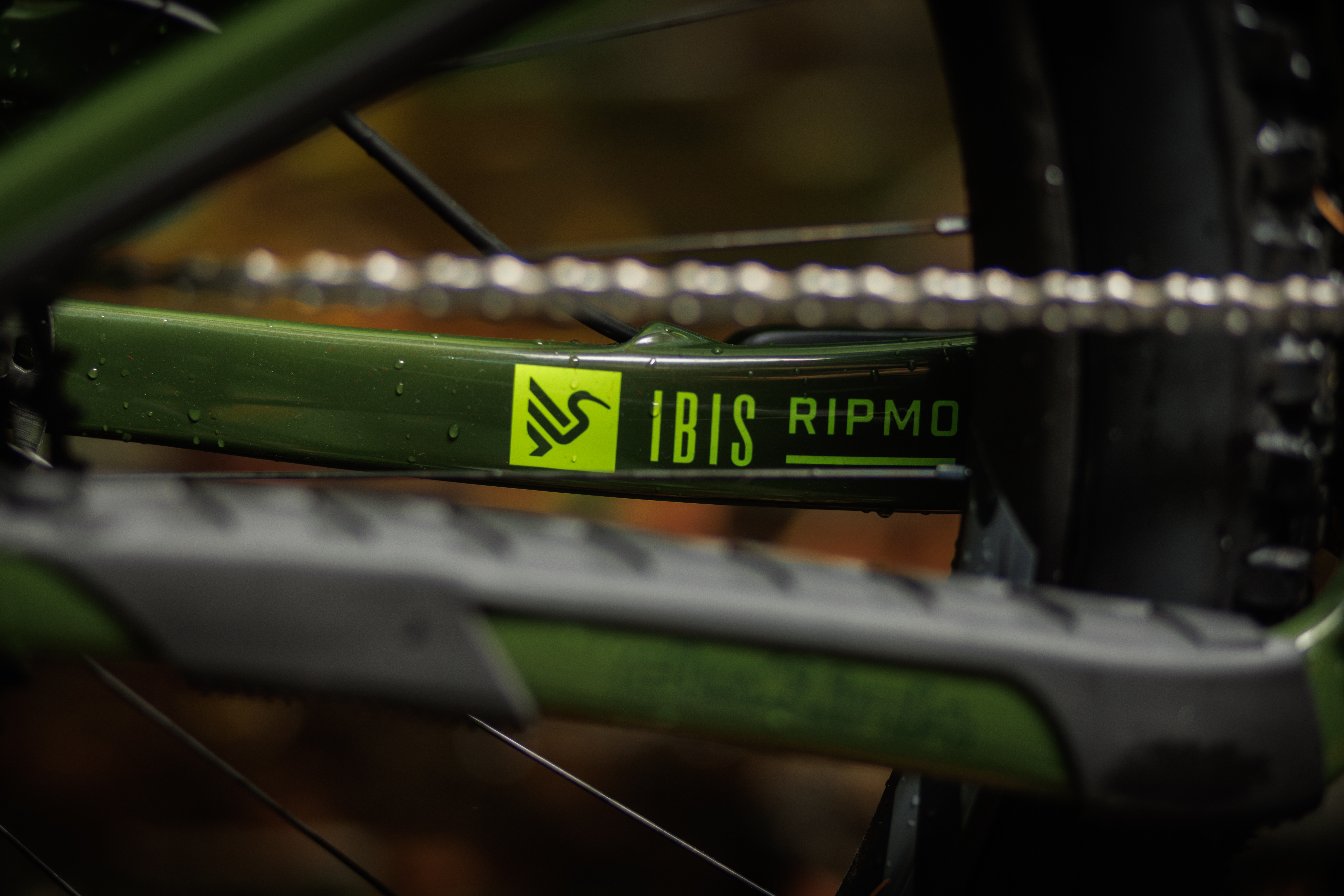
You can visually identify the new swingarms by the new hanger, as well as the derailleur cable exit port, which has been moved to the top of the stay. The new routing boosts heel clearance and offers improved shifting feel, as it provides a smoother passage to the derailleur.

Our new chainstay protector features thick raised sections to help dampen chain slap noise. It also extends downwards, wrapping under the chainstay. This protects from heel rub and eliminates the metal chainsuck plate.

We’re also replacing our bolt on polycarbonate downtube protector with a new thick rubber guard. It covers a larger area and the increased thickness and softer material better absorbs impacts.

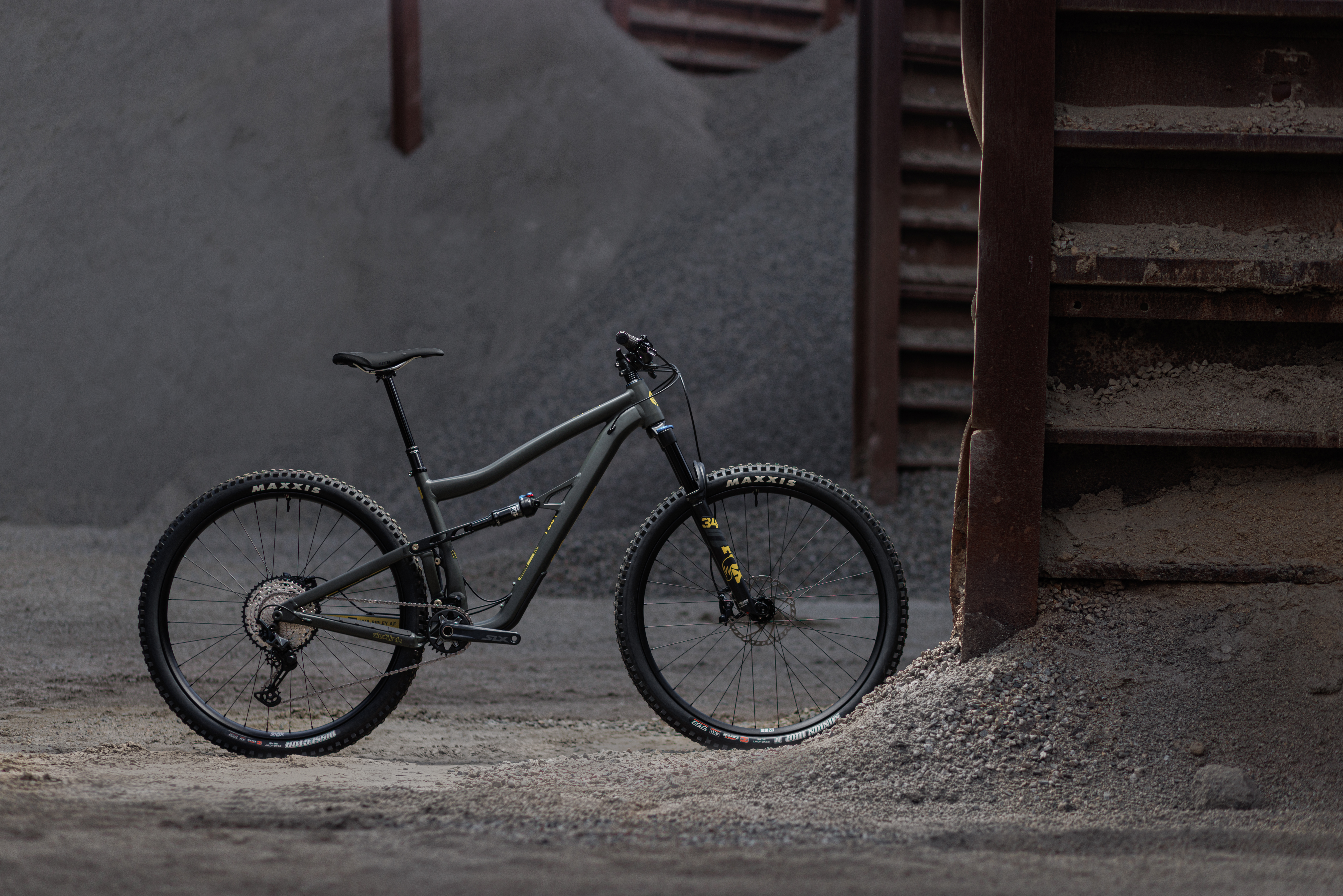
Ibis Ripley AF in ‘Mustard Stain’

After all the branding waffle, count us disappointed that the new swingarm just adds an S to the names. Surely there is some sort of Galapagos Island finch with wider beak that it could have been named after? Anyway, there you go. Info on the latest from Ibis. We’ll probably not be offered a test ride after this level of cheek…but we’re open to writing marketing material, and Amanda has her crayons at the ready for any rebrands…

Ripmo V2S
Author Profile Picture
Hannah Dobson

Managing Editor

I came to Singletrack having decided there must be more to life than meetings. I like all bikes, but especially unusual ones. More than bikes, I like what bikes do. I think that they link people and places; that cycling creates a connection between us and our environment; bikes create communities; deliver freedom; bring joy; and improve fitness. They're environmentally friendly and create friendly environments. I try to write about all these things in the hope that others might discover the joy of bikes too.

More posts from Hannah

Viewing 40 posts - 1 through 40 (of 51 total)
  • New Look Ibis: Birds Are Real
  • honeybadgerx
    Full Member

    Now mulling over prying the old head badge off the SL-R frame I have gathering dust to see how much I can get for it…

    nickc
    Full Member

    One of the nicer things about Ibis, was the head-badge.

    ocrider
    Full Member

    Embracing the bird ?
    First thing that came to my mind was this 🖕
    I’m so childish.
    Shame about the headbadge going the way of the dodo.

    WildHunter2009
    Full Member

    And now all I can think of is thi and apologies for the language…

    zerocool
    Full Member

    I miss head badges. From my old Raleigh Boxer, Lizard and Marauder to my 2005 GT Moto and Orange Alpine 160. Hells, I think my old Universal MTB used to have an actual head badge.

    Now it’s all just stickers and decals.

    Time to find someone how does pretty custom head badges. Any suggestions?

    Don’t Australian’s refer to Ibis as “Bin Chickens”?

    rossburton
    Free Member

    That red Ibis looks _exactly_ like my old Santa Cruz 26er Superlight…

    leegee
    Full Member

    Having cracked two Ripmos under the downtube protector it’s nice to see they realise there is an issue.

    I am waiting to hear if they will warranty my 2nd cracked frame now…..

    rOcKeTdOg
    Full Member

    Time to find someone how does pretty custom head badges. Any suggestions?

    Jen Green
    https://www.headbadges.com/portfolio.html

    hatter
    Full Member

    Suspect some of the Custom headtube badge makers in the states will be adding an old school Ibis jobbie to thier ranges pretty sharpish, it was a lovely design.

    EDIT: Beaten to it!

    gavalar
    Free Member

    Oh dear, how cheap, no pun intended, does that transfer look, as an owner of the HD3 and HD4 part of the identity of an Ibis is the metallic gold headtube badge, it looks as bad as the Santa Cruz square headtube badge compared to the original which resembled someone riding a bike, it looks too corporate and lacks imagination, here’s hoping Yeti don’t follow suit and lose their fabulous metal headtube badge.

    comet
    Full Member

    Marvellous stuff.

    I particularLy like the description of the uppercase IBIS, followed by the use of Ibis in the text. There’s nothing like brand integrity and this is nothing like … oh, never mind!

    ojom
    Free Member

    Keyring

    Had this for an age. It’s even cooler now.

    ojom
    Free Member
    thegeneralist
    Free Member

    What a load of complete shite…

    I mean, really?

    rhayter
    Full Member

    EVERY bike over £3,000 should have a proper head badge. End of.

    Sandwich
    Full Member

    The bird is the word?

    brakestoomuch
    Full Member

    I think Ibis should give you commission. I usually avoid marketing spiel, but I read that, purely because of your intro.

    rickon
    Free Member

    He liked that birds are light and can fly

    Sounds like the kinda guy you want running a milion dollar business.

    You got me.

    Where do I sign?

    zerocool
    Full Member

    I think the new logo would actually look quite good as a metal headbadge. I mean I hadn’t even realised the old one was actually a bird (insert face palm emoji!) I just thought it looked pretty.

    Still don’t understand why all these companies with iconic logos always feel the need to rebrand.

    And yes, I also think that all bikes over £2000 should still have real head badges

    chrismac
    Full Member

    I was hoping for a bit more of a change in the new ripmo than a different, worse, badge

    LAT
    Full Member

    55mm chain line. does this mean they have adopted super boost? or does it mean that your chain has to bend more when you’re on the lower end of the cassette?

    edit it may tell me in the article, but after the bullshit, 55 mil chainline broke me.

    perhaps they should have rebranded to IBS rather than IBIS.

    obviously, i’m sympathetic to IBS sufferers.

    edit edit, are we sure that this isn’t a joke?

    at least this has left me not wanting an IBIS anymore.

    bigrich
    Full Member

    Bin Chicken would be a good name for their latest model

    Daffy
    Full Member

    That marketing statement – W. T. F!

    Whoever commissioned it needs fired. Whoever came up with it needs an education. As for whomever in “IBIS” approved it, goodness they need therapy.

    imrobert
    Full Member

    Sometimes this mag / website is pure gold.

    twonks
    Full Member

    That must be a piss take.

    Old frames made of Moron ?

    If it isn’t, and instead is some marketing spiel designed in such a way, the people responsible need to get out more and stop socially not interacting on their devices.

    I love my mk1 Ripmo and liked what Ibis do as a brand, however this is just a bit silly.

    Do agree, the frame shadow looks like a 2007-2013 (ish) SC Superlight. Only the shadow though, as clearly the linkages are totally different.

    militantmandy
    Free Member

    EVERY bike over £3,000 should have a proper head badge. End of.

    I cannot think of anything less important.

    Unfortunately, they’ve missed the major bit and it’s still minging. Great bikes though!

    a11y
    Full Member

    I love a good headbadge, but I doubt a proper headbadge would sway any decision on an Ibis for me – not a fan of the looks.

    rickon
    Free Member

    Working in branding and marketing for well known consumer brands (not flexing, but flexing) – That statement is for your internal stakeholders and for investors. There should have been a customer-facing statement that was less full of purpose-driven language that people who ride bikes don’t give two hoots about, and one that was about what the brand is going to be in the next 5 – 10 years.

    You know, we’re going to fully embrace the 39″ wheel, and hamster power.

    ads678
    Full Member

    I used to love the look of the Mojo’s, those bikes up there are just Duuuuul!

    The Headtube badge also used to be nice, it’s the finishing touches that make you feel good about expensive bikes, little embosed bits or cut outs on the chainstays or seat stay brace. That new headtube badge is just shite.

    rickmeister
    Full Member

    Your header is indeed a cacophony of flowery copywriting wankage of the highest quality. Much mirth and merryment was had.
    Bravo Han Han, peel yourself another “Shat through the arse of a goat” craft freeze dried rare earth hand picked aubergene, dahling.

    And that Ibis / IBIS sticker looks like it belongs on a Scandinavian ferry or to budget airline. I say that as an IBIS metal headbadge owner….

    slowol
    Full Member

    Just watched that you tube video posted up there^^ 🤣🤣🤣

    Moral of the story before you create a brand find out the ‘cultural associations’ in your target market. Seems Australian liking for anything ibis may be a bit lacking.

    charliedontsurf
    Full Member

    Where the old head badge illustrated synergy with the steel frames and craftsmanship whilst curtseying to heritage, the fresh and exciting contemporary logo encapsulates the core conceptual values of a modern carbon bike. Mass-produced, some variation of plastic, pooped out of a machine, a bold logo that is in one colour so the decals are cheaper to print. “That will do… but can I have 400 words justifying it so it looks like we know what we are doing”.

    vinnyeh
    Full Member

    @stwhannah – not sure who came up with the logo change at Ibis, not sold on it, but as a thought- Roxy Lo is the bike designer there- only woman I’m aware of that has that position in the industry, and she certainly changed a lot of things with the Mojo design- might be a great candidate for an interview/article.

    barney
    Free Member

    @twonks – nope, Moron (‘more on’ the ends, geddit) was Ibis’ 1990s response to Ritchey Logic and (particularly) Columbus Genius steel tubing. This was, don’t forget, the same company that gave the world the ‘hand job’ brake cable holder.

    Regarding the actual story up, it seems to me that someone has been outsourcing to a non-specialised marketing company, and has been releasing internal comms as a press release…

    vinnyeh
    Full Member

    bit remiss of you not to post a picture of a handjob, Barney

    Blackflag
    Free Member

    How to take an expensive bike and make it look like you got it from Aldi

    That’s no way to attract the IT crowd away from Santa Cruz or Yeti

    barney
    Free Member

    Vinny, I knew someone would be along to do it for me 🙂

    leegee
    Full Member

    Just been notified that Ibis will not warranty my second frame that has cracked under the downtube guard. 43 months, over £4K spent on the two frames.
    I know some others have had their frames crack in the same place. The press release yesterday mentions increased protection in this area.

    “We’re also replacing our bolt on polycarbonate downtube protector with a new thick rubber guard. It covers a larger area and the increased thickness and softer material better absorbs impacts”

    It’s crap to find out the day after they announce increased protection they are washing their hands of mine.

    IdleJon
    Full Member

    EVERY bike over £3,000 should have a proper head badge. End of.

    I cannot think of anything less important.

    +1

    I’ve never heard anyone on the trails say ‘nice bike, but where’s the head badge?’ I thought it was just something for bike journos to talk about to fill up space. 😀

    jamesmio
    Free Member

    Geoff Moorhouse is the man for head tube badges
    https://www.instagram.com/headbadge/?hl=en

    Made me a beautiful Cotic one out of pewter for my old Soul – it’s a work of art.

    *EDIT – looks like he’s winding things down due to health reasons, bugger.

Viewing 40 posts - 1 through 40 (of 51 total)

You must be logged in to reply to this topic.