I know there are loads of you on here.
Seen any nice stylish serif typefaces recently? For editorial so legibility is everthing.
MM
Times.
Come ON!!
Not the obvious. Trawling through the font libraries. Think stylish
Come on, you used the words editorial and legibility.
Anymore hints on usage? Don't use anything fancy in body text, if you're after something fancy for headlines only, maybe get a bit more creative.
I quite like Caslon for body copy, depends what size and what amount of type your setting really!
Personally I love Arial and Johnston, the London Transport typeface. Clear, simple, eligible.
EDIT: 'Eligible'? Single, GSOH, nice-smelling, solvent?
😆
(Goes into American Psycho mode...)
[img]  [/img]
[img]  [/img]
Some nice fonts on these sites...
http://www.yoworks.com/yofonts/free.html
http://www.fontsquirrel.com/
FF Unit Slab Pro is kinda nice in body text actually but it has a pretty distinctive look which is either going to work or not.
http://www.fontshop.com/fonts/downloads/fontfont/ff_unit_slab_pro_collection/
Elfinsafety brief FAIL!
serif types old chap!
Elfinsafety, he said serif, not sans...
Women's monthly market magazine. Can't say more really.
May be used as body copy, definately headlines.
Think creative..inspire me! Just want to see what's out there really
comic sans?
I'd always go for a nice san-serif for the body. Comic Sans is my first choice.
FF Unit Slab Pro is kinda nice in body text actually but it has a pretty distinctive look which is either going to work or not.
Ruddy 'ell - is it any wonder that swapping fonts is so rife when a complete set is €975.00!!!
comic sans?
BURN HIM!
Perhaps Meta Serif?
Expecting whinging about the price now...
Papyrus [u]FOR EVERYTHING[/u]
or Mrs Eaves
Price no object. I work for a big publisher.
Cheers Gary. Was looking at Museo for a slab and sans at the mo but early days.
I mean a proper serif (not slab)
Greta.
Ok, if it's lifestyle mags, Slabs are pretty hot at the moment. Officina Serif, Unit Slab, Clarendon...
[img] 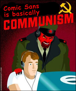 [/img]
I was reading my copy of that last night Gary.
Mag I'm on now uses Archer (slab), Proxima (sans) and Chronicle (serif)
Will probably use the three styles on this project but not the same fonts
Should point out a large family of weights would be needed
Does it need to be suitable for PowerPoint? Remember...lots of bullet points 😉
How about "Optima, only hint of a serif and good for lots of text", so I've just been told
Rotis Sans Serif? 🙂
[img]  [/img]
[img]  [/img]
Swift designed by Gerard Unger. It's a great looking work horse for text 🙂
Swift looks good. Reminds me of Stylist Magazine's masthead
Rotis is awful as a body text, despite that being it's orginal/main purpose. I still love it though.
I'd never use serif fonts for body text...
However if you must then I'd probably opt for something like Century Schoolbook. That's a lovely font. Hoefler Text will work relatively well as a body text font also.
What does slab mean?
Sunday Times.
Archer and Chronicle, now those [b]are[/b] nice typefaces!
That Xavier Dupre designs some interesting faces - I use Absara a lot (very recognisable italic), but perhaps not for a women's monthly market magazine. His Yoga and Parango are nice and a little quirky too.
molgrips - the serifs aren't tapered, they're square edged.
Look at Times close up and then look at Rockwell close up and you'll see.
If you MUST use a serif font then I'd say either Rotis or Meta. Both of which have been mentioned above. Rotis, as you can dump the serif when you've come to your senses
Helvetica for body copy. In fact Helvetica for everything. Full Stop
[url= http://new.myfonts.com/fonts/fontfont/nexus-serif/ ] Nexus serif[/url] really nice nearly abstract internals. One of the dictionary's use it.
Good call IamSam, Nexus is a nice family (though the slab Nexus Mix bears more than a passing resemblance to the earlier PMN Caecilia).
Right, anybody on this thread who understands any of it, is a weirdo.
Century Schoolbook? Bloody hell, that takes me back. Used to use that when I was doing books back in the 70's. Along with Times, Univers, Helvetica. Optima isn't something I'd ever want to use as a body type, and it's more than a little dated now. Prefer Helvetica to Univers, but again, I wouldn't really want to use it as a body type. Perfectly readable, but not distinctive enough for a magazine. Trouble is, there are thousands of fonts out there, and identifying and recognising them is way beyond me now. I was having this exact conversation with our studio manager, someone I've worked with in book publishing and on Macs for over thirty years.
Now, where's my old Letraset catalogue...?
I'd look at new century schoolbook - a more upto date cut, Linotype or bitstream font houses off top of my head. Personally I prefer sans serif for large blocks of copy
