Right, keep it steady for the computer and maths illiterate (apparently I should be using something called Minitab but that doesn't do anything right, so I've fallen back on Excel).
I want to fit a trend line (?) to a graph. My graphlooks like this at the minute-
[IMG] 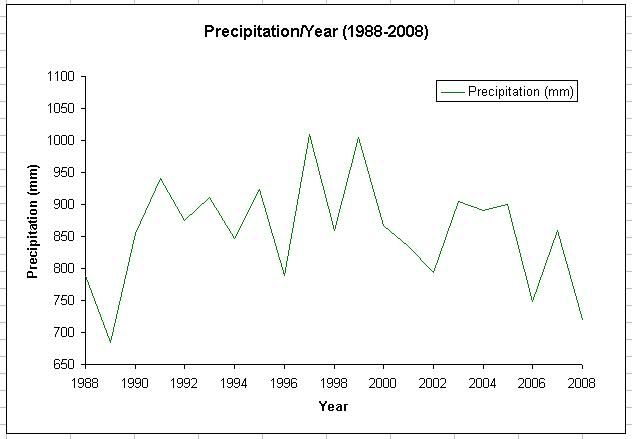 [/IMG]
And I want a nice red line like this going through it all-
[IMG] 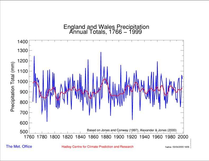 [/IMG]
How do I do that?
Also, while I'm here, what sort of measure of central tendancy do I want to use for that sort of data (interval scale- I think that's it)- my reckoning says the mode, but that doesn't seem right.
Thanks in advance.
Well it is a long time since I did anything like this - but if by a trend line you mean find the regression line that provides the best fit to the data y = mx + c then to find the regression coefficients you would need to write the least square error formulae and solve it yourself in EXCEL! I would use Minitab or some other stats tool - although perhaps EXCEL now has these functions?
Re your central tendency measure. Then the arithmetic mean is probably the most appropriate and certainly not the mode. Your data is ratio data (I think) (nominal, ordinal, interval and ratio) in the sense that you can say 400mm of rain is twice as much as 200mm of rain. Whereas you cannot say 40 deg C is twice as hot as 20 deg C - an interval scale.
I was once a maths geek although not a stats geek (0% in first years exams!)
Gary BSc MSc PhD 😆
Trendlines in excel are pretty useless in terms of "real stats" but simple to do if you just want to show a line without all the noise. To add the trendline right click on the wiggly line on the chart and choose an option - try each of the options and see which one you like!
To do real stats (ie. University stuff rather than stuff that convinces management) I'd recommend SPSS, it was free for students at my uni if that's where you are.
It's a bit of pisser that in my geology degree I now had 2 modules of actual geology, and 3 of computers and maths...
I think I'll just leave the trend line out for now. What you just said baffles the bejeezus out of me.
Mean is good. i can do that. And type in the thing to make a standard deviation.
In essence I do tend to agree with all the above comments.
The really smart choice however is to press 'print'
Get a device called a ruler and a marking device named 'red pen'
Use these tools in conjunction and presto problem solved.
No-one will ever be any the wiser and will marvel in your skills.
No charge for this advice. 😀
I suspect however that since the OP stated he should be using minitab then the objective was to obtain a result with a little more scientific basis then simply drawing a line by eye?
As good as the advice is do any of us believe there is an actual trend or just random noise against a mean value?
I am hard pushed to convince myself there is any trend in the above graphs
I plotted a trendline using the right click thing and it looked like bollocks anyway, and I was really only using it to find the distribution, I don't get marked on that.
Who designs these things and makes up such complex terms for doing stuff, though?
[i]Who designs these things and makes up such complex terms for doing stuff, though?[/i]
Hmmn .... Geology you say ...... 😆
