my compo entry
[img]  [/img]
apologies to David Thorne for blantant plagiarism of his "**** in the arse" logo
Posted : 05/01/2012 10:13 pm
On a similar theme to Klunk....
[img]  [/img]
Posted : 05/01/2012 10:22 pm
Notice how Klunk's gone for the V-neck. Crafty bugger (of the metrosexual kind).
Posted : 05/01/2012 10:24 pm
Amateurs.
Nothing says 'mtb holiday company promotional item of clothing' like a snake eating an orange.
[img] 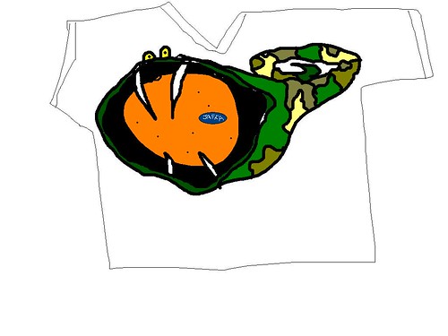 [/img]
Posted : 05/01/2012 10:24 pm
rewski - Member
Why is the o almost touching the a then?
POSTED 2 HOURS AGO # REPORT-POST
It is optically kerned - squint and see the negative space around each letterform - they are quite equal. :-p
But now you have got me wanting to tweak it again 🙂
Posted : 05/01/2012 11:17 pm
Page 3 / 3
Prev
