UPDATE: Reviews section refreshed, redesigned, searchable: Go take a look
The third one is 'better' in that it's much simpler. But I think you're falling into the trap of trying to make it too 'mountain bikey'. Sometimes, a logo needs to convey meaning of the product or service, but very often, something more abstract and not immediately visually obvious can actually work better. Take Nike's 'Swoosh', for example. Suggests speed and vigour.
I think you have some good starting points. Keep plugging away, and you'll hopefully come up with something nice. I just scribble stuff on old envelopes and that, and designs evolve from those scribbles.
Try to think of basic shapes and patterns associated with MTBing, rather than trying to tell a whole story in one simple logo.
And keep in mind how it will be used; web, print, colour, black and white, etc. Personally I think using the minimum amount of colours is best, keeps it simple.
As Elfin says, keep it simple. Here are a few examples from other websites (which I presume your trying to compete with), as you can see they are all instantly recognisable and very simple:
[img]  [/img]
[img] ![]() [/img]
[/img]
[img] ![]() [/img]
[/img]
[img]  [/img]
[img] ![]() [/img]
[/img]
they are all instantly recognisable
As will be this if we keep posting it up here
[img] ![]() [/img]
[/img]
Happy to help 🙂
(seriously though, the third one is much much better)
I love the little rider doing the 'look Mum, no hands!' thing.
Although it's a crap logo.
As above something simpler (and less red) would be a lot betterer.
Make the MTB big... and black.
Overlay with a white Arena...in smaller.
Might look alright.
[img]  [/img]
I prefer the one you are using already.

Just nudge it away from the edges.
Both awful I'm afraid. Elfin is on the money. Less is more. Its not what you put in, its what you leave out. ie: Use clean, simple typefaces, not wacky 'modern' ones. On account of them all being crap
AND... Every time I see a Photoshop filter (bevel, emboss, textures) applied to type, a little part of me dies. JUST DON"T!
Can everyone please start using photoshop filters on every post today please. If a little bit of binners dies each time...well...you never know. 😉
You just need to dump the red and add some gnarr!
(CBA to sort the border properly, I have actual work to do)
[img] ![]() [/img]
[/img]
2 is bearable, but it could do with being simplified.
Think clean and simple. A good logo should also work in multiple colours.
Er, neither. And FFS if you really are going to do this then get someone to give you a proof read/ sort out the text on your site. The number of flying apostrophes 😯 is enough to wind up even the most mild mannered grammar nerd.
None of the Above - but well done for settling on something no-one seems to like
You monster DD!!! I'll keep you updated on which bits of me are carking it 🙁
From Butterfly2346:-
Thank you to all of those who gave constructive feedback. It really has helped and we have taken on board your comments. We are still working on the logo and we are close to getting it right.
Thanks again!
I don't like either - too dated. the other one you posted on page 1 looks like clipart with some text dumped in it.
ourkidsam rework of your logo is an improvement.
If you want a good logo, pay someone to do it for you.
Don't just choose a crappy logo for the sake of having a logo...you'd be better off with some simple text as JEngledow illustrates. Perhaps get a good image of people riding singletrack and create a banner with your text over it.
And your favicon looks like a warning sign.
Thanks chaps for all the constructive comments and taking a moment to vote.
Probably run with last offering or something similar.
Ta Muchly.
PS:
Voting went like this 🙂
Logo1
17.4% (15 votes)
Logo2
82.6% (71 votes)
If you are gonna use that one above (ourkidsam) please FFS flip the second 'A' so it tilts the other way and mimics the shape of the mountain more.
Not that I actually like either. Sorry.
I'm not using the ourkidsam logo [thanks for having a go at it though]
I'll be using the chain ring one I did last night. Just been playing a bit more with it.
[img] ![]() [/img]
[/img]
[img] ![]() [/img]
[/img]
[img] ![]() [/img]
[/img]
Much much better.
I'd suggest trying to simplify the chainring even more, make it a bit more 'abstract'; a logo that can be used on it's own without the text, maybe.
But it's definitely getting there. it's nice to see the process from original ideas through to the finished thing. 🙂
The others were guff, but the last one is a bit better, but please don't use Ariel as the font, I hate that font. It's going to be just grey is it?
i think all of those 3 look really good.
once you've got that far, just pick one and call it a day, you could be fine tuning forever.
Thanks chaps 🙂
Ariel is not on the cards so dont panic!. Possibly Franklin Gothic.
PS: Managed to delete the original logos I did, not such a bad thing ;-). There on a different machine and I'll post back later for thread continuity.
The 3D one sis good above. Just been through the whole logo thing ourselves for www.pmba.org.uk. Kept it simple, sure we could have done better but it's not easy. Something recognisable is better than nothing.
Ariel is not on the cards so dont panic!. Possibly Franklin Gothic.
Arial is fine. Dunno why Coogan is so vehemently opposed to it. Now if it were Sand or Comic Sans or something I could understand....
To continue trying to be 'constructive'; in what way does the chainring represent mountain bicycling over any other form of cycling?
I think it's a bit too obvious to use something like a chainring for a biking thing logo, but maybe that's just me. How many other biking things have similar logos?
It really depends how important it is to have a top-class logo though. Maybe it is, maybe it isn't.
Personally I'd be exploring the idea of a knobbly tyre, tyre tread pattern, incorporate that into the design maybe.
Also, using the 'arena' bit as the basis for ideas. A shape evocative of a sporting area type thing. Hmm, maybe too Olympicky...
I definitely think a circle is a good shape to use though, represents movement maybe, 'cycles', inclusiveness, etc.
Fascinating.
in what way does the chainring represent mountain bicycling over any other form of cycling?
fair point - but ..............
Also, using the 'arena' bit as the basis for ideas
what mtbing takes place in an arena ?
from experience i think you can analyse these things until you just end up crawling up your own ass.
chainring logos look good to me. polish it up, put it to bed.
Ariel is a shit font, simple fact. Helvetica, Franklin Gothic, Univers, News Gothic, DIN, Gotham etc etc are clean well designed fonts. Ariel has always looked like a cheap rubbish rip off. Which it is.
I'd bin the 3D look, no offence but unless your an out and out designer, can be difficult to get these right and for them to work in different situations. I also agree with the chain ring though, I'd probably bin that part too. Do a search for MTB logos, and unless it's a big bike maker, they all have tyre treads, or chains, or bad bike illustrations and so on.
Clean and simple. Always work. Can you tell I work with designers?
from experience i think you can analyse these things until you just end up crawling up your own ass.
Fair point.
One can get far too carried away with such things. 😀
what mtbing takes place in an arena ?
A metaphorical arena, not an actual one. But yeah, difficult to represent such a concept in graphical form in relation to mtbing I spose. Track cycling for example woon't be so difficult.
[img]  [/img]
[img] ![]() [/img]
[/img]
[img] ![]() [/img]
[/img]
Cycling logos in general do seem to follow an obvious and familiar theme...
[img] ![]() [/img]
[/img]
[img] 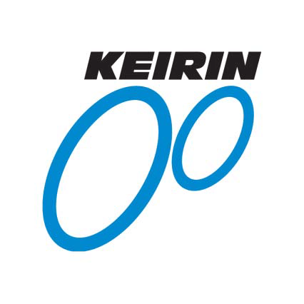 [/img]
[img]  [/img]
But simplicity wins, I think.
Ariel is a shit font, simple fact. Helvetica, Franklin Gothic, Univers, News Gothic, DIN, Gotham etc etc are clean well designed fonts. Ariel has always looked like a cheap rubbish rip off. Which it is.
Uh-oh! Font Fascist! 😀
No it's good to see people passionate about such things. Most folk I know would be happy with Times New Roman or whatever default font is on their computer programmes. 😥
Or worse, they think something like a 'Wild West' style font is 'quirky and fun'. 😐
I like the realistic chainring. It's something we're all so familiar with, so the form is quite visceral and evocative.
However the name is a bit of a problem. MTB Arena? What is it? You're all going to get together in the Colosseum and try and own each other with bombers whilst the crowd roar on? Or is it a forum where that happens metaphorically?
An interesting spin on the usual MTB forum where there's an Emperor who decides who wins the bitter protracted arguments.. nice idea, I like it.
Ariel is a shit font, and that is a fact.
Uh-oh! Font Fascist!
And rightly so. It is actually fact - not a matter of opinion.
Arial was [i]designed[/i] as a substandard typeface. It could [i]only ever be[/i] a substandard typeface. It was commissioned by Microsoft for the sole reason of avoiding having to pay Linotype to licence Helvetica.
So the brief for the design of Arial was to copy Helvetica but change it [i]just enough[/i] to not get sued. Therefore, any deviation from the original design could only make it worse.
By its very nature Arial can only ever be substandard. It's the result of one of the richest corporations the world has ever seen deciding it would circumvent the sort of copyright it rigidly and desperately applies to its own output.
For designers, Arial is like going to see a really great band, only to find out it's a tribute act.
If you are going to rip into Arial, at least spell it correctly... 😀
That's how much I hate it!
Edited 🙂
Down with Comic Sans 😉
[img]  [/img]
Well I quite like Arial. But then Helvetica and some of them are nice too, but tbh, they all look pretty similar really. But I'm not a Font Fascist. As a Londoner, I do love Johnston, but that's prolly cos I've lived with it all my life and so it's almost part of who I am. It's a bloody nice font though.
Best not mention Gill Sans.... 😯
Poor Redthunder. Came on here hoping for a bit of advice, and now there's probbly a war about to erupt* on the merits of various fonts.... 🙁
*Well I hope there is, cos it'll be fun! 😀
jackthedog...you sound like fun. Get invited to many parties?
[img]  [/img]
Not just you jackthedog 😉
Arial wasn't commissioned by Microsoft. Monotype created it, not as a direct copy but as a substitute; a redrawing of Grotesque with the same body size as Helvetica. However, Microsoft shipped Arial with Windows, making it super popular = a target for haters.
But, I still prefer DIN
"jackthedog...you sound like fun. Get invited to many parties?"
Yeah, thousands. That's why I spent my Friday night talking about typography on an internet forum.
Or maybe I'm just one of the lucky few who has a passion for that which pays my bills. Having said that, it seems I've been out-geeked by Militant_biker, so maybe there's hope for me yet.
Mtb Arena logo development team at work 😉
http://www.mtbarena.com/?topic=mtb-arena-logo-development-team-at-work
Heh! 😆
I like the desk.
Bit disturbed by the crazed look in the bloke's eyes...
BTW, YGM...
I like shapes 🙂
[url= http://farm7.static.flickr.com/6023/5918966461_40b0dc3f33_z.jp g" target="_blank">
[url= http://www.flickr.com/photos/58162507@N07/5918966461/ ]IMG_4613[/url] by [url= http://www.flickr.com/people/58162507@N07/ ]SGMTB[/url], on Flickr
I found the desk today. Someone was giving it away. I'm planning to strip it and use for the laptop in the conservatory. I AM SKIP RAT 😉
[url= http://farm7.static.flickr.com/6028/5918945447_08d98ca937_z.jp g" target="_blank">
[url= http://www.flickr.com/photos/58162507@N07/5918945447/ ]IMG_4601[/url] by [url= http://www.flickr.com/people/58162507@N07/ ]SGMTB[/url], on Flickr
That is nice, is that. The desk, I mean...
Don't get owt nice left out for skiprats in this sink estate I live on. Only cheap knackered crap although I did find a brand new unpainted internal door, and loads of various bits of MDF. Neighbour found a lovely bit of ply but instead of swapping it with me for a bit of MDF, he's butchered it to make a shelf on his balcony, and he is pretty poor at making stuff tbh. Such a waste. 🙁
