I wonder if whenever there's a site update the STW crew click 'upload' then scarper off to the pub, get bladdered and only view the comments the day after! 🙂
Why can some posts be reported and others can't?

Works nicely on iPhone. I like it. Crisp-looking.
Fiddling while Rome burns? Forum link from main burger menu far too low on list, given it's the main traffic generator and arguably Singletrack's reason for existence.
Will this advert ever be truly dynamic and not be bigger than the forum itself?

I’m with Kayak23 needs a back to top button or menu at the bottom to get back to relevant forum front page
I might have misunderstood but when I tap the top of the browser window-whoosh! Up to the top of the page and all the navigation bits
Why can some posts be reported and others can’t?
That was always the case, just means it's already been reported by someone else.
That was always the case, just means it’s already been reported by someone else
Thanks, shows how much notice I take.
With double lines it's much harder to quickly scan the thread titles because you have to declutter it in your mind and as a direct result less threads can fit on one page. Going back to single lines would be much more preferable on desktop.

Seems clearer and slightly easier to navigate on my desktop PC, nothing to complain about here.
I'm sure I'll find something to whinge about given a bit more time though.
I would love it if the blue banner at the top included a "Classifieds" link too.
Other than that, quite liking it overall.
Is this new format kind of like one of the previous versions? I can't remember but wasn't there an old version over two lines that got replaced by a single line?
A brief history of stw forums:
“waah waah this forum is rubbish we need a new forum”
New forum arrives
“waah waah this forum is rubbisherer than before, we want the old one back”
And repeat.
Ftfy
With double lines it’s much harder to quickly scan the thread titles because you have to declutter it in your mind and as a direct result less threads can fit on one page. Going back to single lines would be much more preferable on desktop.
I agree. I'm at work so haven't seen it on desktop, but visually before it was simple and uncluttered. Really quite pleasant compared to just about any other forum I've seen.
Now, it's cluttered, messy and visually jarring, and that's without the reduced ease of navigation. Sorry, but yeah. Not one for those who are visually-led.
The magazine I've always thought is beautiful visually. Such a nice contemporary feel to it and a coherent design.
The forum is really now the complete opposite to that.
The forum search function seems to have disappeared? The search at the top of the page just searches magazine content - There's a magazine?
I wonder if whenever there’s a site update the STW crew click ‘upload’ then scarper off to the pub, get bladdered and only view the comments the day after! 🙂
That's what I would be doing. With a developers hat on I feel the pain whenever anything new is released, even when it isn't my own
As said earlier, I'll be used to it by tomorrow
The forum search function seems to have disappeared? The search at the top of the page just searches magazine content – There’s a magazine?
It's there if you're viewing the chat or bike section, but not if you're viewing the 'overview' - just a bug I'd imagine.
Likey.
Looks good to me 👍
how do you click to the most recent post on a thread ?
I quite like it but can't seem to find a way to get to the latest post in a thread, only the latest page. What am I missing?
Now, it’s cluttered, messy and visually jarring, and that’s without the reduced ease of navigation. Sorry, but yeah. Not one for those who are visually-led.
Just had a peek on mobile.
It's a bit on the busy side. I'd see what I could simplify there if I was the product manager/UX designer/dev team.
Why though … why … no likey at all….
I bet this is punishment for those of us that one stump up.
Probs premier have gold plating and wall to wall carpeting.
because you have to declutter it in your mind
That, my friend, is known in the web design game as cognitive load, and there is definitely a lot of it on the mobile version.
I quite like it but can’t seem to find a way to get to the latest post in a thread, only the latest page. What am I missing?
That button's been missing since the last big change, hasn't it?
Ow. My eyes.
Seriously, the new dark theme is ridiculously straining. No idea why but it's like the white brightness has been bumped up to 11. Was it designed by Pinbacker?
With double lines it’s much harder to quickly scan the thread titles because you have to declutter it in your mind and as a direct result less threads can fit on one page. Going back to single lines would be much more preferable on desktop.
<small class="bbp-reply-post-date">Posted 39 minutes ago</small>
^This. Seeing old vs new side by side... bah to change.
good shout! Had a look and there's a "classic" toggle in the Members' section. Phew!!I bet this is punishment for those of us that one stump up.
Probs premier have gold plating and wall to wall carpeting.
Hmmm. This is not a pleasant experience on a mobile so far. The overview is just too busy as has been said above.
I was considering resubscribing, but now can someone from STW assure it will get better before I part with money please?!
how do you click to the most recent post on a thread ?
Yeah that.
It were better before lad. Grindingly slow to load on my ten year old iMac, though that may be my 2Mb max countryfile sized connection.
If I wait for the main forum page to load the links dont work. they only work if clicked when its loading
Tapping on my clock at the top of my screen also works for me on Android! Mind blown.
@Dawson: are you on a new-ish phone or version of Android? I'm on a four year old Samsung (Android 9) and tapping the clock only opens a notification panel for me...
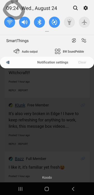
The clock tapping doesn't work for me either on a pixel 6 running Android 13.
Yeah not liking appearance on iPhone, real struggle to make out topic titles as kinda lost amidst all the other topic content like OP etc.
It’s a bit on the busy side. I’d see what I could simplify there if I was the product manager/UX designer/dev team.
I think my UX Designer would have topped herself by now after such an onslaught of negative feedback!
Change....I just dont like change; its hard enough when they move stuff in supermarkets, I cant take this as well
Tbf I quite like it
This actually doesn’t look too bad to me.
Have they fixed the site search?
It's disgusting, please change it back.
If I wanted to endlessly scroll, I'd browse Facebook:-(
Fugly!
Hmmm, so I think it's well intentioned but on the forum each topic now takes up the space of three on the old forum.
I'm sure I'll grow to accept it, but not sure I like it.
Can the
News Review Feature Magazine Podcast Video Classic Ride More Join Us Buy Forum Classifieds
be justified center under Singletrack
and as many have said above, the forum topics list has too much info
🙂
It's marvellous, I still can't read the thread about fly tipping.
& you want me to pay?
Doesn't use screen width efficiently on a monitor - looks optimised for mobile in portrait format.
